
Benjamin Moore Sesame CC-638: A Versatile and Timeless Neutral
Benjamin Moore Sesame CC-638 is a warm and inviting neutral paint color that effortlessly bridges the gap between beige and taupe. Its understated elegance and versatility make it a favorite choice for homeowners and designers alike who are looking to create spaces that feel cozy, refined, and timeless.
Undertones of Sesame CC-638
One of the standout features of Benjamin Moore Sesame is its subtle undertones. This shade has a warm golden-beige base with delicate hints of earthy gray and a faint whisper of green. These undertones lend the color depth and complexity, allowing it to adapt to different lighting conditions. In spaces with ample natural light, Sesame CC-638 appears soft and golden, while in dimmer settings, its grayish-green undertone becomes more pronounced, offering a grounding and calming effect.
Coordinating Colors for a Cohesive Palette
Sesame CC-638 pairs beautifully with a variety of complementary colors, making it an excellent choice for creating a harmonious color scheme. Here are some coordinating shades to consider:
- Whites and Off-Whites: For a classic, clean look, pair Sesame CC-638 with warm whites like Benjamin Moore Chantilly Lace (OC-65) or Cloud White (OC-130). These shades enhance its warmth and create a serene, balanced atmosphere.
- Deep Earth Tones: To add depth and contrast, consider pairing Sesame with rich, earthy hues such as Kendall Charcoal (HC-166) or Fairview Taupe (HC-85). These colors bring out the subtle gray undertones in Sesame and add sophistication to the space.
- Soft Pastels: For a lighter, airier vibe, you can pair Sesame with pastel shades like Palladian Blue (HC-144) or Hollingsworth Green (HC-141). These soft hues create a soothing and refreshing palette.
- Jewel Tones: If you're looking to create a bold and dramatic statement, jewel tones like Hale Navy (HC-154) or Merlot Red (2009-10) provide a striking contrast to Sesame's neutral warmth.
Ideal Uses for Sesame CC-638
Thanks to its versatile nature and balanced undertones, Sesame CC-638 is suitable for a wide range of applications in both residential and commercial interiors. Here are some ideas for incorporating this timeless hue into your design:
- Living Rooms: Use Sesame CC-638 as a wall color to create a warm and inviting atmosphere in your living room. It works equally well in both traditional and modern spaces, offering a neutral backdrop for furniture and decor.
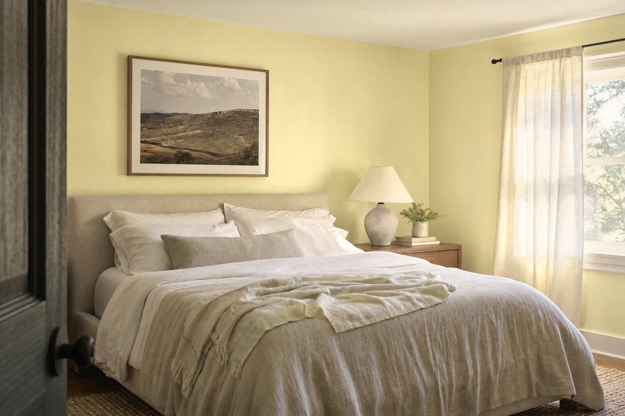
- Bedrooms: The calming undertones of Sesame make it a perfect choice for bedrooms. Pair it with soft linens, textured throws, and warm metallic accents for a cozy, restful retreat.
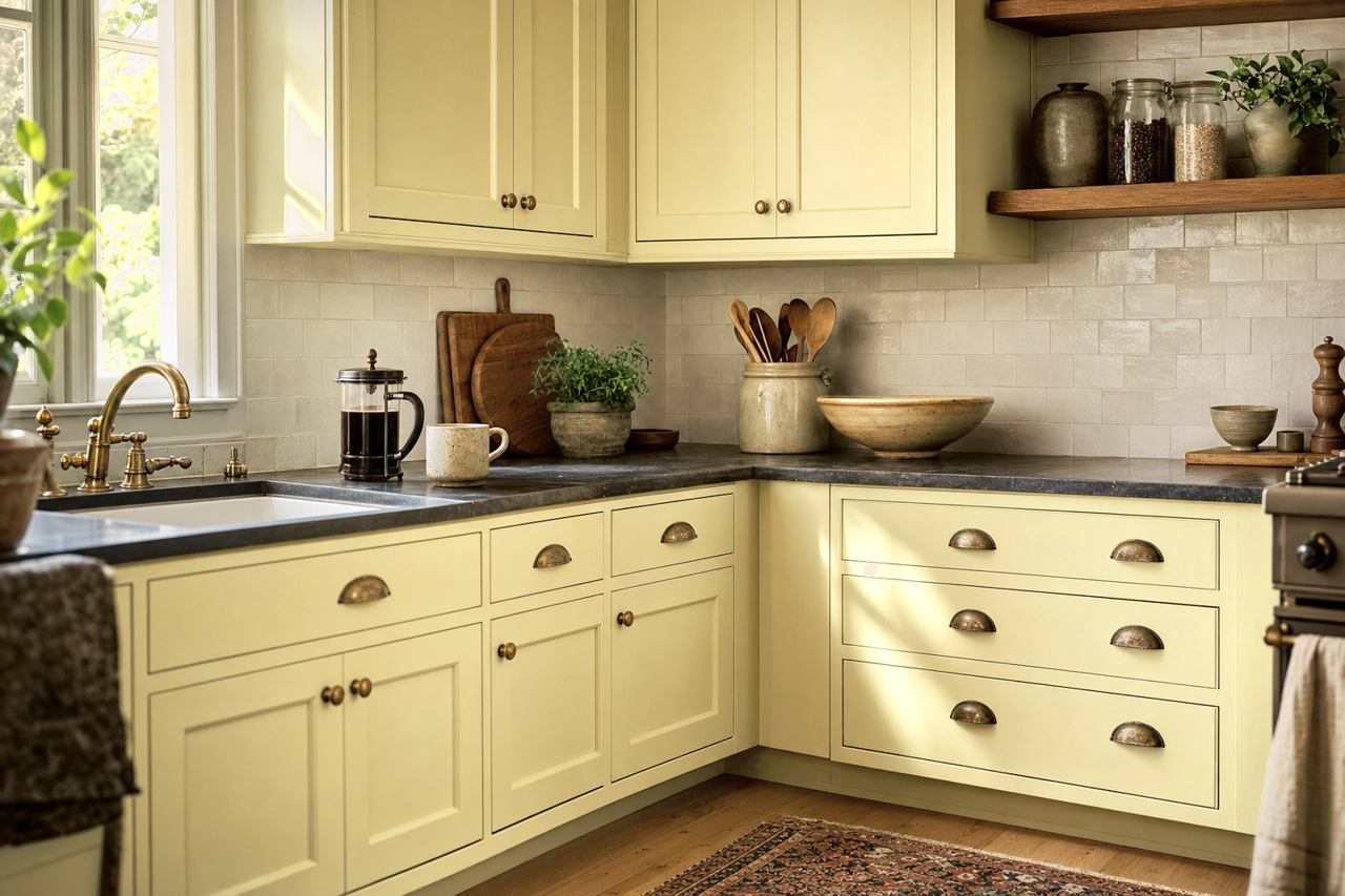
- Kitchens and Dining Areas: Sesame's warmth makes it an excellent option for kitchen walls or cabinetry. It pairs beautifully with wooden finishes, marble countertops, and brass fixtures, creating a timeless and elegant look.
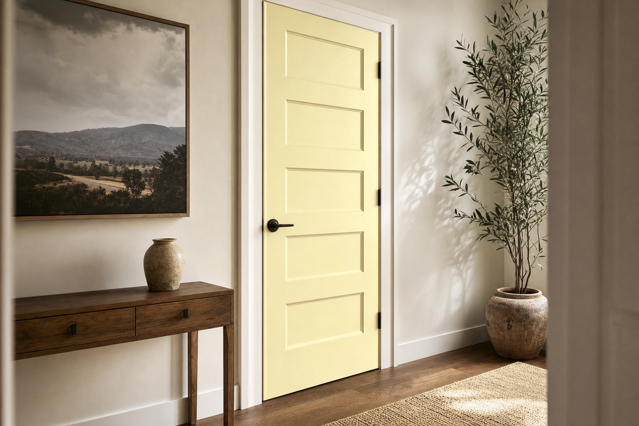
- Entryways and Hallways: Make a welcoming first impression by using Sesame CC-638 in entryways or hallways. Its adaptability allows it to transition seamlessly between adjoining rooms with different color schemes.
- Office Spaces: Create a productive yet comfortable workspace by incorporating Sesame. Its neutral tones provide a subtle, distraction-free backdrop that's ideal for focus and creativity.
Why Choose Sesame CC-638?
Benjamin Moore Sesame CC-638 is a neutral with personality—its rich undertones and adaptability make it anything but boring. Whether you're looking to create a cozy, intimate space or a bright and airy environment, Sesame delivers. Its ability to coordinate effortlessly with a wide range of colors makes it a reliable foundation for any design project.
By choosing Sesame CC-638, you're investing in a versatile and timeless hue that will stand the test of time while enhancing the beauty and functionality of your spaces.