Benjamin Moore Athabasca CC-816: A Sophisticated Neutral for Versatile Interiors
Benjamin Moore Athabasca CC-816 is a timeless, soft neutral gray with subtle blue undertones that lend a serene and sophisticated feel to any space. This paint color is part of Benjamin Moore’s renowned Classic Color Collection, celebrated for its enduring hues that transcend trends while offering versatility for both modern and traditional interiors. Athabasca is a perfect choice for those looking to create a clean, calming atmosphere without veering into overly stark or cold territory.
Undertones: Soft Gray with a Hint of Blue
Athabasca CC-816 is a cool-toned gray that carries a delicate whisper of blue undertones. These cool undertones give it a fresh and airy quality, making it ideal for spaces where you want to evoke tranquility and refinement. The blue undertones are subtle enough to not overpower the gray base, but they add just the right amount of depth and complexity to keep the color from feeling flat or one-dimensional. Depending on the lighting in your space, the blue undertones may appear more pronounced in natural light, creating a soothing and crisp ambiance.
Coordinating Colors: Versatile Pairings for Every Style
Athabasca CC-816 truly shines when paired with complementary shades that enhance its cool, neutral character. Here are some coordinating colors to consider:
- White Dove OC-17: This soft, warm white is perfect for trim, ceilings, or cabinetry, offering a gentle contrast to Athabasca's cool tones.
- Hale Navy HC-154: A deep, rich navy to add drama and sophistication. Use it for accent walls, furniture, or decor for a striking yet harmonious pairing.
- Edgecomb Gray HC-173: A warm greige that balances Athabasca's coolness, ideal for creating a layered and cohesive palette.
- Simply White OC-117: A bright, clean white that enhances the crispness of Athabasca while maintaining a modern and fresh look.
- Revere Pewter HC-172: A classic, warm greige that complements Athabasca's cooler tones for a balanced, transitional aesthetic.
These pairings allow you to tailor Athabasca to various styles, from minimalist and contemporary to cozy farmhouse or coastal-inspired interiors.
Ideal Uses: Where Athabasca Shines
Athabasca CC-816 is one of those rare colors that adapts beautifully to multiple applications, making it a go-to choice for interior designers and homeowners alike. Its versatility allows it to work seamlessly in various rooms and design schemes:
- Living Rooms: Create a calming and inviting space by using Athabasca on the walls, paired with plush furniture and soft textiles in complementary tones.
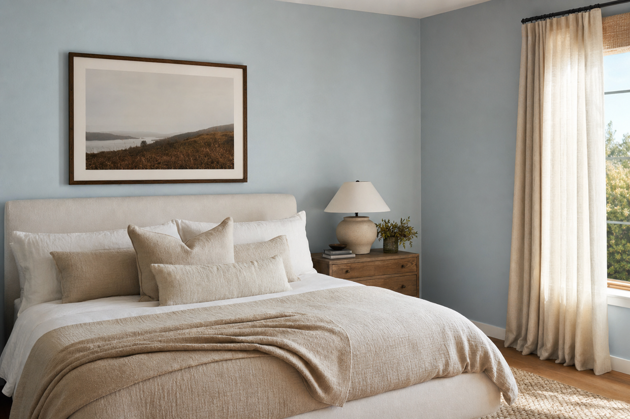
- Bedrooms: The cool undertones of Athabasca make it an ideal choice for bedrooms, fostering a peaceful environment perfect for relaxation and rest.
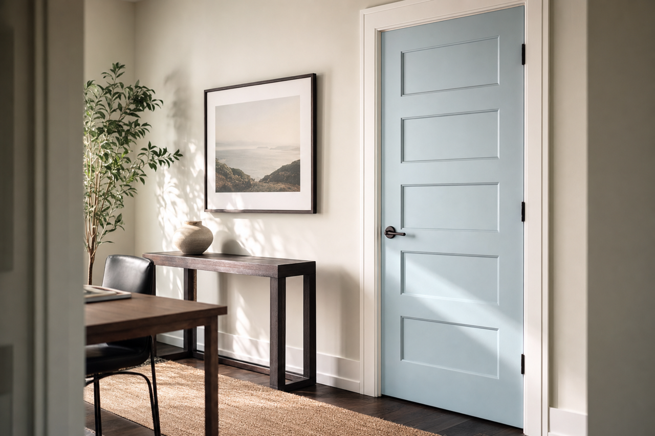
- Home Offices: Its understated elegance and neutral quality provide a clean backdrop that promotes focus and productivity.
- Bathrooms: Paired with crisp white trim and chrome fixtures, Athabasca creates a spa-like atmosphere that feels clean and modern.
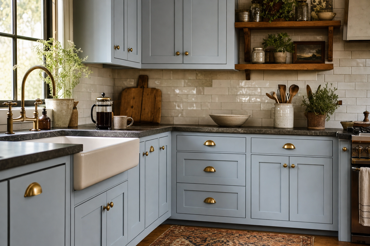
- Kitchens: Use Athabasca for cabinetry or walls to add a touch of sophistication while keeping the space light and airy.
- Hallways and Entryways: Its neutral versatility ensures that it works harmoniously with other colors throughout your home, making it an excellent choice for transitional areas.
Lighting Considerations
Athabasca CC-816's appearance can vary based on the lighting in your space. In rooms with abundant natural light, its blue undertones will be more noticeable, giving the space a fresh, cool vibe. In spaces with less natural light or warmer artificial lighting, Athabasca may lean more toward a soft, neutral gray. To ensure it aligns with your vision, test a sample in your space under different lighting conditions before committing to the color.