

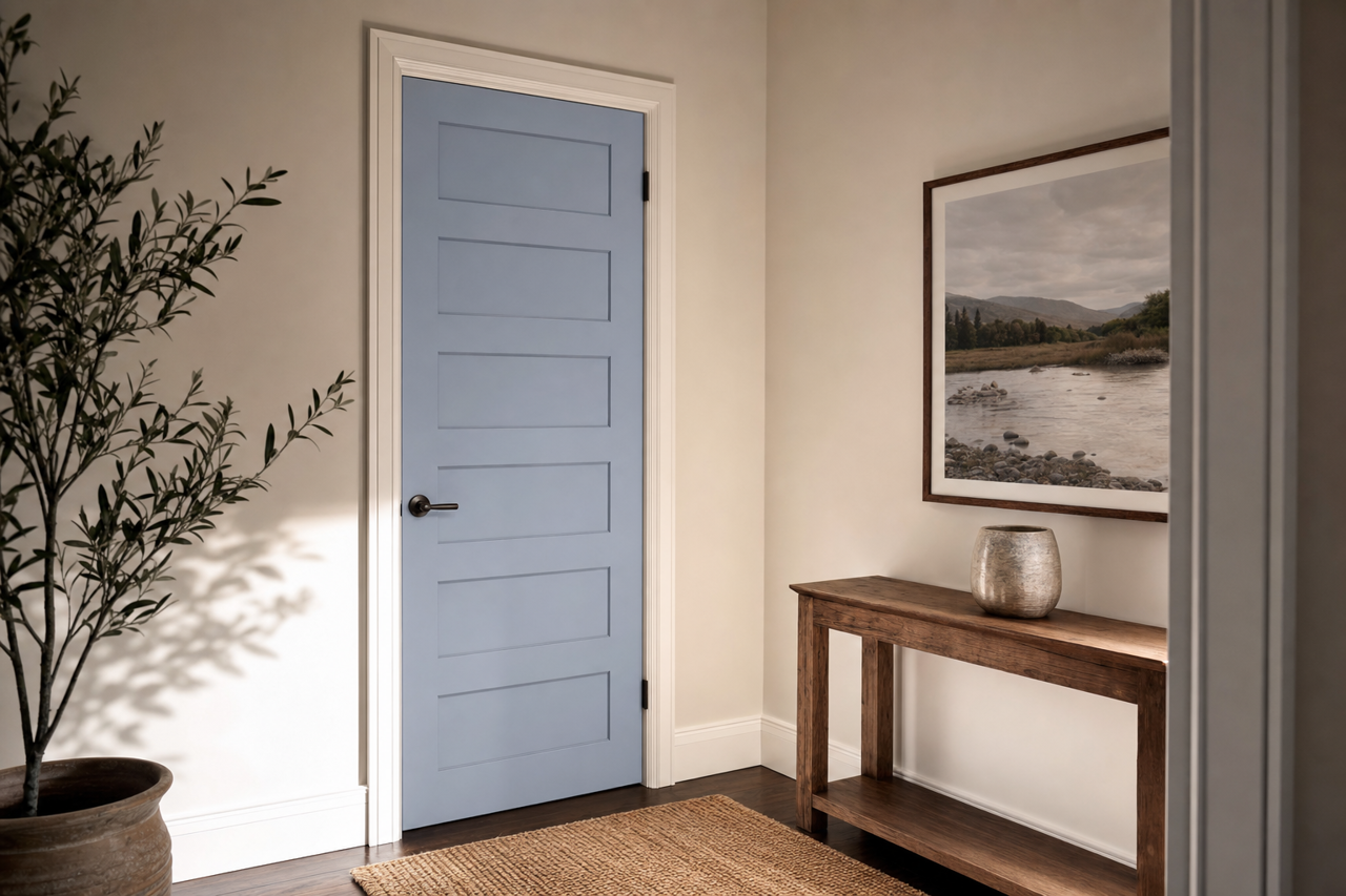

Benjamin Moore Yukon CC-920: A Versatile Neutral with Subtle Sophistication
Benjamin Moore Yukon CC-920 is a timeless and versatile paint color that exudes warmth and understated elegance. As part of Benjamin Moore's popular Classic Colors collection, this shade has become a staple for homeowners and designers alike. With its soft, neutral tone, Yukon CC-920 serves as an excellent choice for creating serene and inviting spaces, whether in residential or commercial settings.
The Undertones of Yukon CC-920
Yukon CC-920 is a light-to-medium greige (a blend of gray and beige) that balances warm and cool undertones. Its subtle taupe base leans warm, offering a hint of coziness, but it also carries a touch of gray that keeps it modern and grounded. This duality makes Yukon CC-920 incredibly versatile, as it can adapt to various lighting conditions and design styles. In spaces with warmer lighting, the beige undertones become more pronounced, adding depth and warmth, while cooler lighting highlights its soft gray side for a more contemporary feel.
Coordinating Colors
One of the key reasons Yukon CC-920 is so beloved is its ability to harmonize beautifully with a wide range of other colors. Here are some suggestions for coordinating shades:
- Whites and Off-Whites: Pair Yukon CC-920 with crisp whites like Benjamin Moore Chantilly Lace (OC-65) or softer off-whites like White Dove (OC-17) for a clean and classic look. These combinations work beautifully for trim, ceilings, or cabinetry.
- Earthy Neutrals: Complement Yukon CC-920 with other warm neutrals like Revere Pewter (HC-172) or Edgecomb Gray (HC-173) to create a layered and cohesive design.
- Accent Colors: Introduce a pop of color with Benjamin Moore Hale Navy (HC-154) or Aegean Teal (2136-40) for a bold yet balanced palette. For a softer accent, consider muted greens like Saybrook Sage (HC-114) or blues like Nimbus Gray (2131-50).
- Dark Contrast: For depth and drama, pair Yukon CC-920 with a dark, moody shade like Kendall Charcoal (HC-166) or Iron Mountain (2134-30).
Ideal Uses for Yukon CC-920
Yukon CC-920’s neutral versatility makes it an excellent choice for a variety of interior and exterior applications. Its balanced undertones allow it to coordinate effortlessly with different materials, textures, and styles, making it suitable for both modern and traditional designs.
Living Rooms and Family Spaces
Use Yukon CC-920 in living rooms or family spaces to create a warm, inviting atmosphere. Its greige tones provide just enough color to add character while remaining neutral enough to complement furniture, rugs, and artwork.
Bedrooms
In bedrooms, Yukon CC-920 works wonderfully as a calming wall color. Pair it with soft fabrics, natural wood tones, and layered bedding for a cozy, restful retreat.
Kitchens and Dining Areas
Yukon CC-920 is an excellent choice for kitchen walls, especially when paired with white cabinetry and natural stone countertops. Its soft warmth enhances the inviting feel of dining areas, making it perfect for entertaining.
Bathrooms
Transform your bathroom into a spa-like sanctuary by using Yukon CC-920 alongside white subway tiles, chrome fixtures, and fluffy white towels. Its neutrality ensures a timeless and fresh look.
Home Offices
For a productive yet comfortable home office, Yukon CC-920 creates a balanced backdrop that works well with both light and dark furniture. Its neutral tone promotes focus without feeling overly stark.
Exterior Applications
Yukon CC-920 is equally stunning for exterior use. It pairs beautifully with traditional brick,