
Benjamin Moore In (CC-934): A Timeless Neutral for Any Space
Benjamin Moore In (CC-934) is a stunning neutral paint color that effortlessly combines sophistication and versatility. Known for its understated elegance, this shade is part of Benjamin Moore's Classic Color Collection, a curated palette of timeless hues designed to enhance any interior. Whether you're crafting a serene space or a refined backdrop, In is an exceptional choice that can adapt to various design styles.
Undertones of Benjamin Moore In (CC-934)
The beauty of In (CC-934) lies in its ability to strike a perfect balance between warmth and coolness. This shade carries subtle taupe undertones, making it lean slightly towards a greige (gray-beige) hue. These undertones give the color its adaptability, allowing it to complement a wide range of palettes without overpowering the space. The taupe base ensures that In feels grounded and cozy, while the slight gray influence lends it a sophisticated and modern edge.
The undertones shift subtly depending on the lighting in the room:
- In Natural Light: The taupe-gray undertones become more pronounced, giving the room a soft, airy feel.
- In Artificial Light: The warmth of the shade comes forward, creating a cozy and inviting atmosphere.
Coordinating Colors for Benjamin Moore In (CC-934)
One of the reasons In (CC-934) is so loved by interior designers is its ability to pair beautifully with other colors. Here are some coordinating shades to consider:
Neutral Pairings:
- Benjamin Moore White Dove (OC-17): A crisp, soft white that elegantly contrasts with In for trim and ceilings.
- Benjamin Moore Edgecomb Gray (HC-173): A lighter greige that complements In, creating a harmonious monochromatic scheme.
Bold Accents:
- Benjamin Moore Hale Navy (HC-154): A rich, deep navy that adds depth and drama when used as an accent wall or furniture color.
- Benjamin Moore Kendall Charcoal (HC-166): A dark gray with warm undertones that pairs beautifully for a moody, sophisticated vibe.
Warm Tones:
- Benjamin Moore Golden Straw (2152-50): A soft, muted yellow that brings warmth and brightness, perfect for accent décor or adjoining spaces.
- Benjamin Moore Simply White (OC-117): A luminous white that enhances the subtle warmth of In, ideal for creating a clean and refreshing aesthetic.
Cool Tones:
- Benjamin Moore Gray Owl (OC-52): A light, cool gray option that contrasts elegantly with In for a modern, balanced look.
- Benjamin Moore Wedgewood Gray (HC-146): A smoky blue-gray that adds a touch of color while maintaining the tranquility of your design.
Ideal Uses for Benjamin Moore In (CC-934)
The versatility of In (CC-934) makes it a popular choice for virtually any room in the home. Its neutral yet rich characteristics allow it to shine in various design applications:
Living Spaces:
Use In to create a sophisticated, welcoming living room or family space. Pair it with plush furnishings in neutral tones, textured throw pillows, and metallic accents for a polished look. The color also works beautifully alongside natural wood furniture.
Bedrooms:
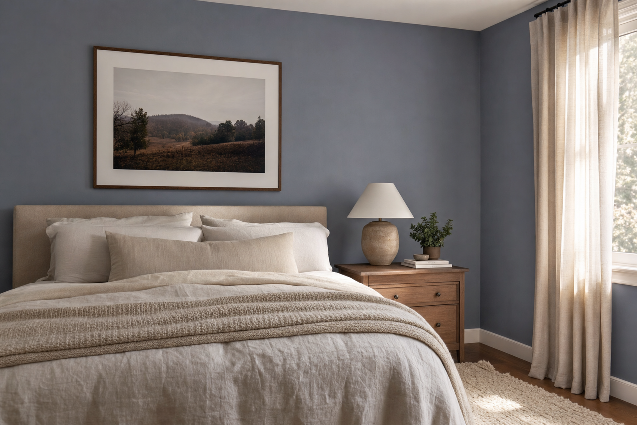
The calming taupe-gray undertones of In make it an excellent choice for bedrooms. Pair it with soft linens in whites, creams, or muted pastels for a tranquil retreat that promotes relaxation.
Kitchens and Dining Areas:
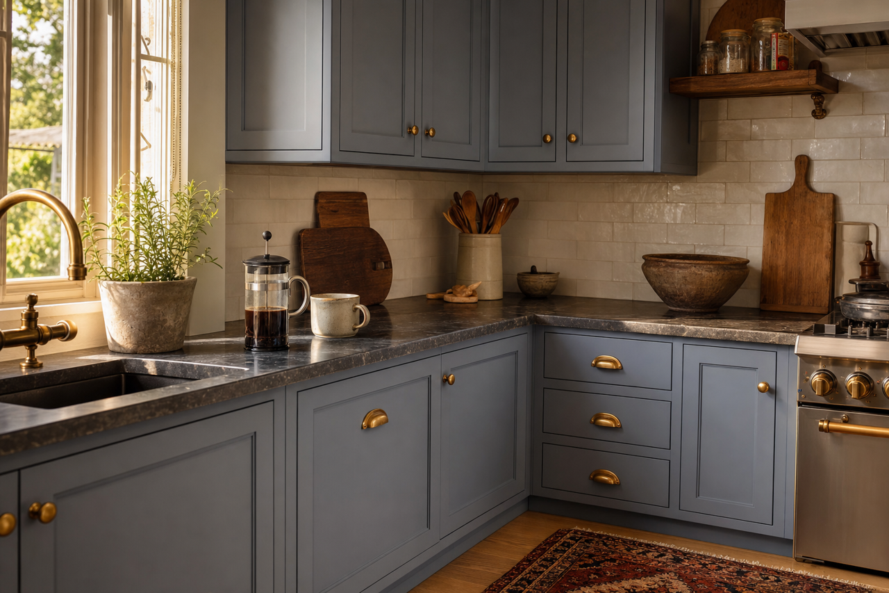
In (CC-934) can bring elegance to kitchens and dining spaces. Use it on walls alongside bright white cabinetry or pair it with natural stone countertops for a cohesive, luxurious feel. Accents in brushed gold or chrome add a touch of modernity.
Bathrooms:
For a serene bathroom, In is a perfect backdrop. Pair it with white tiles, marble finishes, and soft lighting to create a spa-like oasis. Add greenery for a refreshing pop of color.
Offices and Studies:
Create a productive and stylish workspace with In. Its neutral tone fosters focus while still feeling warm and inviting. Pair it with dark wood furniture or sleek metallic accents for a contemporary look.
Hallways and Entryways:
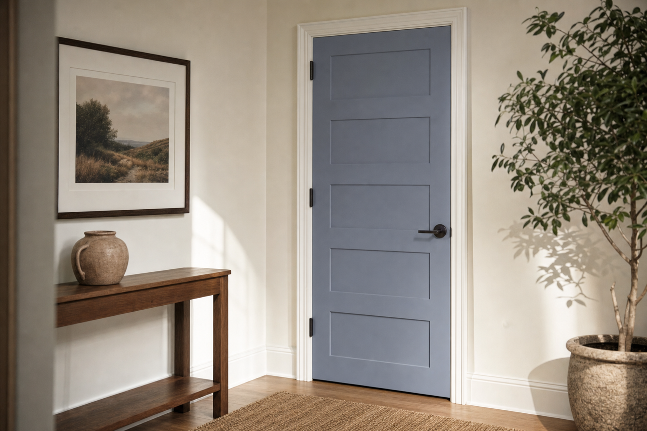
Consider In (CC-934) to elevate transitional spaces like hallways and entryways. The color provides a neutral palette that flows seamlessly into adjoining rooms, enhancing the overall cohesiveness of your home.
Benjamin Moore In (CC-934) is a timeless neutral that delivers both warmth and sophistication. With its adaptive taupe-gray undertones, ability to coordinate effortlessly with other colors, and suitability for a wide range of uses, this shade is a superb choice for homeowners and designers alike. Whether you're refreshing a single room or planning an entire home redesign, In is a versatile foundation that sets the stage for elegant and enduring style.