Benjamin Moore Greenwich (CSP-170): A Sophisticated Neutral with Timeless Appeal
Benjamin Moore Greenwich (CSP-170) is a versatile shade that combines subtle sophistication with an inviting warmth, making it an ideal choice for spaces that call for understated elegance. Part of Benjamin Moore's Color Stories Collection, this nuanced neutral is designed to work beautifully across a variety of design styles, from traditional to modern. Its complexity and depth allow it to adapt seamlessly to different lighting conditions, making it a popular choice for designers and homeowners alike.
Undertones of Benjamin Moore Greenwich
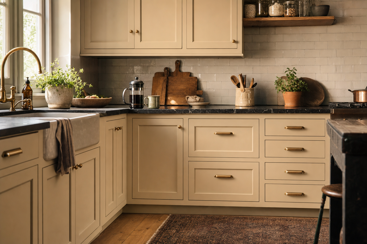
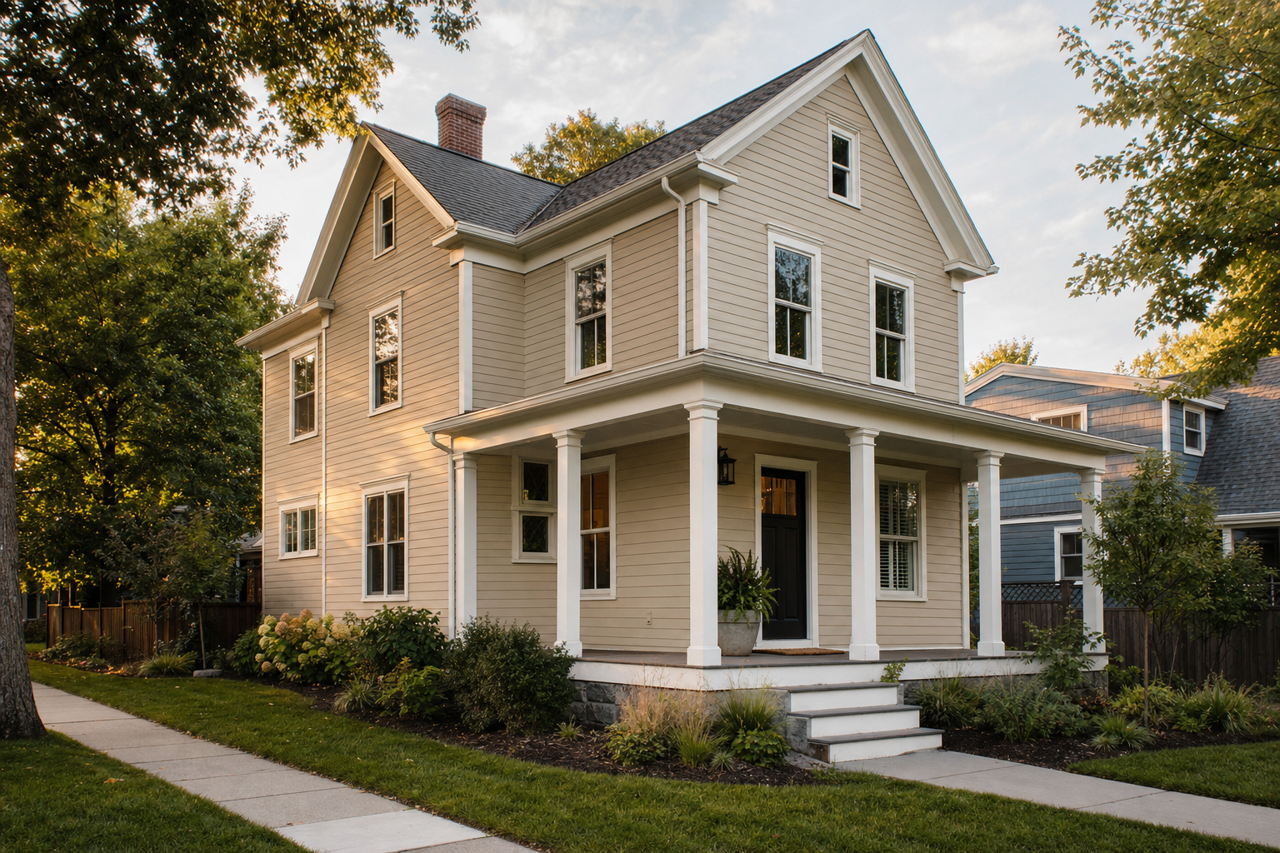
Greenwich is a soft, muted beige with intriguing gray undertones. These gray undertones give the color a refined, modern edge, while its warm beige base keeps it approachable and cozy. Depending on the lighting and surrounding decor, Greenwich may read as a greige—a perfect balance between gray and beige—or lean slightly warmer. This duality makes it an excellent choice for spaces where you want to strike a harmonious balance between warm and cool elements.
Coordinating Colors
Benjamin Moore Greenwich pairs effortlessly with a wide range of colors, thanks to its neutral yet complex nature. Here are some coordinating options:
Complementary Neutrals
- Benjamin Moore White Dove (OC-17): A soft, creamy white that highlights the warmth of Greenwich while maintaining a clean and fresh aesthetic.
- Benjamin Moore Gray Owl (2137-60): A light gray with cool undertones that creates a modern, monochromatic palette when paired with Greenwich.
Earthy Accents
- Benjamin Moore Hale Navy (HC-154): A deep, rich navy that adds bold contrast and sophistication to Greenwich's subtle warmth.
- Benjamin Moore Cypress Green (509): A muted green that complements Greenwich’s beige-gray undertones, enhancing an organic and natural vibe.
Soft Pastels
- Benjamin Moore Palladian Blue (HC-144): A serene blue-green that creates a calming and airy atmosphere when paired with Greenwich.
- Benjamin Moore Pink Damask (CSP-1125): A delicate blush pink that adds a touch of femininity and charm to Greenwich's neutral base.
Best Uses for Benjamin Moore Greenwich
Greenwich (CSP-170) is an incredibly versatile color that can be used in virtually any room of the house. Its neutral yet distinctive tone makes it a great backdrop for a variety of decor styles and color schemes.
Living Rooms
In living rooms, Greenwich creates a warm and inviting atmosphere that feels both polished and relaxed. Pair it with soft white trim and natural wood accents for a classic look, or layer in bold furnishings and metallic accessories for a more contemporary vibe.
Bedrooms
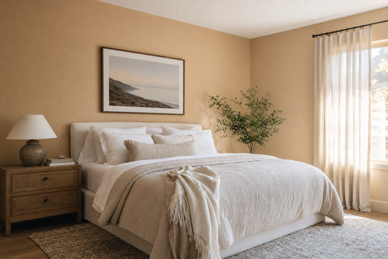
Greenwich is the perfect choice for bedrooms, where its soothing undertones promote rest and relaxation. Pair it with crisp white linens and soft pastel accents to create a serene retreat, or add darker tones for a cozier, more intimate ambiance.
Home Offices
The calming neutrality of Greenwich makes it an excellent choice for home offices. Its gray undertones lend a sense of focus and sophistication, while its beige warmth keeps the space feeling welcoming. Incorporate pops of navy or forest green for a professional yet stylish environment.
Bathrooms
In bathrooms, Greenwich provides a spa-like feel, especially when paired with marble surfaces or brushed nickel fixtures. Add soft white towels and greenery for a clean, fresh look that feels luxurious yet understated.
Entryways and Hallways
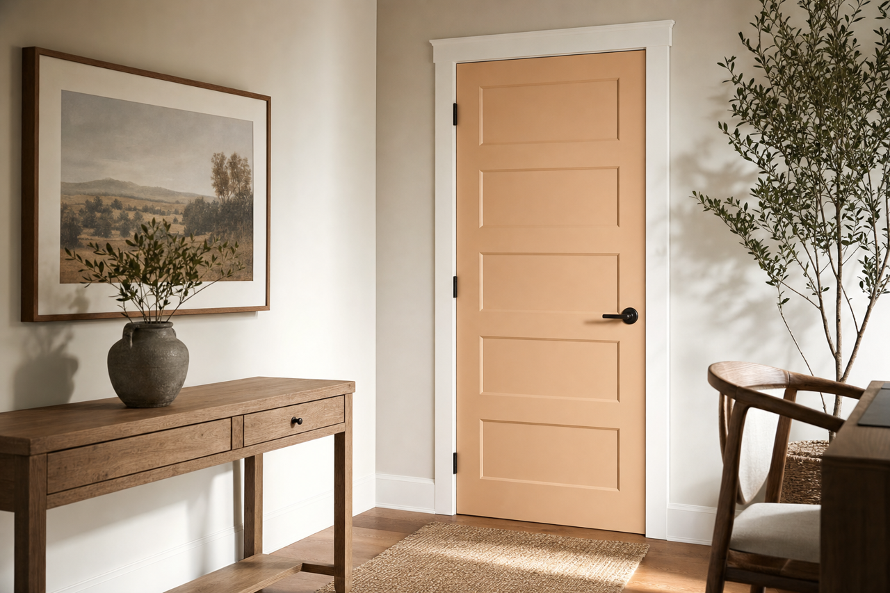
Greenwich works beautifully in transitional spaces like entryways and hallways. Its neutral tone sets the stage for the rest of your home’s decor, creating a seamless flow from room to room.
Lighting Considerations
As with any paint color, lighting plays a key role in how Greenwich appears in a space. In rooms with ample natural light, Greenwich tends to lean slightly cooler, with its gray undertones more prominent. In spaces with artificial or warm lighting, its beige base takes center stage, creating a cozy and inviting feel. To ensure the color works perfectly in your space, test it in different lighting conditions before committing.
Benjamin Moore Greenwich (CSP-170) offers the perfect blend of warmth and sophistication, making it an exceptional choice for a wide range of interiors. Whether you're designing a restful sanctuary or a stylish entertaining space, this timeless neutral is sure to elevate your home's aesthetic.