Benjamin Moore Elderberry CSP-470: A Sophisticated and Versatile Hue
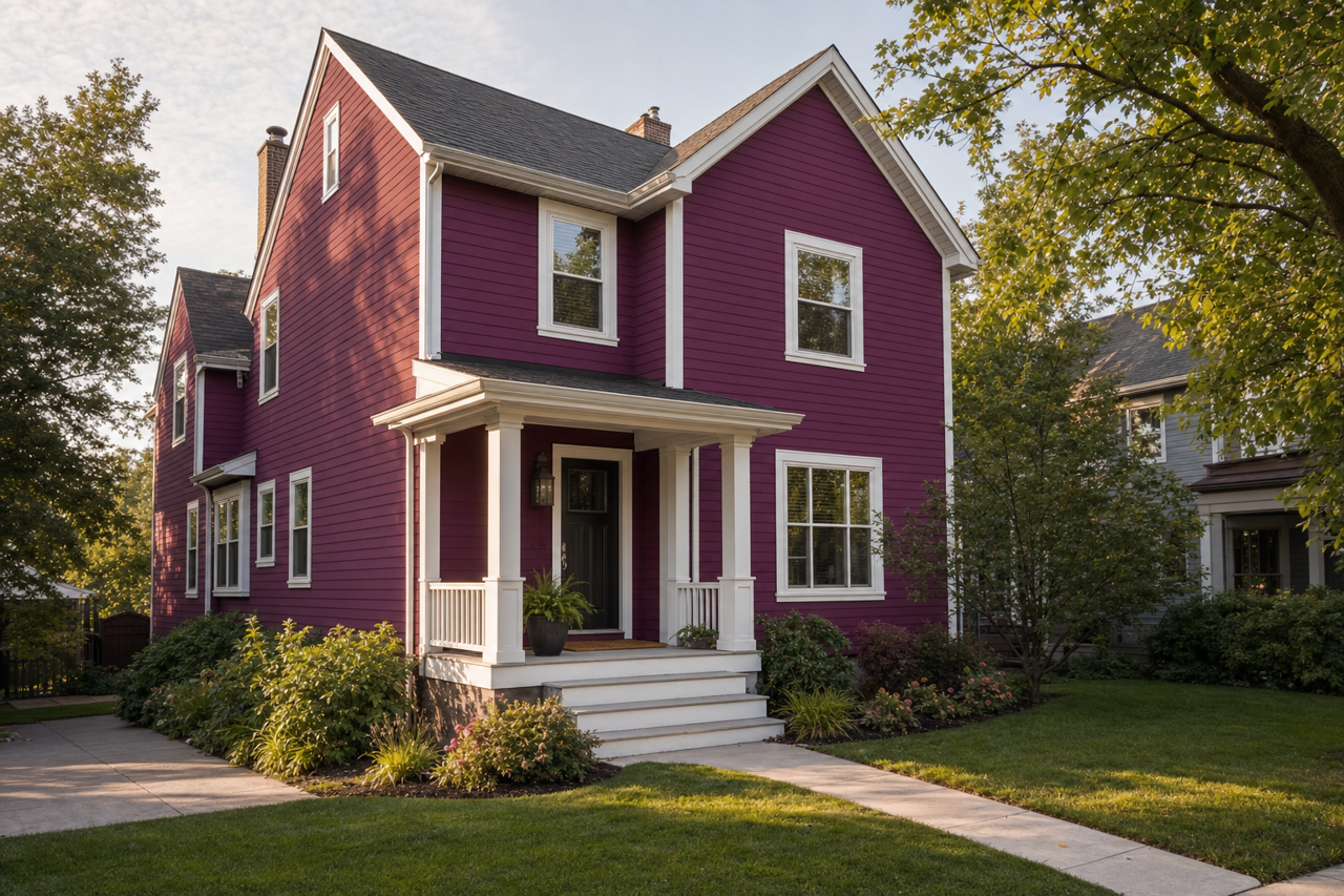
Benjamin Moore Elderberry CSP-470 is a rich, deep color that exudes sophistication and charm, making it a standout choice for a variety of interior spaces. This luxurious shade sits at the intersection of purple and gray, offering a muted yet dramatic tone that radiates warmth and depth. Whether you're looking to create a cozy retreat or a bold statement, Elderberry can add an elegant touch to your home.
Undertones: Subtle Hints of Warmth and Depth
Elderberry CSP-470 is a complex color with a balance of undertones that make it so versatile. It features a harmonious blend of warm plum and cool gray, giving it a chameleon-like quality. In certain lighting, it leans toward a rich, eggplant-inspired purple, while in other scenarios, its gray undertones take center stage, offering a more muted, neutral appearance. This duality makes Elderberry an adaptable choice that can complement a wide range of design styles.
Coordinating Colors: Perfect Pairings for Every Style
To make the most of Benjamin Moore Elderberry CSP-470, pairing it with the right coordinating colors is key. Its versatility allows it to shine alongside both warm and cool tones, providing endless possibilities for harmony and contrast.
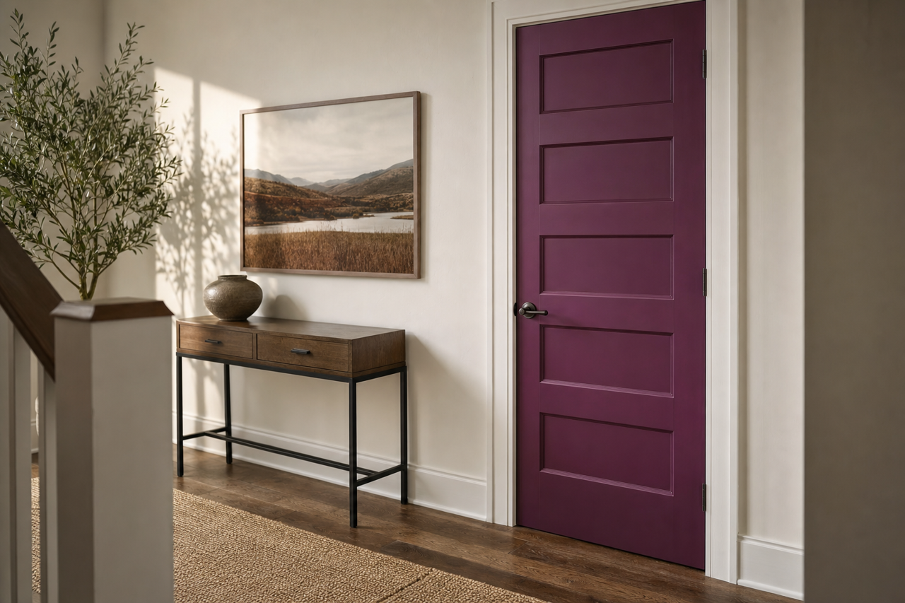
Warm Neutrals: Pair Elderberry with creamy whites like Benjamin Moore White Dove OC-17 or soft beige tones like Edgecomb Gray HC-173 to create a cozy, inviting atmosphere. These lighter shades balance the depth of Elderberry, ensuring the space feels open yet intimate.
Cool Grays and Blues: For a contemporary or moody aesthetic, consider pairing Elderberry with cooler grays such as Stonington Gray HC-170 or smoky blues like Smoke 2122-40. These tones emphasize the gray undertones in Elderberry and create a sleek, modern vibe.
Vivid Accents: If you're looking to add a pop of energy, pair Elderberry with bolder hues like mustard yellow, burnt orange, or a jewel-toned teal. These vibrant accents inject personality into the space and make Elderberry stand out even more.
Ideal Uses for Benjamin Moore Elderberry CSP-470
Elderberry's rich and versatile nature makes it suitable for a range of design applications, from accent walls to full-room color schemes. Here are some of the best ways to incorporate this stunning shade into your home:
Living Rooms: Create a dramatic yet comforting living room by using Elderberry as the primary wall color. Pair it with plush furniture, metallic accents, and soft textiles to add a sense of luxury and warmth.
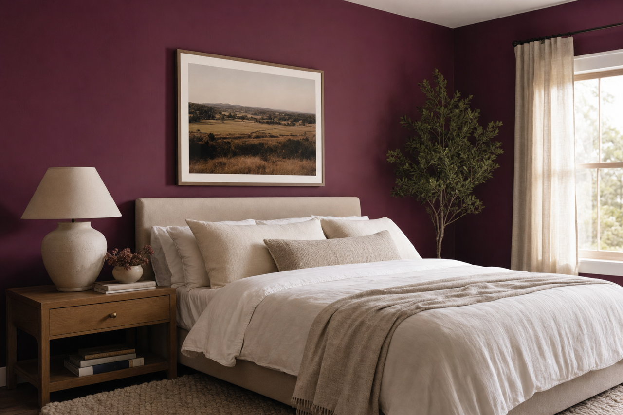
Bedrooms: Elderberry is perfect for crafting a serene and intimate bedroom retreat. Use it as an accent wall behind the bed or as the main color for a cocoon-like effect. Combine it with soft, neutral bedding and warm lighting for a relaxing ambiance.
Dining Rooms: Elevate your dining space with Elderberry’s rich tone. Its depth adds formality and elegance, making it an excellent backdrop for gatherings and special occasions. Pair it with a statement chandelier and wood furniture for a timeless look.
Accent Spaces: If you’re hesitant to commit to a full room, consider using Elderberry for smaller spaces like a powder room, study, or reading nook. Its boldness can make these compact areas feel dramatic and cozy.
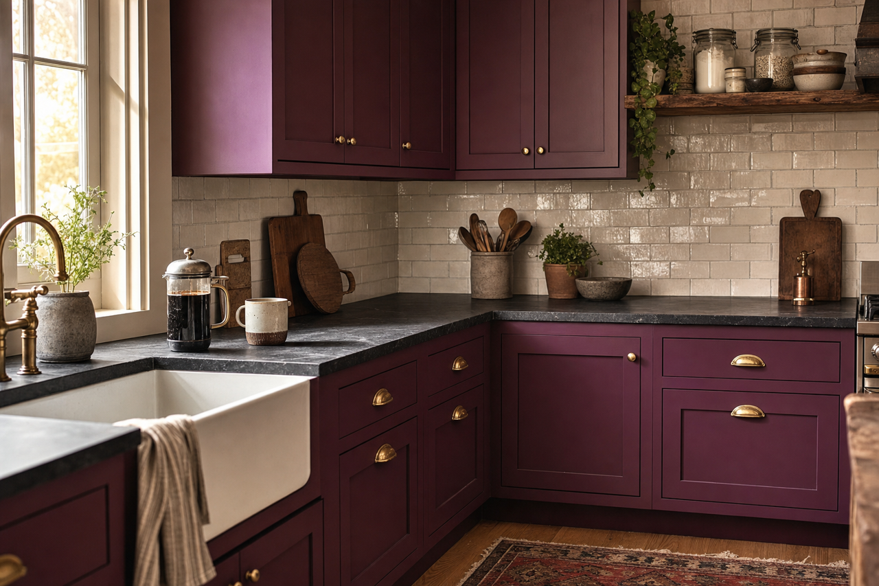
Cabinetry and Furniture: Elderberry is a fantastic choice for painted cabinetry or furniture. It works beautifully on kitchen islands, bathroom vanities, or as an accent piece in a living room or hallway.
Lighting Considerations
As with any deep color, lighting plays a crucial role in how Elderberry appears in your space. In rooms with ample natural light, the purple tones will take on a lighter, more vibrant quality. In dimly lit spaces, the gray undertones will emerge,