Benjamin Moore Bucktrout (CW-180): A Timeless Blend of Warmth and Sophistication
Benjamin Moore Bucktrout (CW-180) is a captivating historic hue that brings depth, warmth, and a sense of timeless elegance to any space. Part of the esteemed Williamsburg® Paint Color Collection, this shade is inspired by 18th-century design, evoking a sense of heritage while remaining versatile for modern interiors. Bucktrout is a medium-toned brown that feels grounded yet dynamic, making it a choice color for those seeking a cozy, earthy aesthetic.
Undertones of Bucktrout (CW-180)
Bucktrout is a rich brown with subtle undertones of red and orange. These warm undertones give it a soft, inviting glow, making it feel more approachable than darker, cooler browns. The reddish undertones add a hint of vibrancy, ensuring the color never feels flat or dull, while the earthy depth keeps it grounded. Depending on the lighting, Bucktrout can appear as a warm, nutty brown in natural daylight or a more muted, terracotta-infused tone under warmer artificial light.
Coordinating Colors for a Cohesive Look
The versatility of Benjamin Moore Bucktrout makes it easy to pair with a variety of coordinating colors. Here are some stunning options to consider:
Neutral Pairings: Pair Bucktrout with soft, neutral tones like Benjamin Moore White Dove (OC-17) or Simply White (OC-117) for a clean and classic aesthetic. These light neutrals will provide a crisp contrast, allowing Bucktrout’s warmth to shine.
Earthy Complements: Enhance the natural feel of Bucktrout by combining it with earthy greens like Saybrook Sage (HC-114) or November Rain (OC-50). These shades create a harmonious palette inspired by nature.
Dramatic Contrasts: For a bold, dramatic look, pair Bucktrout with deep navy hues such as Hale Navy (HC-154) or rich charcoal tones like Kendall Charcoal (HC-166). This contrast adds depth and sophistication to any space.
Accent Colors: For pops of color, consider warm golden shades like Chestertown Buff (HC-9) or muted coral tones like Adobe Orange (2171-30). These accents bring out Bucktrout’s reddish undertones beautifully.
Where to Use Bucktrout (CW-180)
Bucktrout is a highly versatile color that can be used in various settings to achieve different design goals:
Living Rooms: Create a cozy and inviting atmosphere by using Bucktrout on the walls in a living room. Pair it with cream-colored furniture and natural wood accents for a timeless, rustic vibe.
Dining Rooms: Its rich, warm tones make Bucktrout an excellent choice for dining rooms, where it can enhance the ambiance for intimate gatherings and meals.
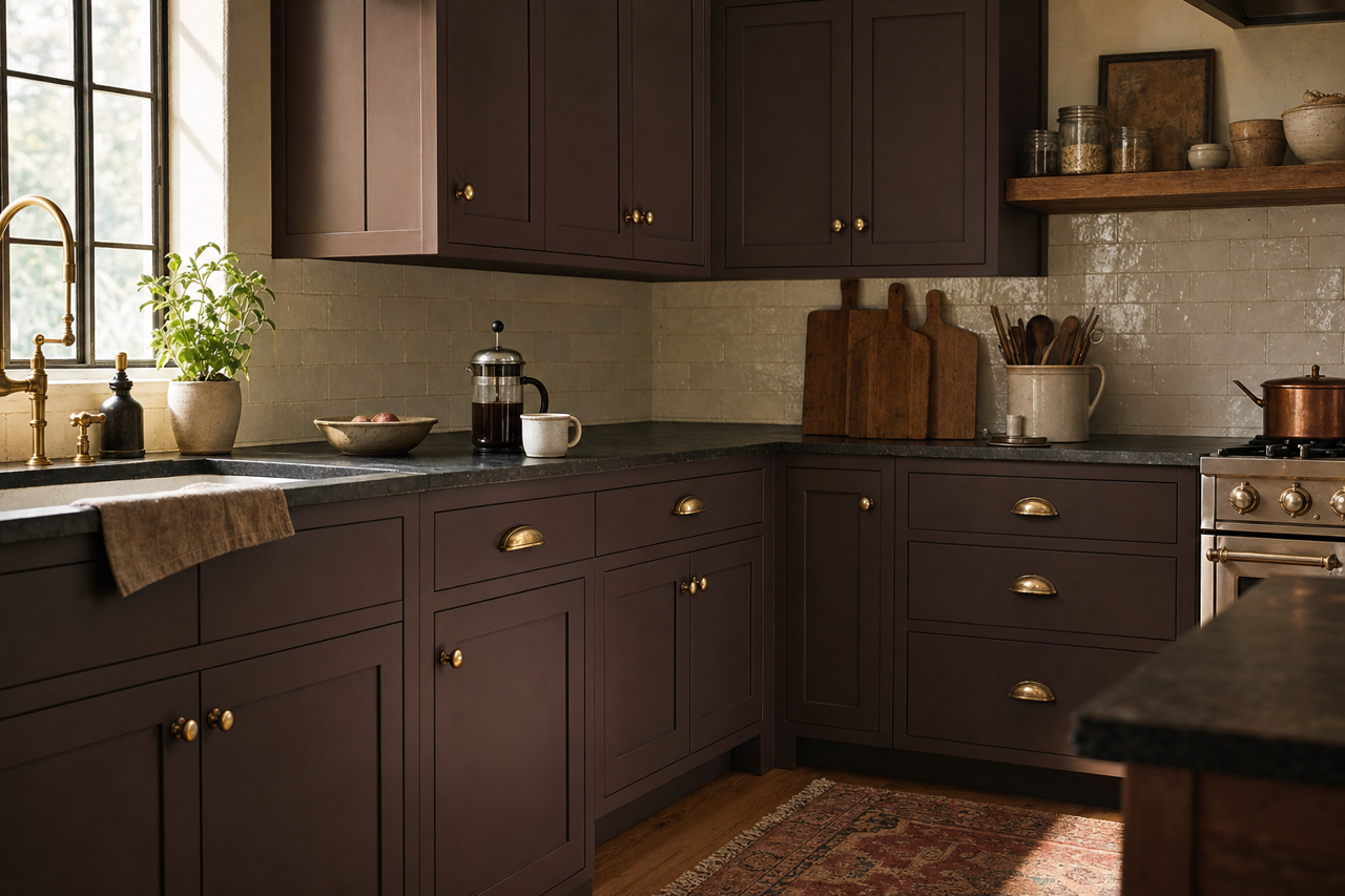
Kitchens: Use Bucktrout on cabinetry for a chic, earthy look that works beautifully with butcher block countertops or brass hardware.
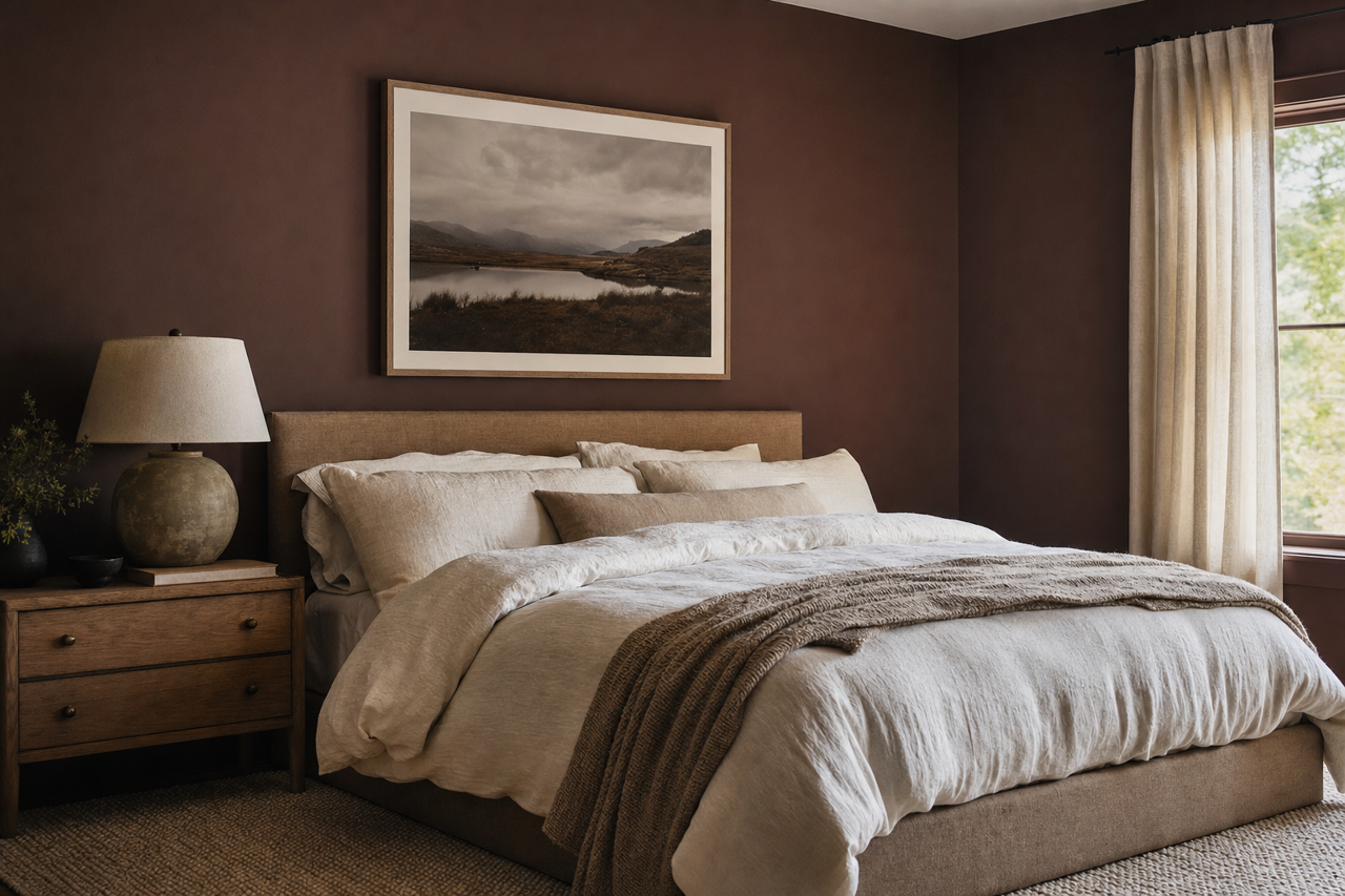
Bedrooms: In a bedroom, Bucktrout can create a soothing and restful retreat. Complement it with soft linens and plush textiles in neutral or muted tones.
Accent Walls: If you’re not ready to commit to Bucktrout across all four walls, consider using it as an accent color. Its depth makes it a striking choice for feature walls, especially in spaces where you want to add warmth and character.
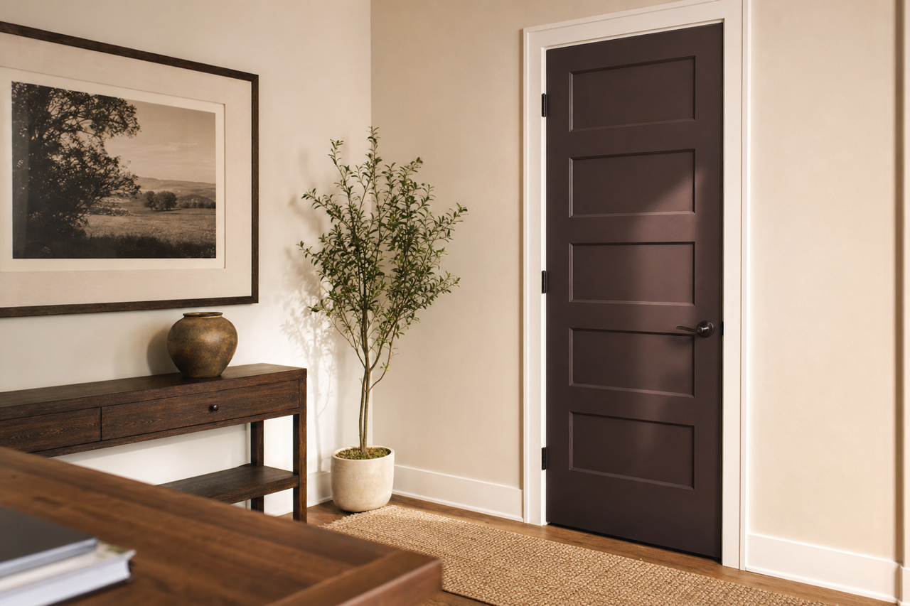
Office Spaces: Bucktrout’s grounded and sophisticated nature makes it a great choice for home offices or libraries, where it can foster focus and productivity.
Lighting Considerations
As with any paint color, lighting plays a crucial role in how Bucktrout is perceived. In spaces with abundant natural light, Bucktrout will appear brighter and more vibrant, showcasing its warm undertones. In dimly lit or north-facing rooms, it will read as a deeper, more subdued brown, lending a cozy, cocoon-like feel. To ensure the desired effect, test a sample in your space during different times of the day.
Why Choose Benjamin Moore Bucktrout (CW-180)?
Bucktrout is more than just a brown paint color—it’s a testament to timeless design and versatility. Whether you're aiming for a modern farmhouse look, a historic-inspired interior, or a warm and welcoming retreat, this shade provides the perfect balance of warmth and sophistication. Its ability to pair effortlessly with a broad range of colors and styles makes it a staple for any interior designer or homeowner seeking a grounded yet dynamic color for their space.