Benjamin Moore Randolph (CW-185): A Timeless, Rich Neutral
Benjamin Moore Randolph (CW-185) is a sophisticated, deep neutral that captures the essence of understated elegance. Part of the Colonial Williamsburg collection, this striking shade is steeped in heritage, providing a refined backdrop that works beautifully across a variety of interiors. Whether you're looking to evoke a sense of history or add depth to modern spaces, Randolph’s versatility makes it a favorite among designers and homeowners alike.
Undertones: Warm Brown with Earthy Depth
Randolph is a complex color with warm brown undertones enriched by hints of earthy taupe. These subtle undertones give it a grounded, natural feel that pairs perfectly with traditional and transitional design styles. The warmth prevents the hue from feeling too heavy, while its richness adds a sense of luxury and sophistication. It’s an ideal choice for creating a cozy, welcoming atmosphere without sacrificing elegance.
Coordinating Colors: Building a Harmonious Palette
Randolph is a highly adaptable color that complements a variety of shades, both bold and neutral. Here are some suggestions for coordinating colors to create a cohesive and balanced palette:
- Warm Whites: Pair Randolph with creamy whites like Benjamin Moore’s White Dove (OC-17) or Simply White (OC-117) for a classic combination that brightens a space while maintaining warmth.
- Soft Grays: Complement Randolph’s earthy tones with greige shades like Revere Pewter (HC-172) or Silver Satin (OC-26) for a chic, monochromatic look.
- Deep Accents: Add drama with rich jewel tones such as Hale Navy (HC-154) or Kendall Charcoal (HC-166) for a bold, sophisticated contrast.
- Natural Greens: Bring out the organic vibe of Randolph by pairing it with muted greens like Saybrook Sage (HC-114) or Guilford Green (HC-116) to create a serene and earthy palette.
These coordinating colors allow Randolph to shine as either the main feature or a supporting player in your design scheme.
Uses: Where Randolph Truly Excels
Randolph (CW-185) is a versatile shade that lends itself to various uses throughout the home. Here are some ideas to incorporate this timeless neutral into your space:
Living Rooms and Family Rooms
Randolph excels in communal spaces where comfort and elegance are paramount. Use it on walls to create a cozy yet upscale atmosphere, especially when paired with warm wood tones or brass accents. Layer in textures with plush upholstery and soft rugs to enhance its inviting quality.
Bedrooms
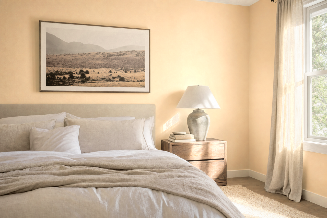
For bedrooms, Randolph provides a rich, cocoon-like ambiance perfect for relaxation. Pair it with soft linens in complementary neutral tones to create a tranquil retreat. It’s particularly stunning when used as an accent wall behind a headboard.
Dining Rooms
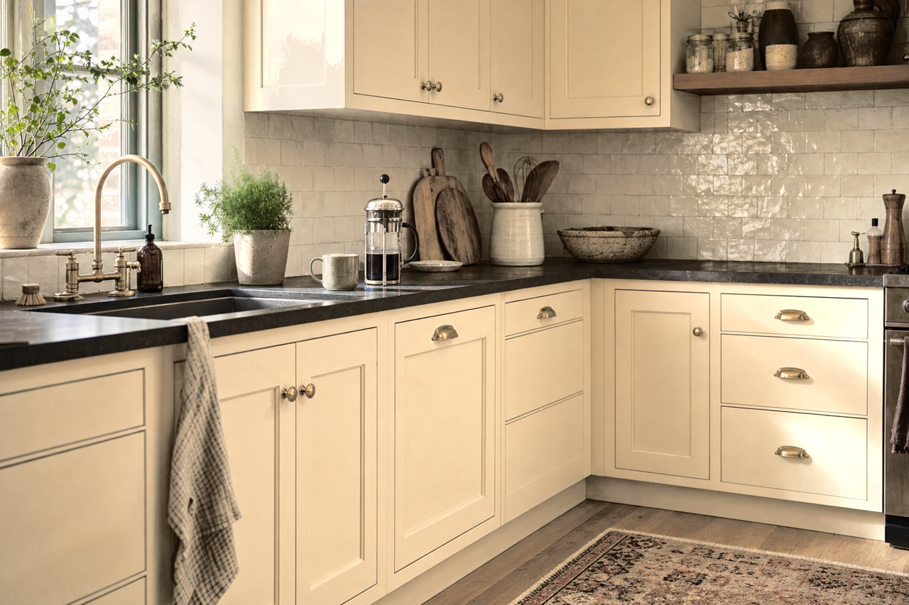
Bring a sense of formality and tradition to your dining space by using Randolph on walls or cabinetry. Its historical roots make it a perfect fit for spaces where you entertain, offering depth that enhances the overall aesthetic.
Home Offices and Libraries
Randolph’s sophisticated vibe makes it an excellent choice for home offices or libraries. Use it on built-in shelving or walls to create a serene, focused environment that promotes productivity while exuding timeless style.
Accent Areas
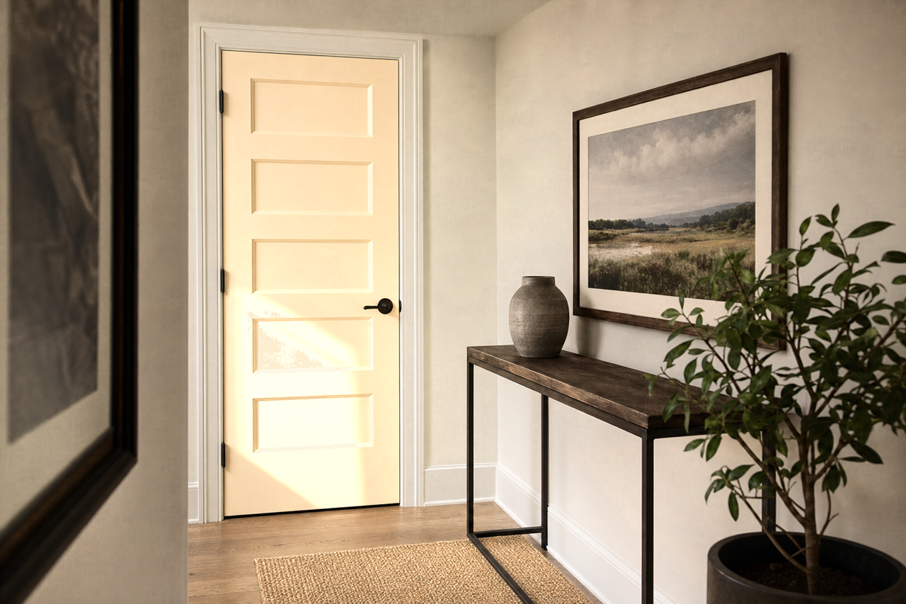
If you’re hesitant to commit to an entire space in Randolph, consider using it in smaller focal areas such as entryways, hallways, or powder rooms. Its ability to create visual interest without overwhelming makes it ideal for these spaces.
Why Choose Randolph for Your Next Project?
Benjamin Moore Randolph (CW-185) is more than just a paint color—it's a mood setter that evokes history, refinement, and warmth. Its versatility, rich undertones, and ability to coordinate with a wide array of colors make it a standout choice for both traditional and contemporary interiors. Whether you’re designing a cozy retreat or a stately entertaining space, Randolph offers a timeless solution that will elevate your home’s style and character.