


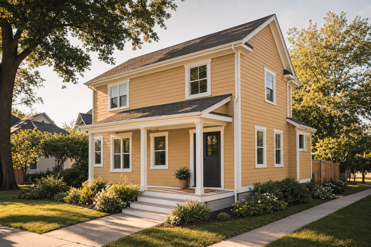
Benjamin Moore Coffeehouse CW-385: A Warm and Inviting Neutral
Benjamin Moore Coffeehouse CW-385 is a rich, earthy shade that instantly brings warmth and comfort to any space. This timeless neutral belongs to the Colonial Williamsburg® color palette, reflecting the historic charm and sophistication of early American design while seamlessly fitting into today’s modern interiors. Its versatility makes it a favorite for creating spaces that feel welcoming, cozy, and grounded.
Undertones of Coffeehouse CW-385
Coffeehouse CW-385 is a warm, medium brown with subtle red and orange undertones. These undertones add depth and richness to the color, lending it a slightly sun-kissed quality without overwhelming the space. The red undertones create a cozy and inviting atmosphere, while the orange hints keep the color feeling lively and dynamic. The result is a balanced hue that works especially well in both warm and neutral design schemes.
Coordinating Colors for a Harmonious Palette
Coffeehouse CW-385 pairs beautifully with a variety of coordinating colors, making it a flexible choice for many design styles. Some of the best complementary shades include:
- Creamy Whites: Pair Coffeehouse with warm whites like Benjamin Moore Simply White (OC-117) or White Dove (OC-17) for a clean, crisp contrast that brightens the space.
- Soft Greens: Muted greens like Saybrook Sage (HC-114) or Dry Sage (2142-40) create a natural, earthy palette that feels serene and balanced.
- Deep Blues: Rich navy hues like Hale Navy (HC-154) or Van Deusen Blue (HC-156) add a striking contrast to Coffeehouse, giving the room a bold and sophisticated edge.
- Warm Accents: For a monochromatic or tonal look, consider lighter browns or tans like Lenox Tan (HC-44) or Shaker Beige (HC-45).
These pairings allow Coffeehouse CW-385 to shine in both neutral and colorful palettes, making it an ideal backdrop or accent color.
Best Uses for Coffeehouse CW-385
Coffeehouse CW-385 is a highly adaptable shade that works well in a variety of settings. Its warm and inviting nature makes it perfect for spaces where you want to create a cozy, lived-in feel. Here are some ideas for incorporating this color into your home:
- Living Rooms: Use Coffeehouse on the walls to create an intimate, welcoming space. Pair it with plush furniture and layered textures for a cozy retreat.
- Dining Rooms: Its depth and warmth make it an excellent choice for dining areas, encouraging relaxation and conversation.
- Kitchens: For a modern farmhouse aesthetic, use Coffeehouse on cabinetry or as an accent wall, paired with white subway tiles and rustic wood accents.
- Bedrooms: This comforting hue is perfect for creating a restful and soothing bedroom atmosphere, especially when paired with soft linens and warm lighting.
- Home Offices: Coffeehouse CW-385 can add a grounded, professional feel to a workspace, fostering focus and productivity.
- Accent Walls: If you’re not ready to commit to full-room coverage, consider using Coffeehouse as an accent wall color to add depth and interest to a space.
Why Choose Coffeehouse CW-385?
Coffeehouse CW-385 is more than just a paint color—it's an experience. Its rich, warm tones evoke a sense of connection and comfort, making it an excellent choice for creating spaces that feel inviting and timeless. Whether you’re restoring a historic home, designing a rustic retreat, or simply looking for a versatile neutral that complements a variety of styles, Coffeehouse CW-385 provides the perfect balance of sophistication and warmth.
Let Benjamin Moore Coffeehouse CW-385 transform your interiors into spaces that feel both elegant and approachable, perfectly suited for modern living.