
Benjamin Moore Bryan (CW-390): A Timeless Gray for Every Space
Benjamin Moore Bryan (CW-390) is a versatile and sophisticated gray that strikes the perfect balance between classic and contemporary. Part of the Benjamin Moore Williamsburg® Paint Color Collection, this shade exudes a refined elegance that pays homage to historical design while feeling effortlessly modern. Its soft, muted tone makes it adaptable for a variety of interior styles, from traditional to minimalist.
Undertones: Subtle Warmth for Inviting Spaces
Bryan (CW-390) features subtle warm undertones that distinguish it from cooler grays, making it a welcoming and approachable color. These faint beige undertones prevent it from feeling too stark, giving it a cozy and grounded vibe. The warmth ensures it works beautifully in spaces where comfort and connection are key, such as living rooms, bedrooms, and family gathering areas.
Coordinating Colors: Pairing for Perfect Harmony
Bryan (CW-390) pairs exceptionally well with other hues from the Williamsburg Collection, as well as complementary tones from Benjamin Moore's broader palette. Here are some suggested coordinating colors:
- White Dove (OC-17): A soft, creamy white that enhances Bryan's warmth while maintaining a crisp and clean aesthetic. Ideal for trim, ceilings, and cabinets.
- Hale Navy (HC-154): A bold, deep blue that creates striking contrast and adds richness to a space when paired with Bryan. Perfect for accent walls or furniture.
- Van Alen Green (CW-12): A muted green with gray undertones that complements Bryan’s warmth while introducing a subtle pop of color.
- Edgecomb Gray (HC-173): Another warm gray with slightly lighter tones, perfect for creating a monochromatic palette with depth and dimension.
Uses: Versatility Across Rooms
Benjamin Moore Bryan (CW-390) is an incredibly flexible paint color that can adapt to a variety of uses depending on your design goals.
- Living Rooms: Its understated elegance makes it an excellent choice for living areas, especially when paired with light furnishings and natural textures like wood and linen.
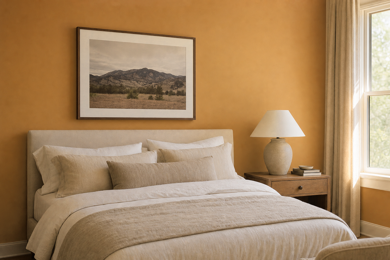
- Bedrooms: Bryan’s soft warmth creates a soothing atmosphere, perfect for a restful retreat. Pair it with plush textiles and muted accent colors for an inviting space.
- Dining Areas: Use Bryan to set the stage for sophisticated dining spaces. Complement it with metallic finishes and darker-toned decor for a refined look.
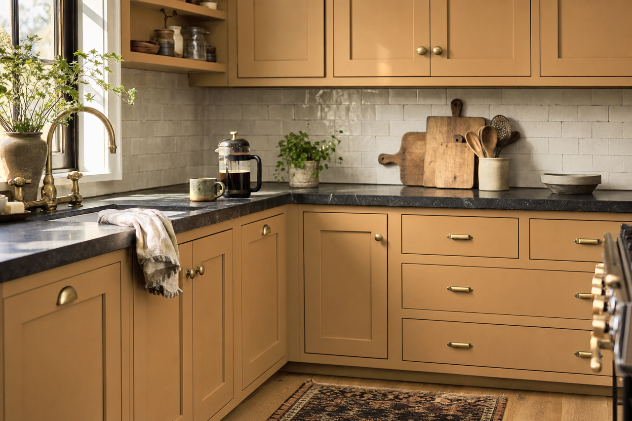
- Kitchens: As a cabinet or wall color, Bryan works beautifully with white countertops and brass hardware, creating a timeless kitchen aesthetic.
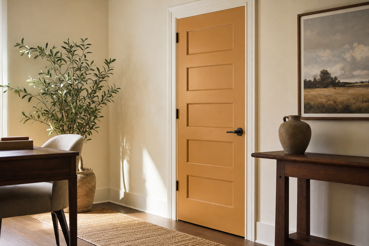
- Home Offices: Its grounded tone fosters focus and productivity, making it a smart choice for workspaces. Pair it with pops of color in artwork or accessories for inspiration.
Lighting Considerations
The appearance of Bryan (CW-390) can shift depending on lighting conditions. In spaces with abundant natural light, its warm undertones will shine through, creating a bright yet cozy ambiance. In rooms with dim lighting or artificial light, it may lean slightly cooler, offering a sleek and polished look. Always test a sample in your space to observe how it interacts with your room’s lighting and decor.
Why Choose Benjamin Moore Bryan (CW-390)?
Benjamin Moore Bryan (CW-390) is more than just a paint color—it's a design tool that allows you to craft spaces that feel timeless and inviting. Whether you’re looking to create a serene bedroom retreat, a chic and modern living area, or a sophisticated home office, Bryan’s versatility and understated charm make it a top choice for designers and homeowners alike.
With its soft warm undertones, easy-to-pair coordinating colors, and adaptability across various rooms, this shade effortlessly bridges the gap between historical elegance and modern sensibility.