Benjamin Moore Nelson (CW-635): A Timeless Shade of Sophistication
Benjamin Moore Nelson (CW-635) is a refined and effortlessly elegant paint color that exudes a sense of calm sophistication. Part of the esteemed Benjamin Moore Williamsburg® Paint Color Collection, this color is inspired by the rich historical roots of early American design. Nelson is a versatile and subdued gray-green that seamlessly bridges the gap between natural tranquility and modern style, making it an exceptional choice for a wide range of interior and exterior spaces.
Undertones: A Delicate Balance
Nelson (CW-635) is characterized by its soft green undertones, gently grounded by a gray base. This combination creates a muted, earthy appearance that feels organic and timeless. The gray undertones provide a sense of neutrality, while the green adds a whisper of warmth and freshness. This balance ensures that Nelson adapts beautifully to various lighting conditions, offering a cooler, more serene vibe in bright, natural light and a warmer, cozier feel in dimmer, artificial light.
Coordinating Colors: Pairing Nelson for Perfection
To create a harmonious and cohesive design, consider pairing Nelson with colors that complement its understated elegance. Here are some excellent coordinating options:
- Soft Neutrals: Pair Nelson with creamy whites like Benjamin Moore Simply White (OC-117) or White Dove (OC-17) to emphasize its classic appeal and create a clean, airy aesthetic.
- Warm Earth Tones: For a natural, grounded palette, combine Nelson with warm taupes like Edgecomb Gray (HC-173) or sandy beiges like Grant Beige (HC-83).
- Blues and Navy: Highlight Nelson's green undertones by pairing it with deep blues like Hale Navy (HC-154) or soothing mid-tones like Van Courtland Blue (HC-145) for a coastal-inspired look.
- Accents of Deep Green: For a dramatic yet cohesive effect, consider pairing Nelson with darker greens like Kendall Charcoal (HC-166) or Essex Green (HC-188) to echo its earthy undertones.
Ideal Uses for Benjamin Moore Nelson
Nelson’s versatility makes it an outstanding choice for various design applications, whether you’re aiming for a serene retreat or a historically inspired ambiance.
Living Rooms and Common Areas
Nelson’s subtle green-gray tone fosters a relaxed and inviting atmosphere, making it ideal for living rooms, family rooms, or open-concept spaces. Its muted quality allows it to function as either a soft backdrop for bold furniture or a focal point in minimalist designs.
Bedrooms
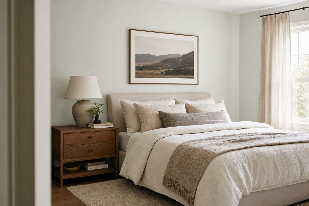
If you’re seeking a tranquil and restful bedroom, Nelson’s gentle green undertones contribute to a soothing environment. Pair it with soft linens and natural textures for a serene, spa-like getaway.
Kitchens and Dining Areas
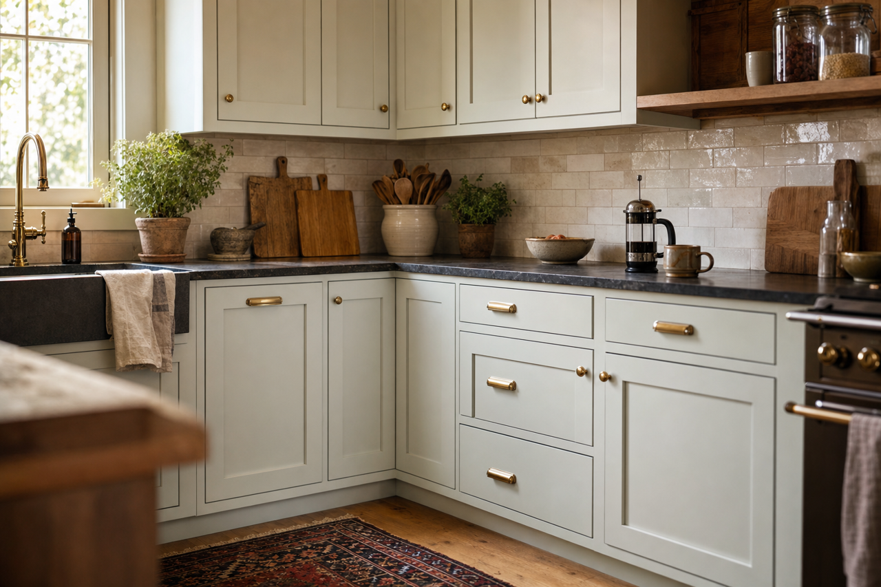
For a fresh yet timeless kitchen or dining room, consider using Nelson on cabinetry or walls. Its organic quality pairs beautifully with natural wood finishes, marble countertops, or brushed gold hardware, creating a warm and inviting culinary space.
Bathrooms
Nelson works wonderfully in bathrooms, where its soft green undertones evoke a sense of cleanliness and calm. Pair it with crisp white tiles and silver or chrome fixtures for a classic, polished look.
Exterior Applications
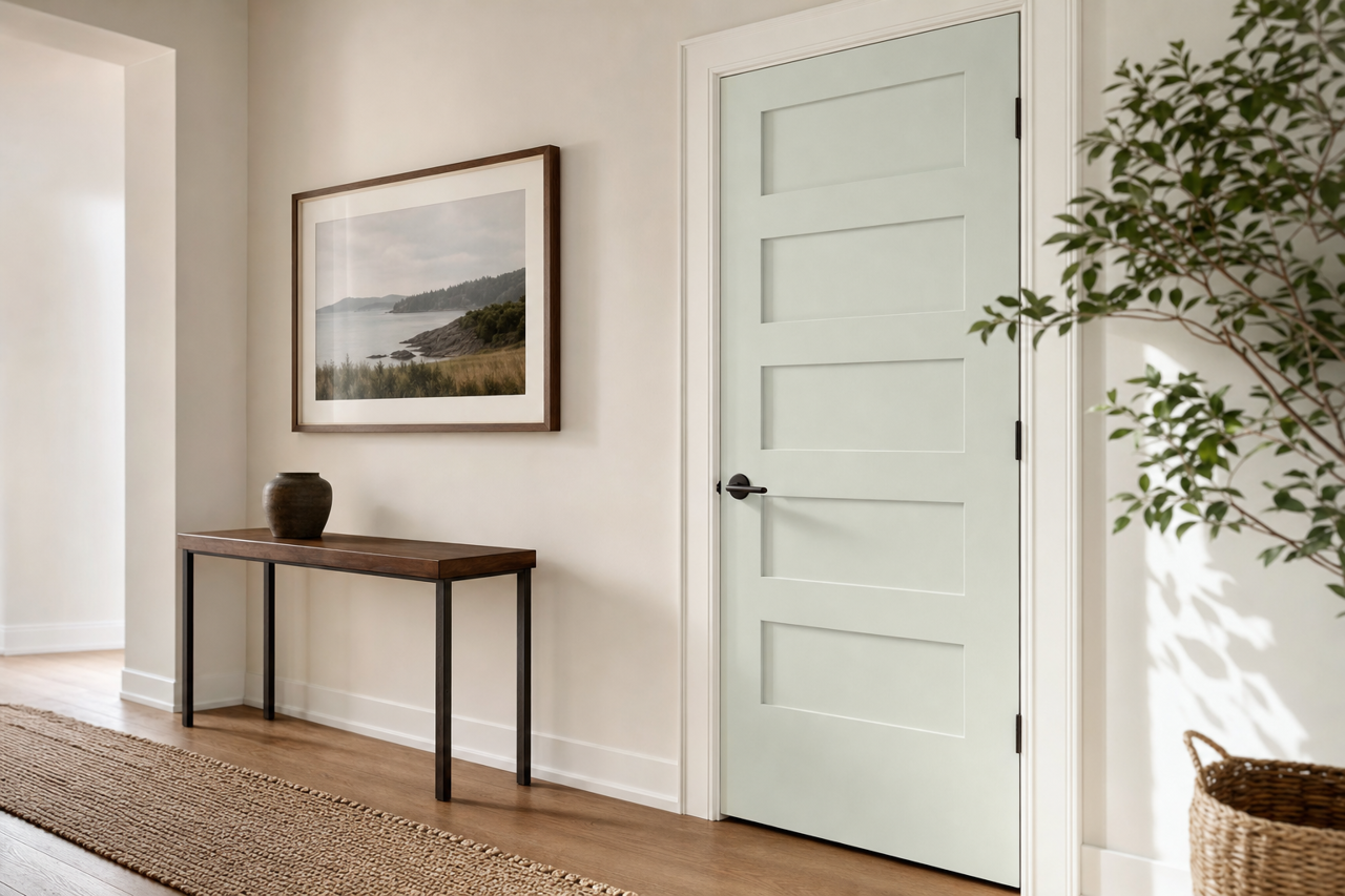
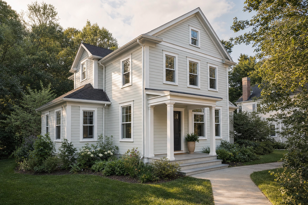
On exteriors, Nelson (CW-635) lends itself to an understated yet sophisticated aesthetic. Use it as a primary siding color or as an accent on shutters or front doors. It pairs beautifully with white trim for a timeless, Colonial-inspired facade.
Why Choose Benjamin Moore Nelson (CW-635)?
Benjamin Moore Nelson is more than just a color; it’s a statement of understated elegance. Its ability to adapt to various styles—from traditional to contemporary—makes it a go-to choice for homeowners and designers alike. Whether you’re looking to create a serene haven, add a touch of historical charm, or design a neutral yet interesting space, Nelson delivers with its harmonious balance of gray and green undertones.
By incorporating Nelson into your home, you’ll achieve a timeless and well-curated space that feels both grounded and effortlessly stylish.