Benjamin Moore Classic (HC-182): A Timeless Neutral with Sophisticated Versatility
Benjamin Moore Classic (HC-182) is a refined and elegant paint color from the brand’s Historical Collection. Renowned for its enduring appeal, this hue is the epitome of understated sophistication, blending seamlessly into both contemporary and traditional design schemes. Its versatility makes it a favorite among interior designers, homeowners, and architects who seek a neutral tone with a hint of warmth and depth.
Undertones of Benjamin Moore Classic (HC-182)
Classic (HC-182) is a warm gray-beige, often referred to as "greige." Its undertones are soft and subtle, with hints of taupe and beige that create a welcoming, grounded feel. These undertones allow it to pair beautifully with a wide range of colors, making it a perfect choice for spaces where you want a harmonious and balanced look. While it leans warm, it maintains enough neutrality to avoid appearing overly yellow or brown, making it adaptable to various lighting conditions.
The undertones of Classic shift slightly depending on the light. In brighter spaces, the color may appear more neutral, while in dimmer settings, its warmth becomes more pronounced. This dynamic quality ensures that the color adds character and depth without overwhelming the space.
Coordinating Colors for Benjamin Moore Classic (HC-182)
One of the most appealing features of Benjamin Moore Classic is its ability to coordinate beautifully with other colors. Here are some complementary options to consider:
- Creamy Whites: Pair it with Benjamin Moore White Dove (OC-17) or Simply White (OC-117) for a clean, timeless contrast that enhances the warmth of Classic.
- Soft Blues and Greens: Colors like Benjamin Moore Wythe Blue (HC-143) or Palladian Blue (HC-144) add a refreshing, tranquil vibe when paired with Classic.
- Deep Charcoal or Black: For a bold, dramatic effect, try coordinating it with Benjamin Moore Wrought Iron (2124-10) or Onyx (2133-10).
- Earthy Tones: Complement it with hues such as Benjamin Moore Saybrook Sage (HC-114) or Kendall Charcoal (HC-166) to create a grounded, organic aesthetic.
With its neutral base, Classic (HC-182) offers incredible versatility, making it easy to layer textures, patterns, and finishes without overwhelming the design.
Uses of Benjamin Moore Classic (HC-182)
Living Rooms
Benjamin Moore Classic is an ideal choice for living rooms, offering a warm yet neutral backdrop that works well with both modern and traditional furniture. Pair it with plush upholstered seating, metallic accents, and natural wood finishes for a cozy yet elevated feel.
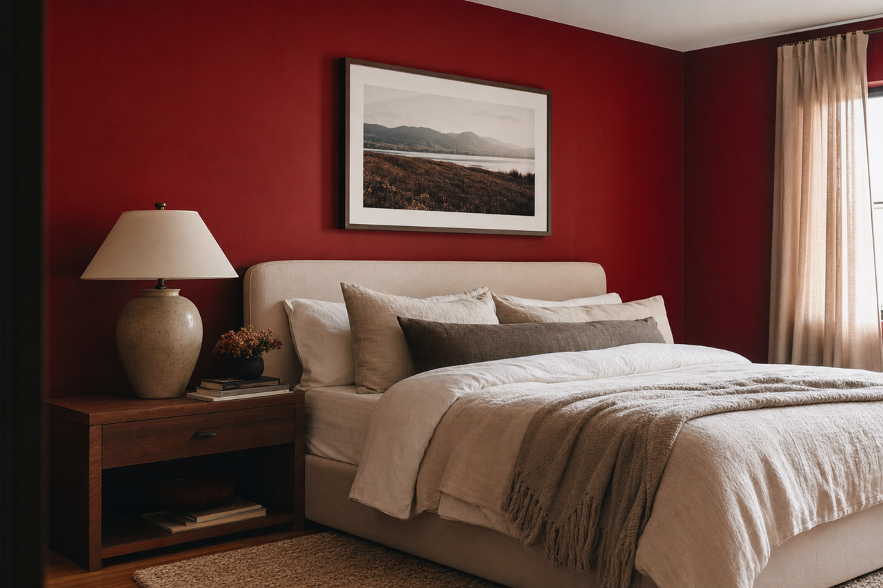
Bedrooms
In bedrooms, Classic creates a serene and inviting atmosphere. It works beautifully with soft linens, warm lighting, and layered textiles. Pair it with accent pillows and throws in muted pastels or deep jewel tones for a luxurious retreat.
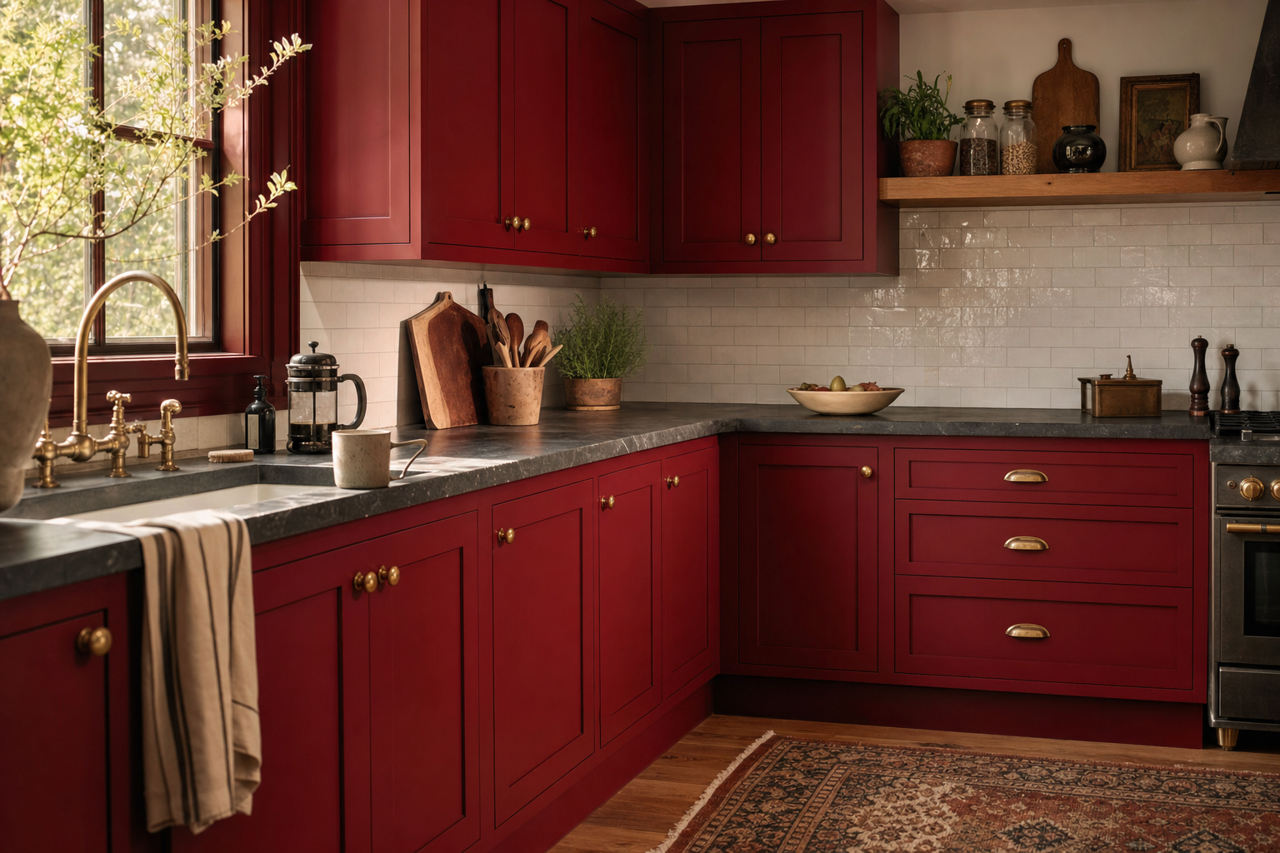
Kitchens
Classic (HC-182) serves as an excellent option for kitchen spaces, especially when paired with white cabinetry or natural wood finishes. Its warm undertones complement stainless steel appliances and marble countertops, creating a timeless and sophisticated look.
Bathrooms
For bathrooms, Classic offers a spa-like ambiance. Pair it with crisp white tiles, brushed nickel fixtures, and soft blue or green accents for a calming and fresh aesthetic.
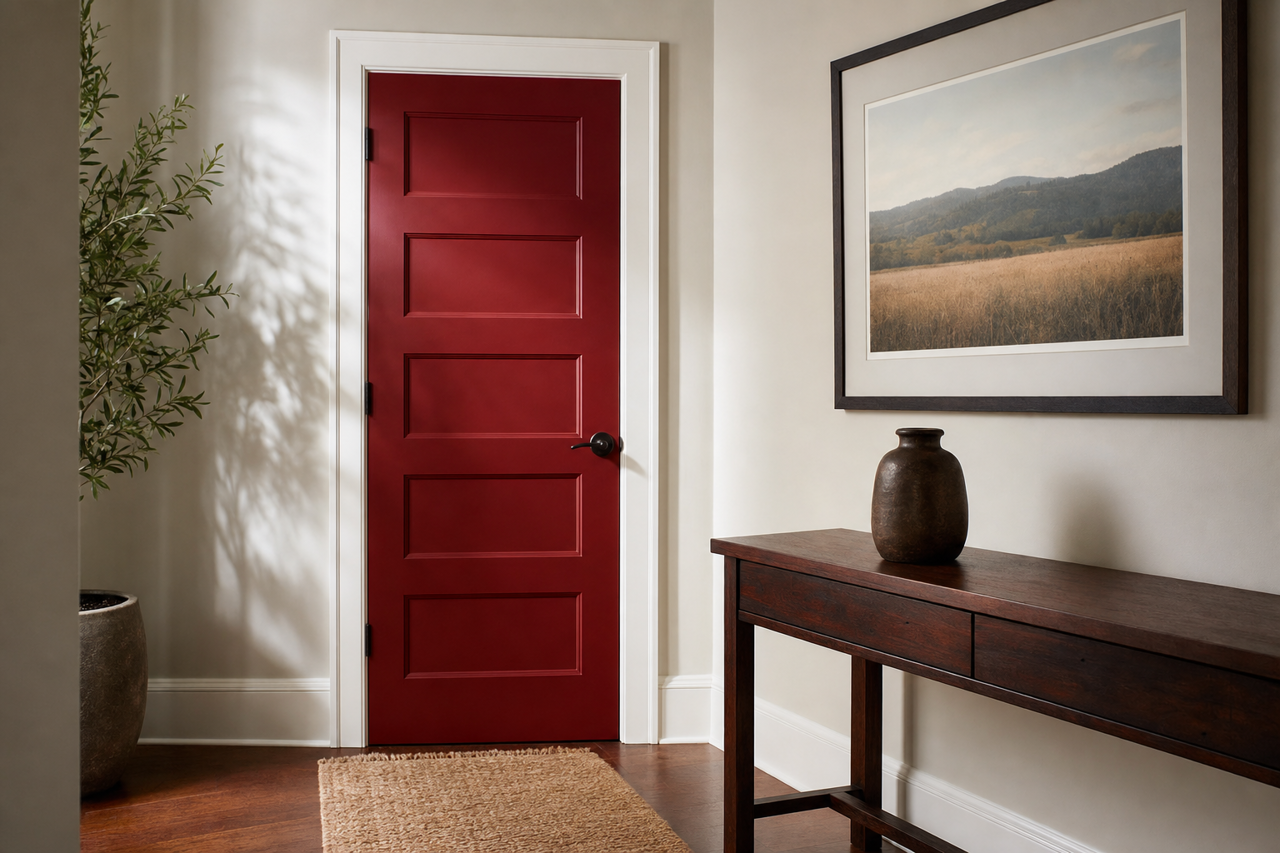
Hallways and Entryways
As a neutral, Classic is perfect for high-traffic areas like hallways and entryways. Its warmth adds a welcoming touch while its adaptability ensures it pairs well with various architectural styles and decor elements.
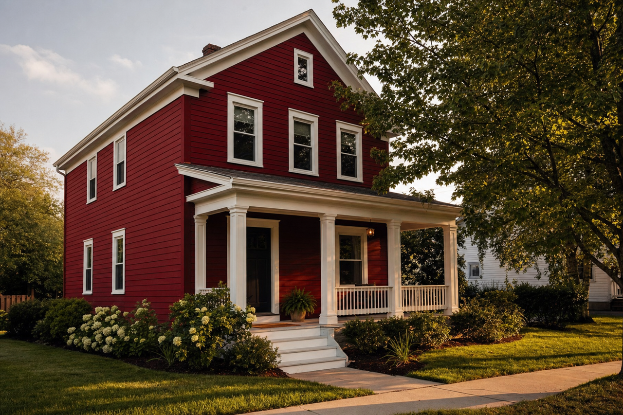
Exteriors
Benjamin Moore Classic is also a stunning choice for exterior painting. Its warmth and neutrality work well with natural stone, white trim, or black accents, making it a versatile option for both traditional and modern homes.
Why Choose Benjamin Moore Classic (HC-182)?
If you're searching for a neutral paint color that exudes timeless elegance and adaptability, Benjamin Moore Classic (HC-182) is an excellent choice. Its ability to complement a wide array of colors and design styles makes it a go-to for creating cohesive and inviting spaces. Whether you're designing a cozy sanctuary or a polished, professional space, Classic offers the perfect balance of warmth and neutrality to elevate your interiors or exteriors.