Benjamin Moore Newburyport Blue (HC-155): The Timeless Navy
Benjamin Moore Newburyport Blue (HC-155) is a rich, sophisticated navy that effortlessly combines depth and versatility. Part of the brand's Historical Collection, this color is inspired by classic American architecture, making it a timeless choice for both traditional and modern interiors. Whether you're looking to create a bold accent wall or establish a serene, moody atmosphere, Newburyport Blue can elevate any space with its elegant charm.
Undertones of Newburyport Blue
Newburyport Blue leans towards a cooler navy with subtle gray undertones, giving it a slightly muted and refined appearance. These gray undertones soften the intensity of the blue, making it feel grounded and approachable without sacrificing its dramatic edge. Unlike brighter navies that can feel overly saturated, Newburyport Blue offers a harmonious balance, making it adaptable to various lighting conditions and design aesthetics.
- Natural Light: In spaces with abundant natural light, Newburyport Blue will appear more vibrant and crisp while still maintaining its stately demeanor.
- Low Light: In dimly lit rooms, its gray undertones become more prominent, creating a moody and intimate atmosphere.
Coordinating Colors for Newburyport Blue
Benjamin Moore Newburyport Blue pairs beautifully with a wide range of colors, from soft neutrals to bold contrasting hues. Below are some complementary options to inspire your palette:
Neutrals and Whites
- White Dove (OC-17): A warm, creamy white that softens the boldness of Newburyport Blue, perfect for trim, ceilings, or cabinetry.
- Classic Gray (OC-23): A soft, neutral gray that enhances the cool undertones of Newburyport Blue without competing for attention.
Accent Colors
- Hale Navy (HC-154): For a monochromatic look, consider pairing Newburyport Blue with Hale Navy, a deeper, richer navy that adds layers of depth.
- Palladian Blue (HC-144): A soft, airy blue with green undertones that creates a coastal-inspired aesthetic when paired with Newburyport Blue.
Warm Tones
- Revere Pewter (HC-172): A greige that introduces warmth to a space, balancing the coolness of Newburyport Blue.
- Caliente (AF-290): A bold, fiery red for a striking contrast that feels luxurious and dramatic.
Best Uses for Newburyport Blue
Thanks to its versatility and timeless appeal, Newburyport Blue can be used in a variety of settings:
Living Rooms
Create a cozy yet sophisticated living space by using Newburyport Blue on the walls. Pair it with soft beige or white furniture to balance its depth, and add metallic accents like gold or brass for a touch of luxury.
Bedrooms
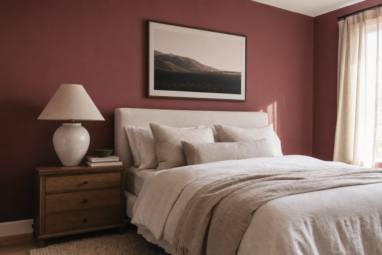
For a serene and intimate bedroom, Newburyport Blue works beautifully as an accent wall behind the headboard. Incorporate plush linens in lighter blues or grays to maintain a cohesive and calming palette.
Kitchens
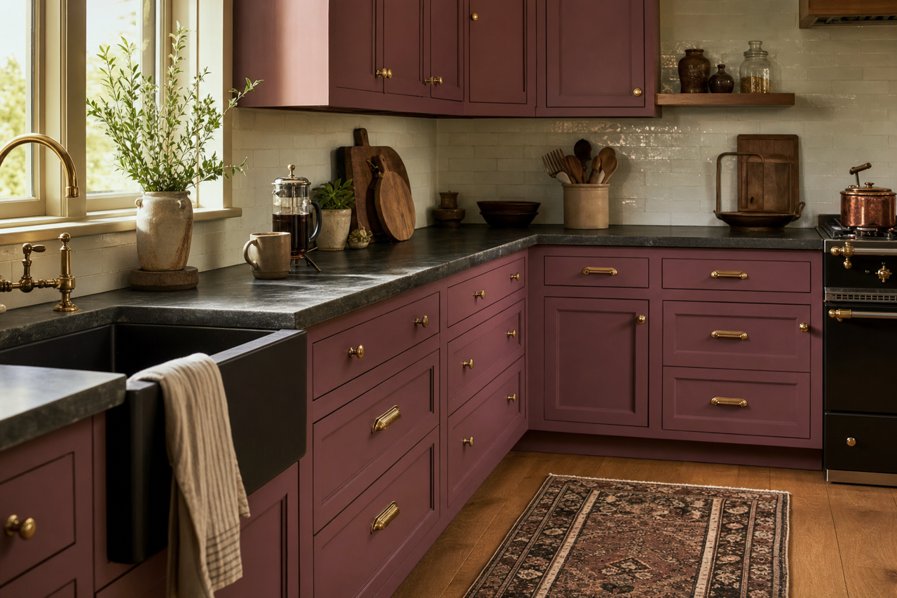
Transform your kitchen with Newburyport Blue cabinetry or an island painted in this rich navy. Pair it with white quartz countertops and brushed nickel hardware for a sleek, modern look.
Dining Rooms
Make a bold statement in the dining room by enveloping the space in Newburyport Blue. Add warmth with wooden furniture and ambient lighting for an inviting atmosphere perfect for entertaining.
Home Offices
Foster focus and productivity by introducing Newburyport Blue to a home office. Its cool undertones promote a sense of calm and order, making it an ideal choice for a workspace.
Why Choose Newburyport Blue?
Benjamin Moore Newburyport Blue (HC-155) is a color that strikes the perfect balance between boldness and subtlety. Its gray undertones make it more versatile than other navy blues, allowing it to adapt seamlessly to a variety of styles and spaces. Whether used as a wall color, cabinetry finish, or accent detail, Newburyport Blue lends an air of sophistication and timeless beauty to any home.