
Sherwin-Williams Acanthus (0029): A Timelessly Elegant Green
Sherwin-Williams Acanthus (0029) is a refined, earthy green that exudes elegance and serenity. With its sophisticated blend of muted tones and natural warmth, this color captures the essence of classic design while remaining versatile enough for modern spaces. Acanthus is the perfect choice for homeowners and designers seeking to bring a sense of harmony and understated luxury to their interiors.
Undertones: The Subtle Charm of Acanthus
Acanthus is a soft, medium green with slight gray and yellow undertones, making it a balanced and versatile hue. The gray undertones lend a touch of sophistication and prevent the color from feeling overly vibrant, while the faint yellow contributes warmth and ensures the shade feels inviting rather than cool. These undertones make Acanthus adaptable to various lighting conditions, whether basking in natural sunlight or illuminated by warm artificial light.
In spaces with abundant natural light, Acanthus leans toward a fresher green, while in dimmer settings, its gray undertones deepen, creating a cozy and grounded atmosphere. This dual nature allows Acanthus to transition seamlessly between rooms and moods, making it a favorite among designers.
Coordinating Colors: Pairing Acanthus for Perfect Harmony
Sherwin-Williams Acanthus (0029) pairs beautifully with a wide range of complementary and contrasting colors. Whether you're designing a monochromatic palette or aiming for bold accents, Acanthus serves as a sophisticated anchor for your space. Below are some recommended coordinating colors:
Neutral Pairings:
- Sherwin-Williams Alabaster (SW 7008): A creamy white that balances Acanthus for a fresh, clean look.
- Sherwin-Williams Accessible Beige (SW 7036): A warm beige that complements the earthy undertones of Acanthus and creates an inviting atmosphere.
Bold Contrasts:
- Sherwin-Williams Naval (SW 6244): A deep, dramatic blue that adds depth and contrast to the muted green tones of Acanthus.
- Sherwin-Williams Peppercorn (SW 7674): A rich charcoal gray that enhances the sophistication of Acanthus without overpowering it.
Accent Colors:
- Sherwin-Williams Lemon Verbena (SW 7726): A soft, cheerful yellow that highlights the subtle warmth in Acanthus.
- Sherwin-Williams Coral Reef (SW 6606): A vibrant coral that adds energy and playfulness to a room featuring Acanthus as the main color.
Where to Use Sherwin-Williams Acanthus (0029)
Acanthus is a versatile shade that works well in a variety of spaces, from traditional to contemporary interiors. Its muted elegance makes it suitable for large-scale use, while its earthy undertones add a sense of calm and balance to any room. Here are some ideas for incorporating Acanthus into your home:
Living Rooms
Acanthus creates a soothing backdrop for living spaces, fostering a sense of relaxation and connection to nature. Pair it with neutral furniture and natural textures like linen, jute, or wood for a timelessly chic look. Add pops of gold or brass accents for an elevated touch.
Bedrooms
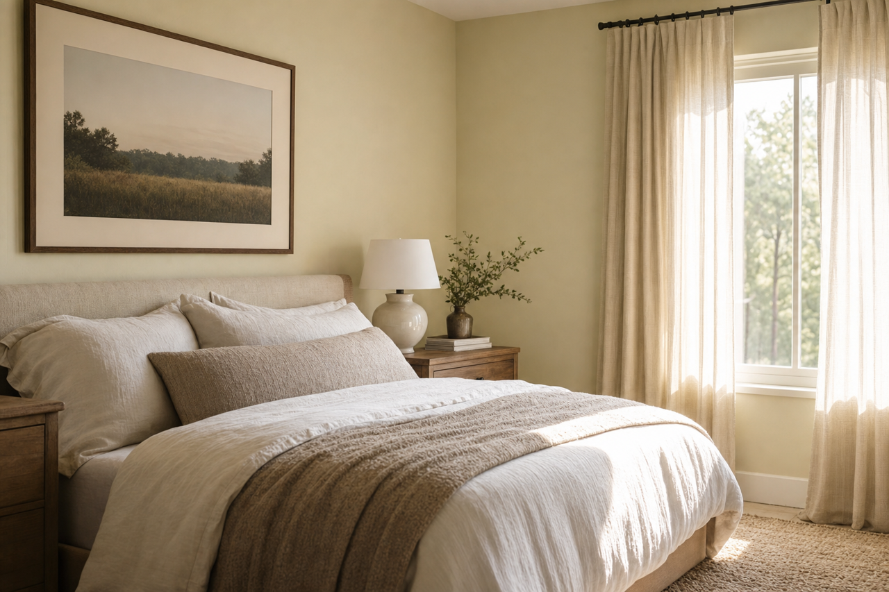
In bedrooms, Acanthus provides a restful, serene ambiance. Combine it with soft whites or creams for a tranquil retreat, or layer it with darker hues like navy or charcoal for a cozy, cocoon-like effect.
Kitchens and Dining Areas
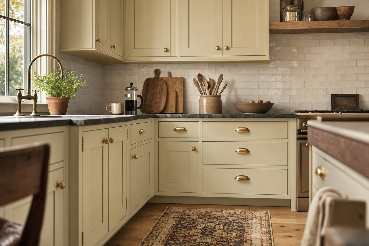
Acanthus is an excellent choice for kitchen cabinetry or dining room walls. Its subtle green tone pairs beautifully with white marble countertops, brass fixtures, and warm wood floors. For added contrast, consider using a darker accent color for the kitchen island or dining chairs.
Bathrooms
Bring the calming qualities of Acanthus into your bathroom to create a spa-like oasis. Pair it with crisp white tiles, natural stone, and greenery for a fresh and organic feel.
Entryways and Accent Walls
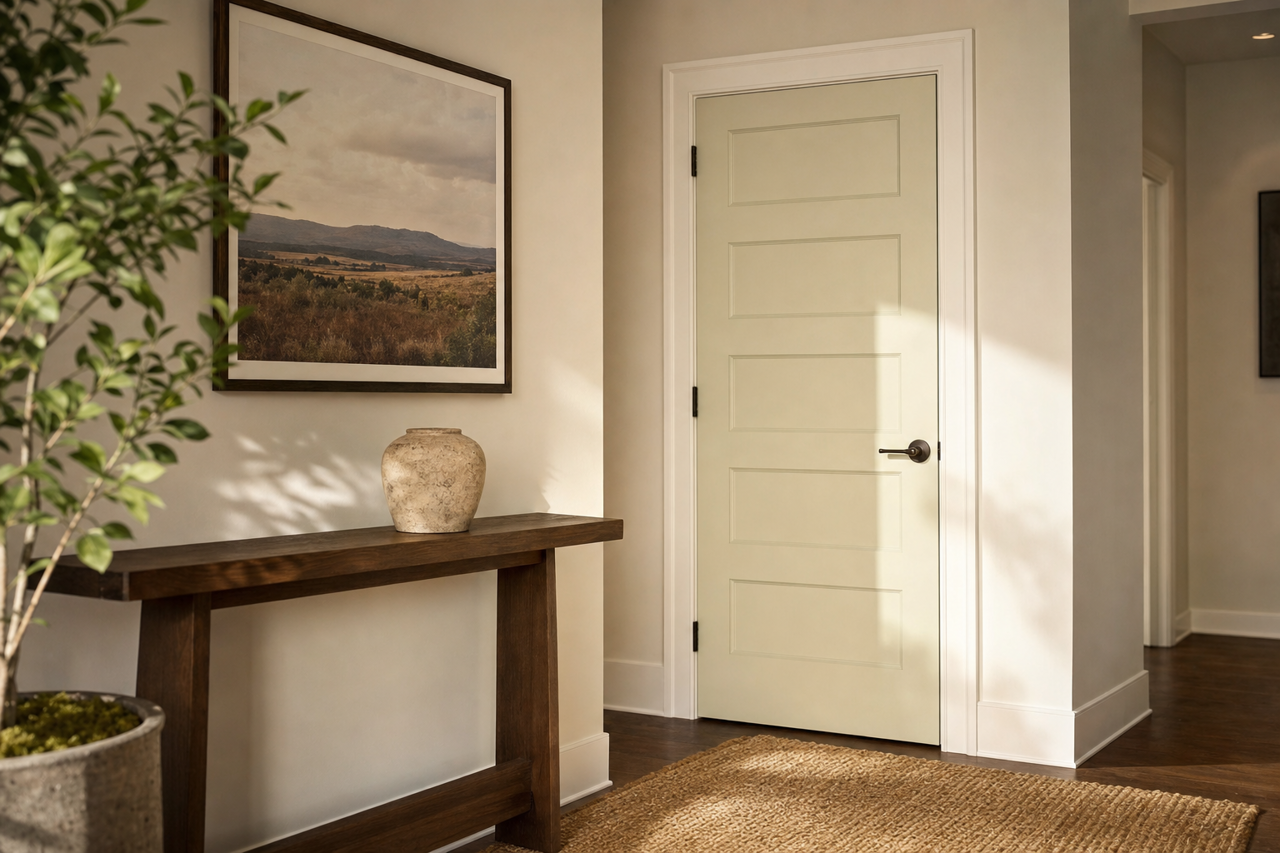
Transform your entryway or a feature wall with Acanthus to make a sophisticated first impression. Pair it with classic moldings in white or cream for a polished and inviting look.
Why Choose Sherwin-Williams Acanthus (0029)?
Sherwin-Williams Acanthus (0029) offers a timeless green that feels both grounded and refined. Its muted undertones and versatility make it an ideal choice for homeowners and designers seeking a color that can adapt to various styles and spaces. Whether used as the main color in a room or as part of a carefully curated palette, Acanthus brings a sense of serenity and sophistication that elevates any interior.
With its ability to complement neutrals, bold accents, and everything in between, Acanthus is a true design chameleon that invites creativity and inspires timeless beauty.