

Sherwin-Williams Bitter Chocolate SW 6013: A Deep, Sophisticated Hue
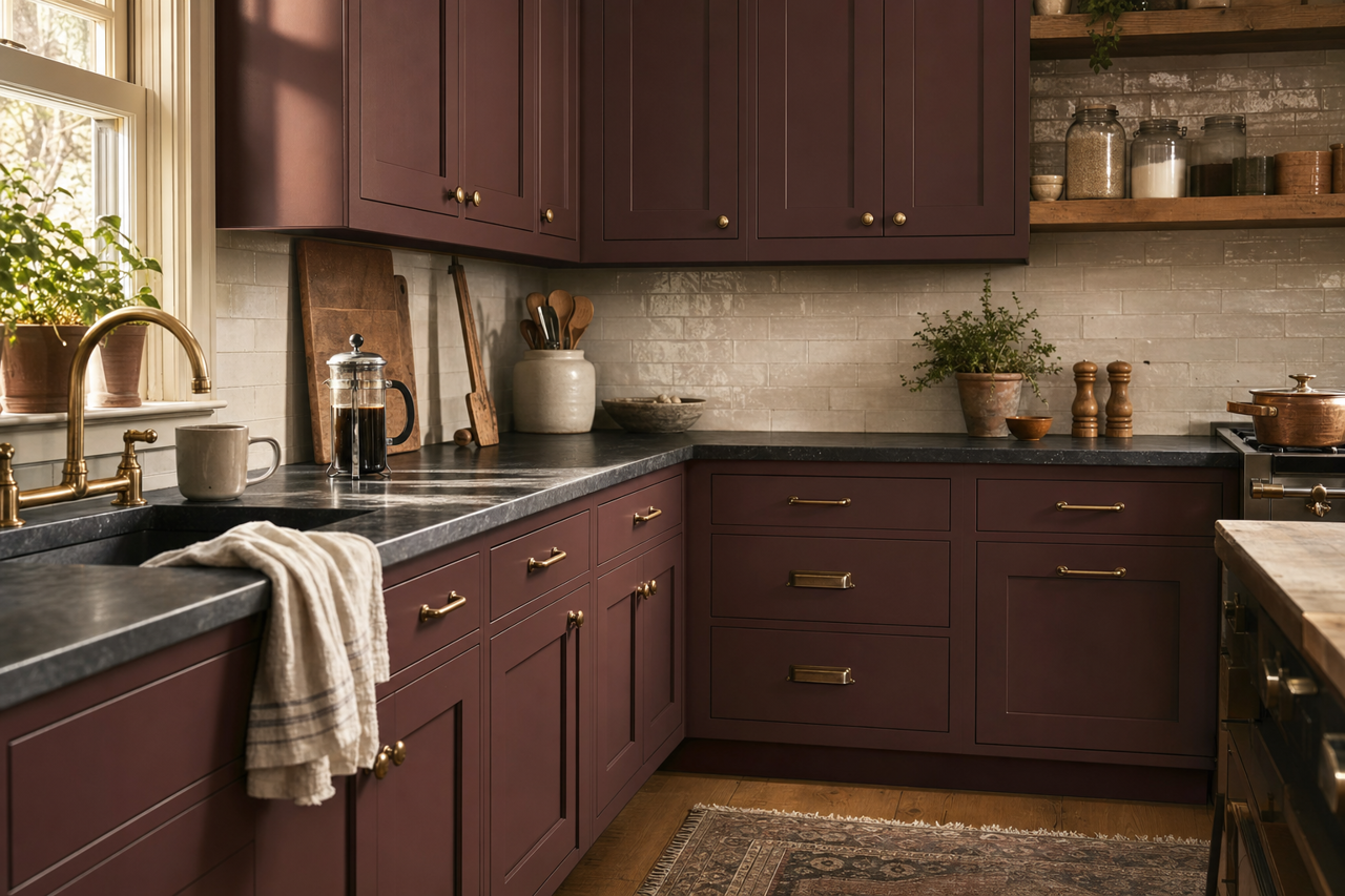
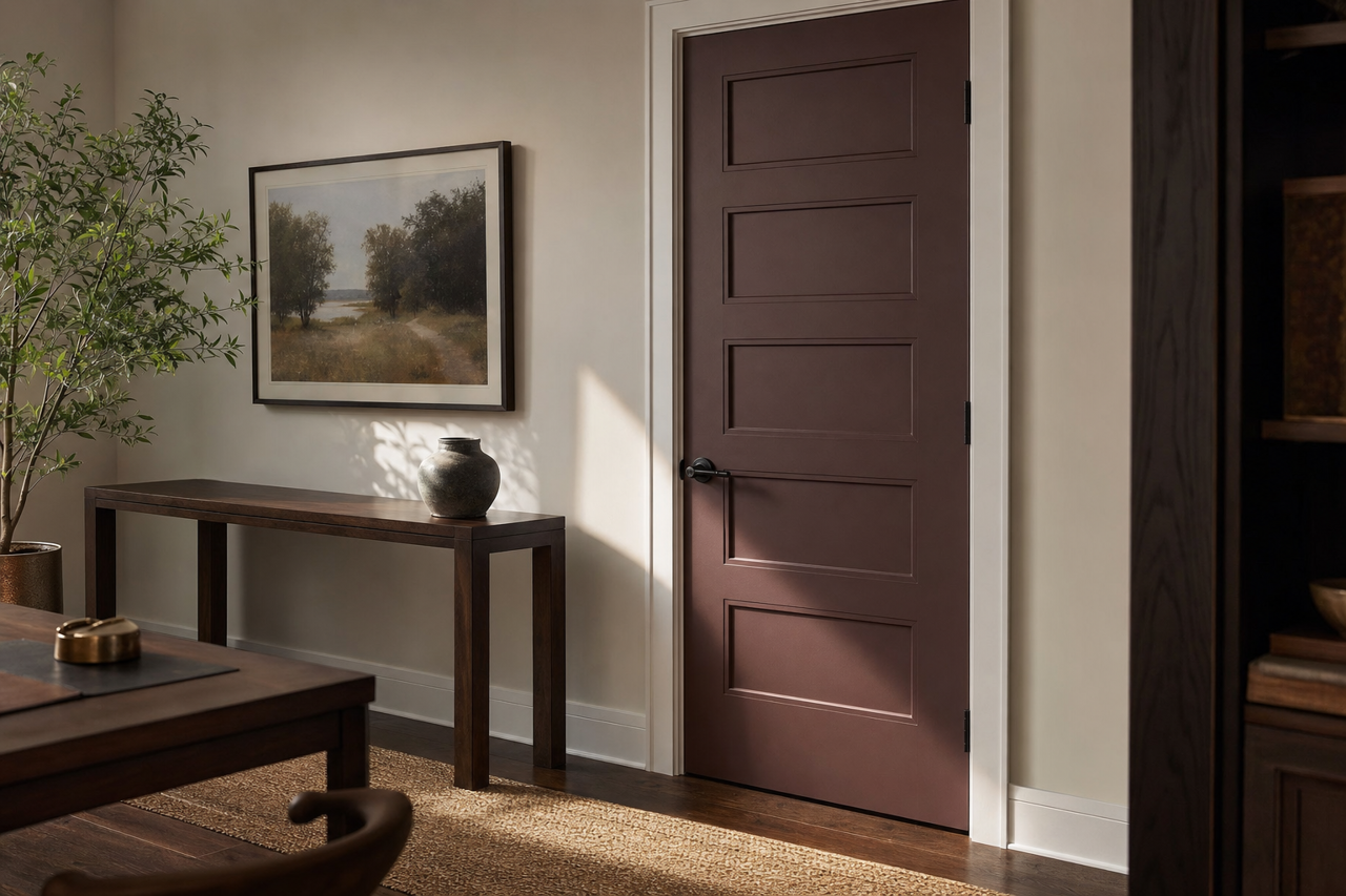
Sherwin-Williams Bitter Chocolate SW 6013 is a rich, velvety brown that exudes depth, elegance, and timeless sophistication. This stunning shade is perfect for creating cozy, moody spaces or injecting a touch of dramatic refinement into your home. Its versatility makes it a favorite among designers, as it can serve as either a bold statement or a grounding neutral, depending on how it is styled.
Undertones of Bitter Chocolate SW 6013
Bitter Chocolate is a warm brown with subtle red undertones, giving it a luxurious depth and richness. These undertones keep the color from feeling flat or dull, adding subtle warmth that makes it inviting. The red undertones also enhance its ability to pair beautifully with a variety of colors, from warm neutrals to bold accent hues.
When applied in different lighting conditions, the undertones can shift slightly. In bright, natural light, the color appears softer and more nuanced, while in dim, artificial lighting, the chocolatey richness deepens, creating a more dramatic and intimate ambiance.
Coordinating Colors for Bitter Chocolate SW 6013
Pairing Bitter Chocolate with complementary hues can elevate your design, creating a cohesive and visually appealing space. Below are some suggestions for coordinating colors that work beautifully with this shade:
Warm Neutrals:
- SW 6106 Kilim Beige
- SW 7036 Accessible Beige
- SW 7566 Westhighland White
These soft neutrals balance the richness of Bitter Chocolate, creating a warm and inviting palette that feels grounded and approachable.
Earthy Greens:
- SW 6171 Chatroom
- SW 6186 Dried Thyme
Earthy greens harmonize with the warm undertones of Bitter Chocolate, evoking a natural and organic aesthetic that’s both modern and timeless.
Pale Blues and Grays:
- SW 6232 Misty
- SW 7654 Lattice
Cool, muted blues and grays offer a subtle contrast to the warmth of Bitter Chocolate, resulting in a balanced and serene atmosphere.
Bold Accents:
- SW 7587 Antique Red
- SW 6695 Midday
For those looking to make a statement, these bold accent colors add vibrancy and drama, complementing Bitter Chocolate’s richness.
Ideal Uses for Bitter Chocolate SW 6013
Bitter Chocolate is a versatile color that can be used in a variety of spaces to create different moods and styles. Here are some ideas for incorporating it into your home:
Living Rooms & Dens
This deep chocolate shade is perfect for creating cozy, intimate living spaces. Use it on walls to envelop the room in warmth, or as an accent color on built-ins, trim, or a feature wall for added depth. Pair it with plush furniture, soft textiles, and metallic accents for a sophisticated look.
Bedrooms
Bitter Chocolate works beautifully in bedrooms, where its depth creates a serene and cocoon-like retreat. Layer it with warm white bedding and natural wood furniture for a grounded, restful space.
Dining Rooms
Transform your dining room with the luxurious feel of Bitter Chocolate on the walls. Pair it with soft lighting, gold or brass fixtures, and elegant table settings to create an inviting environment for entertaining.
Kitchens & Cabinetry
For a bold yet refined look, consider using Bitter Chocolate on kitchen cabinetry or an island. It pairs well with marble countertops, brass hardware, and creamy white walls for a high-end, bespoke aesthetic.
Hallways & Accent Spaces
Use Bitter Chocolate in hallways, powder rooms, or other small spaces to create a dramatic impact.