Sherwin-Williams Marooned (6020): A Deep and Dramatic Hue
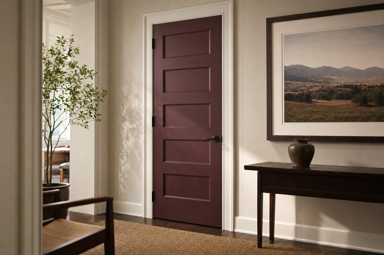
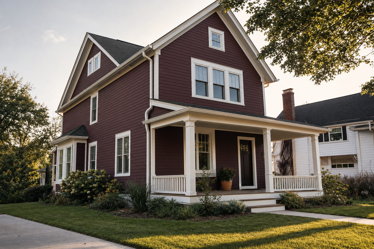
Sherwin-Williams Marooned (6020) is a rich, moody shade that exudes sophistication and warmth. This deep maroon hue is perfect for creating a luxurious and inviting atmosphere in any space. Its dark, wine-colored tones carry a sense of refinement and drama, making it an excellent choice for those looking to elevate their interior design with bold yet timeless elegance.
Undertones of Sherwin-Williams Marooned (6020)
Marooned is a complex color with warm undertones that lean towards brown and burgundy. These subtle undertones make it more versatile than a pure maroon or red. The earthy base ensures that it doesn’t feel overly saturated or harsh, allowing the color to blend beautifully into a variety of design styles. Whether paired with cool neutrals or warmer hues, Marooned adapts effortlessly, creating a balanced and harmonious aesthetic.
Coordinating Colors
To fully bring out the richness of Marooned, consider pairing it with complementary or contrasting tones. Sherwin-Williams offers a wide range of coordinating colors that work beautifully with this dramatic shade:
Neutrals:
- Accessible Beige (SW 7036): A soft, warm beige that adds balance and lightness to Marooned's depth.
- Pure White (SW 7005): A crisp, clean white to provide a stark contrast and keep the space feeling fresh.
Cool Accents:
- Sea Salt (SW 6204): A gentle gray-green that adds a calming, spa-like touch to balance Marooned’s boldness.
- Naval (SW 6244): A deep navy blue that complements Marooned’s richness for a sophisticated pairing.
Warm Accents:
- Goldenrod (SW 6677): A warm, golden yellow that adds vibrancy and depth to the palette.
- Crushed Ice (SW 7647): A light greige that introduces a subtle warmth while maintaining neutrality.
Best Uses for Sherwin-Williams Marooned
Marooned is a versatile color that can be used in a variety of ways to transform your space into a refined sanctuary. Here are some ideas for incorporating this bold hue into your interiors:
1. Accent Walls
Marooned is a stunning choice for creating an accent wall in living rooms, bedrooms, or dining areas. The deep maroon tone draws attention and adds drama without overwhelming the space. Pair it with lighter walls in shades like Accessible Beige or Pure White to create contrast and visual interest.
2. Cozy Bedrooms
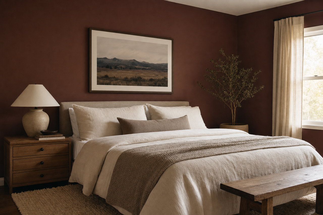
For a restful and intimate bedroom, use Marooned as the main wall color. Complement it with soft bedding in neutral tones like cream or greige for a calming effect. Gold or brass accents in lighting fixtures and decor can enhance the luxurious feel.
3. Sophisticated Offices or Libraries
Marooned’s warm, earthy undertones make it an ideal choice for home offices or libraries, where a sense of focus and refinement is desired. Pair it with rich wood furniture and deep green or navy accents to create a space that feels both classic and inspiring.
4. Dramatic Dining Rooms
Transform your dining room into a space for memorable gatherings with Marooned on the walls. Pair it with a dark wood dining table and metallic accents for a formal yet welcoming atmosphere.
5. Furniture and Cabinetry
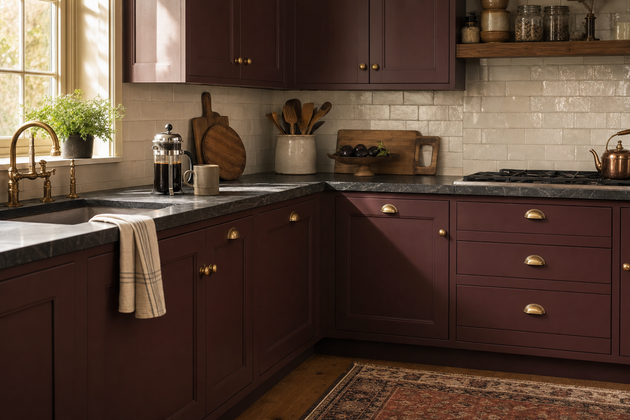
Marooned can also be used for furniture or cabinetry to add a pop of bold color. Consider using it on a kitchen island, built-in shelving, or even repurposed vintage furniture for a touch of elegance.
Lighting Considerations
Due to its dark nature, Marooned is heavily influenced by lighting conditions. In rooms with ample natural light, the color appears rich and warm, while in dimly lit spaces, it takes on a deeper, more dramatic tone. To maintain balance, layer in lighting fixtures like sconces or pendant lights, especially in areas where natural light is limited.
Style Pairings
Sherwin-Williams Marooned (6020) works beautifully across various design styles, including:
- Traditional: Pair with classic furniture pieces and ornate decor for an opulent look.
- Modern: Combine with sleek, minimalist furniture and metallic finishes for a striking yet understated vibe.
- Rustic: Blend with natural textures like reclaimed wood and stone for a cozy, cabin-inspired aesthetic.
Sherwin-Williams Marooned (6020) is a bold, versatile shade that has the power to transform any space into one filled with character, depth, and elegance. Whether you’re looking to make a statement or create a sophisticated backdrop, this color is sure to deliver timeless beauty.