
Sherwin-Williams Socialite (SW 6025): A Sophisticated and Stylish Hue
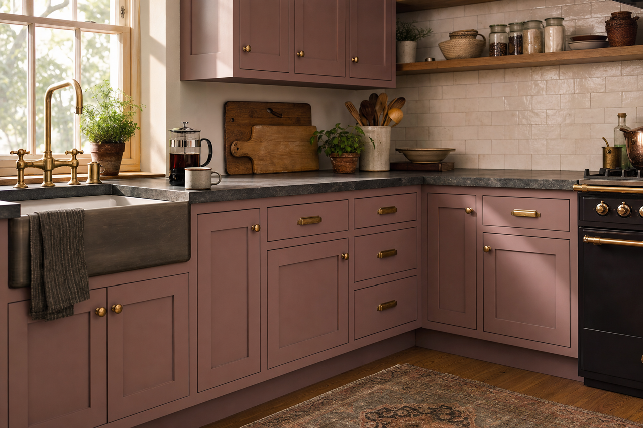
Sherwin-Williams Socialite (SW 6025) is an exquisite paint color that effortlessly blends elegance with a subtle touch of playfulness. Its delicate lavender hue, infused with soft gray undertones, creates a sophisticated look that can transform any space into a serene, inviting retreat. Socialite is a versatile choice for homeowners and designers seeking a color that exudes refinement without overwhelming the senses.
Understanding the Undertones
Socialite is more than just a lavender shade—it’s a masterful blend of subtle gray and purple undertones. The gray undertones lend a modern, grounded quality to the color, ensuring it feels balanced and timeless, while the purple adds a gentle warmth and charm. This harmonious combination makes Socialite a perfect choice for spaces where you want to achieve a relaxed yet upscale ambiance.
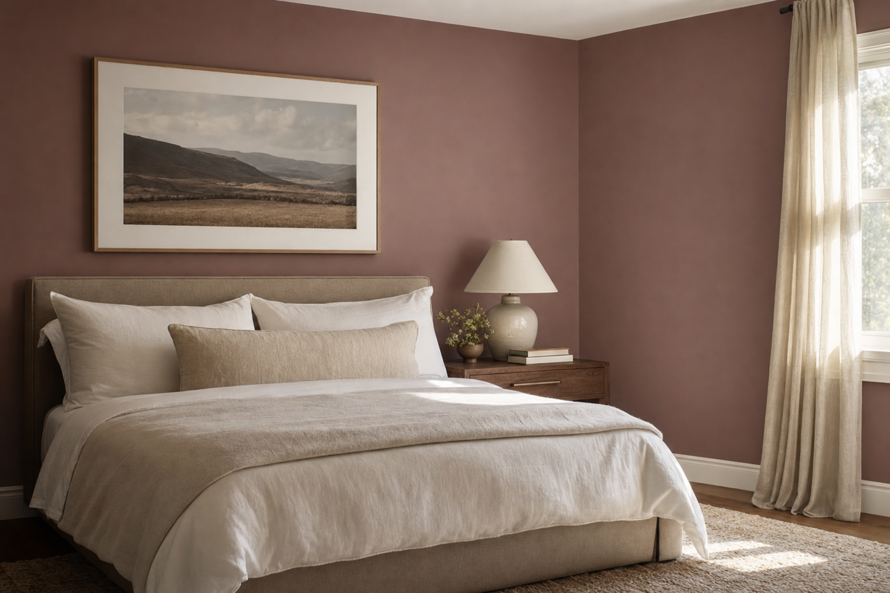
Depending on the lighting, Socialite can take on slightly different characteristics. In natural light, its lavender essence shines through, creating a soft and airy vibe. Under artificial lighting, the gray undertones become more prominent, offering a cooler, more sophisticated appearance. This dynamic nature makes Socialite suitable for a variety of design styles, from contemporary to transitional.
Coordinating Colors for a Cohesive Palette
Sherwin-Williams Socialite pairs beautifully with a range of complementary colors, allowing you to design a cohesive and visually stunning space. Here are some suggestions:
Neutral Coordinating Colors:
- Sherwin-Williams Pure White (SW 7005): A crisp, clean white that emphasizes Socialite’s gentle lavender tones.
- Sherwin-Williams Repose Gray (SW 7015): A soft, neutral gray for a balanced and understated look.
- Sherwin-Williams Accessible Beige (SW 7036): A warm beige that complements Socialite’s subtle warmth.
Accent Colors:
- Sherwin-Williams Tricorn Black (SW 6258): A dramatic black that creates contrast and depth.
- Sherwin-Williams Luxe Blue (SW 6537): A rich navy blue for a bold, modern pairing.
- Sherwin-Williams Coral Reef (SW 6606): A playful coral that adds a pop of color and vibrancy.
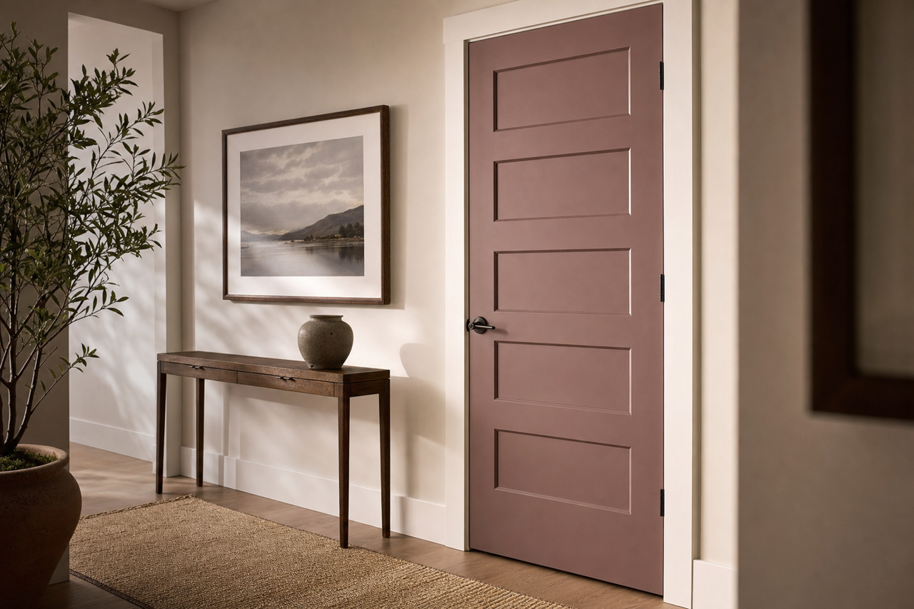
By combining Socialite with these coordinating shades, you can craft a palette that feels intentional and harmonious, whether you’re designing a serene bedroom, a chic living room, or a welcoming entryway.
Best Uses for Sherwin-Williams Socialite
Socialite is a versatile color that adapts beautifully to a variety of spaces and design applications. Here are some of the best ways to incorporate this refined hue into your home:
Bedrooms:
Socialite is an ideal choice for bedrooms due to its soothing and tranquil qualities. Pair it with soft white linens and plush textures to create a dreamy, relaxing retreat.Bathrooms:
Its subtle lavender tones work wonderfully in bathrooms, especially when paired with marble countertops and chrome fixtures for a spa-like feel.Living Rooms:
Socialite can add sophistication to living spaces without feeling overly formal. Combine it with neutral furniture and metallic accents for a polished yet approachable look.Accent Walls:
Use Socialite as an accent wall to bring a touch of personality to your space. Pair it with lighter neutrals or deeper tones to create visual interest.Nurseries or Kids’ Rooms:
The soft, whimsical nature of Socialite makes it a lovely choice for nurseries or children’s bedrooms, especially when paired with pastel accents.Home Offices:
Bring a sense of calm and focus to your workspace by using Socialite on the walls. Its understated elegance promotes productivity while maintaining a sense of style.
Lighting Considerations
When selecting Socialite, it’s important to consider the lighting in your space. In rooms with abundant natural light, Socialite’s lavender tones will feel brighter and more pronounced, ideal for creating an airy atmosphere. In darker spaces or under artificial lighting, the gray undertones will become more apparent, offering a muted and sophisticated vibe. To ensure the perfect result, test Socialite in your room at different times of the day.
Why Choose Sherwin-Williams Socialite?
Sherwin-Williams Socialite is the perfect balance between subtlety and style. Its unique blend of lavender and gray undertones makes it a versatile and timeless choice that can elevate any space. Whether you’re designing a calming retreat or adding an elegant touch to your interiors, Socialite offers endless possibilities for creativity. With its ability to coordinate beautifully with other colors and adapt to different lighting conditions, Sherwin-Williams Socialite is a standout option for homeowners and designers alike.