Sherwin-Williams Protégé Bronze (SW 6153): A Timeless, Warm Neutral
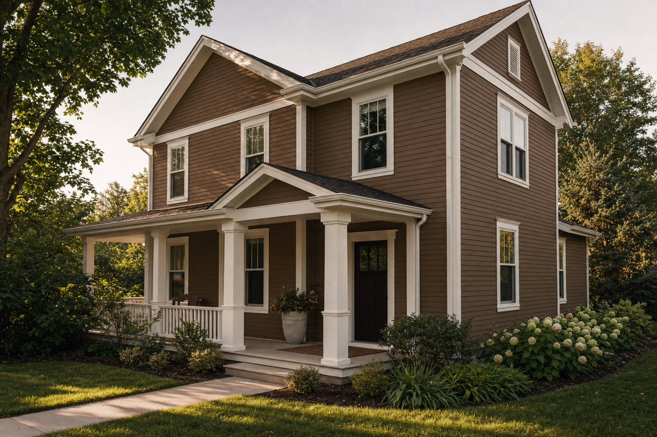
Sherwin-Williams Protégé Bronze (SW 6153) is a classic, earthy neutral that exudes warmth, depth, and sophistication. This stunning shade sits perfectly between taupe and bronze, offering a versatile and grounded hue that works well in a variety of interior design styles. Its understated elegance makes it a popular choice for creating cozy, inviting spaces, whether in residential or commercial settings.
Undertones of Sherwin-Williams Protégé Bronze
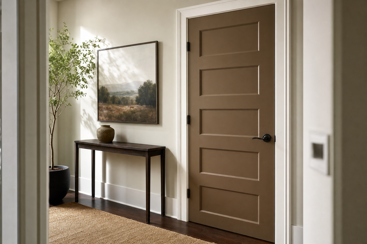
Protégé Bronze features warm undertones of brown and subtle gray, giving it a balanced, muted quality that feels organic and natural. The brown undertones lend a sense of richness and warmth, while the gray softens the hue, ensuring it doesn’t feel too heavy or overpowering. This unique combination of undertones makes Protégé Bronze an adaptable color that harmonizes beautifully with a wide range of palettes, from earthy neutrals to vibrant jewel tones.
Coordinating Colors for Protégé Bronze
Sherwin-Williams Protégé Bronze pairs effortlessly with a variety of coordinating colors, allowing for endless design possibilities. Here are some suggestions to inspire your next project:
Soft Neutrals: Pair Protégé Bronze with lighter, complementary neutrals like Sherwin-Williams Alabaster (SW 7008) or Eider White (SW 7014) to create a clean and sophisticated contrast. These lighter tones help balance the richness of Protégé Bronze and brighten up the space.
Earthy Greens: For a natural, grounded look, combine Protégé Bronze with earthy greens such as Retreat (SW 6207) or Clary Sage (SW 6178). These hues emphasize the organic warmth of the color and create a serene, nature-inspired aesthetic.
Warm Accents: Add depth and character by incorporating warm accent colors like Rookwood Red (SW 2802) or Spicy Hue (SW 6342). These tones bring energy and vibrancy to the space, complementing the warm undertones of Protégé Bronze.
Dark Contrasts: For a bold, dramatic look, consider pairing Protégé Bronze with deep, saturated shades like Black Fox (SW 7020) or Urbane Bronze (SW 7048). These darker hues enhance the richness of Protégé Bronze and add a touch of modern sophistication.
Best Uses for Protégé Bronze
Protégé Bronze is an incredibly versatile color that can be used in various applications to create different moods and aesthetics. Here’s how you can make the most of this timeless shade:
Living Rooms and Family Spaces
Protégé Bronze works exceptionally well in living rooms and family spaces, where its warm undertones create a cozy and inviting ambiance. Pair it with plush furniture, textured fabrics, and natural wood accents for a space that feels both stylish and comfortable.
Bedrooms
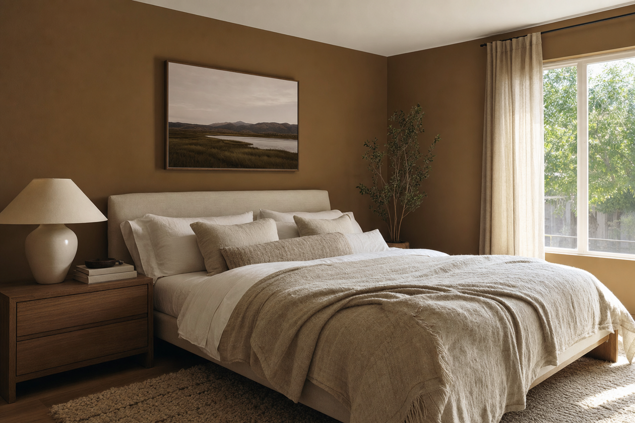
In bedrooms, Protégé Bronze offers a soothing, cocoon-like quality that promotes relaxation. Use it on the walls for a rich, enveloping look, or as an accent color on furniture or decor to add depth to a lighter palette.
Kitchens and Dining Areas
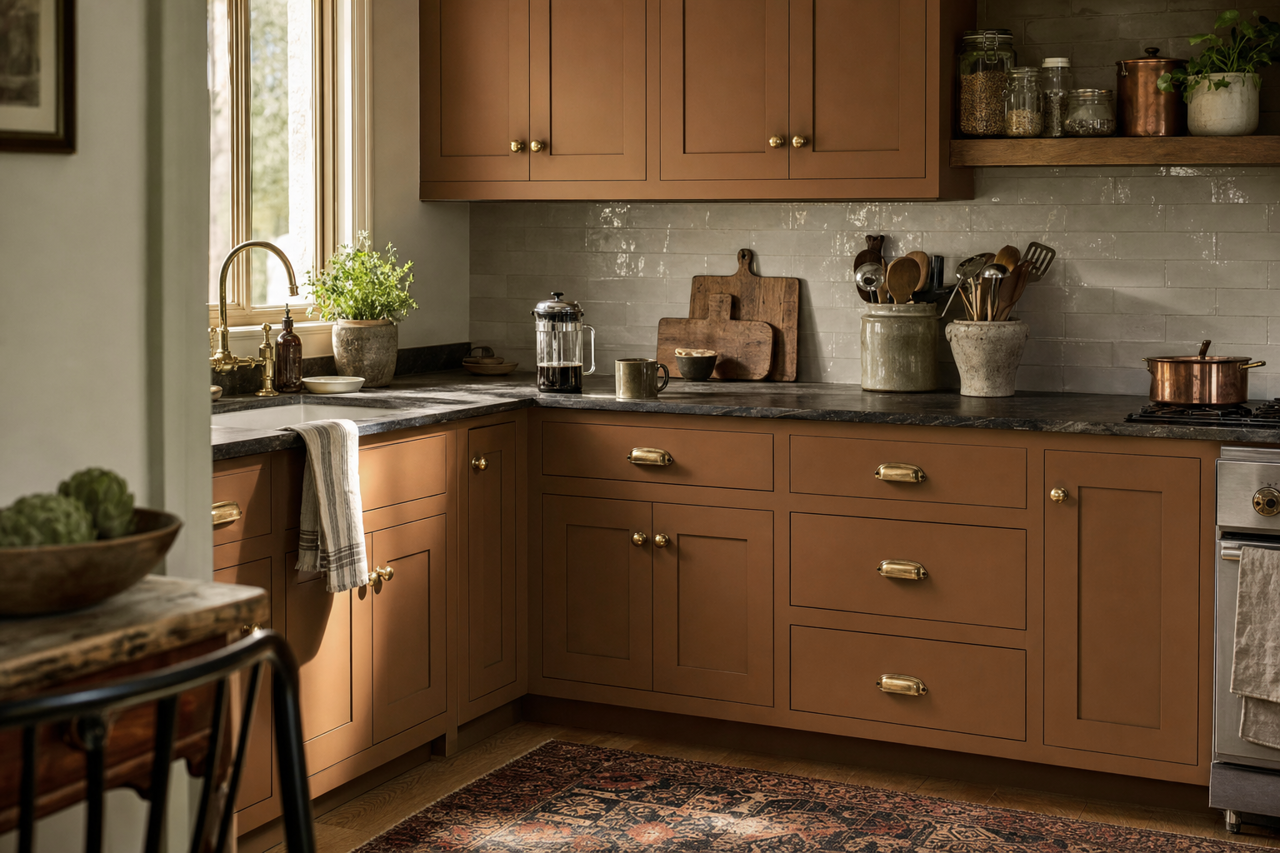
Protégé Bronze brings warmth and sophistication to kitchens and dining areas. Use it on cabinetry for a modern yet timeless appearance, or as a wall color to create an elegant backdrop for dining furniture and fixtures.
Bathrooms
For bathrooms, Protégé Bronze pairs beautifully with crisp white trim and fixtures, creating a clean yet inviting spa-like atmosphere. Add metallic accents in brushed gold or oil-rubbed bronze to enhance the luxurious feel.
Offices and Libraries
In home offices or libraries, Protégé Bronze adds a sense of depth and focus. Its warm, earthy tones help create an atmosphere conducive to productivity and concentration, while still feeling stylish and refined.
Why Choose Sherwin-Williams Protégé Bronze?
Sherwin-Williams Protégé Bronze is an excellent choice for anyone looking to add warmth, depth, and versatility to their space. Its unique combination of brown and gray undertones makes it a standout neutral that complements a wide range of design styles, from rustic farmhouse to modern minimalist. Whether you’re looking to create a cozy retreat or add a touch of sophistication to your home, Protégé Bronze delivers timeless appeal with a contemporary twist.