Sherwin-Williams Contented (SW 6191): A Serene Green for Timeless Interiors
Sherwin-Williams Contented (SW 6191) is a calming, muted green that offers a sense of tranquility and understated elegance. Perfectly balanced between cool and warm tones, this versatile color is ideal for creating soothing spaces that feel both fresh and grounded. Whether you're designing a spa-like bathroom, a cozy living room, or a serene bedroom retreat, Contented brings an air of peaceful sophistication to any interior.
Undertones of Sherwin-Williams Contented
Contented features subtle gray undertones that soften its green hue, making it a more neutral and adaptable choice compared to brighter greens. These gray undertones also give the color a slightly cool quality, ensuring it doesn’t overpower a space and allowing it to harmonize beautifully with a wide range of palettes. Depending on the lighting, Contented may lean slightly cooler or warmer, which makes it a dynamic choice for rooms with varying natural light throughout the day.
Coordinating Colors for a Cohesive Look
Sherwin-Williams Contented pairs effortlessly with complementary shades, making it an excellent anchor for a variety of color schemes. Here are some coordinating colors to consider:
- Neutral Pairings: Pair Contented with Sherwin-Williams Alabaster (SW 7008) or Pure White (SW 7005) for a crisp, clean look. These whites highlight the soft green tones without overwhelming the space.
- Earthy Complements: For a natural, grounded feel, combine Contented with Sherwin-Williams Accessible Beige (SW 7036) or Repose Gray (SW 7015). These muted neutrals create a harmonious palette that feels warm and inviting.
- Deep Contrasts: Add depth and drama with darker shades like Sherwin-Williams Urbane Bronze (SW 7048) or Pewter Green (SW 6208). These rich tones create an elegant contrast against Contented's delicate softness.
- Soft Accents: Enhance the serene vibe by incorporating pastel shades such as Sherwin-Williams Misty (SW 6232) or Sea Salt (SW 6204). These lighter hues complement Contented for a dreamy, coastal-inspired aesthetic.
Ideal Uses for Sherwin-Williams Contented in Your Home
Contented is a highly versatile color that can be used in various spaces throughout your home. Its muted tone makes it equally suited for large areas and small rooms, offering a sense of calm without feeling too heavy.
Living Room
Create a welcoming and tranquil living room by using Contented as the primary wall color. Pair it with natural wood furniture and neutral textiles to evoke a cozy yet modern atmosphere. Add metallic accents such as brushed gold or matte black for a touch of sophistication.
Bedroom
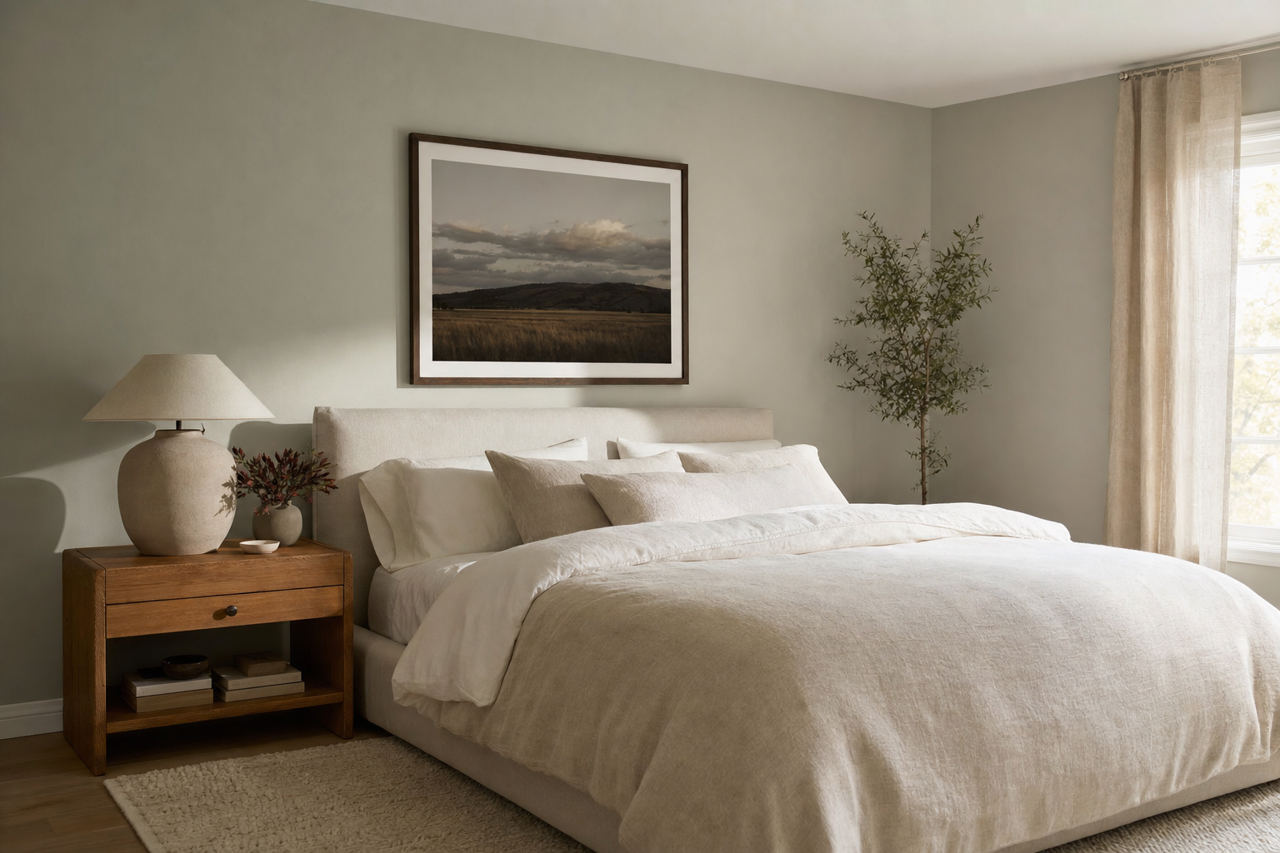
Contented is an excellent choice for bedrooms, where serenity is key. Combine it with soft white bedding, plush throws, and textured rugs to craft a space that feels like a retreat. Incorporate greenery or botanical artwork to emphasize its connection to nature.
Bathroom
Transform your bathroom into a spa-like oasis with Contented as the backdrop. Pair it with white subway tiles, marble countertops, and chrome fixtures for a clean yet inviting aesthetic. Add soft towels and candles in complementary colors for a luxurious touch.
Kitchen
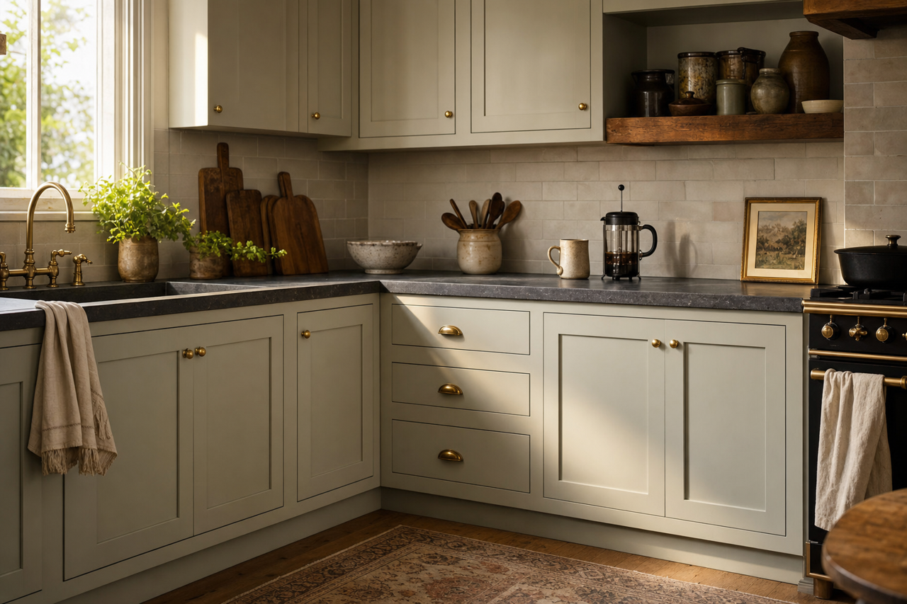
In the kitchen, Contented works beautifully on walls or cabinetry. Pair it with warm wood tones, white countertops, and brushed nickel hardware for a timeless, balanced look. Its muted green tone brings a fresh yet subtle energy to the space.
Office
For a productive yet calming workspace, use Contented in your home office. Its muted green tones help reduce visual clutter and create an environment conducive to focus and creativity. Pair it with light woods and minimalist decor for a modern, streamlined feel.
Hallways and Entryways
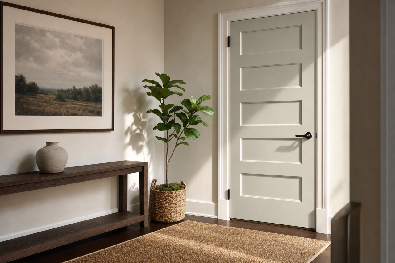
Contented can also shine in transitional spaces like hallways and entryways. Its neutral undertones make it an ideal choice for creating a seamless flow between rooms. Pair it with bold accent pieces like a statement mirror or artwork to elevate these spaces.
Lighting Considerations
Like all paint colors, Sherwin-Williams Contented can appear different depending on the lighting in your space. In natural light, the green tones are more prominent and refreshing. Under warm artificial light, the gray undertones become more pronounced, lending a cozy and grounded feel. To see how Contented will perform in your home, sample it on your walls and observe its transformation throughout the day.
Why Choose Sherwin-Williams Contented?
Sherwin-Williams Contented (SW 6191) is a masterful blend of muted green and gray that adapts seamlessly to a variety of design styles, from modern farmhouse to coastal chic. Its delicate balance of warmth and coolness makes it an enduring choice for interiors that prioritize comfort and tranquility. Whether you're refreshing a single room or transforming your entire home, Contented is a color that inspires relaxation and timeless beauty.