
Sherwin-Williams Link Gray (SW 6200): A Timeless Neutral for Sophisticated Spaces
Sherwin-Williams Link Gray (SW 6200) is a versatile, medium-toned gray that exudes understated elegance and timeless appeal. Perfect for creating serene and balanced interiors, this shade is neither overly warm nor starkly cool, making it a go-to choice for designers and homeowners seeking a modern neutral to anchor their spaces. Link Gray offers a harmonious blend of depth and subtlety, making it suitable for both contemporary and traditional designs.
Undertones in Sherwin-Williams Link Gray (SW 6200)
One of the defining characteristics of Link Gray is its soft, taupe undertones. These warm undertones prevent the color from feeling cold or sterile, while still maintaining a refined gray appearance. The taupe influence allows Link Gray to adapt beautifully to various lighting conditions, shifting slightly warmer in spaces with soft incandescent lighting and cooler in rooms with abundant natural light. This dynamic quality makes it an incredibly versatile neutral that works well in a wide range of settings.
Coordinating Colors
Sherwin-Williams Link Gray pairs effortlessly with a curated palette of complementary hues, offering endless design possibilities. Below are some suggested coordinating colors to help you achieve a cohesive and polished look:
1. Whites & Off-Whites
- Sherwin-Williams Pure White (SW 7005): A crisp, clean white that enhances Link Gray's subtle warmth.
- Sherwin-Williams Alabaster (SW 7008): A soft and creamy white that complements the taupe undertones in Link Gray.
2. Accent Colors
- Sherwin-Williams Naval (SW 6244): A bold, deep navy blue that creates striking contrast against Link Gray's muted sophistication.
- Sherwin-Williams Urbane Bronze (SW 7048): A rich, earthy bronze that brings out Link Gray's warmth for a grounded, dramatic effect.
- Sherwin-Williams Peppercorn (SW 7674): A charcoal gray that offers depth and creates a monochromatic palette.
3. Warm Neutrals
- Sherwin-Williams Accessible Beige (SW 7036): A soft beige that harmonizes beautifully with Link Gray's taupe undertones.
- Sherwin-Williams Repose Gray (SW 7015): A warm gray that complements Link Gray for layered neutral spaces.
Uses for Sherwin-Williams Link Gray (SW 6200)
Link Gray is the epitome of versatility, making it an excellent choice for various applications throughout the home or commercial spaces.
1. Walls
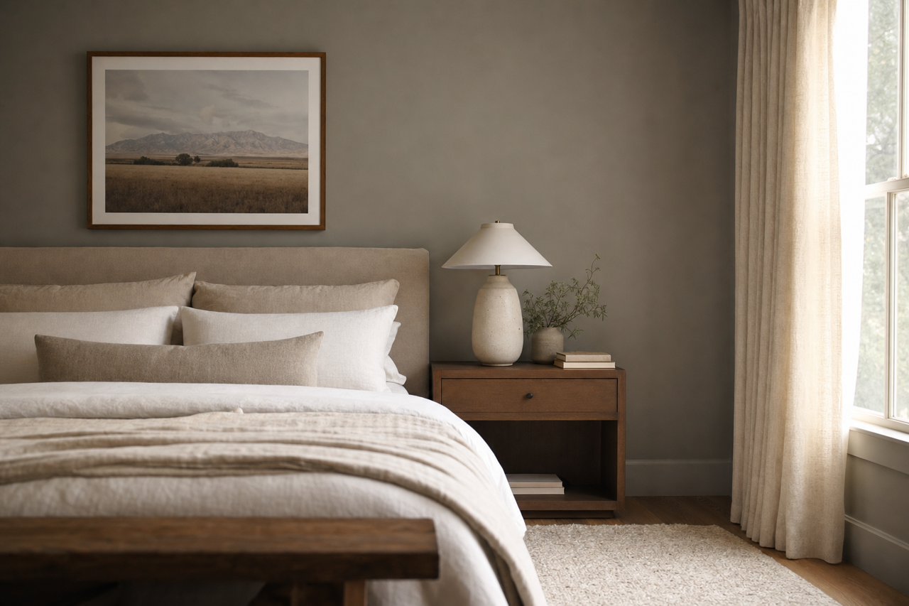
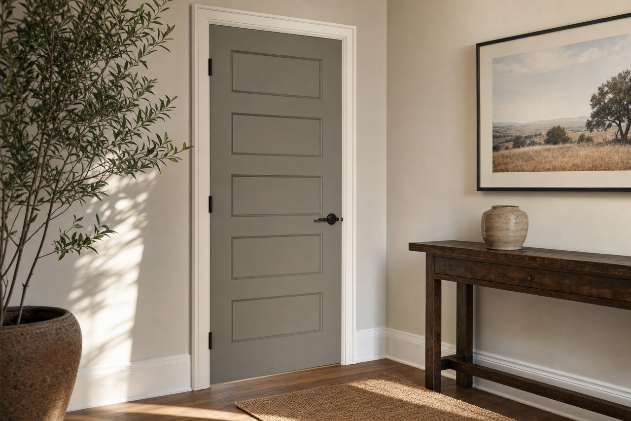
Link Gray works wonderfully as a primary wall color in living rooms, bedrooms, dining areas, and entryways. Its understated elegance provides a neutral backdrop that allows other design elements—such as furniture, artwork, and textiles—to shine.
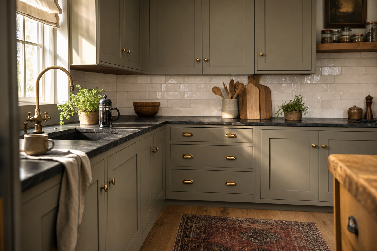
2. Trim & Cabinetry
For a sleek and modern aesthetic, consider using Link Gray on trim, cabinetry, or built-ins. Pair it with a lighter wall color, such as Pure White (SW 7005), to create contrast and sophistication.
3. Transitional Spaces
Hallways, staircases, and mudrooms are ideal candidates for Link Gray. Its neutral tone makes these transitional spaces feel cohesive and connected to the rest of the home.
4. Offices & Commercial Spaces
Link Gray's balanced undertones make it a popular choice for office spaces, conference rooms, and retail environments. It fosters a calm and professional atmosphere while allowing flexibility in decor.
Lighting & Room Style Considerations
The way Link Gray appears in your space can vary depending on the lighting and surrounding decor. In rooms with abundant natural light, it leans cooler, while dimmer spaces with warm artificial lighting highlight its taupe undertones. Consider pairing Link Gray with metallic finishes like brushed nickel or gold accents for a luxurious touch. For flooring, it coordinates well with both dark hardwoods and lighter-toned carpets or tiles.
Whether you're designing a cozy retreat or a sophisticated gathering space, Sherwin-Williams Link Gray (SW 6200) is a universally appealing choice that adds depth and subtle charm to any environment.