Sherwin-Williams Thunderous (SW 6201): A Bold and Sophisticated Neutral
Sherwin-Williams Thunderous (SW 6201) is an unforgettable paint color that combines modern sophistication with a timeless, earthy appeal. This stunning shade is a deep gray-green that exudes warmth and depth, making it the perfect choice for creating spaces that feel grounded, refined, and effortlessly stylish. Whether you're aiming for a cozy retreat or a dramatic focal point, Thunderous offers the versatility and character to elevate your interior design.
Undertones of Sherwin-Williams Thunderous
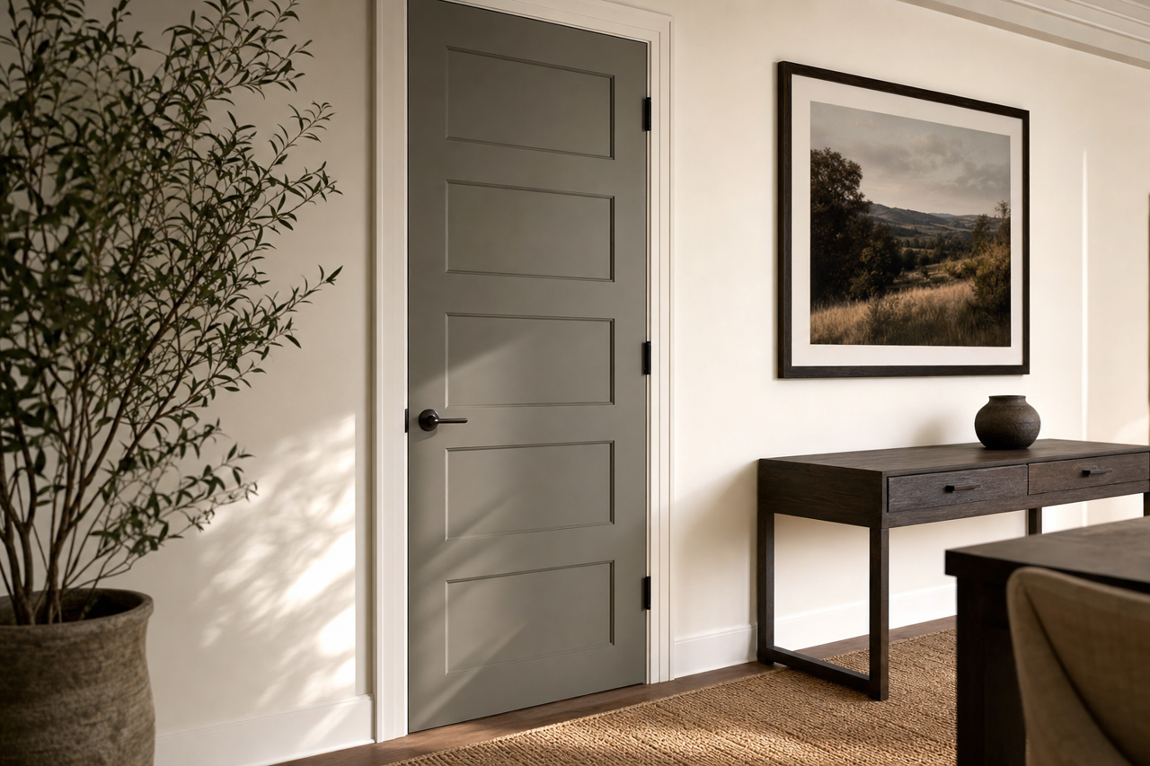
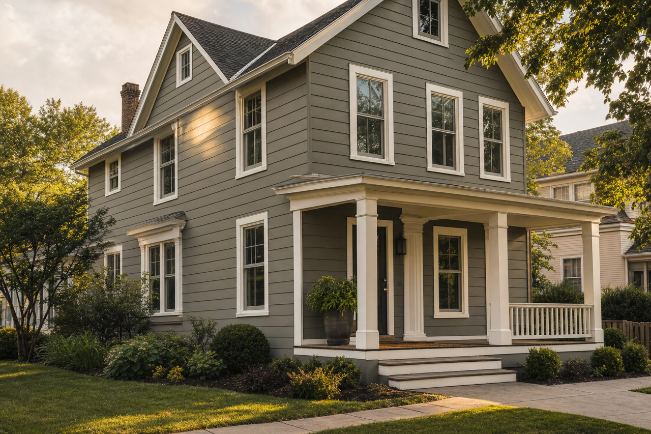
Thunderous is a rich, medium-to-dark neutral with complex undertones that make it uniquely captivating. It features a noticeable green undertone, giving it a natural and organic vibe, while subtle hints of gray soften the color and enhance its versatility. The balance between green and gray ensures Thunderous works beautifully in spaces where you want to evoke calm, sophistication, and a connection to nature.
Because of its green undertone, Thunderous pairs exceptionally well with wood tones, stone accents, and other earthy elements. It’s important to consider lighting, as this color can shift slightly depending on the light source. In cooler lighting, the gray undertones may become more prominent, while warmer lighting will amplify its green richness.
Coordinating Colors for Thunderous
Sherwin-Williams Thunderous thrives when paired with complementary hues that enhance its depth and complexity. Here are some ideas for coordinating colors that work harmoniously with Thunderous:
Whites and Off-Whites:
For crisp contrast, pair Thunderous with clean whites like Snowbound (SW 7004) or Pure White (SW 7005). These shades provide a fresh and airy balance against Thunderous’s darker tones.Soft Neutrals:
Create a seamless, layered look with warm neutrals like Accessible Beige (SW 7036) or Balanced Beige (SW 7037). These colors add a cozy, inviting touch to your space.Deep Accents:
For a bold and dramatic palette, consider pairing Thunderous with darker accents like Iron Ore (SW 7069) or Urbane Bronze (SW 7048). These deep, moody colors amplify Thunderous’s sophistication and add a modern edge.Earthy Greens and Blues:
Enhance the green undertones in Thunderous by pairing it with complementary hues like Evergreen Fog (SW 9130) or Rainwashed (SW 6211). These soft, nature-inspired colors bring balance and harmony to the palette.
Best Uses for Sherwin-Williams Thunderous
Thunderous is an incredibly versatile color that can be used in a variety of spaces to create different moods and aesthetics. Its bold yet neutral qualities make it suitable for both residential and commercial interiors.
Living Rooms and Family Spaces
Thunderous can transform living rooms into cozy, inviting retreats. Pair it with natural textures like linen, jute, or reclaimed wood to enhance its earthy character. Add pops of white or metallic accents to brighten the space and create visual interest.
Bedrooms
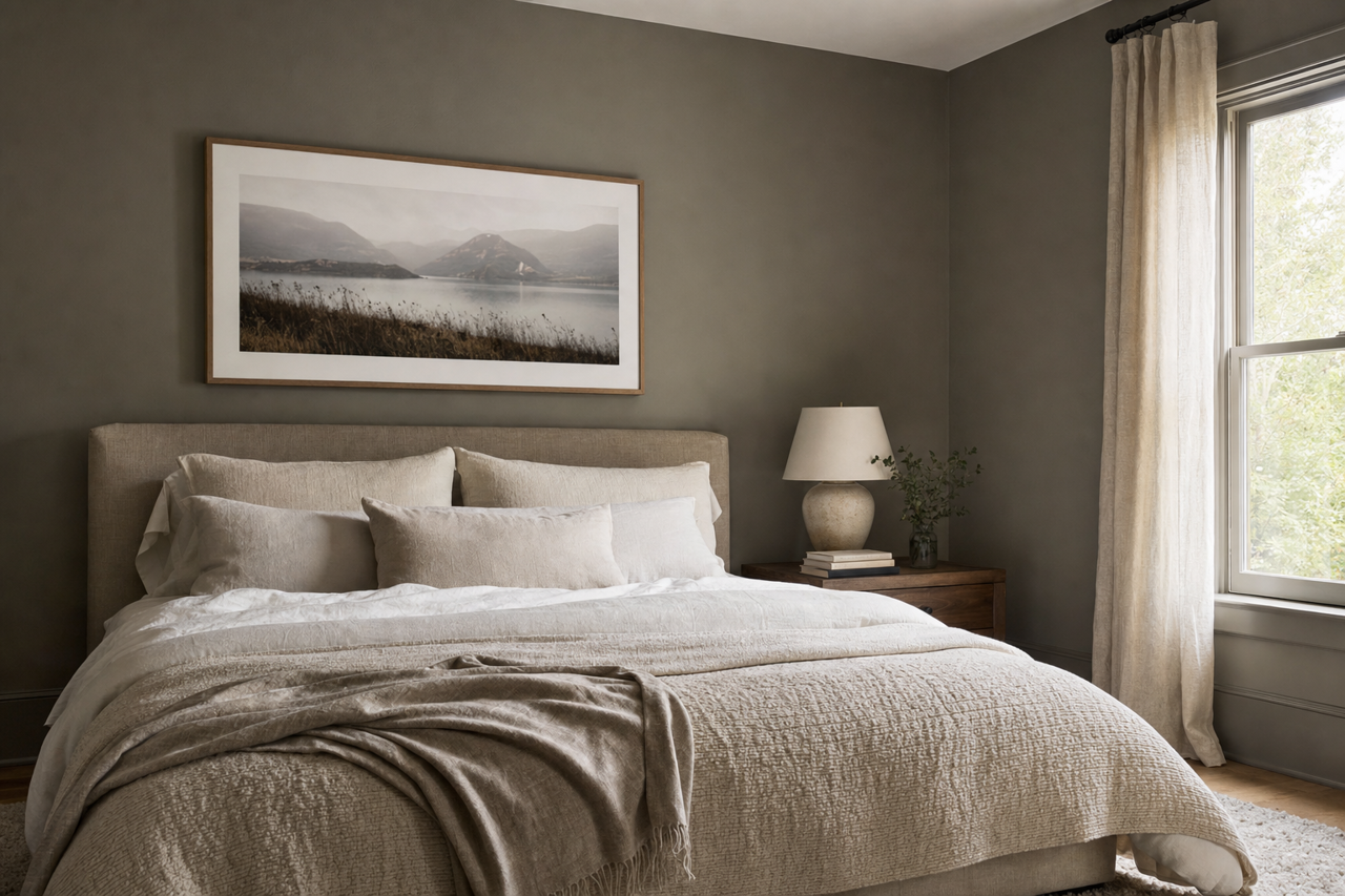
In bedrooms, Thunderous creates a serene and restful atmosphere. Combine it with soft bedding in whites or muted greens for a tranquil vibe. Incorporate warm lighting fixtures to draw out its rich undertones and make the space feel cozy.
Dining Rooms and Kitchens
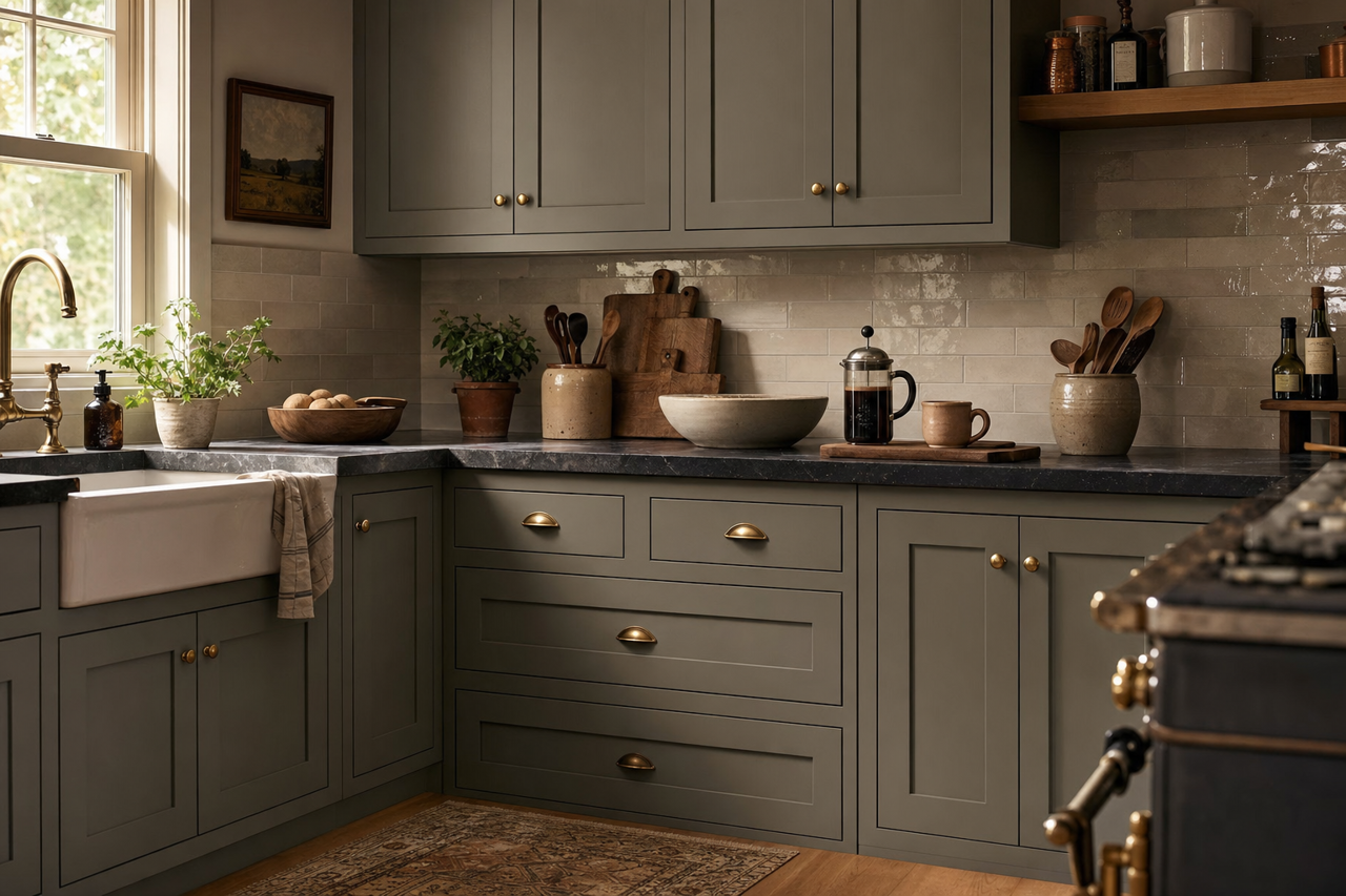
For dining rooms or kitchens, Thunderous adds an upscale, dramatic flair. It pairs beautifully with dark wood furniture, brass hardware, and stone countertops. Consider using it as an accent wall or cabinetry color to make a bold statement.
Bathrooms
Thunderous’s connection to nature makes it ideal for spa-like bathrooms. Pair it with white subway tiles, marble accents, and lush greenery for a refreshing retreat. The gray-green hue creates a soothing backdrop that complements modern or traditional designs.
Accent Walls
If you’re looking for a way to introduce depth and dimension to a space, Thunderous works beautifully as an accent wall. Whether it’s behind a bed, fireplace, or gallery wall, this color draws the eye and creates a focal point that feels both sophisticated and grounded.
Why Choose Sherwin-Williams Thunderous?
Sherwin-Williams Thunderous (SW 6201) is a bold yet approachable neutral that bridges the gap between contemporary and timeless design. Its complex gray-green undertones allow it to adapt to a wide range of styles, from rustic and organic to sleek and modern. Whether you’re designing an entire room or adding a touch of drama to your home, Thunderous offers versatility, elegance, and a connection to nature that will elevate your space.