Sherwin-Williams Rainwashed SW 6211: A Serene and Versatile Hue
Sherwin-Williams Rainwashed SW 6211 is a soft, tranquil paint color that effortlessly blends subtle sophistication with a natural-inspired aesthetic. This harmonious hue is part of Sherwin-Williams' Green Paint Color family but reads as a delicate blend of green and blue, creating an airy, spa-like atmosphere. Its versatility makes it a sought-after choice for various interior and exterior spaces, offering a timeless, calming effect that homeowners and designers alike adore.
Undertones of Rainwashed SW 6211
One of the most captivating aspects of Rainwashed is its subtle undertones. This color carries a gentle balance of green and blue, with a slight gray undertone that tempers its vibrancy. The gray undertone ensures that Rainwashed doesn’t feel overly bright or saturated, making it an elegant choice for those seeking a muted, refined look. Depending on the lighting, Rainwashed may lean more green in spaces with warm light or more blue in areas with cooler lighting. This chameleon-like quality gives it a dynamic charm that adapts beautifully to different environments.
Coordinating Colors for Rainwashed SW 6211
Rainwashed pairs effortlessly with a variety of complementary colors, making it ideal for creating cohesive palettes in your home. Here are a few standout options:
Neutral Pairings
- Extra White SW 7006: A crisp, clean white for trim, ceilings, or cabinetry.
- Alabaster SW 7008: A soft, warm white that adds a touch of warmth without overpowering Rainwashed’s cool tones.
- Accessible Beige SW 7036: A versatile greige that balances warm and cool tones for a harmonious look.
Accent Colors
- Sea Salt SW 6204: A subtle, muted green that complements Rainwashed’s serene vibe.
- Naval SW 6244: A deep, bold navy blue that creates a striking contrast for accents or feature walls.
- Coral Reef SW 6606: A cheerful, coral hue that adds warmth and energy to the palette.
Dark Contrast
- Peppercorn SW 7674: A deep charcoal gray that provides dramatic contrast for a modern, sophisticated edge.
Ideal Uses for Rainwashed SW 6211
Rainwashed’s soothing and versatile nature makes it an excellent choice for a wide range of interior and exterior applications. Here are some ways to incorporate this color into your space:
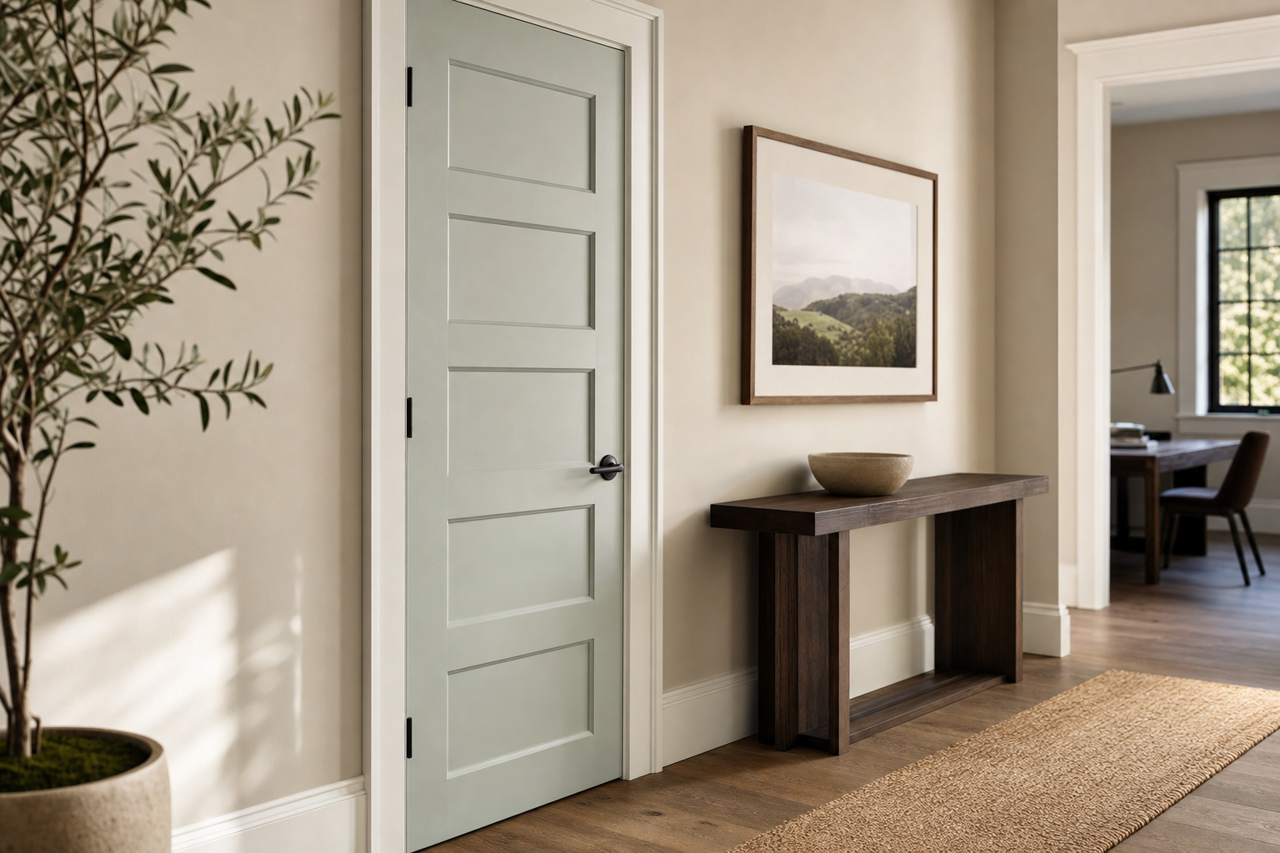
Living Spaces
Rainwashed is a fantastic option for living rooms and family spaces where you want to create a relaxed and inviting atmosphere. Pair it with natural materials like light wood flooring or woven textures to enhance its organic, serene quality.
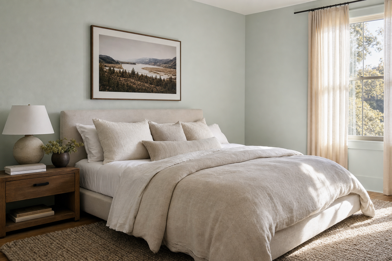
Bedrooms
Transform your bedroom into a peaceful retreat by using Rainwashed on walls or even furniture. Its soft, calming tones promote relaxation and restful sleep, especially when paired with crisp white linens or muted pastel accents.
Bathrooms
Rainwashed is often chosen for bathrooms because of its spa-like vibe. It evokes the feeling of being near water, making it perfect for spaces where you seek tranquility. Pair it with white subway tile, marble countertops, or brushed nickel fixtures for a clean and timeless aesthetic.
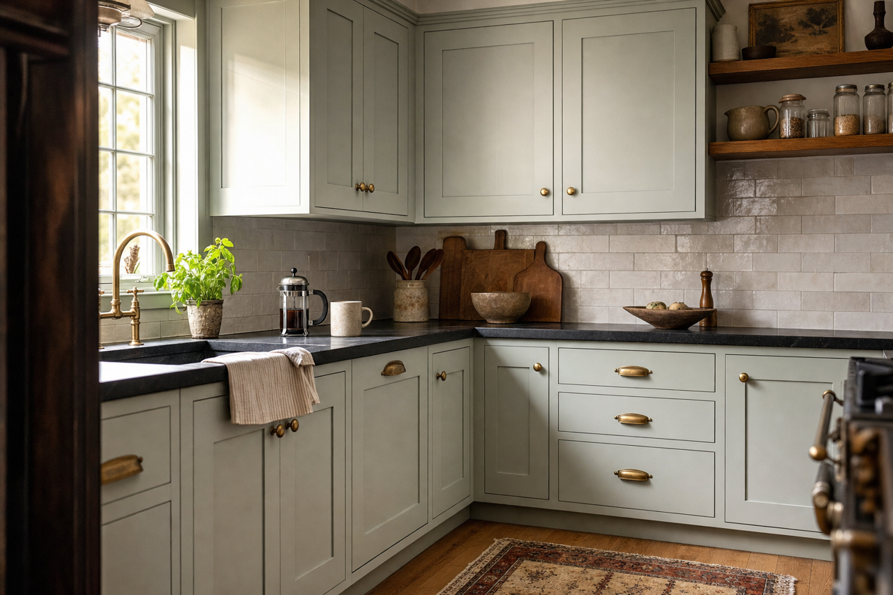
Kitchens
For a fresh and airy kitchen, consider Rainwashed for cabinetry or walls. It pairs beautifully with white or gray countertops and stainless steel appliances, delivering a modern yet welcoming feel.
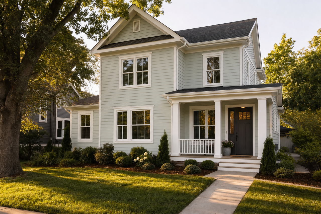
Exterior
Rainwashed also works wonderfully on exteriors, giving homes a soft, coastal-inspired look. It pairs well with white trim and darker shutter colors, such as navy or charcoal, for a balanced and eye-catching façade.
Lighting Considerations
Lighting plays a crucial role in how Rainwashed appears in your space. In rooms with abundant natural light, the color may lean more blue or green, creating a fresh and breezy effect. In spaces with artificial or warm lighting,