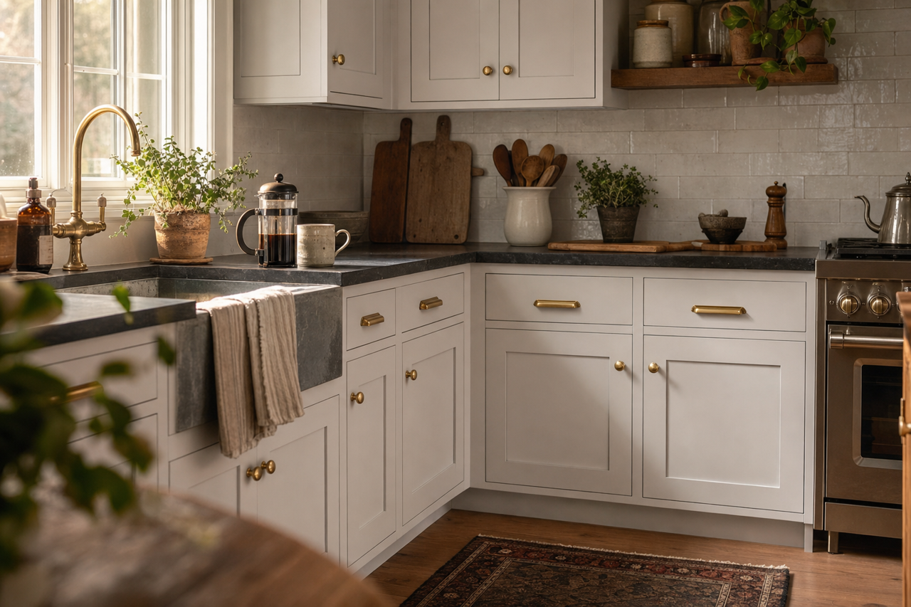



Sherwin-Williams Destiny (SW 6274): A Serene, Versatile Hue for Your Space
Sherwin-Williams Destiny (SW 6274) is a captivating and versatile shade that falls into the blue-violet family, offering a serene and sophisticated ambiance. With its soft, muted tones, Destiny balances a perfect harmony between coolness and warmth, making it a popular choice for creating tranquil and inviting interiors. Whether you're designing a calming bedroom retreat, a chic living room, or a relaxing spa-like bathroom, this hue brings an understated elegance to any space.
Undertones of Sherwin-Williams Destiny (SW 6274)
Destiny 6274 is a nuanced color with subtle undertones that make it highly adaptable. Its primary undertone is a soft violet, which gives it a slight warmth while still maintaining its cool blue base. Depending on the lighting in your space, the color may lean more toward a lavender-gray or a subdued periwinkle. In natural daylight, you’ll notice its blue tones softly glowing, while under artificial lighting, its violet undertones may become more prominent, lending a cozy feel.
This delicate balance of undertones makes Destiny a fantastic choice for homeowners who want a color that’s adaptable and sophisticated without being overly bold.
Coordinating Colors for Sherwin-Williams Destiny
Destiny is a versatile shade that pairs beautifully with a wide variety of colors. Whether you’re aiming for a monochromatic look or a more layered, complementary palette, here are some coordinating color options to consider:
Neutral Coordinating Colors
- Sherwin-Williams Alabaster (SW 7008): A soft, creamy white that provides a crisp and clean contrast to Destiny’s muted blue-violet tones.
- Sherwin-Williams Agreeable Gray (SW 7029): A warm greige that complements the subtle undertones of Destiny while adding a touch of warmth to the palette.
- Sherwin-Williams Dovetail (SW 7018): A rich, medium gray that adds depth and sophistication to the overall color scheme.
Bold, Contrasting Colors
- Sherwin-Williams Naval (SW 6244): A deep, striking navy blue that provides dramatic contrast and makes Destiny’s softer tones pop.
- Sherwin-Williams Coral Reef (SW 6606): A vibrant coral that brings a playful energy to the design, perfect for accent pieces or feature walls.
Harmonizing Colors
- Sherwin-Williams Silvermist (SW 7621): A soft, silvery blue-green that complements Destiny’s cool undertones for a serene and cohesive look.
- Sherwin-Williams Mythical (SW 6228): A muted lavender-gray that enhances Destiny’s violet undertones for a beautifully monochromatic style.
Ideal Uses for Sherwin-Williams Destiny
The versatility of Sherwin-Williams Destiny makes it a great choice for a wide range of applications in both residential and commercial spaces. Here are some suggestions for where and how to use this serene shade:
Bedrooms
Destiny’s calming and tranquil qualities make it an excellent choice for bedrooms. Pair it with soft white bedding, natural wood furniture, and textured fabrics for a cozy, spa-like retreat.
Living Rooms
In living spaces, Destiny can create a soothing backdrop that works well with both traditional and modern designs. Use it on walls alongside neutral furniture and metallic accents for a polished, sophisticated feel.
Bathrooms
For a relaxing, spa-inspired bathroom, Destiny shines when paired with white or light gray tiles, chrome fixtures, and soft, fluffy towels. Its cool undertones evoke a sense of peace and rejuvenation.
Offices
If you want a workspace that fosters focus and creativity, Destiny is a great choice. Its soft violet undertones are inspiring without being distracting, helping you strike the right balance between productivity and calmness.