Sherwin-Williams Bravado Red (6320): A Bold and Timeless Hue
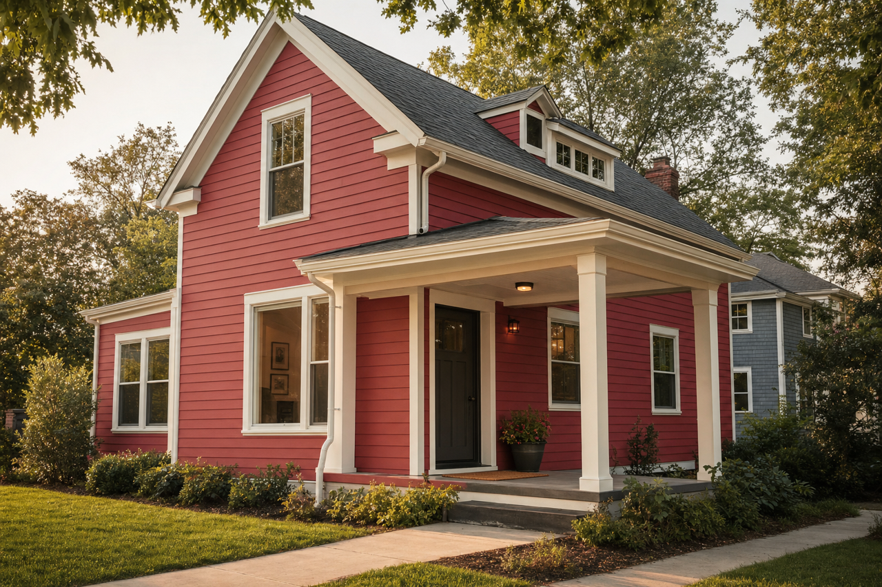
Sherwin-Williams Bravado Red (6320) is a striking and sophisticated color that exudes warmth, confidence, and elegance. As part of Sherwin-Williams' rich palette of reds, Bravado Red makes an impactful statement in any space, effortlessly balancing boldness with a sense of refinement. This color is ideal for homeowners and designers looking to infuse interiors with passion and energy while maintaining a timeless aesthetic.
Color Profile and Undertones
Bravado Red is a deep, rich red with subtle brown undertones that give it a grounded and earthy quality. These undertones soften the vibrancy of the red, making it more versatile and suitable for both traditional and contemporary spaces. The brown influence lends it a natural warmth, ensuring it doesn’t feel too overpowering or stark. This balance makes Bravado Red perfect for creating cozy yet dramatic environments.
The undertones also allow the color to adapt beautifully to various lighting conditions. In brighter spaces, Bravado Red may reveal its lively, passionate side, while in dimmer settings, it deepens into a more subdued and intimate tone. This adaptability makes it a versatile choice for rooms that transition between day and evening use.
Coordinating Colors
Bravado Red pairs wonderfully with a variety of complementary and contrasting hues, allowing you to craft a cohesive and visually stunning palette. Here are some excellent coordinating colors:
Neutral Pairings: To balance the vibrancy of Bravado Red, consider soft neutrals like Sherwin-Williams Accessible Beige (SW 7036) or Alabaster (SW 7008). These tones provide a calming counterpoint, ensuring the red doesn’t overwhelm the space.
Earthy Accents: For a harmonious, nature-inspired palette, pair Bravado Red with warm browns like Sherwin-Williams Latte (SW 6108) or deep greens like Sherwin-Williams Rosemary (SW 6187). These colors enhance the earthy undertones of Bravado Red, creating a grounded and sophisticated look.
Metallic Complements: Bravado Red shines when paired with metallics like gold, bronze, or brushed brass. Consider adding accents like hardware, lighting fixtures, or decorative pieces in these finishes for a touch of glamour.
Contrasting Colors: If you're aiming for a bold and energetic vibe, pair Bravado Red with cooler tones like Sherwin-Williams Naval (SW 6244) or Snowbound (SW 7004). These contrasts create striking visual interest and add depth to the space.
Uses of Bravado Red
Bravado Red is a versatile color that can be used in a variety of design applications to create spaces that are inviting, dramatic, and memorable. Here are some ways to incorporate it into your interior design:
Accent Walls
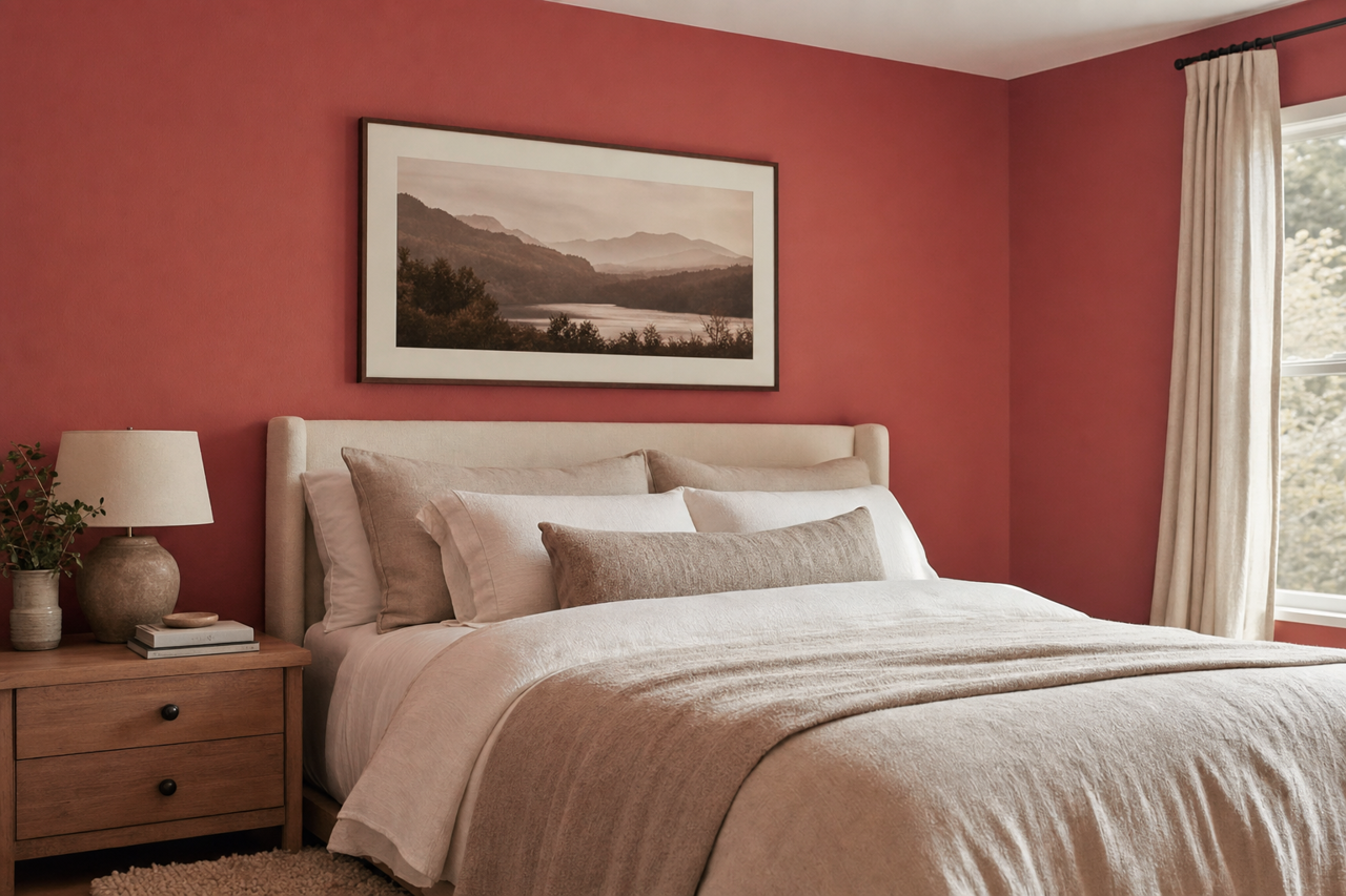
Bravado Red is an excellent choice for accent walls in living rooms, dining areas, or bedrooms. Its bold presence draws attention without overwhelming the space. Pair it with neutral walls and furnishings to let the color truly shine.
Dining Rooms
Red tones, particularly deeper ones like Bravado Red, are known to stimulate appetite and encourage conversation, making them perfect for dining spaces. Combine it with warm wood tones and dimmed lighting for a cozy, intimate ambiance.
Entryways
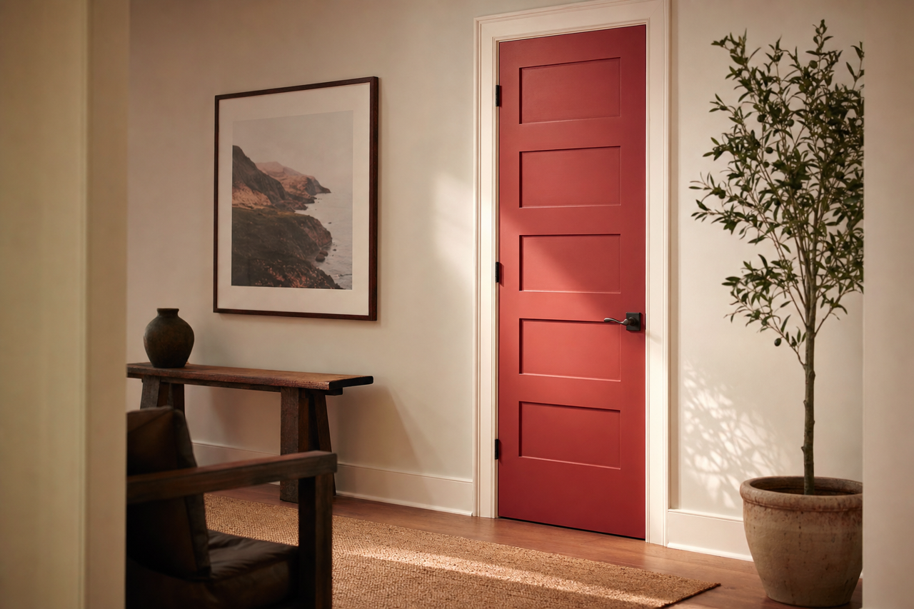
Make a lasting first impression by using Bravado Red in your entryway. Its boldness sets the tone for the rest of the home, creating a welcoming yet dramatic introduction.
Furniture and Cabinetry
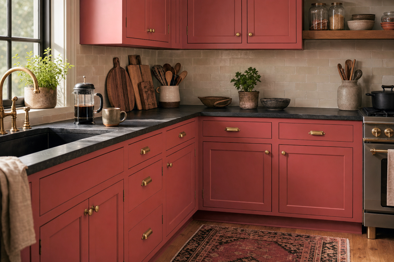
For a modern twist, use Bravado Red on furniture or cabinetry. Painted kitchen islands, bookshelves, or bathroom vanities in this color will add a unique design element that feels both contemporary and timeless.
Bedrooms
Though red may not be the first choice for bedrooms, the earthy undertones in Bravado Red make it a viable option for creating a warm and cocoon-like retreat. Pair it with soft textiles and calming neutrals to balance its boldness.
Commercial Spaces
Bravado Red is also ideal for commercial spaces such as restaurants, boutique stores, or offices. Its rich and confident tone can set the mood for an upscale, sophisticated environment that leaves a lasting impression.
Design Considerations
When working with Bravado Red, consider the size of the space and the amount of natural light available. In smaller rooms, it’s best to use this color sparingly, such as on accent walls or furniture, to avoid making the space feel cramped. In larger areas with ample light, don’t hesitate to use Bravado Red more generously for a bold and dramatic effect.
Textures and finishes also play a role in how Bravado Red is perceived. Matte finishes will give it a soft, understated appearance, while gloss or satin finishes will amplify its richness and depth. Incorporate contrasting textures—like velvet upholstery or natural wood—to enhance the overall design.
Sherwin-Williams Bravado Red (6320) is more than just a paint color; it’s a statement. Its bold yet versatile nature allows it to transform spaces into warm, inviting, and visually stunning environments. Whether used sparingly or generously, this hue is sure to imbue your home or project with timeless elegance and undeniable personality.