Sherwin-Williams Constant Coral 6325: A Vibrant and Versatile Hue
Sherwin-Williams Constant Coral 6325 is a bold, invigorating color that instantly adds energy and warmth to any space. This vibrant coral hue is the perfect balance of pink and orange, creating a lively yet sophisticated atmosphere. Whether you're looking to make a statement in your living room, create a cheerful bedroom retreat, or bring a pop of color to a neutral palette, Constant Coral is a dynamic choice that commands attention.
Undertones of Constant Coral 6325
Constant Coral is a blend of warm undertones that lean towards peachy pink with subtle hints of orange. Its undertones evoke feelings of optimism and playfulness, making it an uplifting and inviting color. The warmth of this shade ensures it pairs beautifully with a variety of coordinating colors and materials, from soft neutrals to rich, earthy tones.
Coordinating Colors
To make the most of Constant Coral's lively personality, here are some exceptional coordinating colors that complement its vibrancy:
Neutral Pairings:
- Alabaster (SW 7008): A soft, creamy white that provides a clean and calming contrast.
- Agreeable Gray (SW 7029): A versatile, greige tone that balances Constant Coral’s brightness with a grounding effect.
Earthy Complements:
- Dried Thyme (SW 6186): A muted green that evokes nature and adds depth when paired with Constant Coral.
- Cavern Clay (SW 7701): A warm, terracotta-inspired tone that harmonizes beautifully with the coral’s warmth.
Bold Accents:
- Naval (SW 6244): A deep navy blue that creates a striking and dramatic contrast.
- Goldfinch (SW 6905): A cheerful yellow that enhances the playful side of Constant Coral.
Ideal Uses for Constant Coral
Constant Coral is a versatile shade that can be used in a variety of settings, both residential and commercial. Here are some ideas for incorporating it into your space:
Living Rooms and Common Areas
Use Constant Coral as an accent wall to energize a living room or dining space. Its warm and inviting tone fosters a sense of togetherness, making it ideal for areas where people gather. Pair it with neutral furniture and gold or brass accents for a chic, modern look.
Bedrooms
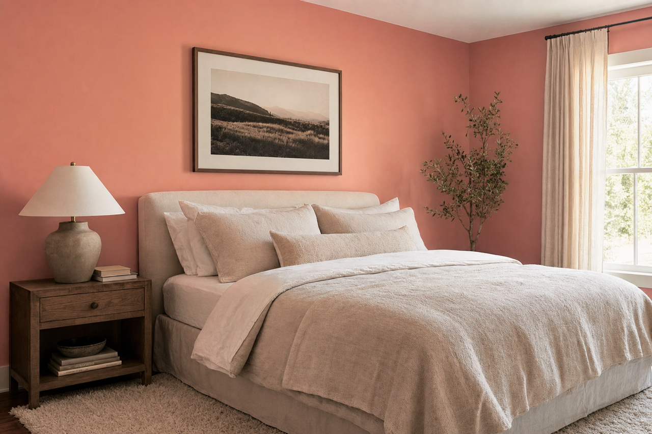
For a bedroom, Constant Coral can be used to create a cozy and cheerful retreat. Consider pairing it with soft white linens and light wood furniture for a balanced, airy feel. Its uplifting undertones work well for children’s bedrooms, adding a playful yet sophisticated touch.
Bathrooms and Powder Rooms
A powder room is an excellent space to experiment with bold colors, and Constant Coral is no exception. Its vibrant hue can make a small bathroom feel like a jewel box. Pair it with metallic finishes like brushed gold or polished chrome for a luxe look.
Kitchens
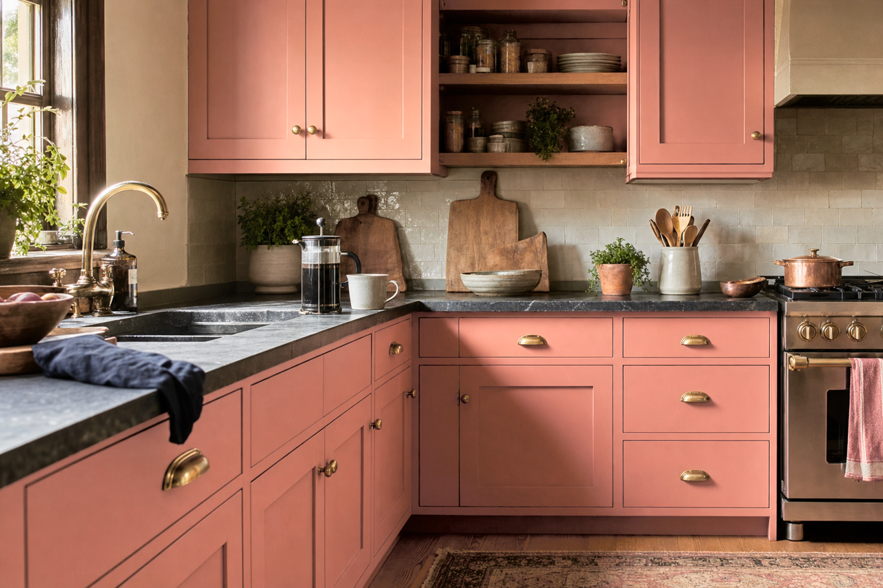
Bring warmth and personality to your kitchen by using Constant Coral on cabinets or as a backsplash color. It pairs beautifully with white countertops and natural wood tones, creating a fresh and inviting space.
Exteriors
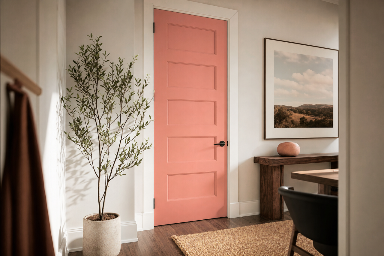
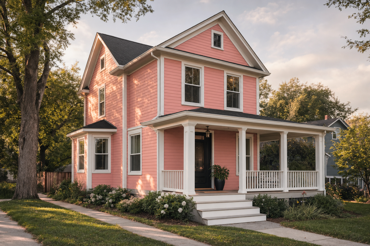
Constant Coral can also be used to add curb appeal. It works well as a front door color or an accent for shutters, especially when paired with a neutral exterior like Dover White (SW 6385) or Iron Ore (SW 7069).
The Mood and Ambiance of Constant Coral
This vibrant coral hue exudes energy, positivity, and creativity. It’s a great choice for spaces where you want to feel inspired and uplifted. While it’s bold enough to stand out on its own, it can also be used in moderation to add a playful touch to an otherwise subdued palette.