Sherwin-Williams Autumnal (6361) is a rich, inviting color that evokes the warmth and charm of fall foliage and earthy landscapes. Perfect for creating a comforting atmosphere, this warm orange-brown hue brings a sense of depth and timeless sophistication to any space. Whether you're designing a rustic retreat or adding a touch of autumnal warmth to a modern home, Autumnal delivers versatility and character.
Autumnal features subtle undertones of red and golden brown, which give it its signature rich appearance. These undertones add warmth and vibrancy, making the color feel grounded yet dynamic. While predominantly an earthy shade, its red undertones make it particularly powerful in spaces where you want to evoke passion, energy, and warmth. The golden undertones soften the overall effect, ensuring the color feels approachable and balanced rather than overwhelming.
Sherwin-Williams Autumnal pairs beautifully with a range of complementary and contrasting hues. Here are some recommendations for coordinating colors:
Autumnal is a versatile color suitable for a variety of spaces and design styles. Here are some ideas on how to incorporate it into your home:
If you're looking to make a bold statement, Autumnal works wonderfully as an accent wall. Its earthy richness draws the eye and creates a focal point in living rooms, dining areas, or bedrooms. Pair it with neutral furniture and décor to keep the overall look balanced.
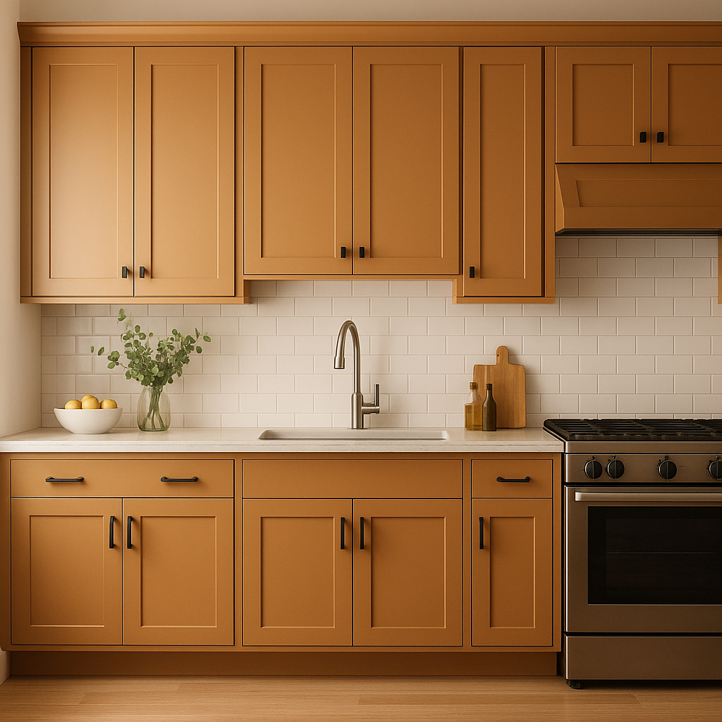
Autumnal's warm, inviting nature makes it an excellent choice for dining rooms or kitchens. It enhances the appetite, stimulates conversation, and creates a cozy environment for meals and gatherings. Pair it with wood finishes or brass accents for a timeless, elegant look.
Autumnal is inherently tied to nature, making it a perfect fit for rustic or farmhouse-style interiors. Combine it with reclaimed wood furniture, natural fibers, and earthy décor to emphasize its organic beauty.
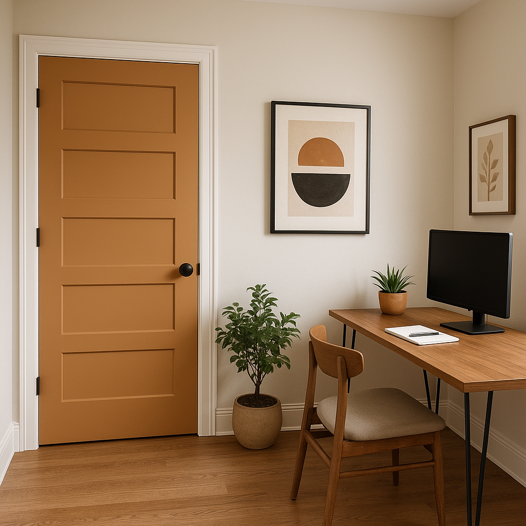
For a touch of seasonal charm, use Autumnal on your front door or as an exterior trim color. It pairs beautifully with natural stone, brick, or stucco finishes, making it a standout choice for curb appeal.
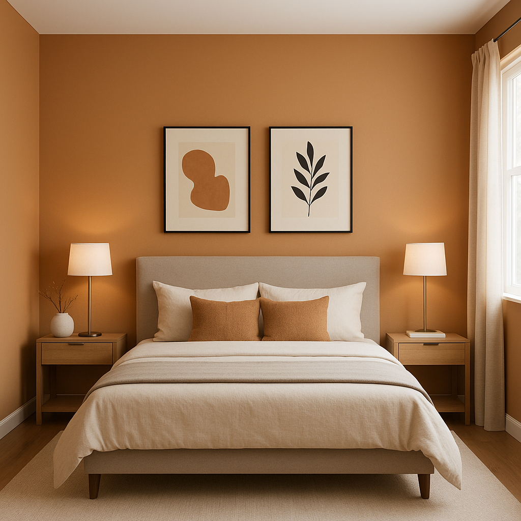
Create a comforting retreat in bedrooms or living spaces by using Autumnal as the main wall color. Incorporate soft textures like linen, wool, or velvet to enhance the cozy vibe.
Autumnal's warmth can shift depending on the lighting in your space. In natural daylight, it appears brighter and more vibrant, with its red and orange undertones taking center stage. In artificial or dim lighting, the deeper brown tones emerge, creating a more subdued and intimate atmosphere. Consider testing the color in your space at different times of day to ensure it fits the mood you want to create.
Sherwin-Williams Autumnal (6361) is more than just a color—it’s a mood, a feeling, and an invitation to embrace warmth and comfort. With its versatile undertones, harmonious coordinating colors, and adaptability in various spaces, Autumnal is the perfect choice for anyone looking to bring a touch of fall-inspired elegance into their home.
Note: These images were all generated with AI, there may be inaccurate color results. Please only use a general reference to get a rough idea of what a color may look like, we will continue to generate new images to improve accuracy.
View Colors Only by Brand (No Imagery):
Sherwin-Williams
|
Benjamin-Moore
|
Behr
|
Valspar
Live on the Eastern Slope of Colorado and looking for a local painting professional, check out all our painting services and reach out for a free estimate.
Copyright © 2026 : Wild Fox Painting Inc. : 12435 Mead Way, Littleton, CO 80125


