
Sherwin-Williams Relish (SW 6443): A Rich and Inviting Green for Timeless Interiors
Sherwin-Williams Relish (SW 6443) is a lush, medium-tone green that evokes a sense of sophistication, balance, and natural serenity. Perfect for both modern and traditional spaces, this color offers versatility and depth, making it an ideal choice for creating inviting interiors that feel grounded yet refined. Whether you're designing a cozy living room, a charming kitchen, or an elegant office, Relish adds a touch of nature-inspired beauty that feels both fresh and timeless.
Undertones of Sherwin-Williams Relish
Relish is a warm green with subtle yellow undertones, giving it an earthy richness that feels organic and approachable. These undertones lend warmth to the shade, making it more versatile across various lighting scenarios. In spaces with abundant natural light, Relish appears vibrant and lively, while in dimmer settings, it takes on a softer, more muted quality. The yellow undertones ensure Relish remains inviting and never veers into overly cool or harsh territory, making it especially suitable for spaces where comfort and relaxation are key.
Coordinating Colors for Sherwin-Williams Relish
Relish pairs beautifully with a wide range of colors, allowing you to create a harmonious palette tailored to your design vision. Consider these coordinating colors for a cohesive look:
Neutral Partners: Pair Relish with warm neutrals like Sherwin-Williams Alabaster (SW 7008) or Accessible Beige (SW 7036) for a balanced, understated aesthetic. These tones allow Relish to take center stage while creating an overall sense of calm and warmth.
Earthy Accents: Complement Relish with earthy browns and taupes such as Sherwin-Williams Urbane Bronze (SW 7048) or Virtual Taupe (SW 7039). These colors enhance the natural appeal of Relish, reinforcing its grounded and organic qualities.
Bright Contrasts: For a playful yet polished look, incorporate vibrant colors like Sherwin-Williams Coral Reef (SW 6606) or Lemon Twist (SW 6909). These bold hues create eye-catching accents and bring energy to the space.
Cool Complements: If you prefer a cooler palette, pair Relish with blues like Sherwin-Williams Naval (SW 6244) or Rainwashed (SW 6211). These tones provide a refreshing contrast while maintaining a soothing vibe.
Uses for Sherwin-Williams Relish in Interiors
Relish is a versatile color that can be used in a variety of ways to elevate your interiors. Its rich green hue makes it suitable for both bold statements and subtle accents, depending on your design intent.
Living Rooms: Use Relish as a feature wall color to create a focal point in living rooms. Pair it with neutral furnishings and natural textures like wood or linen for a cozy yet sophisticated space.
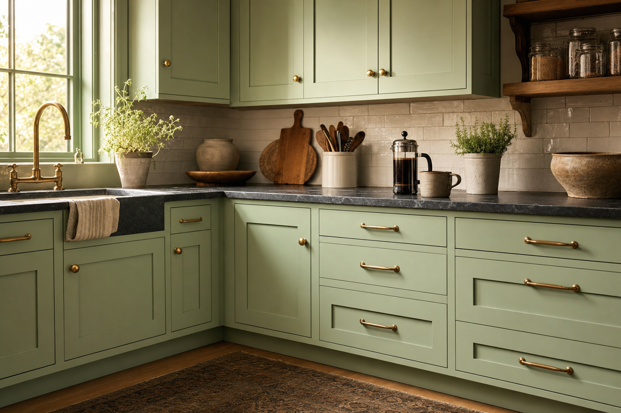
Kitchens: Relish works wonderfully in kitchens, especially when paired with white cabinetry and brass hardware. Add pops of vibrant color through textiles or decor for a fresh and inviting cooking space.
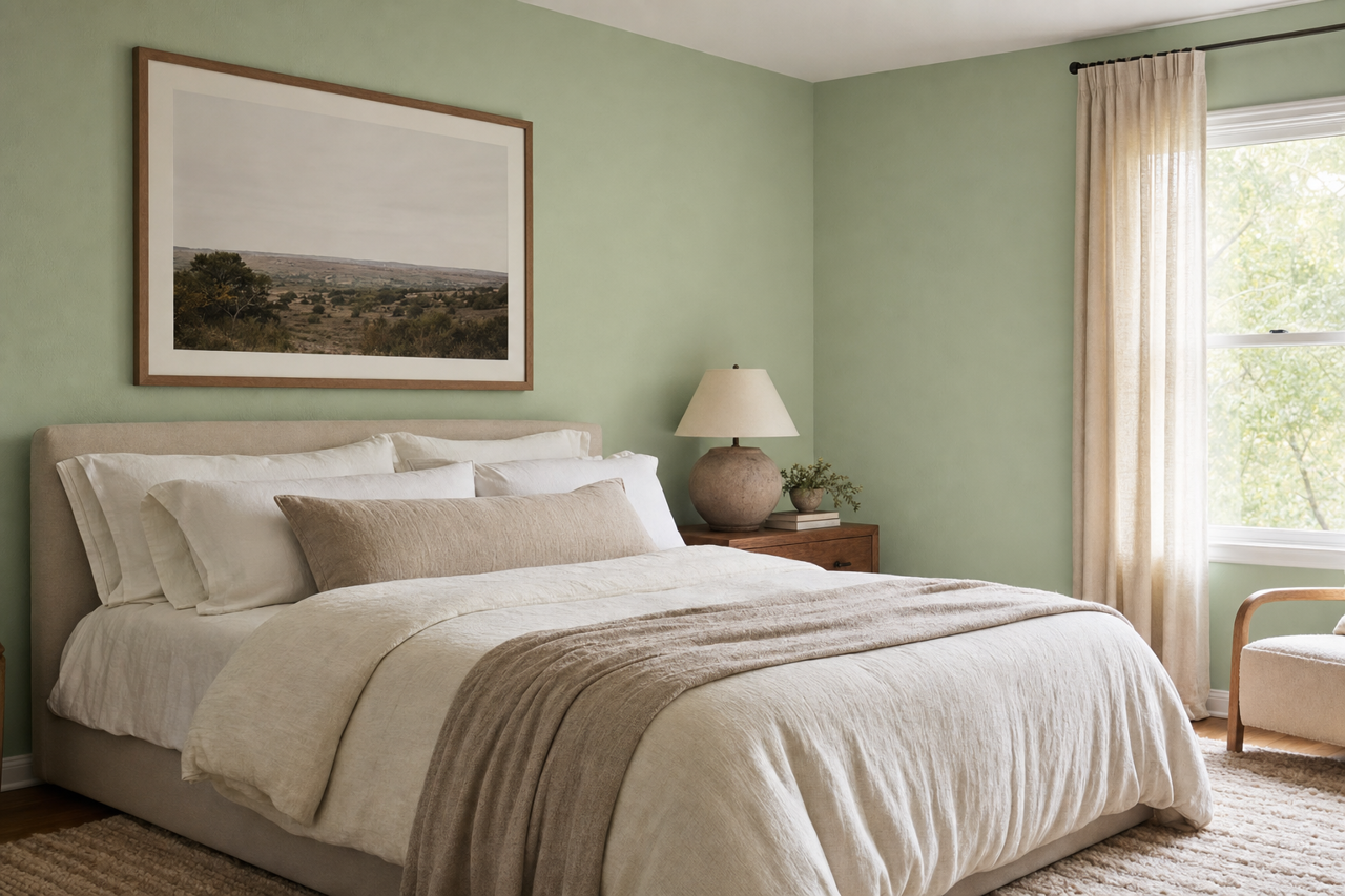
Bedrooms: Create a tranquil retreat by using Relish on bedroom walls. Pair it with soft, muted tones in bedding and curtains to enhance its calming qualities.
Dining Areas: Relish brings a sense of refinement to dining spaces. Combine it with deep wood tones for a traditional look or sleek metallic accents for a modern edge.
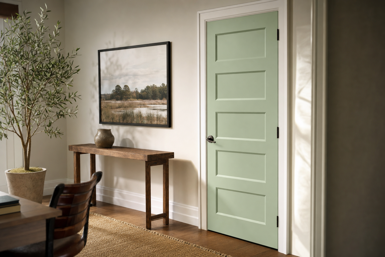
Home Offices: Infuse your workspace with energy and focus by using Relish on an accent wall or cabinetry. Its grounding nature can help boost productivity while keeping the space stylish and inspiring.
Sherwin-Williams Relish (SW 6443) is more than just a paint color—it’s a statement of warmth, vitality, and connection to nature. With its rich undertones and ability to coordinate effortlessly with a variety of hues, Relish is a perfect addition to any interior design palette. Whether used as the main color or a supporting accent, it’s sure to enhance the beauty and personality of your home.