Sherwin-Williams Purple Passage (SW 6551): A Sophisticated, Serene Hue
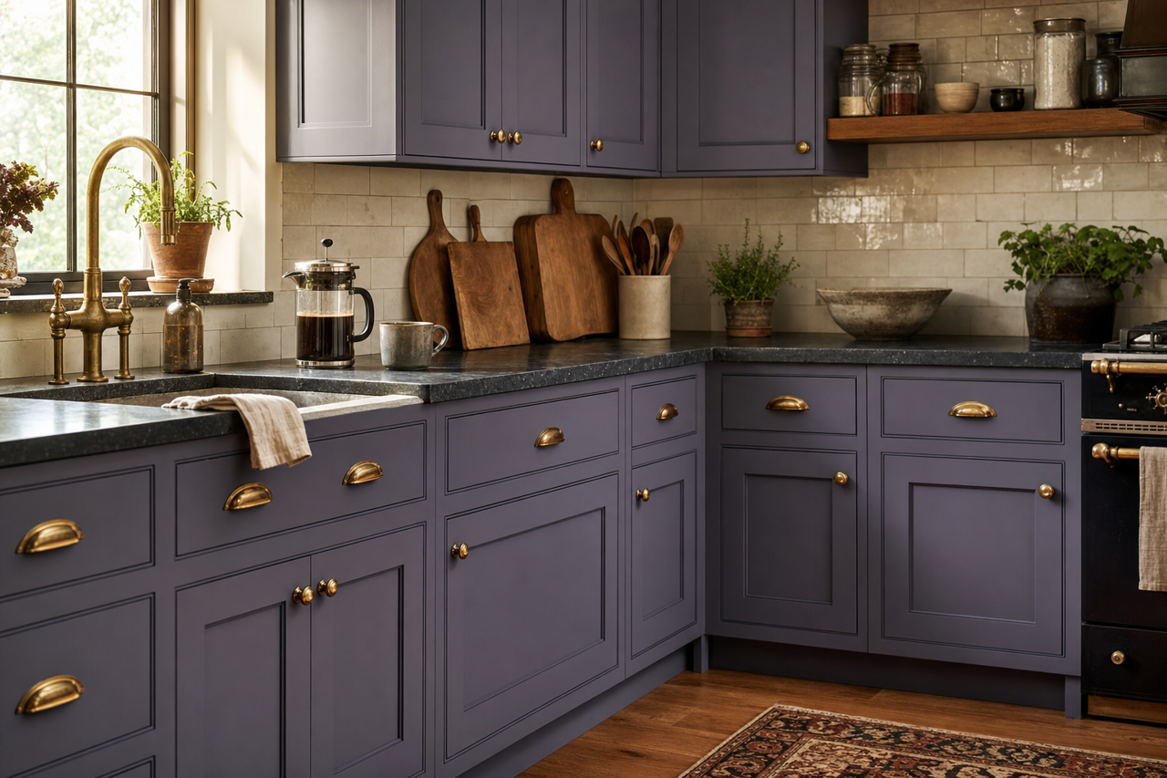
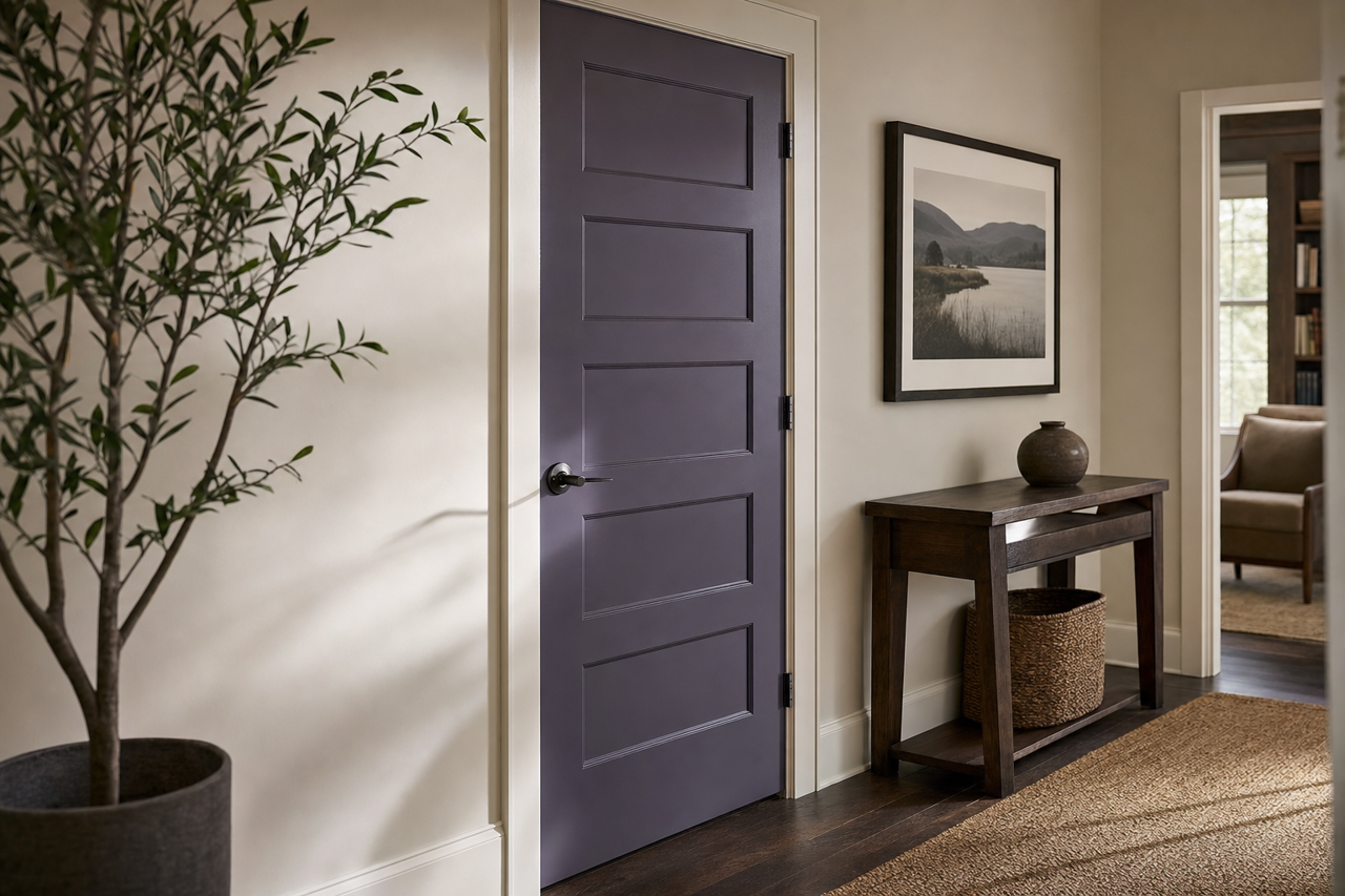
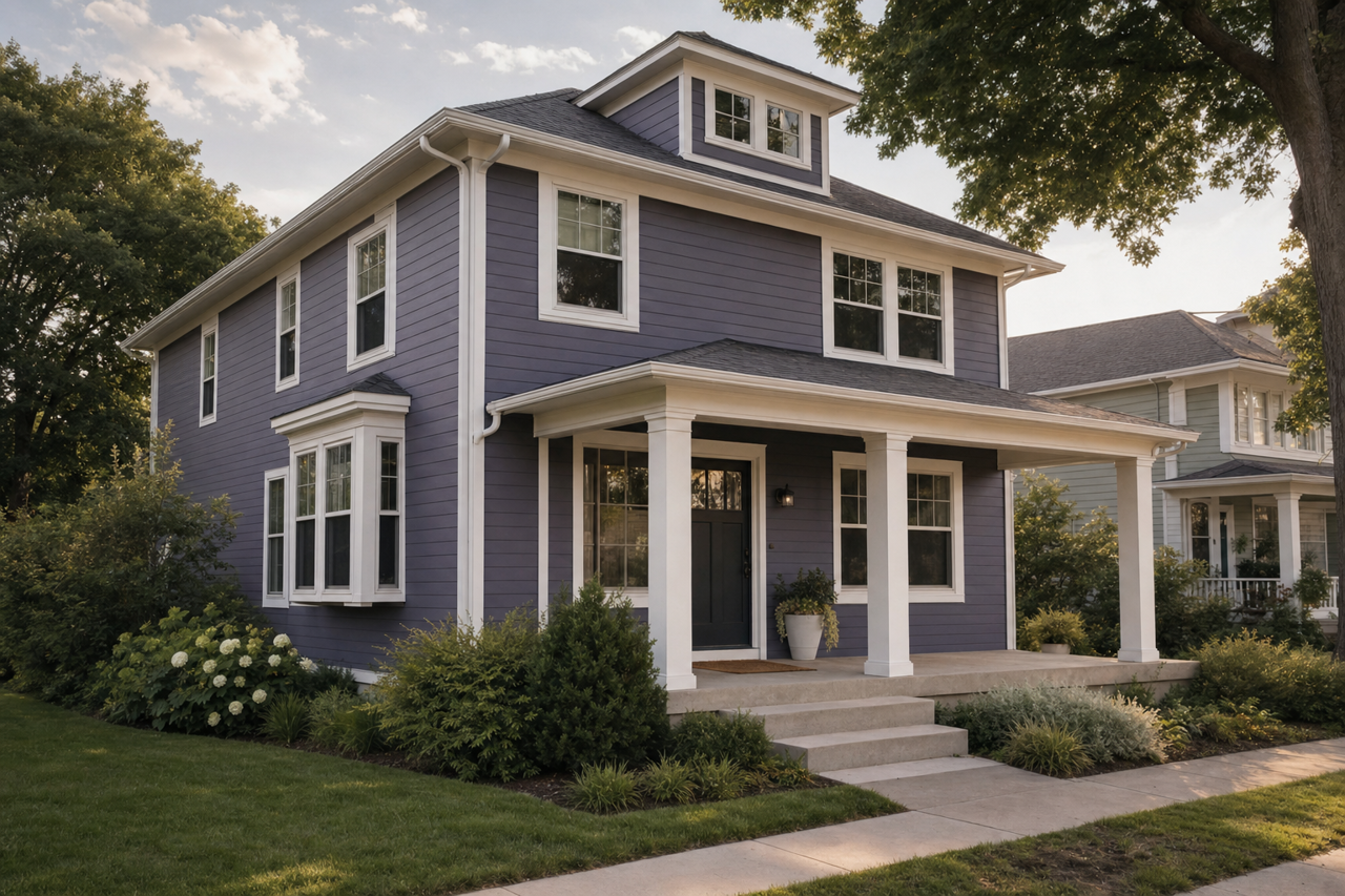
Sherwin-Williams Purple Passage (SW 6551) is a captivating shade that brings an air of mystery and refinement to any space. This enchanting color strikes the perfect balance between delicate femininity and bold sophistication, making it a versatile choice for a variety of interior design styles. Whether you're looking to create a calming retreat or a striking feature wall, Purple Passage delivers charm and character with its rich yet approachable presence.
Undertones in Sherwin-Williams Purple Passage
Purple Passage is a soft, medium-toned purple with cool undertones. Its subtle hints of blue lend a serene quality, creating a sense of tranquility and calm. These cool undertones prevent the color from feeling overly sweet or overpowering, making it a mature and elegant choice for residential or commercial spaces. The blue influence also allows Purple Passage to pair beautifully with other cool hues while maintaining its own unique personality.
Coordinating Colors for Purple Passage
Purple Passage works harmoniously with a variety of complementary tones, offering versatility in design. Here are some coordinating colors that pair beautifully with this sophisticated purple:
- Sherwin-Williams Extra White (SW 7006): A crisp, clean white that provides contrast and highlights Purple Passage’s depth.
- Sherwin-Williams Krypton (SW 6247): A soft, cool gray with blue undertones that enhances the serene qualities of Purple Passage.
- Sherwin-Williams Silvermist (SW 7621): A muted blue-green that complements the cool undertones of Purple Passage for a soothing palette.
- Sherwin-Williams Indigo Batik (SW 7602): A rich navy blue that adds depth and drama when paired with Purple Passage.
- Sherwin-Williams Eider White (SW 7014): A warm off-white that softens the space while maintaining a light, airy feel.
The versatility of Purple Passage allows for creative pairings and layering, whether you’re aiming for a classic look or a modern, eclectic vibe.
Best Uses for Sherwin-Williams Purple Passage
Purple Passage is a color that can transform rooms into tranquil escapes or make bold design statements, depending on how it’s used. Here are a few ideas for incorporating this elegant hue into your interior design:
1. Bedroom Retreats
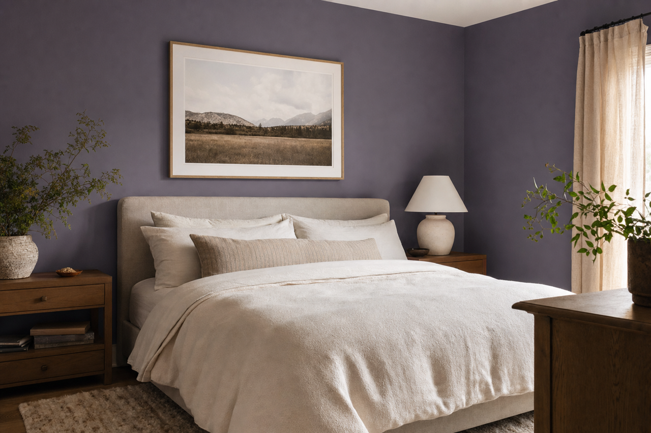
Purple Passage is ideal for bedrooms, where its calming undertones can create a relaxing sanctuary. Pair it with crisp whites for a fresh, clean aesthetic, or layer it with darker purples and grays for a cozy, cocoon-like atmosphere.
2. Accent Walls
This rich purple works beautifully as an accent wall in living rooms, dining areas, or home offices. Use it to anchor the room and add visual interest, pairing it with lighter neutrals or metallic finishes for a modern touch.
3. Children’s Rooms
For a playful yet sophisticated take on children’s spaces, Purple Passage brings a soothing energy that's far from the over-the-top vibrancy of traditional kid's room colors. Pair it with pastel accents and soft textures for a whimsical feel.
4. Bathrooms
Transform your bathroom into a spa-like retreat with Purple Passage on the walls. Its cool undertones lend themselves well to spaces filled with natural light and can be paired with white subway tiles or brushed nickel fixtures for a polished look.
5. Creative Spaces
From artist studios to reading nooks, Purple Passage sparks creativity and imagination. Its serene yet engaging qualities make it a great choice for areas where focus and relaxation go hand-in-hand.
Lighting Considerations
Purple Passage’s appearance can vary depending on the lighting in the room. In spaces with abundant natural light, its cool undertones become more pronounced, creating a soft, airy feel. In rooms with dim or artificial lighting, the hue deepens, offering a more intimate and dramatic ambiance. To get the most out of this color, test it in different lighting conditions to ensure it complements your space perfectly.
Sherwin-Williams Purple Passage (SW 6551) is more than just a color—it’s a mood, a statement, and a design element that can elevate any room it graces. Its versatility, elegance, and calming qualities make it a timeless choice for interior design enthusiasts looking to create spaces filled with beauty and serenity.