Sherwin-Williams Alyssum (6589): A Soft, Refreshing Lavender Hue
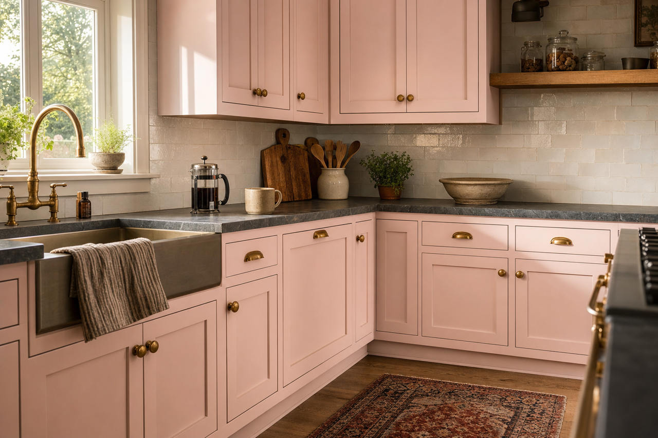
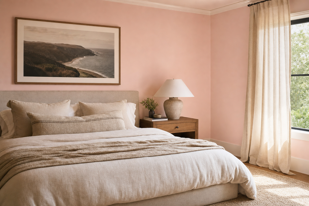
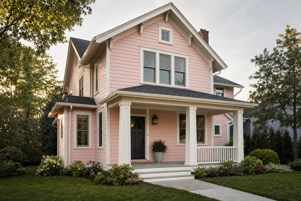
Sherwin-Williams Alyssum (6589) is a delicate, airy lavender hue that evokes a sense of calm and serenity. Perfectly balancing sophistication and playfulness, this color is ideal for creating tranquil spaces that feel warm and inviting. Its soft, pastel-like appearance makes it a versatile choice for a wide range of interior design styles, from modern and minimalist to romantic and traditional.
Undertones of Sherwin-Williams Alyssum (6589)
Alyssum features subtle pink undertones that add warmth to its lavender base. These undertones make the color feel approachable and comforting rather than overly cool or stark. The pink notes also help Alyssum complement a variety of other colors, allowing it to transition seamlessly into different palettes. Depending on the lighting, Alyssum may appear slightly cooler or warmer, making it important to test the shade in your space before committing.
Coordinating Colors for Alyssum
Sherwin-Williams Alyssum pairs beautifully with a variety of complementary and neutral colors to create harmonious and visually appealing spaces. Here are some coordinating colors that enhance its charm:
- Sherwin-Williams Snowbound (SW 7004): A crisp, clean white that helps Alyssum stand out while maintaining a serene atmosphere.
- Sherwin-Williams Silver Strand (SW 7057): A muted gray-green that adds depth and sophistication when paired with Alyssum.
- Sherwin-Williams Rosebud (SW 6288): A vibrant pink hue that amplifies Alyssum’s playful undertones for a bold and cheerful look.
- Sherwin-Williams Urbane Bronze (SW 7048): A rich, deep bronze that contrasts beautifully with Alyssum for a dramatic, modern aesthetic.
When designing with Alyssum, consider incorporating metallic accents like brushed gold or silver for added elegance, or natural textures such as rattan and wood for a grounded, organic feel.
Best Uses for Sherwin-Williams Alyssum (6589)
Alyssum’s soft lavender tone is versatile enough to be used in a variety of spaces, whether you’re looking to create a calming retreat or a bright and cheerful area. Below are some inspiring ideas for incorporating Alyssum into your home:
Bedrooms and Nurseries
The soothing nature of Alyssum makes it an excellent choice for bedrooms and nurseries. Its calming effect promotes relaxation, making it perfect for restful spaces. Pair it with white furniture and plush textures like linen or velvet to enhance the serene vibe.
Bathrooms
Use Alyssum in bathrooms to create a spa-like atmosphere. This hue works wonderfully when paired with white subway tiles, marble countertops, and chrome or brushed nickel fixtures. Add greenery or lavender-scented candles to complete the tranquil aesthetic.
Living Rooms
For living rooms, Alyssum can be used as a wall color to create a light and airy ambiance. It pairs beautifully with neutral furnishings and pops of complementary colors like blush pink, sage green, or even muted teal. Consider layering textures such as chunky knit throws, woven rugs, and soft drapes to add depth and coziness.
Accent Walls
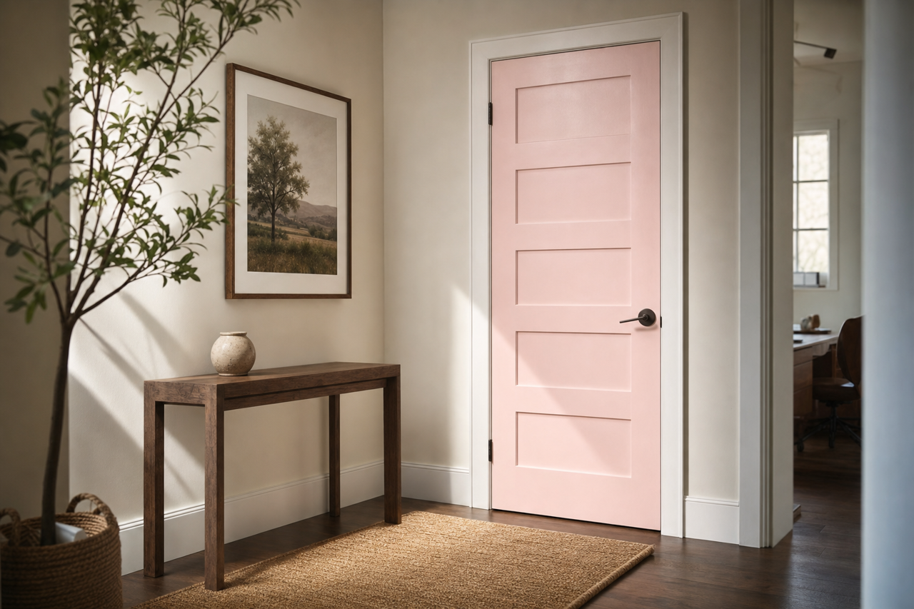
Alyssum makes for a stunning accent wall in spaces like home offices, entryways, or dining rooms. Its subtle color provides visual interest without overwhelming the space. Pair it with coordinating artwork or decor in complementary shades for a cohesive look.
Children’s Playrooms
The playful undertones of Alyssum make it an excellent choice for children’s playrooms. It feels cheerful yet calming, striking the perfect balance for a creative and fun environment. Pair it with bold, colorful furniture or whimsical decor for added charm.
Lighting Considerations
Lighting plays a significant role in how Sherwin-Williams Alyssum (6589) appears in your space. In bright, natural light, Alyssum leans more toward its lavender side, while in dim or artificial lighting, its pink undertones may become more pronounced. For optimal results, test the color in different lighting conditions to ensure it aligns with your desired aesthetic.
Sherwin-Williams Alyssum (6589) is a versatile and timeless lavender shade that adds a touch of refinement and tranquility to any room. Whether used as a primary wall color or a subtle accent, it brings a delightful sense of calm and beauty to your home.