Sherwin-Williams Jalapeño (SW 6629): A Bold Burst of Vibrant Energy
Sherwin-Williams Jalapeño (SW 6629) is a fiery and captivating shade of red that brings a sense of drama, energy, and passion into any space. Inspired by the bold vibrance of a fresh jalapeño pepper, this color is perfect for those seeking to make a statement. Whether you're designing a lively kitchen, an inviting dining room, or an accent wall that demands attention, Jalapeño delivers an impactful punch of personality.
Undertones of Sherwin-Williams Jalapeño (SW 6629)
Jalapeño boasts warm, saturated undertones of orange, which infuse the color with a spicy vibrancy. These undertones give it a rich depth and make it feel exhilarating yet approachable. The orange undertone ensures the red remains warm and lively without becoming overly harsh or cool. This subtle complexity allows Jalapeño to appear differently depending on the lighting conditions. In bright, natural light, it radiates energy and vibrance, while in dim or artificial lighting, it takes on a slightly deeper, cozier feel.
Coordinating Colors for Sherwin-Williams Jalapeño
Jalapeño pairs beautifully with a variety of complementary and contrasting hues. Whether you're aiming for a bold color palette or a more balanced aesthetic, here are some coordinating colors to consider:
Neutrals:
- Sherwin-Williams Alabaster (SW 7008): A soft, warm white that balances Jalapeño's intensity and creates a clean, refreshing contrast.
- Sherwin-Williams Accessible Beige (SW 7036): A versatile beige with subtle greige undertones for a grounded, neutral pairing.
Earthy Greens:
- Sherwin-Williams Rosemary (SW 6187): A muted green that contrasts beautifully with Jalapeño's warmth, evoking a natural, organic vibe.
- Sherwin-Williams Ripe Olive (SW 6209): A deep olive green that provides a sophisticated counterpoint to Jalapeño's boldness.
Warm Yellows:
- Sherwin-Williams Friendly Yellow (SW 6680): A cheerful golden hue that complements Jalapeño's fiery energy and creates a cohesive, sunny palette.
Charcoal and Black:
- Sherwin-Williams Iron Ore (SW 7069): A dramatic charcoal gray that adds modern sophistication to Jalapeño's boldness.
- Sherwin-Williams Tricorn Black (SW 6258): A classic black for high-contrast designs that feel sleek and contemporary.
Ideal Uses for Sherwin-Williams Jalapeño
Jalapeño's bold and vivacious hue makes it an excellent choice for spaces where energy, warmth, and personality are desired. Here are some ways to incorporate this stunning shade into your interior design:
Accent Walls:
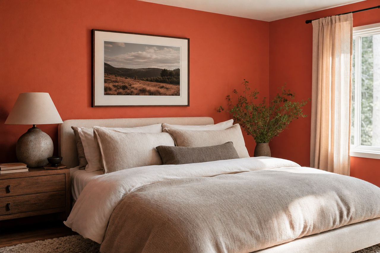
Use Jalapeño to create a feature wall in living rooms, dining rooms, or bedrooms. Pair it with neutrals like Alabaster or Accessible Beige to keep the rest of the space balanced and harmonious.Kitchens and Dining Areas:
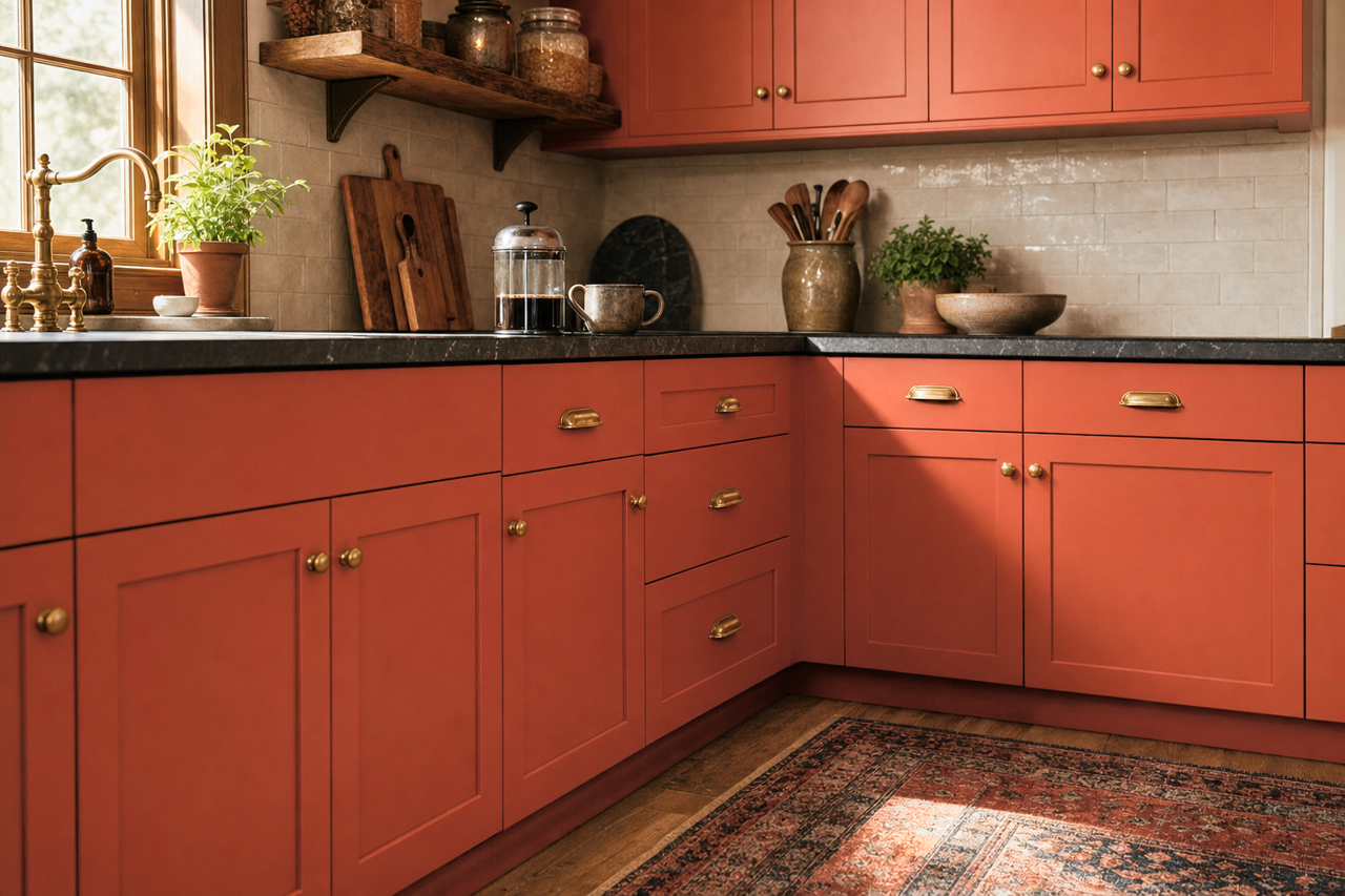
Jalapeño is perfect for kitchens or dining spaces, as red is known to stimulate appetite and conversation. Paint cabinetry, an island, or even a backdrop wall to bring a sense of liveliness and warmth.Entryways and Hallways:
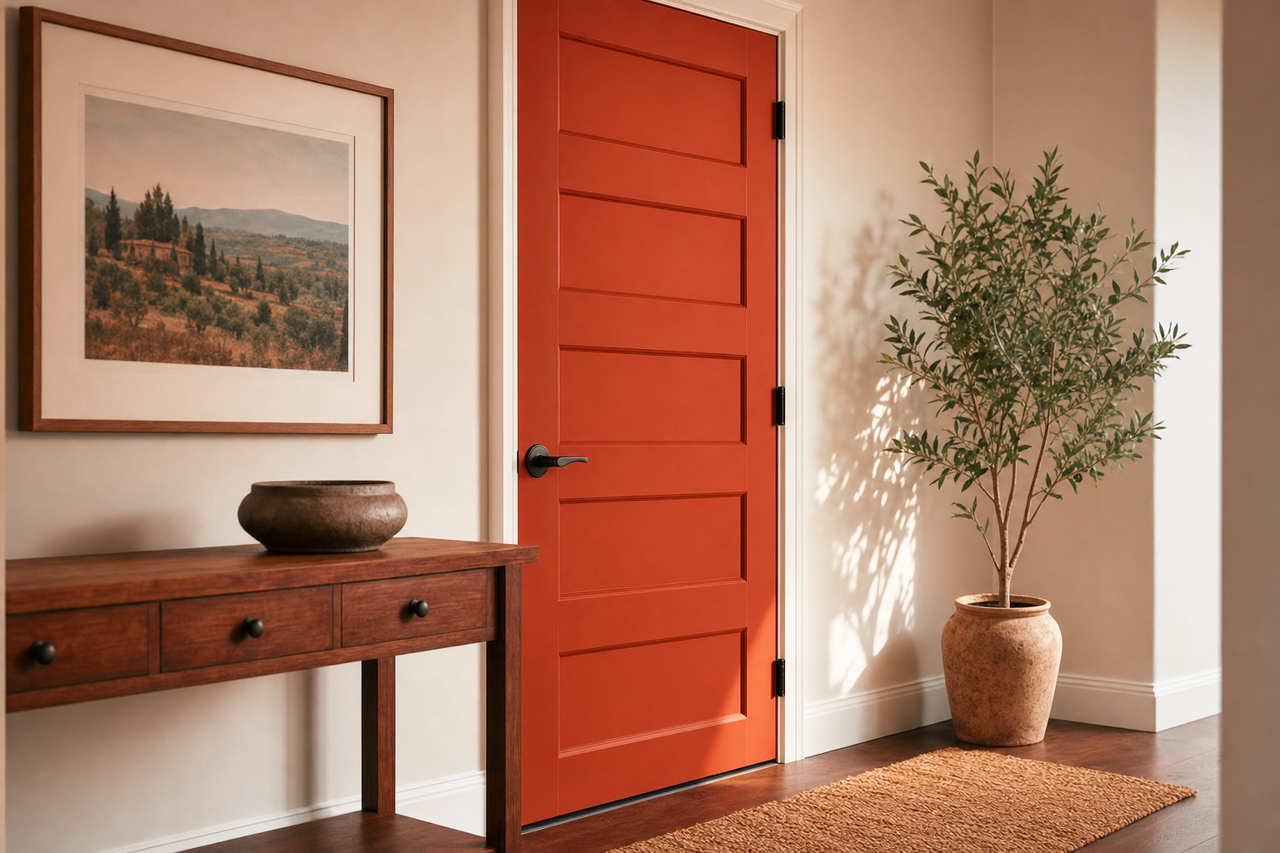
Make a bold first impression by using Jalapeño in entryways or hallways. Pair it with crisp white trim for a striking, clean finish.Furniture and Décor:
Incorporate Jalapeño into your space through painted furniture, like a bookshelf or coffee table, or through decorative accents like pillows, rugs, and artwork.Commercial Spaces:
In restaurants, cafes, or retail environments, Jalapeño can be used to create an inviting and energetic atmosphere that draws people in and encourages engagement.
Lighting Considerations
When using Sherwin-Williams Jalapeño, consider the lighting in your space. In rooms with abundant natural light, the color will appear brighter and more vivid, while in spaces with subdued or artificial lighting, it will take on a slightly richer and deeper tone. Test swatches in various lighting conditions to ensure the hue complements your design vision.
Sherwin-Williams Jalapeño (SW 6629) is not just a paint color—it's an embodiment of boldness, warmth, and creativity. With its fiery vibrance and versatile pairing potential, this spicy red is sure to infuse your space with energy and excitement. Whether you're creating a dramatic accent wall or refreshing an entire room, Jalapeño has the power to transform your interiors into a lively, unforgettable experience.