Sherwin-Williams Serape (6656): A Warm, Vibrant Hue for Bold Interiors
Sherwin-Williams Serape (6656) is a stunning, vibrant reddish-orange that exudes warmth, energy, and creativity. Named after the colorful Mexican serape blanket, this eye-catching hue is perfect for those who want to make a bold statement in their interiors. Its invigorating tone brings a cheerful and cozy ambiance, making it a versatile choice for various design styles, from rustic and bohemian to modern and eclectic.
Undertones of Sherwin-Williams Serape (6656)
Serape is a rich, saturated color with a blend of red and orange undertones. Its primary characteristic is its warmth, but the slight orange influence gives it a playful and dynamic edge. Unlike some reds that veer into cooler or muted territory, Serape leans heavily into its sunny, fiery personality. Its undertones make it ideal for creating spaces that feel inviting, energetic, and full of life.
Coordinating Colors for Sherwin-Williams Serape (6656)
When designing with Serape, pairing it with complementary or neutral shades can help balance its boldness while highlighting its best features. Here are a few Sherwin-Williams colors that coordinate beautifully with Serape:
Neutrals:
- Shoji White (SW 7042): A soft, creamy off-white that provides a subtle contrast and allows Serape to shine as the focal point.
- Accessible Beige (SW 7036): A warm, grounded beige that complements the earthy undertones of Serape without overpowering it.
Accents:
- Inky Blue (SW 9149): A deep, moody navy that creates a striking contrast while adding sophistication.
- Coral Island (SW 6332): A softer coral that harmonizes beautifully with Serape for a layered monochromatic palette.
Earth Tones:
- Saguaro (SW 6419): A muted green with earthy undertones that offers a natural, calming counterbalance to Serape’s vibrancy.
- Chatura Gray (SW 9169): A versatile taupe-gray that pairs well with Serape for a modern and grounded look.
Ideal Uses for Sherwin-Williams Serape (6656)
Serape’s bold personality makes it a fantastic choice for spaces that need a pop of color or a touch of drama. Here are some creative ways to incorporate this stunning hue into your home or commercial space:
Accent Walls:
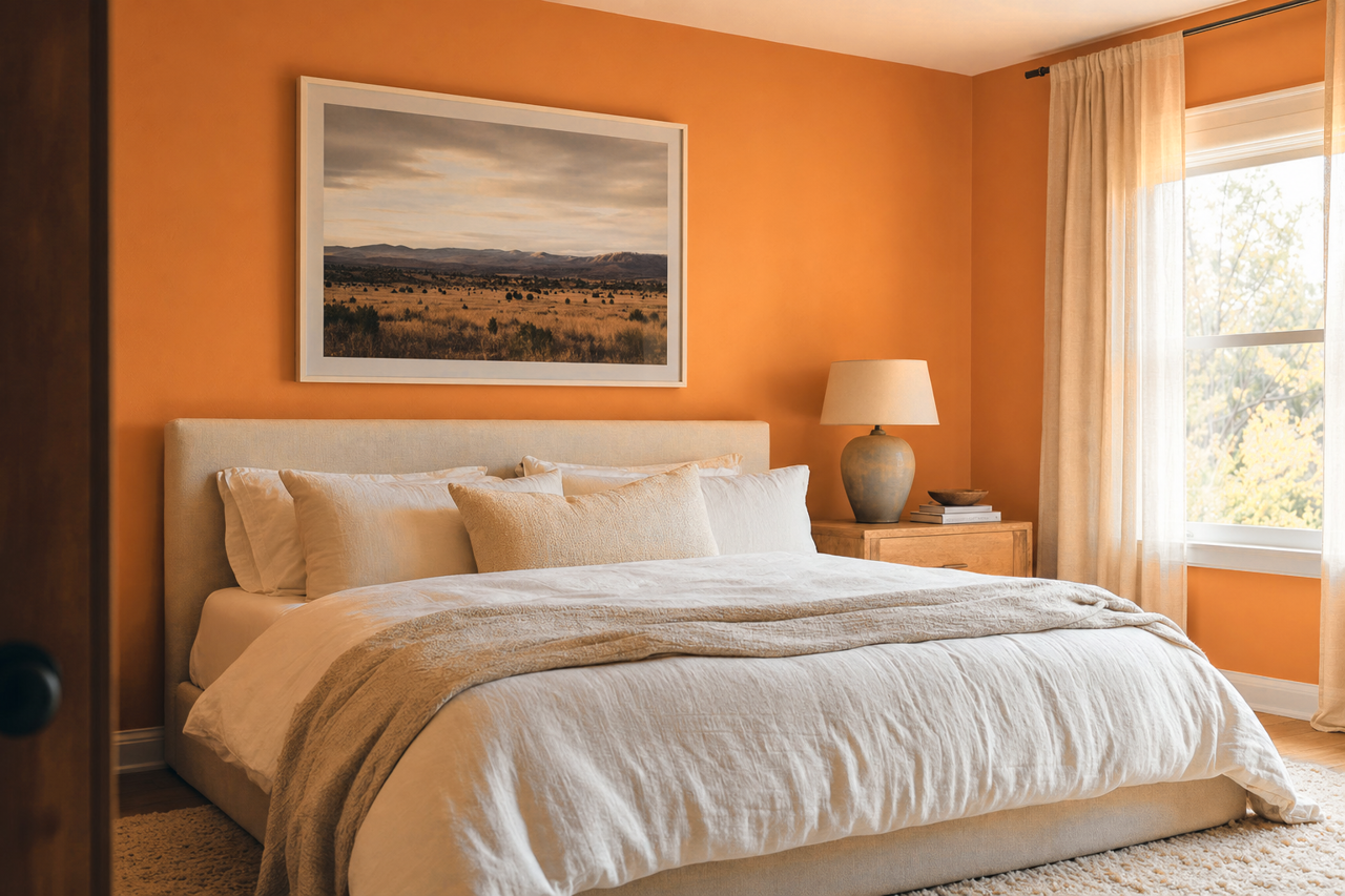
Use Serape on a single accent wall to create a focal point in a living room, dining room, or bedroom. Its warm undertones make it especially suitable for spaces where you want to encourage conversation, creativity, or comfort.
Statement Ceilings:
For a daring design move, paint your ceiling in Serape. This unexpected application adds a cozy, cocoon-like feel to smaller spaces like powder rooms or reading nooks.
Furniture and Decor:
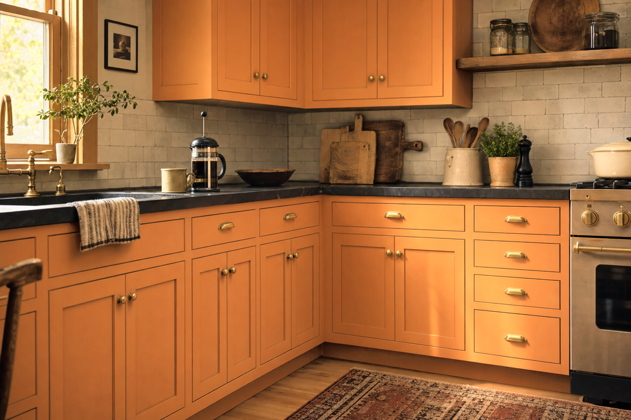
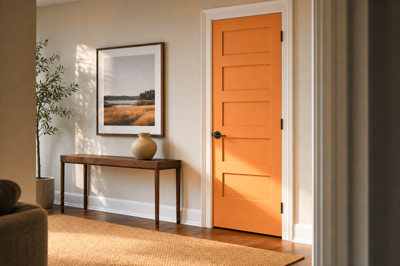
If you’re hesitant to commit to Serape on your walls, consider incorporating it through painted furniture, cabinetry, or decorative accessories like vases, throw pillows, or artwork.
Outdoor Spaces:
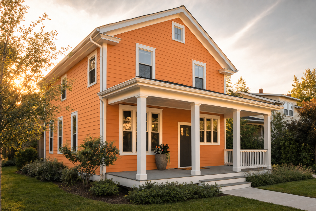
Serape’s sunny disposition is perfect for outdoor areas like patios or garden walls. Pair it with terracotta tiles and lush greenery to create a vibrant and inviting outdoor retreat.
Commercial Interiors:
Serape is an excellent choice for retail spaces, restaurants, or creative studios where energy and vibrancy are key. Its lively tone draws attention and fosters a welcoming atmosphere.
Design Tips for Using Sherwin-Williams Serape
- Balance Boldness: Because Serape is such a dynamic color, balance it with plenty of neutrals or softer shades to prevent it from overwhelming the space.
- Play with Textures: Pair Serape with natural materials like wood, rattan, or stone to enhance its warmth and create a layered, organic aesthetic.
- Lighting Matters: The warmth of Serape can be influenced by different lighting conditions. In natural light, it leans brighter and more energetic, while artificial lighting can emphasize its deeper, richer tones.
Sherwin-Williams Serape (6656) is a vibrant, versatile color that brings warmth, energy, and personality to any space. Whether you use it as the star of the show or as an accent, this rich reddish-orange will add a touch of bold beauty to your design. Let Serape inspire you to create spaces that are as unique and lively as the color itself.