Sherwin-Williams Lupine (6810): A Captivating Shade of Purple
Sherwin-Williams Lupine (6810) is a rich, enchanting violet that radiates sophistication and depth. This stunning hue captures the essence of a blooming lupine flower, blending boldness with elegance. Perfect for making a statement, Lupine strikes a balance between dramatic intensity and soft refinement, making it a versatile choice for a variety of interior design styles.
Undertones of Sherwin-Williams Lupine (6810)
Lupine boasts subtle blue undertones that give the color its cool and calming demeanor. These undertones temper the richness of the purple, preventing it from feeling overwhelming or overly saturated. The result is a balanced color that feels regal yet approachable. Depending on the lighting, Lupine may lean slightly cooler, bringing out its serene blue notes, or warmer, emphasizing its velvety violet depth.
Coordinating Colors for Sherwin-Williams Lupine (6810)
When designing a space with Lupine, pairing it with complementary and coordinating hues can elevate its beauty. Consider these options:
- Sherwin-Williams Pure White (7005): A crisp, clean white that provides a refreshing contrast to Lupine’s deep tones, making it ideal for trim, ceilings, or accent pieces.
- Sherwin-Williams Silver Strand (SW 7057): A soft gray-green that enhances Lupine’s cool undertones, perfect for creating a harmonious and serene palette.
- Sherwin-Williams Naval (6244): A deep navy blue that complements Lupine’s dramatic vibe, adding depth and sophistication to any room.
- Sherwin-Williams Creamy (7012): A warm off-white that softens Lupine’s boldness, creating a cozy and inviting atmosphere.
These coordinating colors allow you to create a variety of looks, from modern elegance to cozy traditional spaces.
Suggested Uses for Sherwin-Williams Lupine (6810)
Lupine is a versatile color that can transform any room into a luxurious retreat or a creative haven. Here are some popular ways to use this shade:
Accent Walls
Lupine is an excellent choice for accent walls. Its rich hue draws attention without overpowering the space, making it ideal for living rooms, bedrooms, or dining areas. Pair it with lighter neutral walls to let Lupine shine as the focal point.
Bedrooms
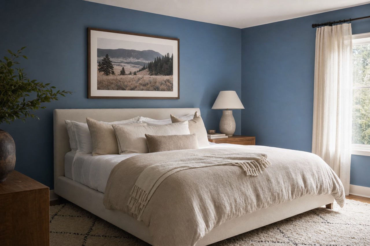
Create a serene and intimate atmosphere in bedrooms by using Lupine as the main wall color or on a feature wall behind the bed. Pair it with soft white bedding and metallic accents for a chic and restful retreat.
Home Offices or Creative Spaces
Purple tones like Lupine are associated with creativity and imagination. Use this color in home offices or studios to inspire productivity and artistic thinking. Pair with sleek furniture and minimalist décor for a modern vibe.
Bathrooms
Bring an unexpected touch of luxury to bathrooms by incorporating Lupine. Whether on walls or cabinetry, this color pairs beautifully with polished chrome fixtures and marble finishes.
Furniture and Decor
If you’re not ready to commit to Lupine on your walls, consider using it on furniture, such as a painted desk or dresser, or in decor elements like throw pillows and curtains. This allows you to incorporate its charm in small doses while adding personality to the space.
Lighting Considerations
Lighting plays a crucial role in how Lupine appears in your space. In natural light, its cool blue undertones shine through, making it feel airy and fresh. Under warm artificial lighting, the purple takes on a richer, warmer tone, adding depth and drama. Always test Lupine in your space under various lighting conditions to ensure it achieves the desired effect.
Sherwin-Williams Lupine (6810) is a dynamic and elegant addition to any interior design palette. Whether used as a bold statement or a subtle accent, its rich violet hue and cool undertones make it a show-stopping choice for spaces that demand both character and charm. Pair it with complementary tones and thoughtful lighting to bring out its full potential and create a space that feels uniquely yours.