Sherwin-Williams Mindful Gray (SW 7016): The Perfect Neutral for Every Space
Sherwin-Williams Mindful Gray (SW 7016) is a sophisticated and versatile neutral paint color that has become a favorite among interior designers and homeowners alike. Renowned for its ability to adapt to a wide range of styles and spaces, Mindful Gray is a medium-light gray that delivers a sense of calm and balance while maintaining a modern, understated elegance.
Undertones: Warmth with a Subtle Cool Edge
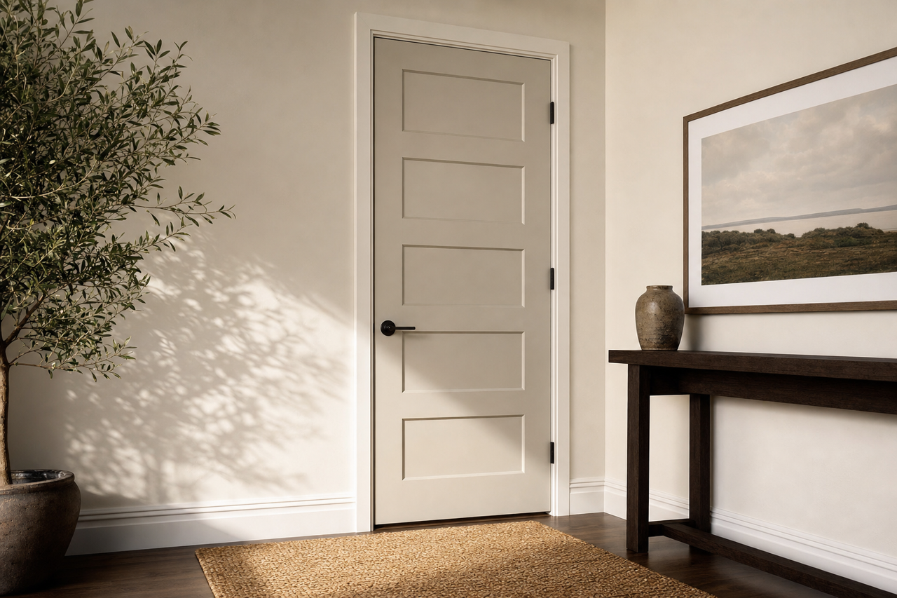
Mindful Gray is a warm gray with taupe undertones, which helps it feel inviting and grounded without veering too far into beige territory. It also has the faintest hint of green undertones, which become more apparent in certain lighting conditions. This delicate balance between warm and cool tones makes it an exceptional "greige" that pairs beautifully with a variety of color palettes. The undertones are subtle enough that Mindful Gray won’t dominate the room, making it an ideal backdrop for accent colors.
- In warm lighting (southern exposure): The warmer taupe undertones come forward, giving the gray a cozy, almost earthy quality.
- In cooler lighting (northern exposure): The green undertones may emerge, lending a crisp, modern feel to the space.
Coordinating Colors: Create a Harmonious Palette
One of the greatest strengths of Mindful Gray is its adaptability. It pairs effortlessly with a variety of colors, making it easy to create a cohesive and timeless design. Here are some excellent coordinating colors to consider:
- Trim and Accents: Sherwin-Williams Pure White (SW 7005) or Alabaster (SW 7008) for a clean, crisp contrast.
- Complementary Neutrals: Dorian Gray (SW 7017) for a monochromatic look, or Agreeable Gray (SW 7029) for a softer gradient.
- Accent Colors:
- For a serene vibe, pair it with muted blues like Rainwashed (SW 6211) or Sea Salt (SW 6204).
- For a bold contrast, try navy tones like Naval (SW 6244) or deep greens like Evergreen Fog (SW 9130).
- Add warmth with burnt oranges or rust tones, such as Cavern Clay (SW 7701).
Where to Use Mindful Gray
Mindful Gray’s versatility makes it a go-to choice for nearly any room in your home. Its ability to strike a balance between warm and cool ensures it works well in both traditional and contemporary spaces, as well as transitional styles that blend the two.
Living Rooms and Family Rooms
Mindful Gray brings a sense of calm and sophistication to living spaces. It creates a neutral backdrop that allows furniture, artwork, and décor to shine. Pair it with plush sofas, rich wood tones, and textural accents like woven throws or sisal rugs for a cozy yet polished feel.
Bedrooms
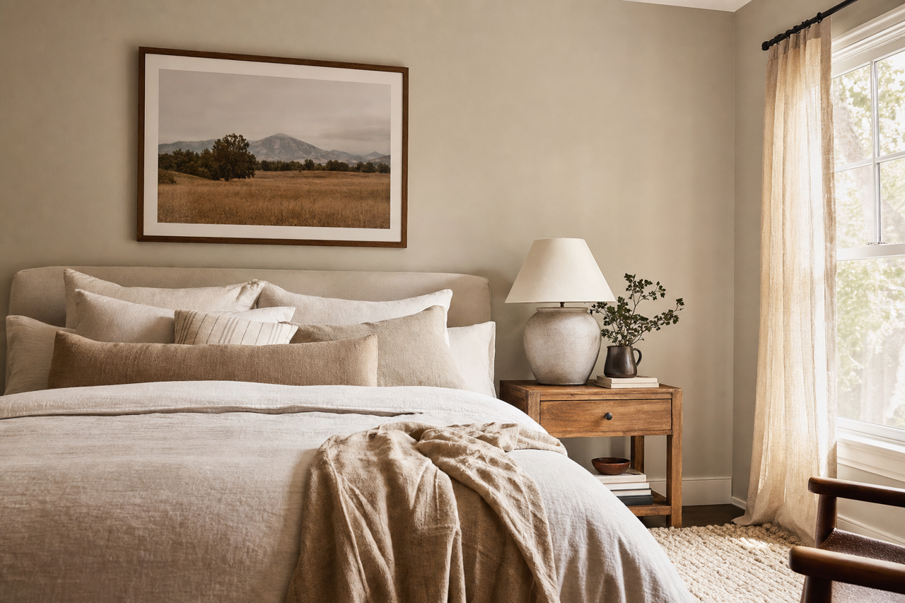
In a bedroom, Mindful Gray sets a relaxing tone, perfect for winding down at the end of the day. Pair it with soft, neutral bedding for a serene retreat, or add pops of color through pillows and artwork for a more dynamic look.
Kitchens and Dining Areas
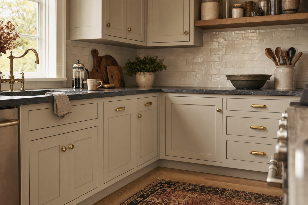
Mindful Gray’s neutral undertones make it ideal for kitchens and dining spaces, particularly when paired with white cabinetry for a fresh, timeless aesthetic. Incorporate metallic accents like brushed nickel or matte black for a contemporary touch, or warm it up with natural wood tones and earthy accessories.
Bathrooms
For bathrooms, Mindful Gray adds a spa-like quality. Pair it with crisp white tiles, marble surfaces, and soft blue or green accents for a clean and tranquil space.
Exteriors
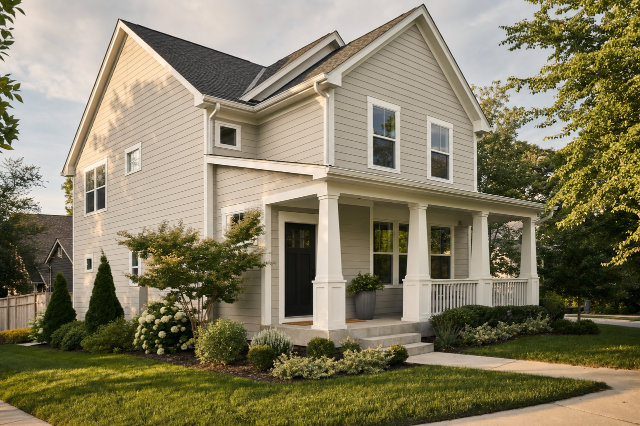
Mindful Gray is also a fantastic option for exterior painting projects. Its neutral tone works beautifully on siding, especially when paired with white trim or darker accent colors like black or navy for shutters and doors.
Lighting Considerations
As with any paint color, lighting plays an essential role in how Mindful Gray will appear in your space. Be sure to test it in different lighting conditions to see how its undertones interact with your specific environment. Use swatches or sample pots to observe how the color looks at various times of the day.
Why Choose Sherwin-Williams Mindful Gray?
Mindful Gray (SW 7016) is more than just a neutral—it’s a chameleon-like shade that adapts to its surroundings while maintaining a timeless, elegant appeal. Whether you’re designing a cozy retreat, a modern kitchen, or a welcoming exterior, this color offers the perfect balance of warmth and sophistication. Its neutrality ensures it will remain a classic choice for years to come, making it a smart investment for any space.