Sherwin-Williams Quest Gray (SW 7080): A Timeless Neutral for Contemporary and Classic Spaces
Sherwin-Williams Quest Gray (SW 7080) is a versatile and sophisticated neutral that effortlessly balances both warm and cool undertones, making it a go-to choice for homeowners and interior designers alike. With its refined gray hue, Quest Gray creates a harmonious backdrop for a variety of design styles, from modern minimalism to traditional elegance.
Undertones of Sherwin-Williams Quest Gray
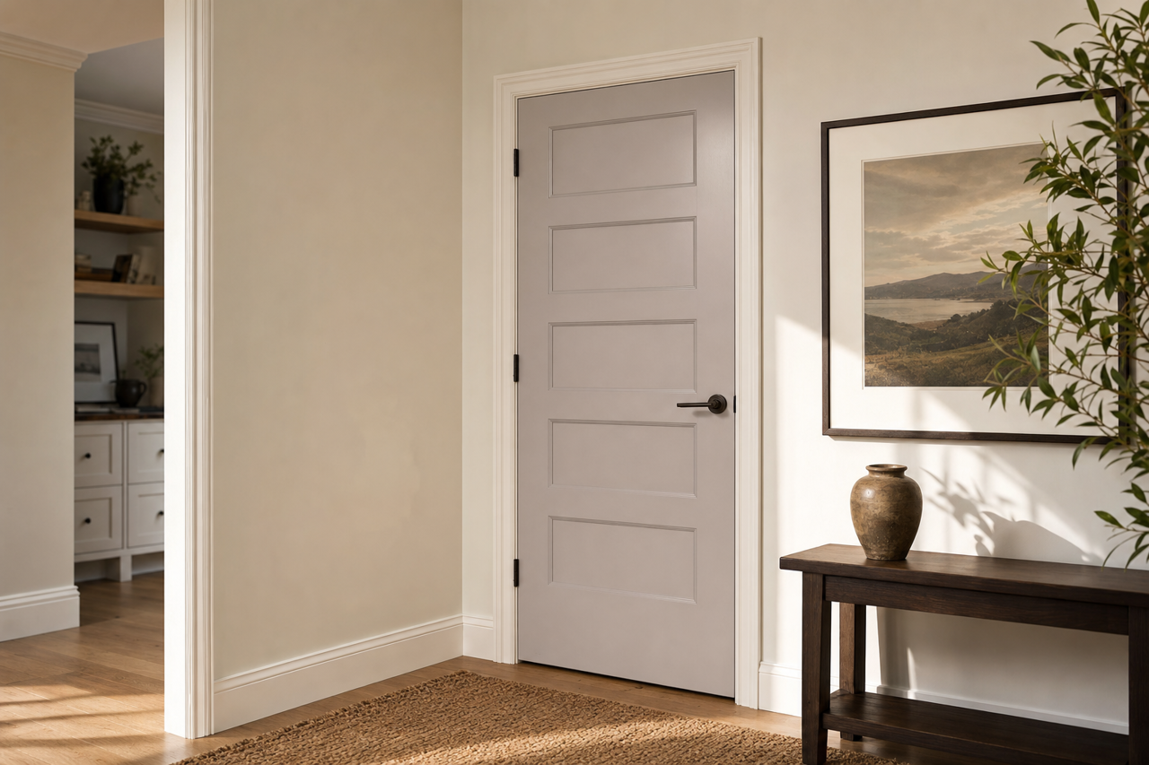
Quest Gray is a true chameleon in the world of neutrals, offering subtle undertones that adapt to their surroundings. This shade leans slightly toward a cooler gray but retains a soft warmth, ensuring it doesn’t feel stark or industrial. In spaces with ample natural light, Quest Gray may appear slightly cooler, giving off hints of slate or charcoal. Conversely, in areas with artificial or warmer lighting, the hue softens and takes on a faint taupe-like warmth.
Its balanced undertones make it an ideal choice for those seeking a neutral that doesn’t skew too heavily toward either beige or blue-gray. This adaptability allows Quest Gray to complement an array of color palettes and design elements.
Coordinating Colors for Sherwin-Williams Quest Gray
Sherwin-Williams Quest Gray pairs beautifully with a range of coordinating colors, making it an anchor for layered and cohesive designs. Consider these suggestions to create stunning combinations:
Complementary Neutrals:
- Sherwin-Williams Alabaster (SW 7008): A creamy, off-white that provides a soft contrast while maintaining a cohesive neutral palette.
- Sherwin-Williams Pure White (SW 7005): A bright, crisp white that enhances the subtle elegance of Quest Gray.
Accent Colors for Depth:
- Sherwin-Williams Naval (SW 6244): A deep navy blue that adds rich sophistication, perfect for accent walls or furniture.
- Sherwin-Williams Urbane Bronze (SW 7048): A dark, earthy bronze that brings warmth and grounding to the overall aesthetic.
Soft and Natural Pairings:
- Sherwin-Williams Sea Salt (SW 6204): A muted green-gray that evokes tranquility and pairs beautifully in coastal or spa-inspired spaces.
- Sherwin-Williams Accessible Beige (SW 7036): A warm beige that complements Quest Gray’s subtle warmth for a cohesive neutral palette.
Best Uses for Sherwin-Williams Quest Gray
Quest Gray’s understated elegance makes it a versatile choice for a wide variety of applications, whether you’re refreshing a single room or designing an entire home.
Living Rooms and Family Rooms:
The balanced undertones of Quest Gray make it perfect for living spaces, offering a neutral canvas that allows furniture, artwork, and decor to shine. Pair it with plush textiles in creamy whites and rich navy accents for a cozy yet sophisticated atmosphere.
Bedrooms:
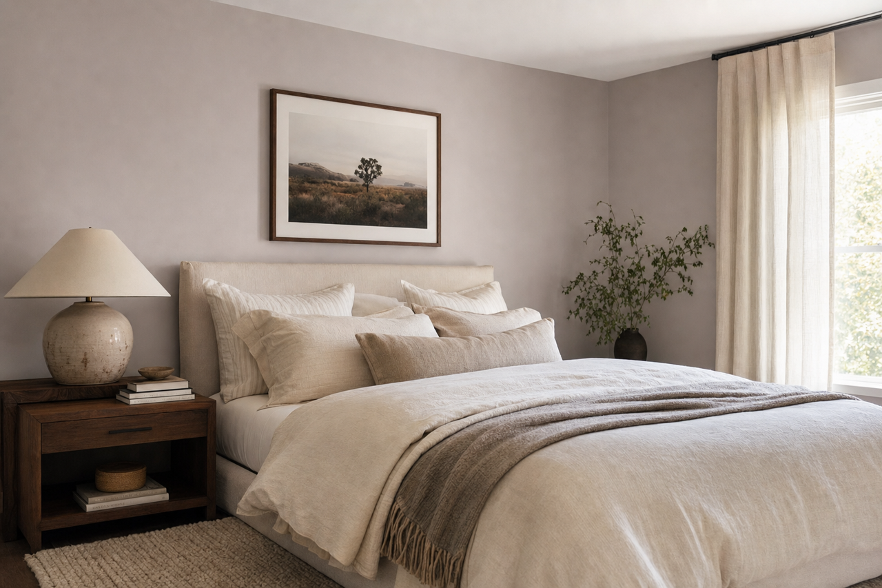
In bedrooms, Quest Gray fosters relaxation and serenity. Pair it with soft, muted tones like blush pinks, sage greens, or light taupes to create a calming retreat.
Kitchens and Bathrooms:
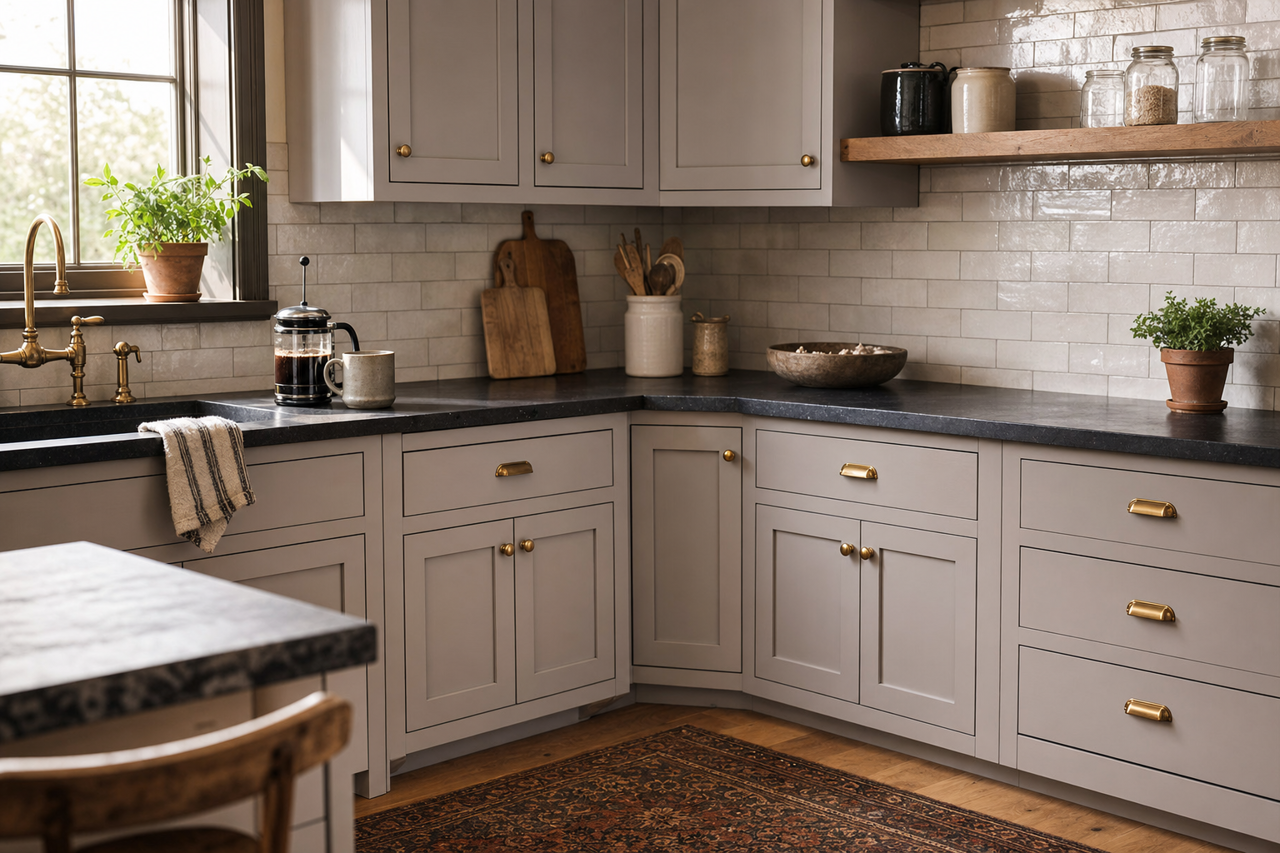
Quest Gray works beautifully in kitchens and bathrooms, especially when paired with crisp white cabinetry or marble countertops. Its neutral tone allows metallic finishes, such as brushed gold or polished chrome, to stand out and add a touch of luxury.
Home Offices and Studios:
For home offices or creative studios, Quest Gray provides a professional and polished backdrop. It combines the neutrality needed for focus with a touch of warmth, making the space feel inviting and productive.
Exterior Applications:
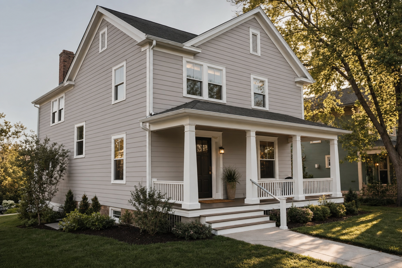
Quest Gray isn’t just for interiors; it’s a fantastic choice for exteriors as well. Use it for siding, trim, or shutters to achieve a timeless curb appeal. Pair it with dark accents like Sherwin-Williams Caviar (SW 6990) or light tones like High Reflective White (SW 7757) for contrast.
Why Choose Sherwin-Williams Quest Gray?
Sherwin-Williams Quest Gray (SW 7080) is more than just a paint color—it’s a canvas for creativity and style. Its adaptability and balanced undertones make it a favorite among designers seeking a neutral that can seamlessly fit into any space. Whether you're creating a tranquil bedroom, a polished office, or a modern living area, Quest Gray provides the perfect foundation for your vision.
With its ability to coordinate effortlessly with a wide array of colors and finishes, Quest Gray serves as a timeless choice that will elevate your interiors for years to come.