
Sherwin-Williams Tamarind (SW 7538): A Rich and Versatile Brown
Sherwin-Williams Tamarind (SW 7538) is a sophisticated, earthy brown that exudes warmth and depth, making it a versatile choice for a wide range of interior design styles. Whether you're looking to create a cozy retreat or add a touch of natural elegance to your space, Tamarind delivers with its rich appearance and understated charm. This color is perfect for grounding a room while adding a timeless quality to your design palette.
Undertones of Sherwin-Williams Tamarind
The beauty of Tamarind lies in its subtle complexity. It features warm red and chocolate undertones that add a sense of richness without overwhelming the space. These undertones ensure Tamarind feels inviting and balanced, making it ideal for creating a welcoming atmosphere in living rooms, dining areas, or bedrooms. Its depth makes it particularly suited for accent walls, cabinetry, or even exterior applications where you want to make a statement with a natural yet refined color.
Coordinating Colors for Sherwin-Williams Tamarind
Pairing Tamarind with complementary shades can enhance its warmth and create a harmonious aesthetic. Here are some coordinating colors to consider:
- Sherwin-Williams Creamy (SW 7012): This soft, creamy white provides a beautiful contrast to Tamarind’s depth, creating a balanced and airy feel in the space.
- Sherwin-Williams Oyster Bay (SW 6206): A muted green-gray with cool undertones, Oyster Bay complements Tamarind’s warmth and adds a touch of tranquility to your palette.
- Sherwin-Williams Urbane Bronze (SW 7048): If you want to elevate the drama, pair Tamarind with Urbane Bronze, a deep, metallic brown-gray that adds a modern edge to any room.
- Sherwin-Williams Kilim Beige (SW 6106): The soft beige tones in Kilim Beige harmonize beautifully with Tamarind, creating a cohesive and inviting color scheme for traditional or transitional designs.
In addition to these, lighter neutrals, creamy whites, and soft greens work well to balance Tamarind’s richness and prevent the space from feeling too heavy.
Uses for Sherwin-Williams Tamarind
Tamarind’s versatility makes it suitable for a variety of applications and design styles. Here are some ways you can incorporate this color into your home:
1. Accent Walls
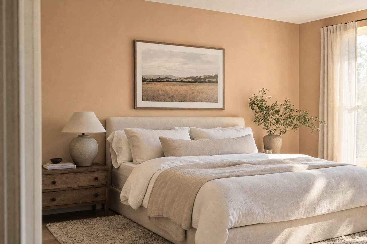
Tamarind shines as an accent wall in spaces like bedrooms or living rooms. Its warm brown tone adds depth and drama without overpowering the room. Pair it with lighter walls and furniture to ensure the space remains balanced and inviting.
2. Cabinetry and Built-Ins
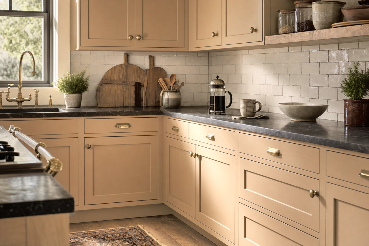
For kitchens and bathrooms, Tamarind is an excellent choice for cabinetry, lending a rich and grounded feel to the space. The color works beautifully with brass hardware for a luxurious touch or black matte finishes for a more modern vibe.
3. Exterior Applications
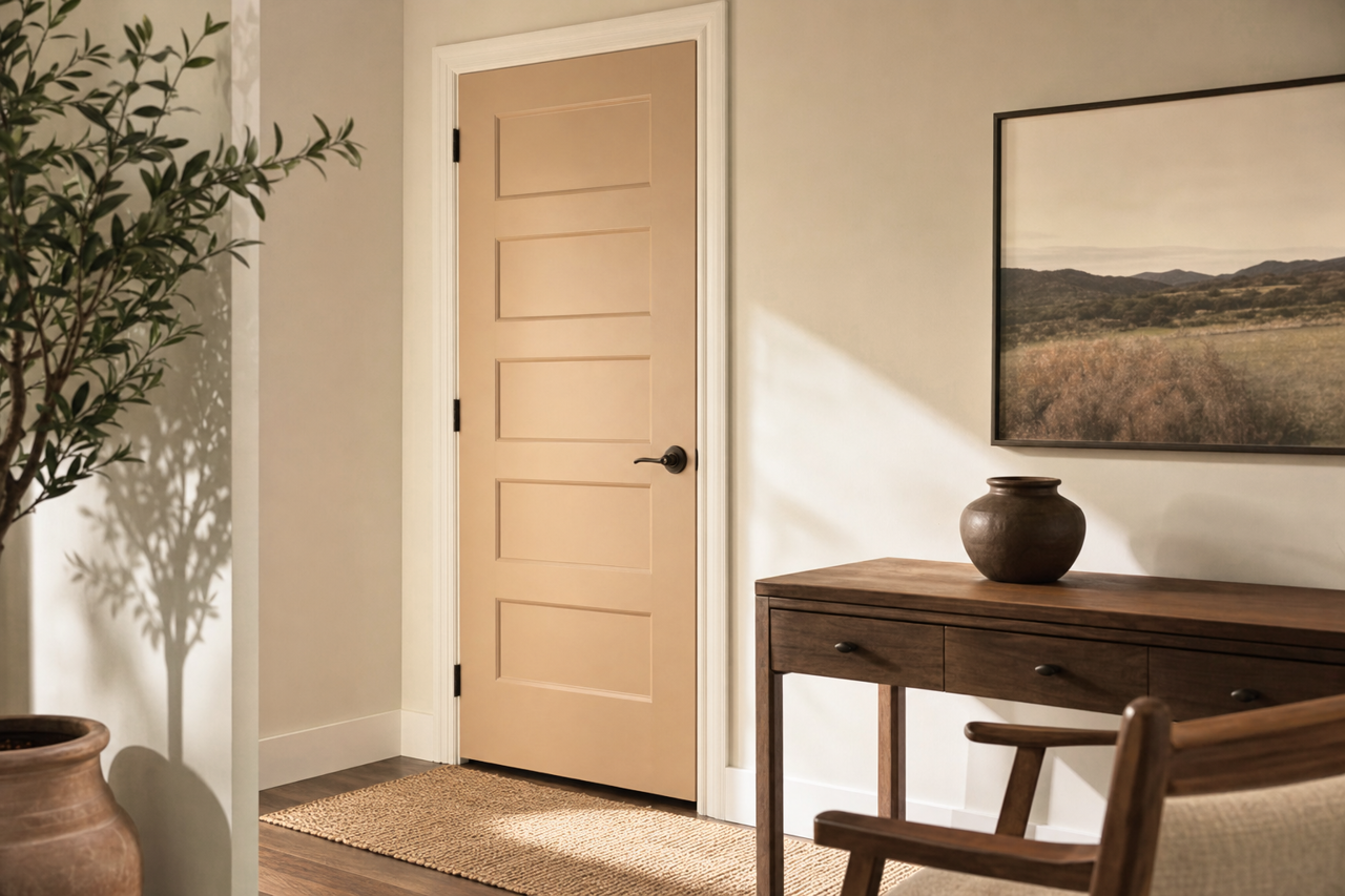
Tamarind’s earthy tone makes it a standout choice for exterior siding, trim, or shutters. It pairs well with natural stone and wood accents, creating a cohesive and timeless look for your home’s exterior.
4. Cozy Retreats
Use Tamarind in spaces designed for relaxation, such as a study, library, or reading nook. Its warm undertones foster a sense of comfort and intimacy, making it perfect for rooms where you want a tranquil atmosphere.
5. Flooring and Furniture
If you’re looking for a bold yet natural statement, Tamarind can be used to stain wood floors or furniture pieces. Its rich hue complements natural textures and enhances the beauty of wood grain.
6. Rustic and Modern Spaces
Tamarind fits seamlessly into both rustic and modern design aesthetics. For a rustic look, combine it with natural materials like exposed wood beams and stone. In modern spaces, pair it with sleek lines and metallic accents to create a contemporary yet grounded feel.
Why Choose Sherwin-Williams Tamarind?
Sherwin-Williams Tamarind (SW 7538) is more than just a paint color—it’s a design statement. Its warm, earthy tone creates a sense of comfort while maintaining an understated elegance. Whether you’re designing a cozy retreat or a sophisticated gathering space, Tamarind’s versatility and depth make it a reliable choice for nearly any application. Combined with the right coordinating colors and thoughtful design elements, Tamarind has the power to transform interiors and exteriors alike.