Sherwin-Williams Reflection (SW 7661): A Timeless, Serene Gray
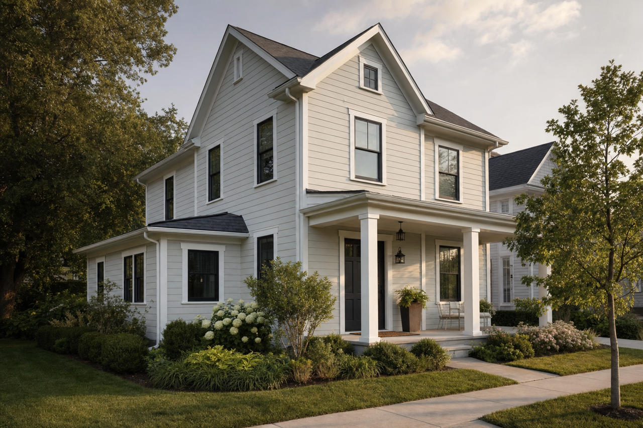
Sherwin-Williams Reflection (SW 7661) is a versatile and sophisticated paint color that effortlessly balances modern elegance and timeless charm. This soft, cool gray is an ideal choice for creating tranquil spaces, reflecting natural light beautifully, and providing a serene backdrop for any interior design style. Whether you're aiming for a contemporary aesthetic or a cozy, classic look, Reflection is a color that adapts seamlessly to your vision.
Undertones of Sherwin-Williams Reflection
One of the standout features of Reflection is its delicate undertones. This gray leans slightly cool, with subtle blue undertones that impart a fresh and airy quality to the color. These blue notes prevent it from feeling overly stark or sterile, instead adding depth and softness. The undertones make Reflection perfect for spaces where you want a balance of sophistication and comfort.
Because of its cool base, Reflection works particularly well in rooms with ample natural light, where the blue undertones can gently enhance the overall ambiance. However, it remains versatile enough to perform beautifully in artificial lighting, giving your space a clean and polished look without feeling harsh.
Coordinating Colors for Sherwin-Williams Reflection
Pairing Sherwin-Williams Reflection with the right coordinating colors can elevate your design to new heights. Here are a few suggestions to create harmonious palettes:
Whites and Off-Whites: For a crisp, minimalist look, pair Reflection with clean whites like Sherwin-Williams Pure White (SW 7005) or Alabaster (SW 7008). These combinations are perfect for modern, Scandinavian, or coastal-inspired interiors.
Deep Blues: Highlight Reflection’s cool undertones by pairing it with rich navy shades like Naval (SW 6244) or Gale Force (SW 7605). These darker colors add depth and drama to the space, perfect for accent walls or furniture.
Soft Neutrals: Create a warm yet balanced palette by pairing Reflection with beige tones like Accessible Beige (SW 7036) or creamy taupes like Agreeable Gray (SW 7029). This combination works beautifully in transitional and traditional spaces.
Muted Greens: Enhance the serene vibe by introducing muted greens such as Sea Salt (SW 6204) or Comfort Gray (SW 6205). These nature-inspired hues create a calming, spa-like atmosphere in bathrooms or bedrooms.
Metallic Accents: Reflection pairs beautifully with metallic finishes like brushed nickel, chrome, or even gold. Use these accents in light fixtures, hardware, or decor elements to add a touch of luxury and sparkle.
Best Uses for Sherwin-Williams Reflection
Reflection’s versatility makes it ideal for a wide range of applications throughout your home. Here are some ideas to incorporate this elegant paint color into your design:
Living Rooms: Use Reflection as the primary wall color in living rooms to create a serene and welcoming atmosphere. Pair it with plush furnishings and layered textures for added warmth.
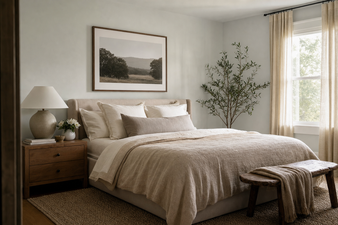
Bedrooms: The calming blue undertones make Reflection a perfect choice for bedrooms, promoting relaxation and restful sleep. Pair it with soft linens and natural wood tones for a cozy retreat.
Bathrooms: Reflection’s cool gray tone lends itself beautifully to bathrooms, creating a clean and spa-like space. Pair it with crisp white trim and metallic fixtures for a polished finish.
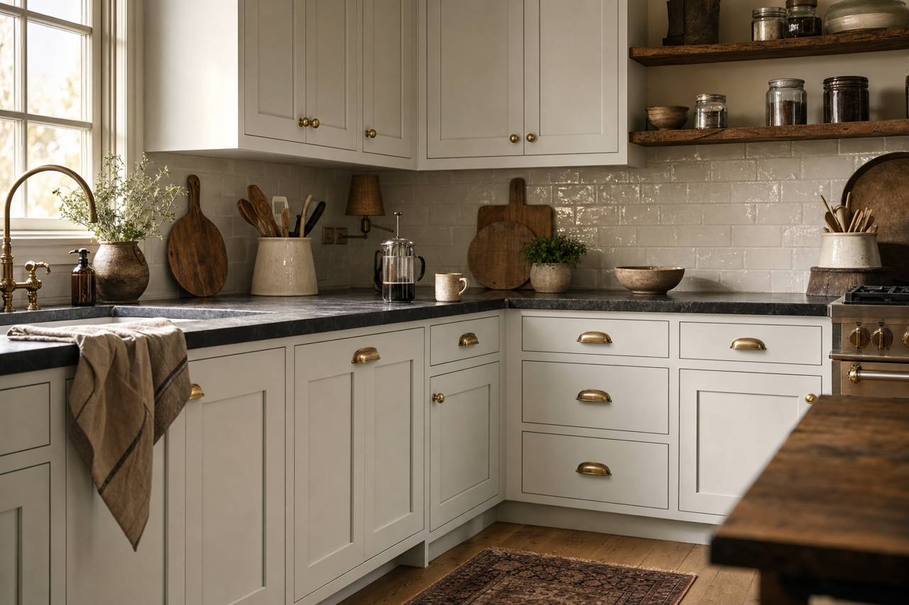
Kitchens: For a sleek and contemporary kitchen, use Reflection on cabinets or walls. Complement it with stainless steel appliances and a white marble countertop for a modern look.
Home Offices: Reflection’s balanced tone fosters focus and creativity, making it an excellent choice for home office walls. Pair it with darker accent colors to ground the space and add visual interest.
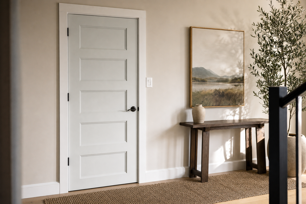
Trim and Accent Walls: If you’re looking for a subtle contrast, use Reflection as a trim color against darker shades or as an accent wall to complement a lighter palette.
Why Sherwin-Williams Reflection Stands Out
Sherwin-Williams Reflection (SW 7661) is more than just a paint color; it’s a design element that can transform your space into a haven of elegance and tranquility. Its ability to adapt to different lighting conditions and pair effortlessly with a wide range of colors makes it a favorite among homeowners and designers alike. Whether you're revamping a single room or redecorating your entire home, Reflection offers a timeless solution that enhances both style and comfort.