
Sherwin-Williams Fleur de Sel SW 7666: A Timeless Neutral for Any Space
Sherwin-Williams Fleur de Sel SW 7666 is a soft, understated color that brings a sense of calm and sophistication to any interior or exterior space. Known for its delicate balance of gray and green undertones, this paint color creates a versatile canvas that works beautifully in a variety of design styles, from coastal chic to modern farmhouse. Its subtlety and elegance make it an enduring favorite for homeowners and designers alike.
The Undertones of Fleur de Sel
Fleur de Sel is a light gray with a hint of green, creating a cool, refreshing vibe in spaces where it's used. Depending on the lighting, this color can shift in appearance. In natural daylight, the green undertones become slightly more pronounced, lending a soft, earthy quality to the room. Under artificial light, the gray base takes center stage, appearing clean and neutral. This chameleon-like nature makes Fleur de Sel incredibly adaptable and easy to pair with other colors.
Coordinating Colors for a Cohesive Look
Fleur de Sel is a neutral powerhouse that pairs beautifully with a range of shades to create harmonious color palettes. Here are some coordinating colors to consider:
- Sherwin-Williams Sea Salt (SW 6204): A soothing green-gray that enhances the soft, coastal vibe of Fleur de Sel.
- Sherwin-Williams Extra White (SW 7006): A crisp, clean white for trim, ceilings, or cabinetry that complements the cool undertones of Fleur de Sel.
- Sherwin-Williams Comfort Gray (SW 6205): A slightly darker gray-green that creates a layered, tonal effect when paired with Fleur de Sel.
- Sherwin-Williams Repose Gray (SW 7015): A warm, greige tone that balances the coolness of Fleur de Sel for a more transitional feel.
- Sherwin-Williams Naval (SW 6244): A rich, deep navy blue that adds depth and contrast, perfect for accent walls or furniture.
These combinations allow you to create a cohesive and polished look, whether you’re aiming for a serene monochromatic scheme or a bold, contrasting design.
Ideal Uses for Sherwin-Williams Fleur de Sel
Fleur de Sel’s versatility makes it a great option for almost any room or surface. Here are some of the best ways to incorporate it into your home:
- Living Rooms: Its soft, neutral tone provides a calming backdrop for furniture and décor, allowing you to play with textures and accents without overwhelming the space.
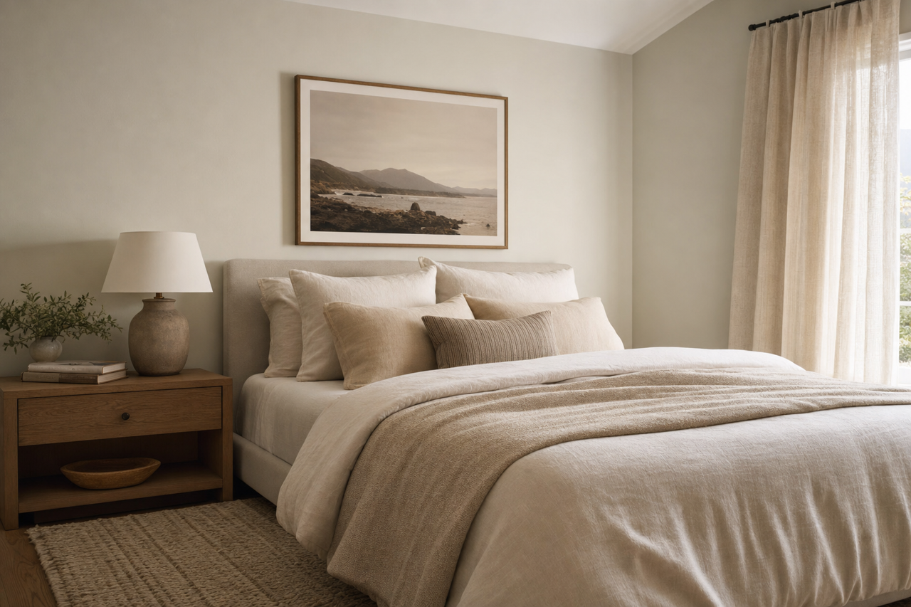
- Bedrooms: The cool undertones of Fleur de Sel promote relaxation, making it a perfect choice for a restful retreat. Pair it with soft linens and natural wood elements for a cozy yet modern vibe.
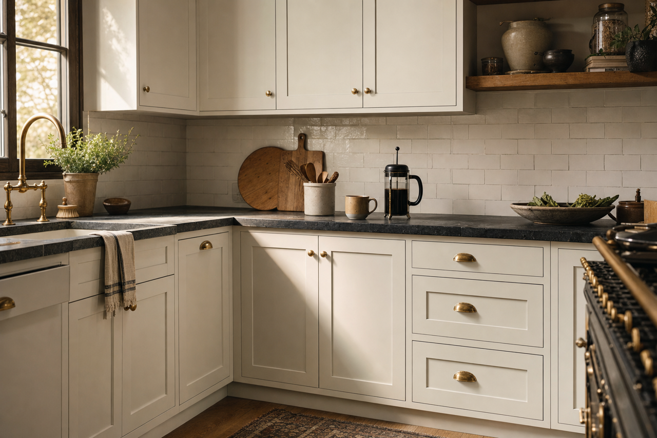
- Kitchens: Use Fleur de Sel on cabinetry or walls for a clean, fresh look. Pair it with white subway tiles and brushed nickel hardware for a timeless kitchen design.
- Bathrooms: Its subtle green undertones evoke a spa-like quality, especially when paired with crisp whites and natural stone finishes.
- Home Offices: Fleur de Sel can create a focused and serene environment, helping to boost productivity without feeling too stark or clinical.
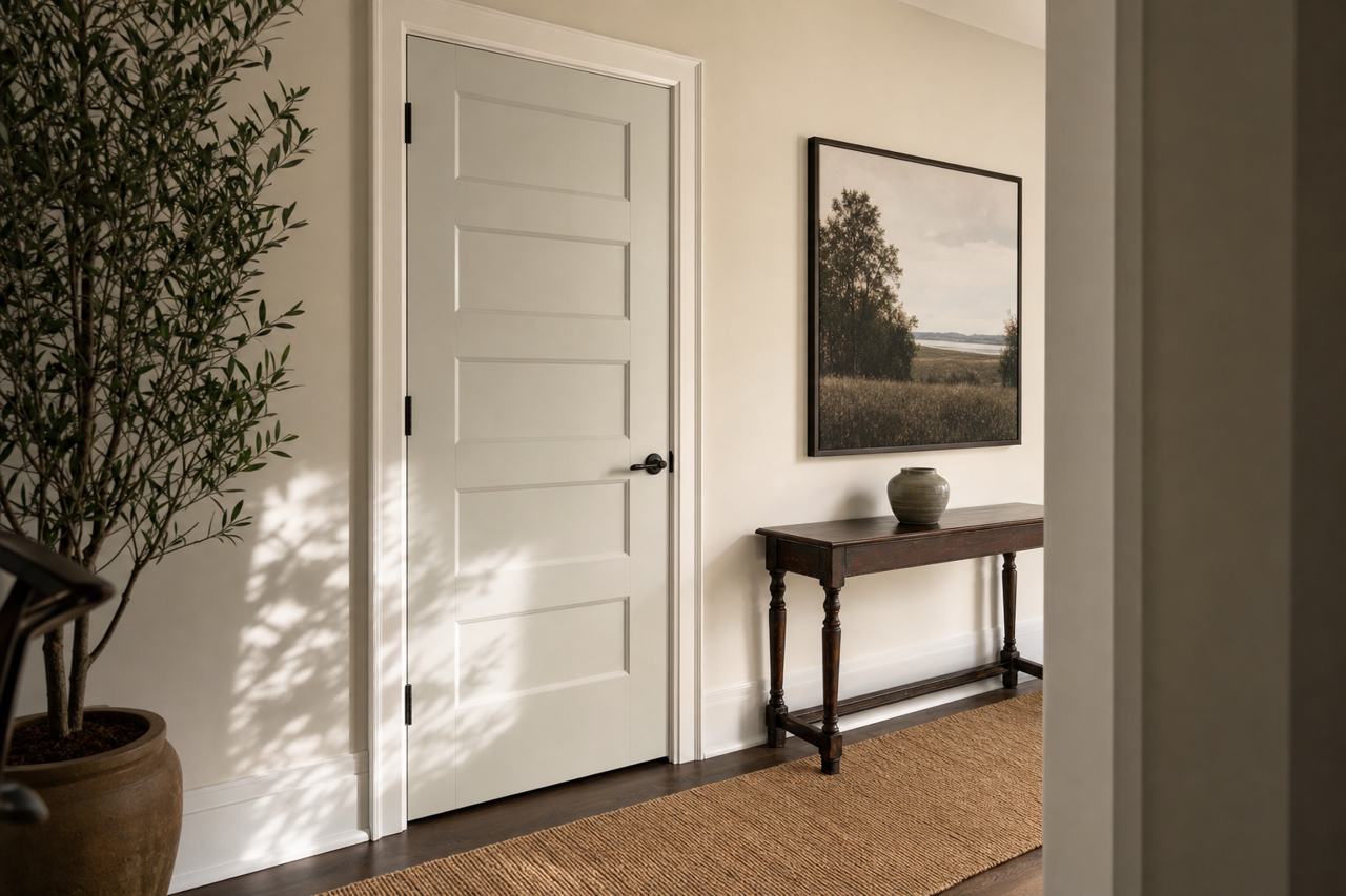
- Exterior: This color works beautifully on exteriors, particularly for coastal or Craftsman-style homes. Pair it with white trim and darker accent colors for a balanced, elegant façade.
Why Choose Fleur de Sel?
Sherwin-Williams Fleur de Sel is a color that strikes a perfect balance between warmth and coolness, making it a go-to choice for countless design projects. Whether you’re refreshing a single room or reimagining your entire home, this versatile shade adapts effortlessly to its surroundings. Its ability to reflect light beautifully, pair with a wide range of colors, and maintain a timeless appeal ensures it will remain a favorite for years to come.