

Sherwin-Williams Crescent Cream (SW 7721): A Warm, Inviting Neutral
Sherwin-Williams Crescent Cream (SW 7721) is a soft and timeless neutral that brings warmth, light, and a touch of sophistication to any space. This creamy off-white hue has an inviting quality that makes it incredibly versatile and easy to work with, whether you're refreshing a single room or designing an entire home. Its ability to adapt to different lighting conditions and décor styles makes it a go-to choice for homeowners and designers alike.
Color Profile and Undertones
Crescent Cream is a warm, creamy hue with subtle yellow undertones. While its base leans toward a soft, buttery beige, the yellow undertones give it a gentle glow that feels uplifting without being overpowering. These undertones ensure that Crescent Cream maintains a balance of warmth and neutrality, avoiding the starkness of pure white or the heaviness of deeper beige tones. In natural light, Crescent Cream radiates a cozy charm, while under artificial lighting, its warmth becomes more pronounced, creating a welcoming ambiance.
Coordinating Colors
Sherwin-Williams Crescent Cream pairs beautifully with a variety of colors, making it a highly versatile choice for interior and exterior design. Whether you're looking to create a monochromatic palette or add complementary accents, here are some coordinating colors that work well:
Monochromatic Pairings: For a seamless and cohesive look, pair Crescent Cream with other soft neutrals like Sherwin-Williams Netsuke (SW 6134) or Interactive Cream (SW 6113). These tones enhance the creamy warmth of Crescent Cream while adding subtle depth.
Complementary Accents: For a pop of contrast, consider using rich and earthy tones like Homburg Gray (SW 7622) or Dried Thyme (SW 6186). These deeper hues ground Crescent Cream and create a striking yet harmonious balance.
Cool Contrast: To add a refreshing twist, pair Crescent Cream with cooler shades like Rainwashed (SW 6211) or Sea Salt (SW 6204). These tranquil blues and greens provide a serene backdrop that complements Crescent Cream's warmth.
Trim and Ceilings: For trim, ceilings, or cabinetry, Sherwin-Williams Pure White (SW 7005) or Alabaster (SW 7008) offers a crisp and clean contrast that highlights Crescent Cream's soft tones.
Best Uses for Crescent Cream
Crescent Cream is a versatile shade that works well in various spaces, from traditional to modern interiors. Its warm and inviting quality ensures a timeless appeal, making it a perfect choice for the following applications:
Living Rooms
Crescent Cream is ideal for creating a cozy yet polished living room. Its creamy warmth enhances natural light, making the space feel larger and more open while maintaining a sense of comfort. Pair it with plush furnishings in neutral tones or add splashes of color through textiles and artwork for a striking yet inviting look.
Bedrooms
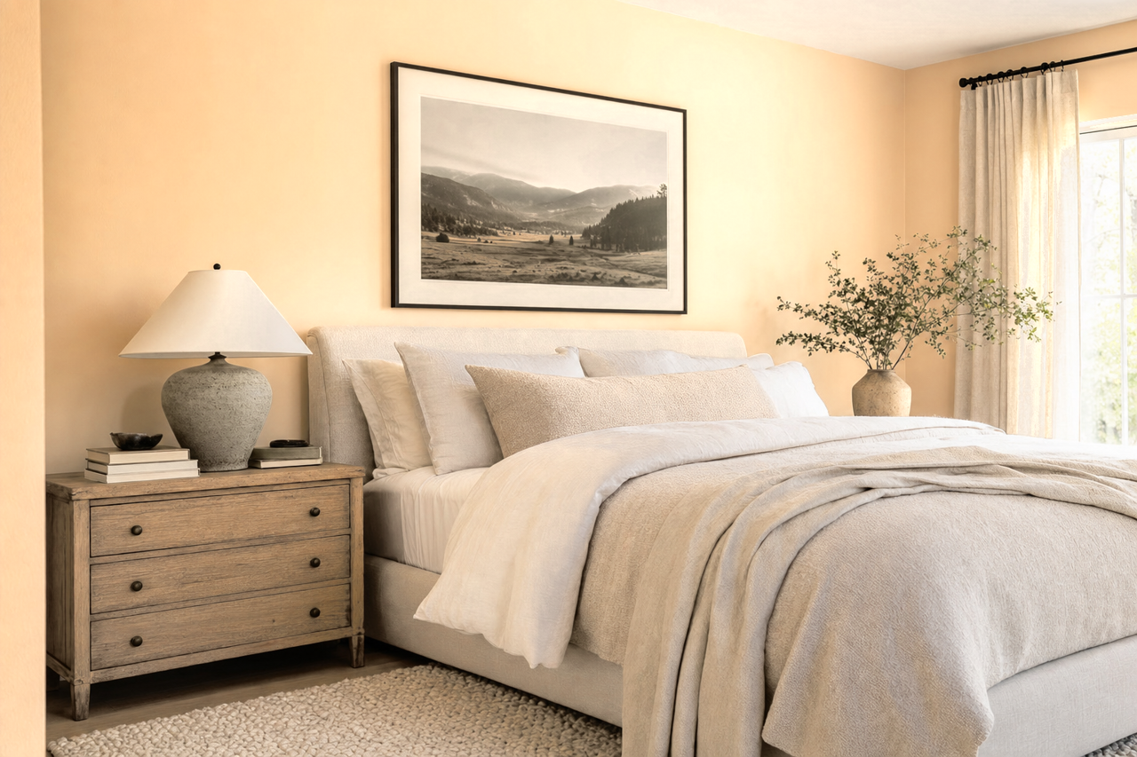
In bedrooms, Crescent Cream provides a serene, restful atmosphere. Its soft glow is perfect for cultivating a space that feels like a tranquil retreat. Layer the room with textures, such as linen bedding and velvet throw pillows, in coordinating colors to amplify the design.
Kitchens and Dining Areas
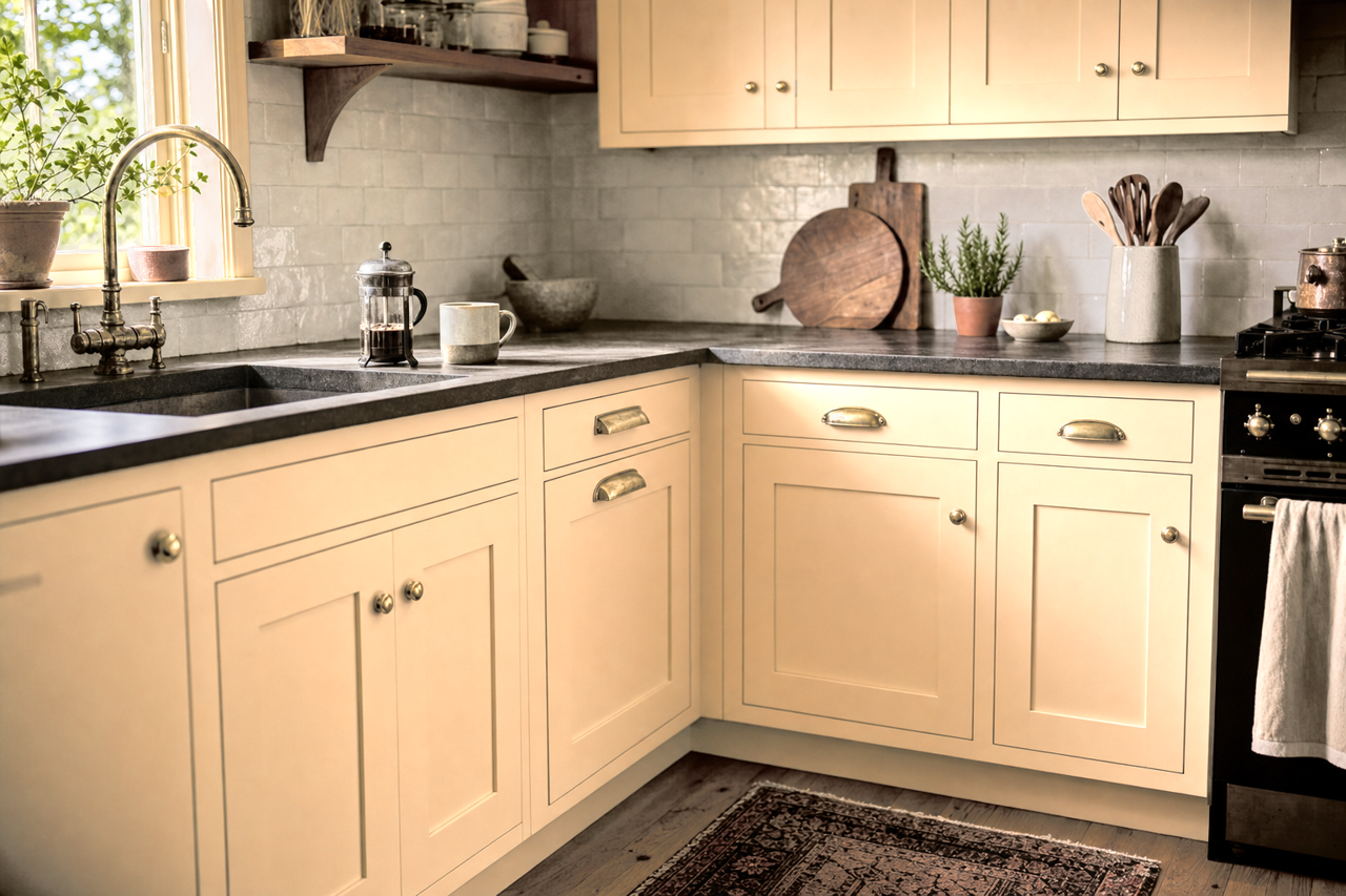
Crescent Cream is an excellent choice for kitchens and dining areas, where its warmth can create a welcoming environment. It pairs beautifully with both light and dark cabinetry, offering flexibility for various design styles. Add metallic accents in brushed gold or matte black for a touch of modern sophistication.
Bathrooms
For bathrooms, Crescent Cream exudes a spa-like calmness. It works well with natural materials such as marble, wood, and stone, creating a soothing and cohesive design. Opt for cool blue or green accents in towels and accessories to enhance the sense of relaxation.
Exteriors
Crescent Cream isn't just for interiors—it shines as an exterior paint color as well. Its warm, creamy tone is perfect for creating a timeless façade. Pair it with dark shutters or a bold front door color like Tricorn Black (SW 6258) for a classic and elegant look.
Why Choose Sherwin-Williams Crescent Cream?
Crescent Cream is more than just a paint color; it’s a design element that enhances the beauty and functionality of any space. Its warm undertones, versatility, and ability to complement a wide range of colors make it a standout neutral that never goes out of style. Whether you’re aiming for cozy and traditional or bright and contemporary, Crescent Cream adapts effortlessly, bringing warmth and character to your home.