
Sherwin-Williams Lullaby (SW 9136): A Soft, Serene Hue for Timeless Interiors
Sherwin-Williams Lullaby (SW 9136) is a delicate, whisper-soft paint color that captures the essence of tranquility. This gentle shade of blue-gray exudes a sense of calm, making it an excellent choice for spaces where relaxation and serenity are key. Whether you're transforming a nursery, living room, or bedroom, Lullaby’s soothing qualities can create a peaceful atmosphere that is both inviting and effortlessly elegant.
Undertones of Sherwin-Williams Lullaby
Lullaby is a cool-toned color with subtle gray undertones that lend it a refined softness. These gray undertones prevent it from skewing overly pastel or bright, making it more versatile than traditional baby blues. It also carries faint hints of green, depending on the lighting, which adds depth and complexity to the color. Its understated nature makes it adaptable across a variety of design styles, from modern and minimalist to coastal and traditional.
Coordinating Colors for Lullaby
Sherwin-Williams Lullaby pairs beautifully with a range of complementary shades, allowing you to create a harmonious palette for your interior design. Consider these coordinating colors:
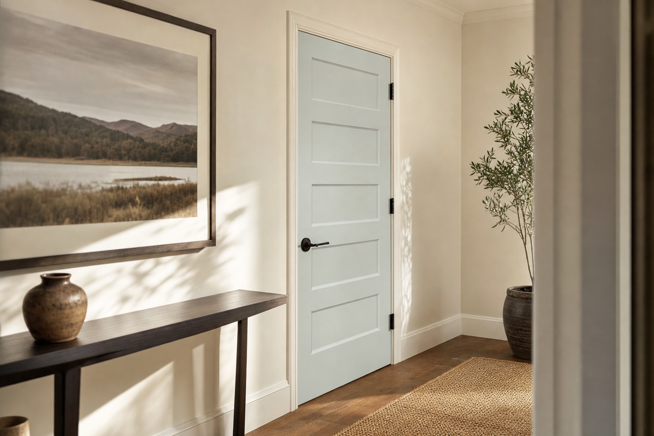
- Pure White (SW 7005): A crisp, clean white that enhances Lullaby’s soft elegance, perfect for trim, ceilings, or accent pieces.
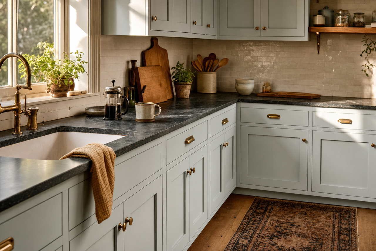
- Silver Strand (SW 7057): A cool gray-green that complements Lullaby’s undertones, ideal for adjacent walls or cabinetry.
- Rainwashed (SW 6211): A muted blue-green that creates a serene, cohesive look when paired with Lullaby.
- Sea Salt (SW 6204): A pale greenish-gray that adds a subtle contrast while maintaining the calming vibe.
- Peppercorn (SW 7674): A rich dark gray for dramatic accents, grounding the softness of Lullaby with bold sophistication.
Best Uses for Sherwin-Williams Lullaby
Lullaby’s versatility shines in a variety of spaces, making it a go-to choice for designers and homeowners alike. Here are some of the most effective ways to use this color:
1. Nurseries and Kids’ Rooms
The gentle, soothing aura of Lullaby makes it ideal for nurseries and children’s bedrooms. Pair it with white furniture and soft textiles to create a calming environment for rest and play.
2. Bedrooms
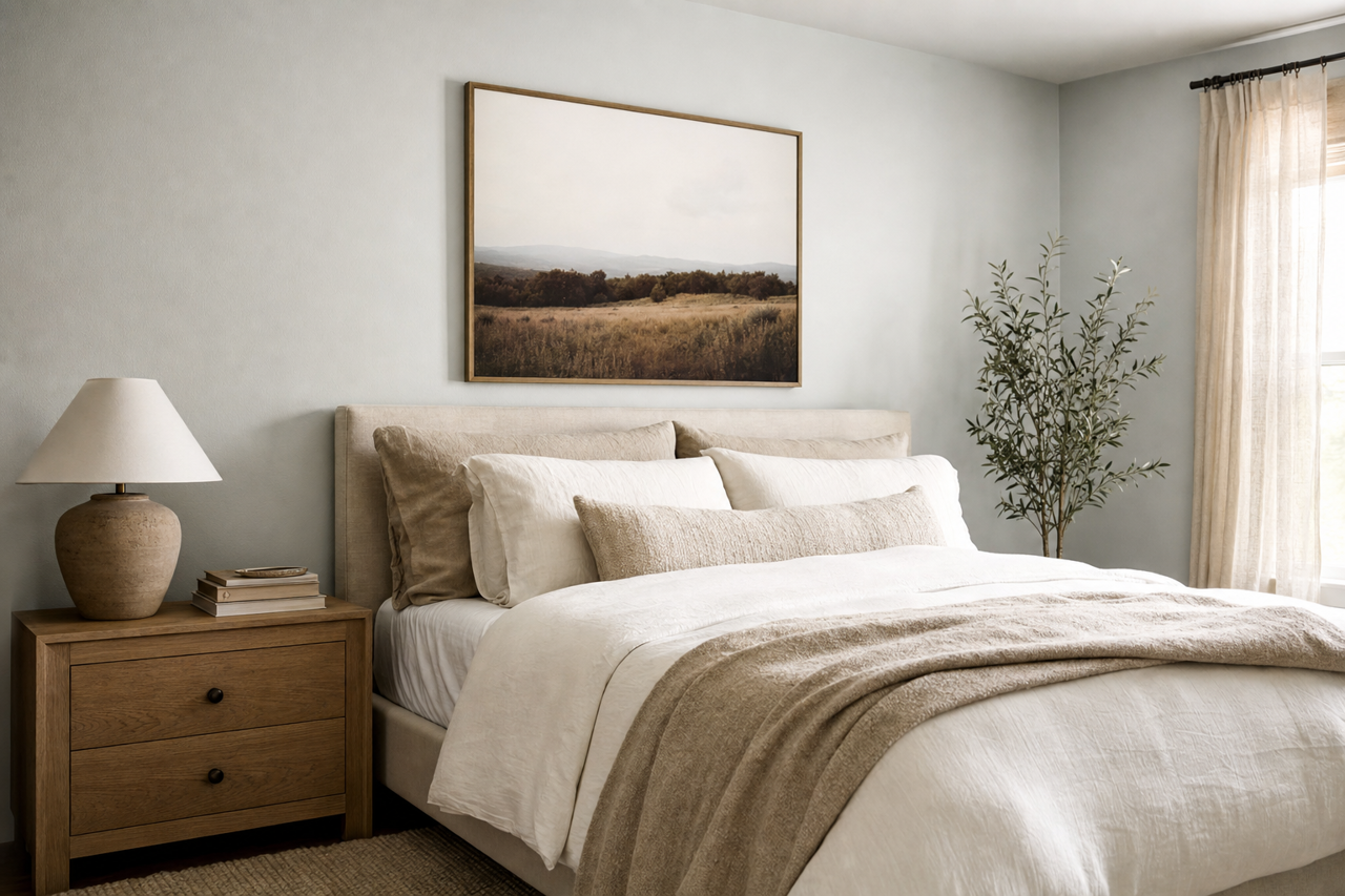
Introduce relaxation into your bedroom by using Lullaby on the walls. Its subtle gray undertones work exceptionally well with plush bedding in neutral tones or pastel accents for a dreamy retreat.
3. Living Rooms
Lullaby’s versatility makes it a wonderful choice for living rooms. Combine it with warm beige or taupe furnishings to balance its cool tones, or layer it with metallic accents like brushed brass or chrome for a modern aesthetic.
4. Bathrooms
Transform your bathroom into a spa-like sanctuary with Lullaby on the walls. Pair it with white subway tiles, natural wood elements, or marble countertops for a clean and timeless look.
5. Home Offices
In a home office setting, Lullaby fosters focus and calm. Use it as a backdrop for sleek, modern furniture or pair it with soft grays and blues to create a space that inspires productivity without overwhelming.
Lighting Considerations
Lullaby reacts beautifully to different lighting conditions. In natural light, it leans more toward blue, while artificial lighting may emphasize its gray undertones. To ensure the desired effect, sample the color in your space at different times of the day.
Why Choose Sherwin-Williams Lullaby?
Sherwin-Williams Lullaby (SW 9136) is more than just a paint color—it’s a mood enhancer. Its balanced blend of blue, gray, and subtle green undertones creates a serene canvas for any interior design project. By pairing it with coordinating colors and incorporating it thoughtfully into your space, you can achieve a timeless ambiance that feels both fresh and calming. Whether used as the main wall color or as an accent, Lullaby is a versatile choice that delivers understated elegance.