

Sherwin-Williams In the Navy 9178: A Sophisticated Classic
Sherwin-Williams In the Navy 9178 is a timeless, deep navy blue that exudes sophistication, strength, and versatility. This rich hue is more than just a color—it’s a statement. Whether you're looking to create a bold accent wall, a cozy backdrop, or a dramatic exterior, In the Navy delivers both elegance and visual depth. It’s a shade that feels luxurious yet grounded, making it a favorite for both modern and traditional interiors.
Undertones of In the Navy 9178
In the Navy is a true navy blue with subtle cool undertones. These undertones lend it a sleek and slightly moody appearance, balancing its intensity without veering into overly bright or overly muted territory. The coolness of the color pulls hints of gray and black, which add a refined depth and prevent it from feeling overly saturated. This makes In the Navy adaptable to a variety of lighting conditions, from natural daylight to warm artificial lighting. Depending on the surrounding colors and finishes, it can read as both bold and serene.
Key Undertones:
- Cool blue base with a slight gray influence
- Subtle black accents, providing richness and depth
- No overwhelming green or purple tones, ensuring a pure navy appearance
Coordinating Colors for In the Navy 9178
Pairing In the Navy with the right coordinating colors can create a seamless and harmonious palette. Because of its versatility, this navy blue shines in both contrasting and tonal color schemes. Whether you're aiming for a crisp, modern look or a cozy, layered effect, the options are endless.
Coordinating Neutrals:
- White Dove SW 7014: A soft, creamy white that creates a classic contrast
- Repose Gray SW 7015: A warm gray with light undertones that softens the boldness of the navy
- Pure White SW 7005: A clean, bright white that adds crispness and modernity
Accent Colors:
- Brassy Gold or Warm Metallics: These tones add warmth and glamour to the cool richness of In the Navy.
- Soft Blush Tones: Colors like Intimate White SW 6322, a gentle pink, can provide a romantic touch.
- Earthy Greens: Pairing In the Navy with organic tones like Clary Sage SW 6178 brings a natural and grounded feel to the space.
Bold Contrasts:
- Coral Reef SW 6606: A vibrant coral that pops beautifully against the dark navy
- Tricorn Black SW 6258: A deep black for a dramatic, monochromatic look
- Ripe Olive SW 6209: A muted green that complements the cool undertones of the navy
Ideal Uses for In the Navy 9178
The versatility of In the Navy makes it suitable for a variety of spaces, from interiors to exteriors, and from bold feature walls to subtle cabinetry. Its ability to enhance both modern and traditional aesthetics makes it a go-to choice for designers and homeowners alike.
Interior Applications:
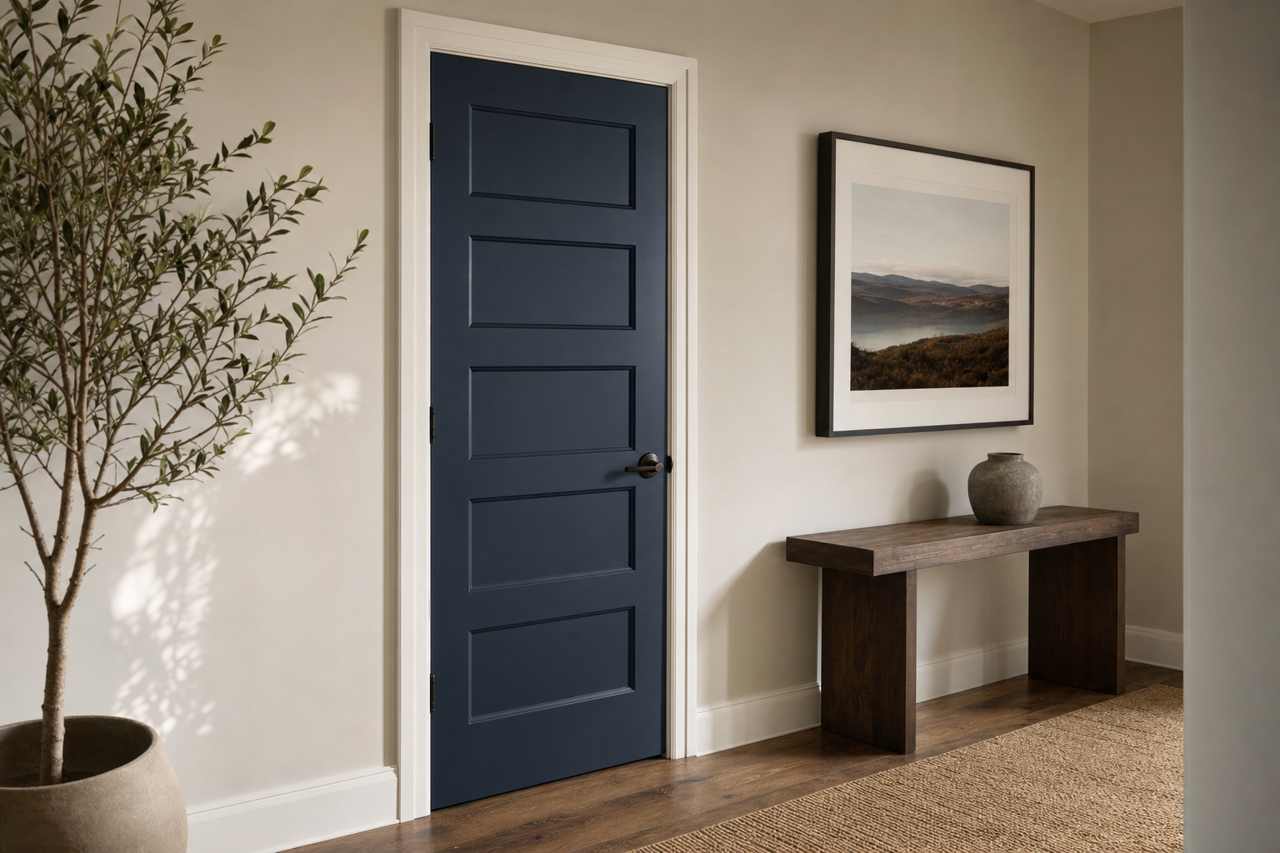
- Accent Walls: Create a focal point in living rooms, bedrooms, or dining areas with a single wall painted in this striking navy. Pair with crisp white trim for a classic, high-contrast look.
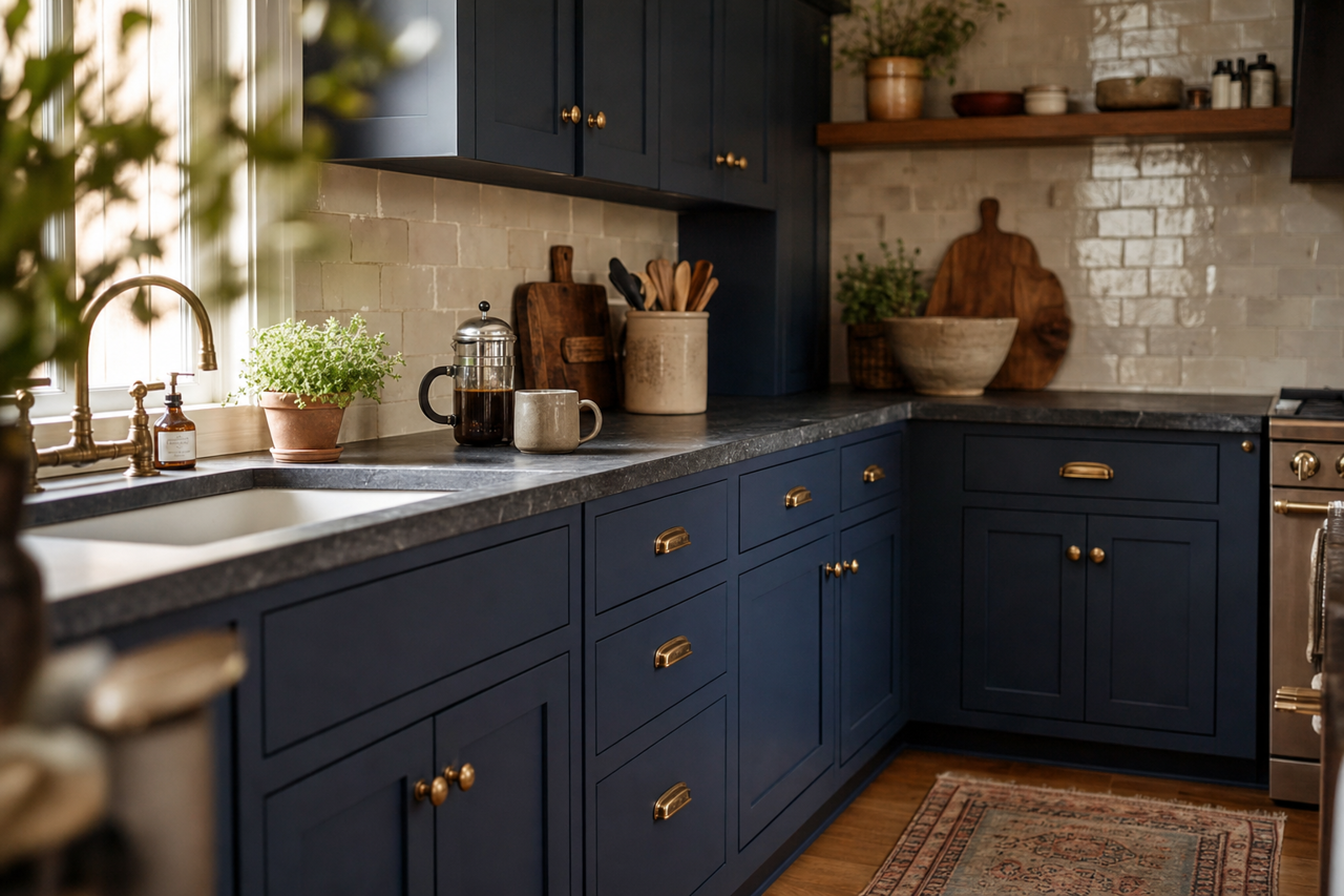
- Cabinetry: Transform kitchen or bathroom cabinets into a bold design feature. In the Navy adds depth and elegance to cabinetry, especially when paired with brass or gold hardware.
- Bedrooms: Use this color to create a cozy, cocoon-like space in master or guest bedrooms. Layer with plush textiles in lighter tones for balance.
- Ceilings: For a dramatic twist, paint the ceiling in In the Navy to draw the eye upward and create a sense of intimacy.