Benjamin Moore "At Sea" (1518) is a timeless and versatile paint color that brings a sense of calm, sophistication, and understated elegance to any space. This mid-tone blue-green shade is reminiscent of serene ocean waters, balancing a cool, tranquil vibe with just enough warmth to make it feel inviting and approachable. Whether you're updating a coastal-inspired interior or adding a fresh pop of color to a neutral palette, "At Sea" is a stunning choice for a variety of design styles.
One of the most captivating features of "At Sea" is its subtle undertones. This hue leans slightly more green than blue, with a soft gray undertone that grounds the color and prevents it from feeling overly vibrant or saturated. The gray undertone gives "At Sea" a sophisticated, muted quality, making it a versatile option that adapts beautifully to different lighting conditions. In bright, natural light, the green tones come forward, evoking the refreshing feel of seafoam. In dimmer settings or artificial light, the gray undertones deepen, lending a cozy, subdued quality to the space.
Benjamin Moore "At Sea" (1518) is a dream to work with when creating a cohesive color palette. Its balanced blue-green tone pairs effortlessly with a variety of coordinating colors, making it easy to design a space that feels curated and harmonious. Here are some suggestions for complementary shades:
Neutrals: Pair "At Sea" with soft, warm neutrals like Classic Gray (OC-23) or White Dove (OC-17) to create a clean, airy aesthetic that feels both modern and timeless. These light tones will enhance the serene quality of the color while keeping the space bright and open.
Earthy Tones: For a natural, organic vibe, combine "At Sea" with warm beige or taupe shades like Revere Pewter (HC-172) or Pale Oak (OC-20). This creates a grounded, earthy look that feels comforting and relaxed.
Accent Colors: To add depth and contrast, incorporate deep navy blues like Hale Navy (HC-154) or rich greens such as Cushing Green (HC-125). For a bolder accent, consider a soft coral like Coral Gables (2010-40) or a creamy yellow like Hawthorne Yellow (HC-4) to infuse the space with energy.
Metallics: Metallic finishes in brushed gold or aged brass pair wonderfully with "At Sea," enhancing its sophisticated undertones and adding a touch of glamour.
"At Sea" (1518) is a highly adaptable color that works well in a variety of rooms and design schemes. Its soothing, mid-tone quality makes it an excellent choice for spaces where you want to encourage relaxation and a sense of retreat. Here are some ways to incorporate this versatile shade into your home:
Transform your living room into a serene oasis with "At Sea" on the walls. Pair it with light-colored furniture, natural wood tones, and soft textiles to create a space that's both cozy and sophisticated. Add throw pillows or curtains in complementary shades to tie the look together.
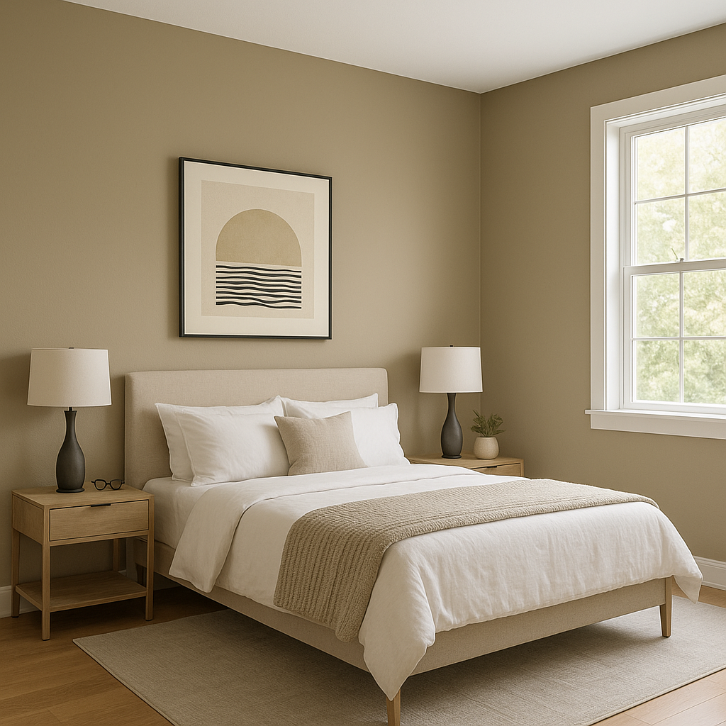
For a calming bedroom retreat, "At Sea" is an ideal choice. Use it as the main wall color and pair it with crisp white linens for a classic look. Add texture with woven baskets, soft throws, and plush area rugs to create a restful sanctuary.
Bring the tranquility of the ocean into your bathroom by using "At Sea" on the walls or cabinetry. Contrast it with bright white tiles or a marble countertop to achieve a spa-like atmosphere. Incorporate natural elements like bamboo accessories for a fresh, coastal-inspired feel.
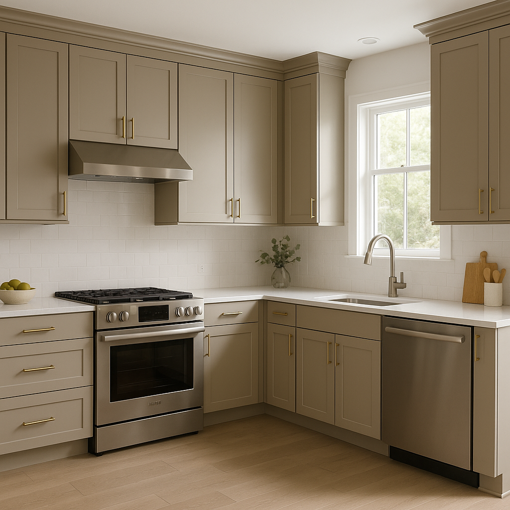
Make a statement in your kitchen or dining room by using "At Sea" on cabinetry or as an accent wall. Pair it with white countertops and polished nickel fixtures for a clean, contemporary look, or go for darker wood finishes and brass accents to add warmth and character.
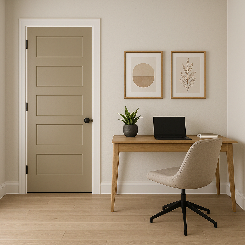
If you're not ready to commit to painting an entire room, "At Sea" is a fantastic choice for smaller areas like entryways, powder rooms, or built-ins. Its rich yet subdued tone adds depth and personality to these spaces without overwhelming them.
Benjamin Moore "At Sea" (1518) is more than just a color—it's a feeling. Its balanced blend of blue, green, and gray undertones makes it a versatile and timeless choice for both modern and traditional interiors. Whether you're aiming to create a relaxing retreat or add a touch of sophistication to your home, "At Sea" will deliver a polished, effortless result. Its ability to shift in tone depending on lighting conditions ensures it will complement your space beautifully, no matter the time of day.
View Colors Only by Brand (No Imagery):
Sherwin-Williams
|
Benjamin-Moore
|
Behr
|
Valspar
Live on the Eastern Slope of Colorado and looking for a local painting professional, check out all our painting services and reach out for a free estimate.
Copyright © 2026 : Wild Fox Painting Inc. : 12435 Mead Way, Littleton, CO 80125


