Benjamin Moore Saratoga (1669) is a sophisticated medium gray that exudes timeless elegance and versatility. Its balanced tone makes it an exceptional choice for creating interiors that feel grounded yet stylish. Whether you're designing a serene retreat or a contemporary living space, Saratoga delivers a refined and polished aesthetic that works beautifully across a variety of decor styles.
Saratoga is a gray with subtle blue undertones that add depth and a cool sophistication. These undertones make the color feel modern and crisp without veering into starkness. The blue hints are gentle enough to maintain versatility, allowing the gray to adapt beautifully in different lighting conditions. In spaces with natural light, the blue undertones may appear more pronounced, creating a calming and tranquil effect. In artificial or warmer lighting, Saratoga leans towards a soft neutral gray, making it suitable for both cool and warm environments.
Saratoga pairs seamlessly with a wide range of hues, enhancing its versatility for any design scheme. Here are some coordinating colors to consider:
Saratoga's versatility makes it an excellent choice for a variety of spaces and applications:
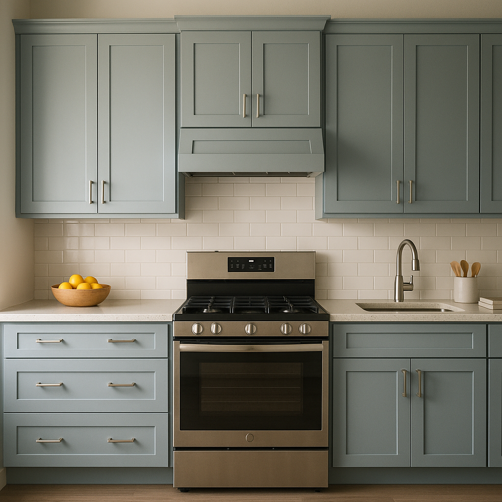
Saratoga creates a sophisticated backdrop for living spaces. Pair it with plush furniture in neutral or jewel tones, layered textures, and metallic accents to achieve an upscale yet cozy atmosphere.
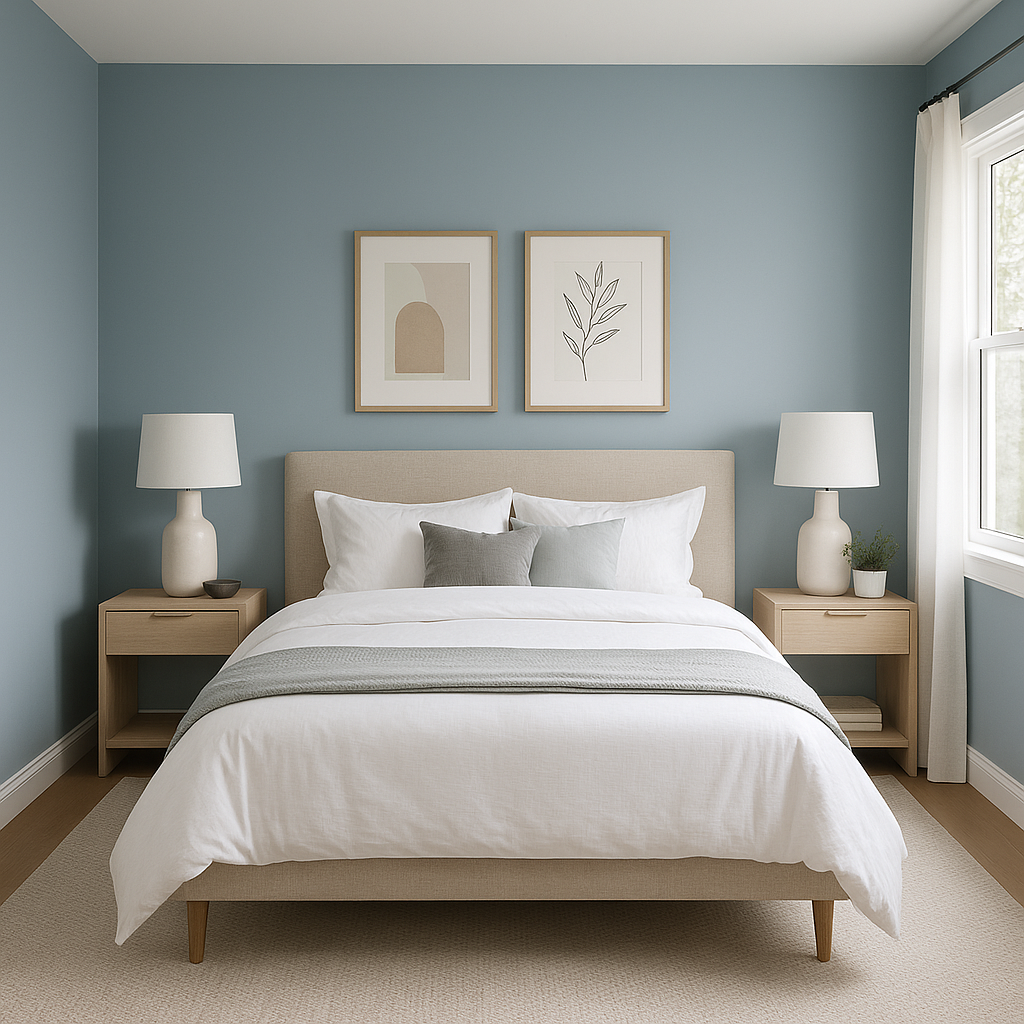
Its calming gray-blue undertones make Saratoga ideal for bedrooms. Use it to foster a serene environment by combining it with soft linens in whites, grays, or muted blues. Add natural wood furniture and warm lighting to enhance the cozy effect.
Saratoga’s cool undertones lend themselves beautifully to bathrooms. Pair it with white subway tiles, marble countertops, and chrome or brushed nickel fixtures for a spa-like ambiance.
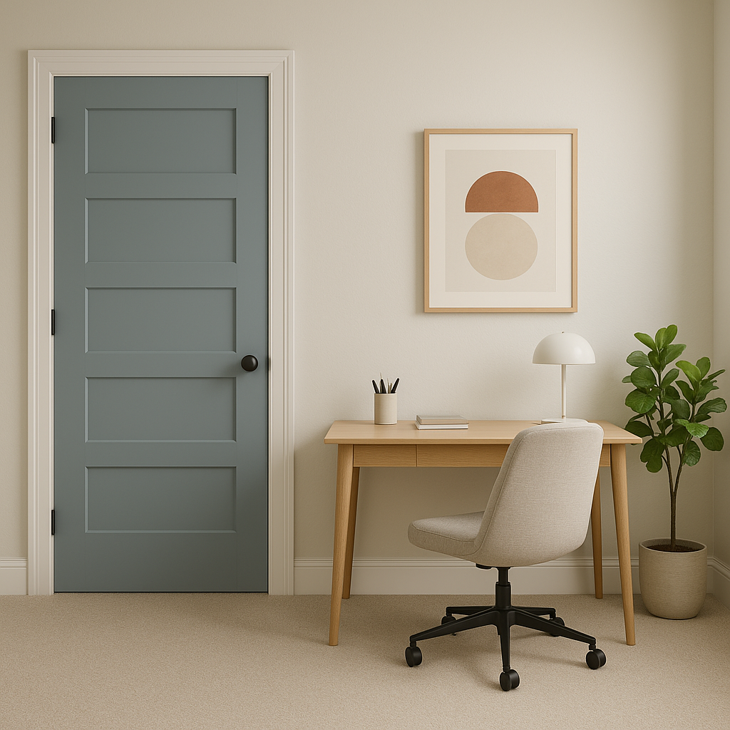
Looking for a color that promotes focus and productivity? Saratoga is perfect for home offices. Its neutral yet engaging tone provides enough character to inspire creativity without being distracting.
Saratoga also translates well for exterior applications, whether as siding, shutters, or trim. Pair it with crisp whites or deep blues for a classic and inviting curb appeal.
The appearance of Saratoga (1669) can vary based on the lighting in your space. In rooms with ample natural light, the blue undertones will emerge more prominently, creating a fresh and airy feel. In dim or artificial lighting, the gray becomes richer and warmer, making it feel cozy and grounded. Testing Saratoga in different lighting scenarios is recommended to ensure it achieves the desired effect in your specific space.
Benjamin Moore Saratoga strikes a perfect balance between boldness and neutrality. Its ability to complement a variety of colors and adapt to different lighting conditions makes it an interior designer’s dream. Whether used as a main wall color or an accent hue, Saratoga provides a timeless and versatile foundation for any room. Its cool elegance and subtle undertones ensure it remains a sophisticated choice for years to come.
View Colors Only by Brand (No Imagery):
Sherwin-Williams
|
Benjamin-Moore
|
Behr
|
Valspar
Live on the Eastern Slope of Colorado and looking for a local painting professional, check out all our painting services and reach out for a free estimate.
Copyright © 2026 : Wild Fox Painting Inc. : 12435 Mead Way, Littleton, CO 80125


