Sherwin-Williams Respite 6514 is a soothing and versatile blue that effortlessly transforms any space into a calm retreat. This color embodies a sense of tranquility and balance, making it a popular choice for those who seek a peaceful ambiance in their interiors. Its understated elegance pairs well with a wide range of styles, from coastal and modern to traditional and farmhouse-inspired designs.
Respite 6514 is a soft blue with subtle gray undertones. These gray nuances help ground the color, preventing it from feeling too bright or overwhelming. The muted quality of the gray undertones gives Respite a sophisticated and timeless character, making it an excellent choice for both small and large spaces. Additionally, this color leans slightly cool, but the overall effect is balanced and inviting rather than chilly.
To maximize the beauty of Sherwin-Williams Respite 6514, it’s essential to pair it with complementary hues that enhance its serene qualities. Here are some coordinating colors that work beautifully with Respite:
Whites and Off-Whites:
Sherwin-Williams Pure White (SW 7005) or Alabaster (SW 7008) can be used for trim, ceilings, or cabinetry to create a crisp and clean backdrop that highlights Respite’s soft blue tones.
Warm Neutrals:
Accessible Beige (SW 7036) or Natural Linen (SW 9109) provide a warm, earthy contrast that balances the coolness of Respite and adds depth to your space.
Deeper Blues and Grays:
Storm Cloud (SW 6249) or Naval (SW 6244) are excellent for accent walls, furniture, or decor. These deeper shades create a cohesive, layered look when paired with Respite.
Soft Greens:
Comfort Gray (SW 6205) or Sea Salt (SW 6204) bring a touch of nature-inspired harmony to the palette, enhancing the calming vibe of Respite.
Respite 6514’s versatility makes it suitable for various applications throughout your home. Its calming and understated nature allows it to shine in both private and shared spaces. Below are some ideas on where and how to use this beautiful shade:
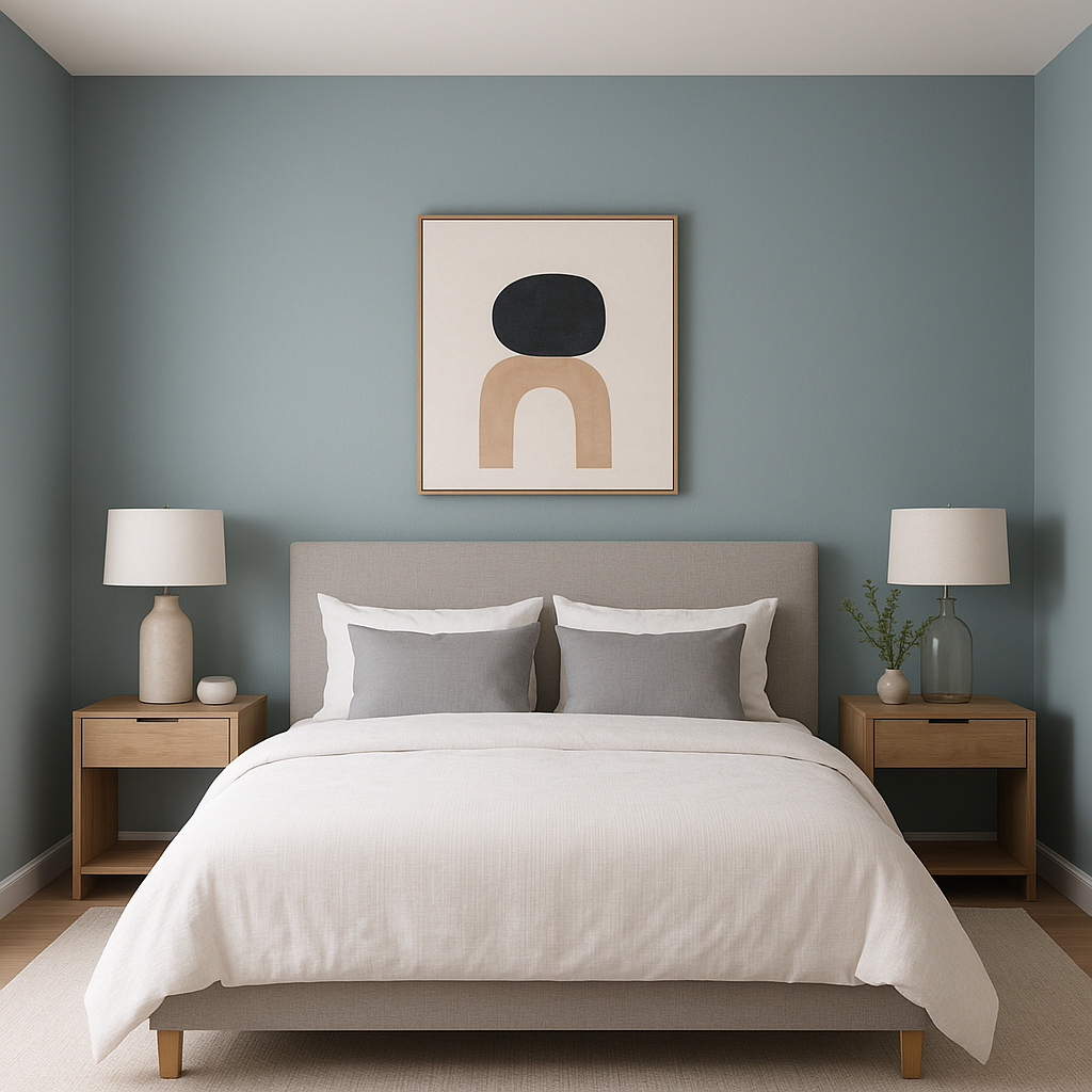
Bedrooms:
Respite is an ideal choice for bedrooms, where its serene undertones promote rest and relaxation. Pair it with soft white bedding, natural wood furniture, and cozy textiles for a tranquil retreat.
Living Rooms:
In living areas, Respite creates a welcoming and peaceful atmosphere. Use it on the walls with white or neutral furniture to achieve a light and airy look. Add pops of navy or muted green in throw pillows and decor for visual interest.
Bathrooms:
The cool, refreshing nature of Respite makes it a natural fit for bathrooms. Combine it with crisp white tile, marble, or chrome fixtures for a spa-like feel.
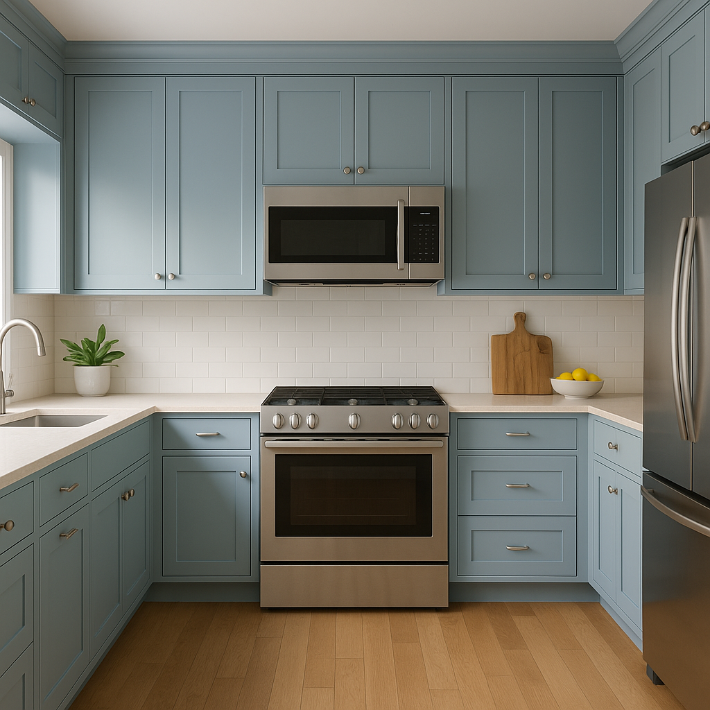
Kitchens:
Consider using Respite for cabinetry or as a wall color in kitchens. Pair it with white subway tiles, brushed nickel hardware, and light quartz countertops for a timeless aesthetic.
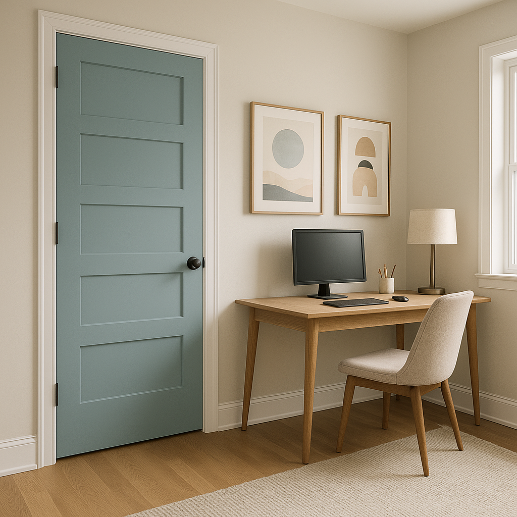
Home Offices:
In a workspace, Respite fosters focus and calm. Complement it with natural wood tones and minimalistic decor to create an environment that encourages productivity without feeling sterile.
Exteriors:
Respite can also be used on home exteriors. It works beautifully as a siding color, especially when combined with white trim and a darker blue or gray front door for a classic yet modern curb appeal.
Note: These images were all generated with AI, there may be inaccurate color results. Please only use a general reference to get a rough idea of what a color may look like, we will continue to generate new images to improve accuracy.
View Colors Only by Brand (No Imagery):
Sherwin-Williams
|
Benjamin-Moore
|
Behr
|
Valspar
Live on the Eastern Slope of Colorado and looking for a local painting professional, check out all our painting services and reach out for a free estimate.
Copyright © 2026 : Wild Fox Painting Inc. : 12435 Mead Way, Littleton, CO 80125


