Valspar Faint Maple (2008-9C): A Soft and Versatile Neutral
Valspar Faint Maple (2008-9C) is a timeless, soft neutral that brings a touch of understated elegance to any space. With its delicate balance of warmth and subtle coolness, this hue is the perfect choice for creating a serene and inviting atmosphere. Whether you're designing a cozy living room, a tranquil bedroom, or a sophisticated office, Valspar Faint Maple offers the versatility and charm to elevate your interior design vision.
Undertones: A Warm and Cool Fusion
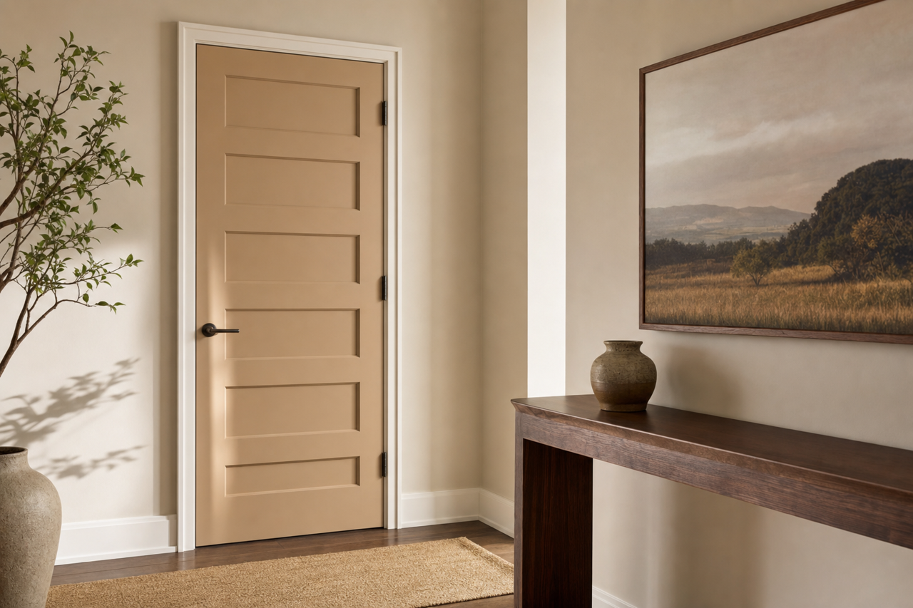
One of the most distinctive qualities of Valspar Faint Maple is its nuanced undertones. This shade sits gracefully between warm beige and soft gray, with subtle hints of taupe that make it incredibly adaptable. Its undertones shift depending on the lighting, appearing warmer in spaces with natural sunlight and cooler under artificial or LED lighting. This chameleon-like quality makes Faint Maple an excellent choice for homeowners and designers who desire a color that seamlessly blends into various design styles and lighting conditions.
Coordinating Colors: Perfect Pairings for Faint Maple
To highlight the beauty of Valspar Faint Maple, consider pairing it with complementary tones that enhance its subtle warmth and depth. Here are a few coordinating color suggestions:
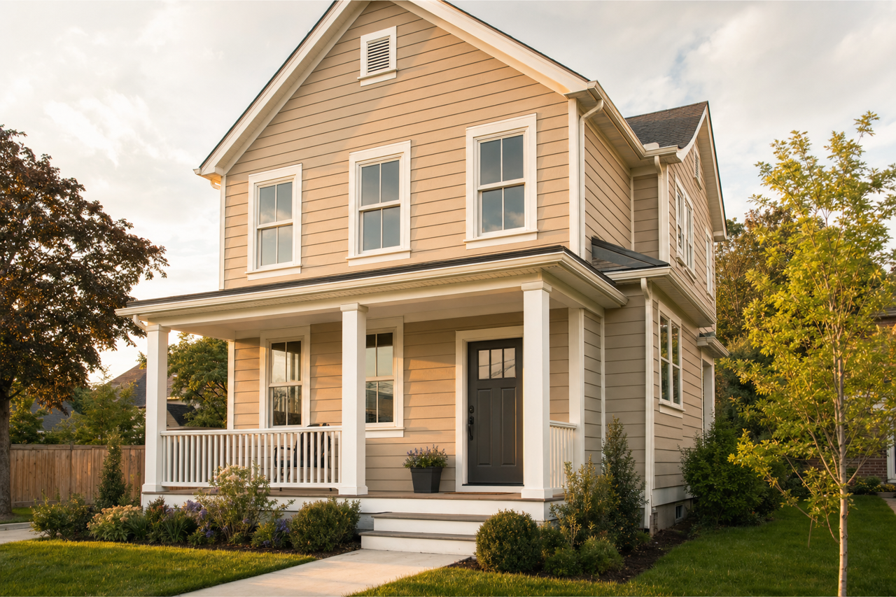
- Soft Whites and Creams: Colors like Valspar "Du Jour" or "Cream Delight" create a clean, fresh contrast, perfect for trim, ceilings, or accent furniture.
- Earthy Greens: Muted greens such as Valspar "Sage Bud" or "Meadow View" harmonize beautifully with Faint Maple, infusing the space with a natural, organic vibe.
- Rich Charcoals and Deep Blues: For a bold yet balanced contrast, pair Faint Maple with darker shades like Valspar "Ocean Storm" or "Lincoln Cottage Black." These deeper hues add drama and sophistication.
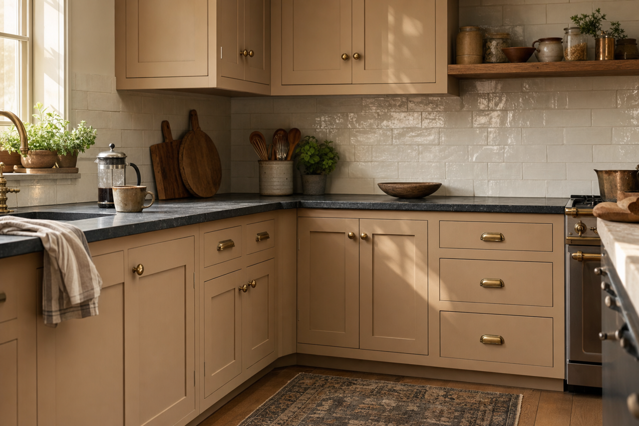
- Warm Metallics: Gold and bronze accents, whether in fixtures or décor, enhance the soft warmth of Faint Maple, creating a luxe and inviting feel.
By incorporating these complementary colors, you can craft a cohesive and visually appealing palette that works for both modern and traditional styles.
Best Uses: Where Faint Maple Shines
Valspar Faint Maple is truly a universal shade that can be used throughout the home. Its soft, neutral quality makes it suitable for a variety of applications:
- Living Spaces
In living rooms and family rooms, Faint Maple creates a warm and neutral backdrop that allows furniture, artwork, and accent pieces to shine. It works beautifully with both minimalist and eclectic design schemes.
- Bedrooms
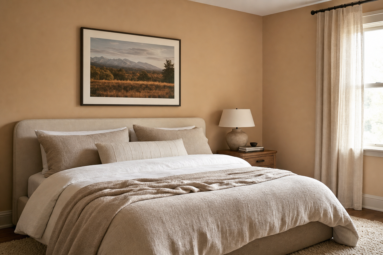
This shade's gentle undertones foster relaxation, making it ideal for bedrooms. Pair it with plush textiles and soft lighting to create a cozy retreat.
- Kitchens and Dining Areas
Faint Maple's versatility makes it a great choice for kitchens and dining rooms. It pairs well with natural wood finishes, white cabinetry, and metallic hardware for a clean yet inviting look.
- Offices or Study Areas
If you're designing an office or workspace, Faint Maple's calming qualities can help maintain focus while reducing visual distractions. Pair it with sleek furniture and muted accents for a productive environment.
- Bathrooms
In bathrooms, this neutral hue adds a spa-like calmness. Combine it with white or marble finishes and chrome fixtures to achieve an effortless, polished aesthetic.
Why Choose Valspar Faint Maple?
Valspar Faint Maple (2008-9C) is more than just a neutral paint color—it's a versatile foundation for any design vision. Its ability to adapt to different lighting, coordinate with a wide range of colors, and complement various styles makes it a go-to choice for homeowners and designers alike. Whether you're aiming for a cozy, rustic feel or a sleek, modern ambiance, Faint Maple provides the perfect balance of warmth and sophistication.
For those seeking a paint color that is as adaptable as it is beautiful, Valspar Faint Maple delivers a soft, timeless charm that enhances any space.