Benjamin Moore Pastel (548) is a timeless color that exudes softness and sophistication. Its delicate nature makes it a perfect choice for creating serene spaces that feel both refined and welcoming. With a subtle touch of warmth and versatility, this shade works beautifully in a variety of design schemes, whether you're aiming for understated elegance or a light and airy ambiance.
Benjamin Moore Pastel (548) is a muted, creamy beige that leans toward the lighter side of the neutral spectrum. It is characterized by its gentle warmth, which stems from its soft undertones of peach and faint yellow. These undertones help the hue maintain a cozy and inviting feel without veering into starkness or cool gray territory. The result is a color that feels fresh yet grounded, striking the perfect balance between sophistication and simplicity.
The warmth in Pastel (548) makes it particularly adept at catching natural light, allowing it to glow softly in bright spaces. However, it remains consistent and graceful under artificial lighting, making it a versatile choice for both daytime and evening interiors.
Benjamin Moore Pastel (548) pairs beautifully with a variety of complementary and contrasting hues, offering endless possibilities for design. Below are some coordinating colors that enhance its charm and create harmonious palettes:
Soft Whites: Shades like Benjamin Moore White Dove (OC-17) or Chantilly Lace (OC-65) provide crisp, clean contrast while maintaining a warm and approachable feel. These are ideal for trim, ceilings, or accents.
Earthy Greens: For a natural and soothing vibe, pair Pastel (548) with muted greens like Benjamin Moore Saybrook Sage (HC-114) or Soft Fern (2144-40). These tones evoke a sense of tranquility and balance.
Rich Browns: Add depth and drama with rich tones like Benjamin Moore Kendall Charcoal (HC-166) or Fairview Taupe (HC-85). These darker shades anchor the space and create a sophisticated contrast.
Subtle Blues: Light blue hues such as Benjamin Moore Pale Smoke (1584) or Wedgewood Gray (HC-146) bring a refreshing touch to the palette while maintaining the soft, relaxed feel of the space.
Benjamin Moore Pastel (548) is an incredibly versatile color that can transform a wide variety of spaces. Here are some suggestions for incorporating it into your home or project:
Pastel (548) is an ideal choice for living rooms where you want to create a cozy yet sophisticated vibe. Its creamy warmth works well with soft furnishings, natural wood tones, and light fabrics, offering a welcoming backdrop for both intimate gatherings and day-to-day relaxation.
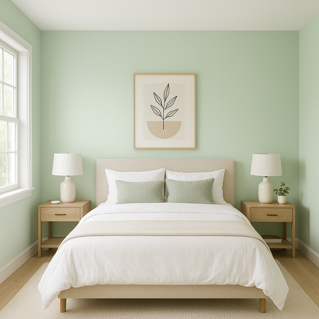
For bedrooms, this shade sets the stage for tranquility and comfort. Pair it with plush textiles and warm lighting to craft a retreat-like atmosphere. Its understated elegance makes it equally suitable for classic or modern aesthetics.
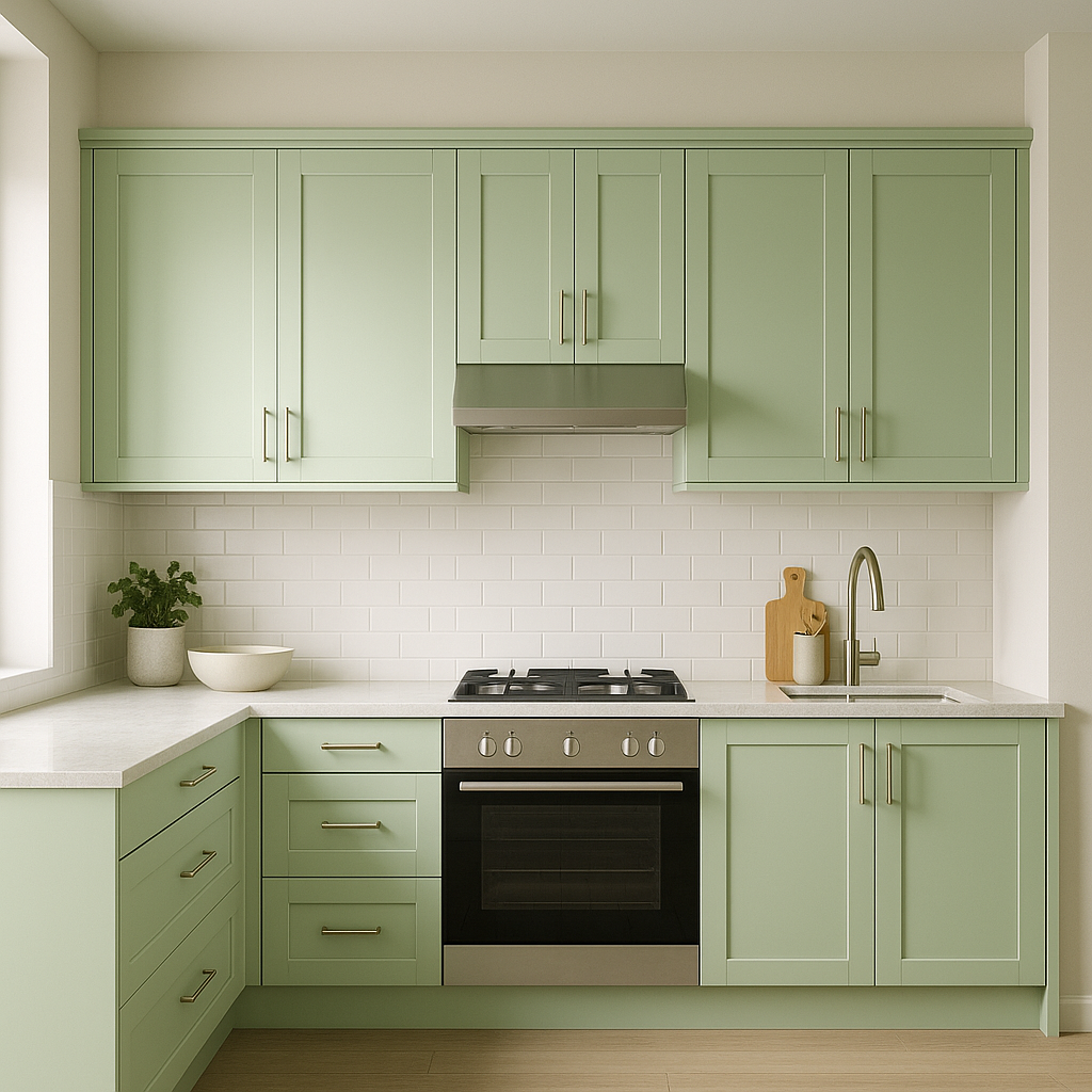
Bring warmth and light to your kitchen with Pastel (548. Whether used on walls or cabinetry, its gentle hue pairs seamlessly with stone countertops, brass or matte black hardware, and natural wood accents for a timeless, inviting space.
Pastel (548) shines in bathrooms, creating a spa-like feel that feels clean yet calming. Pair it with white subway tiles, marble finishes, and soft greenery for a polished yet soothing environment.
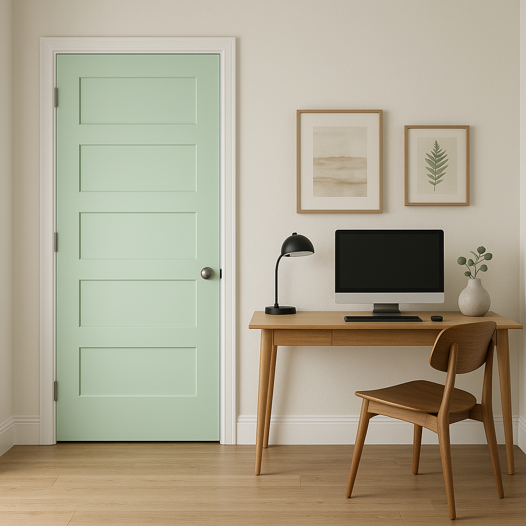
The subtle nature of Pastel (548) makes it perfect for transitional spaces like hallways and entryways. It offers a classic and neutral backdrop for artwork, mirrors, or decorative lighting fixtures.
Benjamin Moore Pastel (548) is more than just a paint color; it’s a tool for creating environments that feel serene, warm, and thoughtfully designed. Its subtle undertones and ability to pair with a wide range of coordinating colors make it a versatile choice for modern, traditional, or eclectic interiors. Whether you're looking to refresh a single room or establish a cohesive color palette throughout your home, Pastel (548) delivers graceful elegance every time.
View Colors Only by Brand (No Imagery):
Sherwin-Williams
|
Benjamin-Moore
|
Behr
|
Valspar
Live on the Eastern Slope of Colorado and looking for a local painting professional, check out all our painting services and reach out for a free estimate.
Copyright © 2026 : Wild Fox Painting Inc. : 12435 Mead Way, Littleton, CO 80125


