Sherwin-Williams Dutch Tile Blue (SW 0031) is a captivating, medium-toned blue that evokes a sense of timeless sophistication and historical charm. This richly pigmented shade is deeply rooted in tradition, reminiscent of handcrafted ceramic tiles found in European homes. Its versatility, depth, and understated elegance make it an ideal choice for a variety of interior and exterior spaces, lending a sense of calm and refinement wherever it’s used.
Dutch Tile Blue carries distinct gray undertones, softening its blue base and giving it a muted, subdued appearance. These cool undertones make the color feel grounded and harmonious, creating a balance that steers clear of overly vibrant or saturated blues. The gray influence provides it with an adaptable character, making it suitable for both modern and traditional design aesthetics.
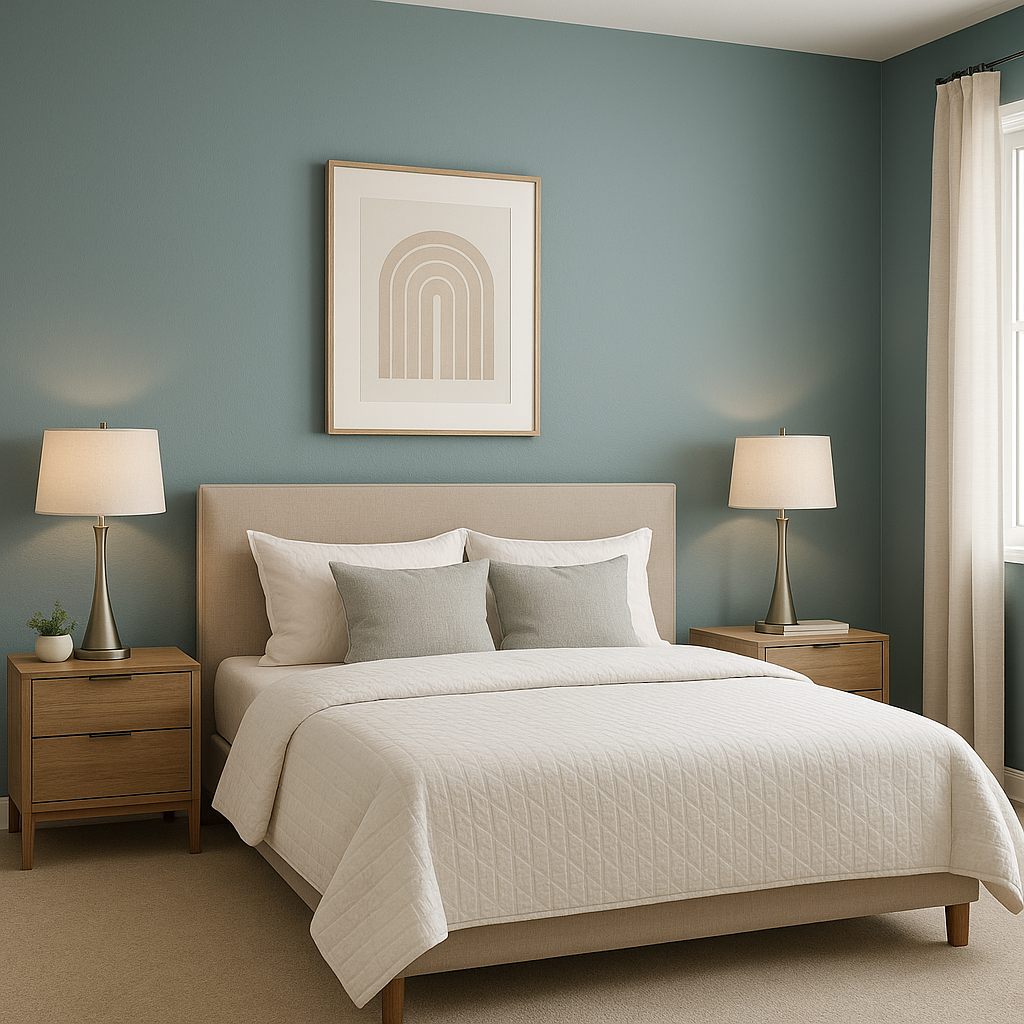
This shade's undertones also contribute to its ability to evoke tranquility, making it an excellent option for spaces where relaxation and serenity are prioritized, such as bedrooms, bathrooms, or home offices.
Dutch Tile Blue pairs beautifully with a wide range of complementary colors, allowing you to craft a cohesive and well-rounded palette. Consider these suggestions when coordinating with Dutch Tile Blue:
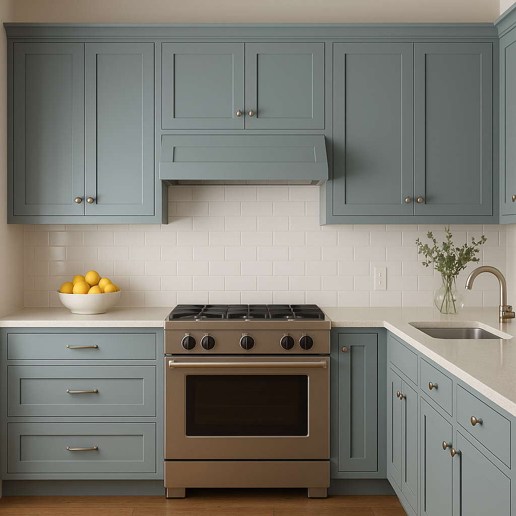
Dutch Tile Blue is particularly striking when paired with metallic finishes like brushed nickel, antique brass, or polished chrome. These accents enhance the color’s timeless appeal and add a touch of sophistication.
Dutch Tile Blue is a versatile color that works beautifully across various rooms:
Dutch Tile Blue is ideal for bathrooms, where its cool undertones evoke the feeling of water and tranquility. Consider pairing it with white wainscoting, marble countertops, or brushed nickel fixtures for a spa-like effect.
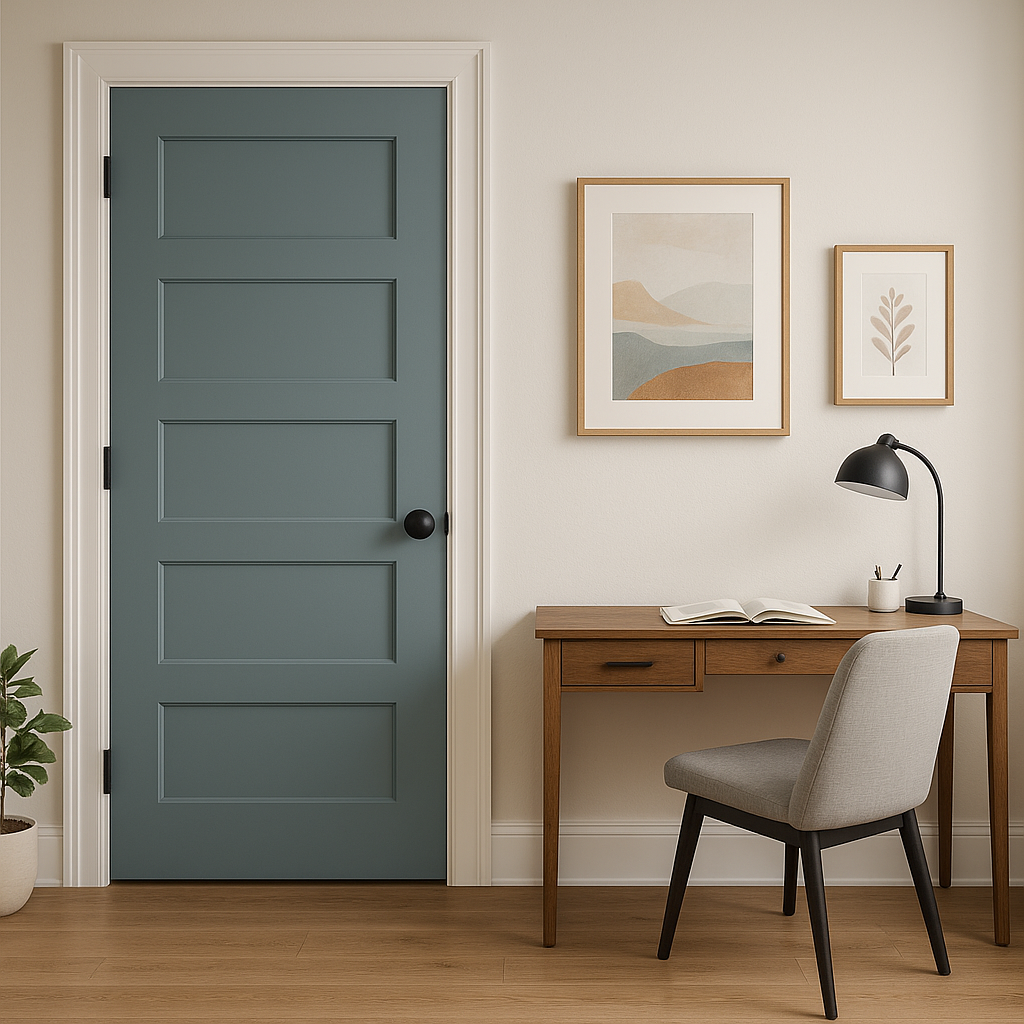
This shade works wonderfully as an accent color for built-ins, feature walls, or furniture. Use Dutch Tile Blue to add depth and interest to spaces without overwhelming the overall design.
Dutch Tile Blue isn’t just for interiors—it shines as an exterior color as well. Consider it for:
Sherwin-Williams Dutch Tile Blue (SW 0031) is more than just a color—it’s a design statement that bridges the gap between tradition and modernity. Its muted gray undertones, coordinating versatility, and wide range of applications make it a go-to choice for creating spaces that feel elegant, serene, and inviting. Whether you’re seeking a refined interior or a bold exterior, Dutch Tile Blue is a timeless option that elevates any design.
Note: These images were all generated with AI, there may be inaccurate color results. Please only use a general reference to get a rough idea of what a color may look like, we will continue to generate new images to improve accuracy.
View Colors Only by Brand (No Imagery):
Sherwin-Williams
|
Benjamin-Moore
|
Behr
|
Valspar
Live on the Eastern Slope of Colorado and looking for a local painting professional, check out all our painting services and reach out for a free estimate.
Copyright © 2026 : Wild Fox Painting Inc. : 12435 Mead Way, Littleton, CO 80125


