
Sherwin-Williams Blue Peacock (SW 0064): A Bold and Sophisticated Jewel Tone
Sherwin-Williams Blue Peacock (SW 0064) is a rich, luxurious color that effortlessly combines elegance and drama. This deep, jewel-toned shade of teal strikes a perfect balance between blue and green, making it a captivating choice for interiors that aim to make a statement. Whether you're designing a cozy reading nook, a moody dining room, or an opulent accent wall, Blue Peacock brings depth and character to any space.
Undertones That Add Depth and Complexity
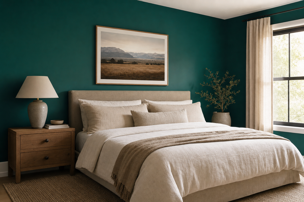
Blue Peacock is not your average teal—its undertones give it a multidimensional quality that sets it apart. The color leans slightly toward the cooler side, with blue undertones dominating the mix, while hints of green add a subtle vibrancy that feels both fresh and grounded. Depending on the lighting in your space, Blue Peacock may appear more blue in cooler environments or more green in warmer lighting. Its chameleon-like adaptability makes it a versatile choice for various settings and styles.
Coordinating Colors for a Harmonious Palette
Creating a cohesive design with Blue Peacock is easy when paired with the right coordinating colors. The deep, saturated hue pairs beautifully with neutrals, metallics, and other jewel tones. Here are some suggestions for complementary shades:
Neutral Pairings:
- Alabaster (SW 7008): A soft, creamy white that balances the boldness of Blue Peacock.
- Agreeable Gray (SW 7029): A warm greige that adds subtle contrast without overpowering.
- Iron Ore (SW 7069): A dark, moody charcoal that enhances Blue Peacock’s dramatic appeal.
Metallic Accents:
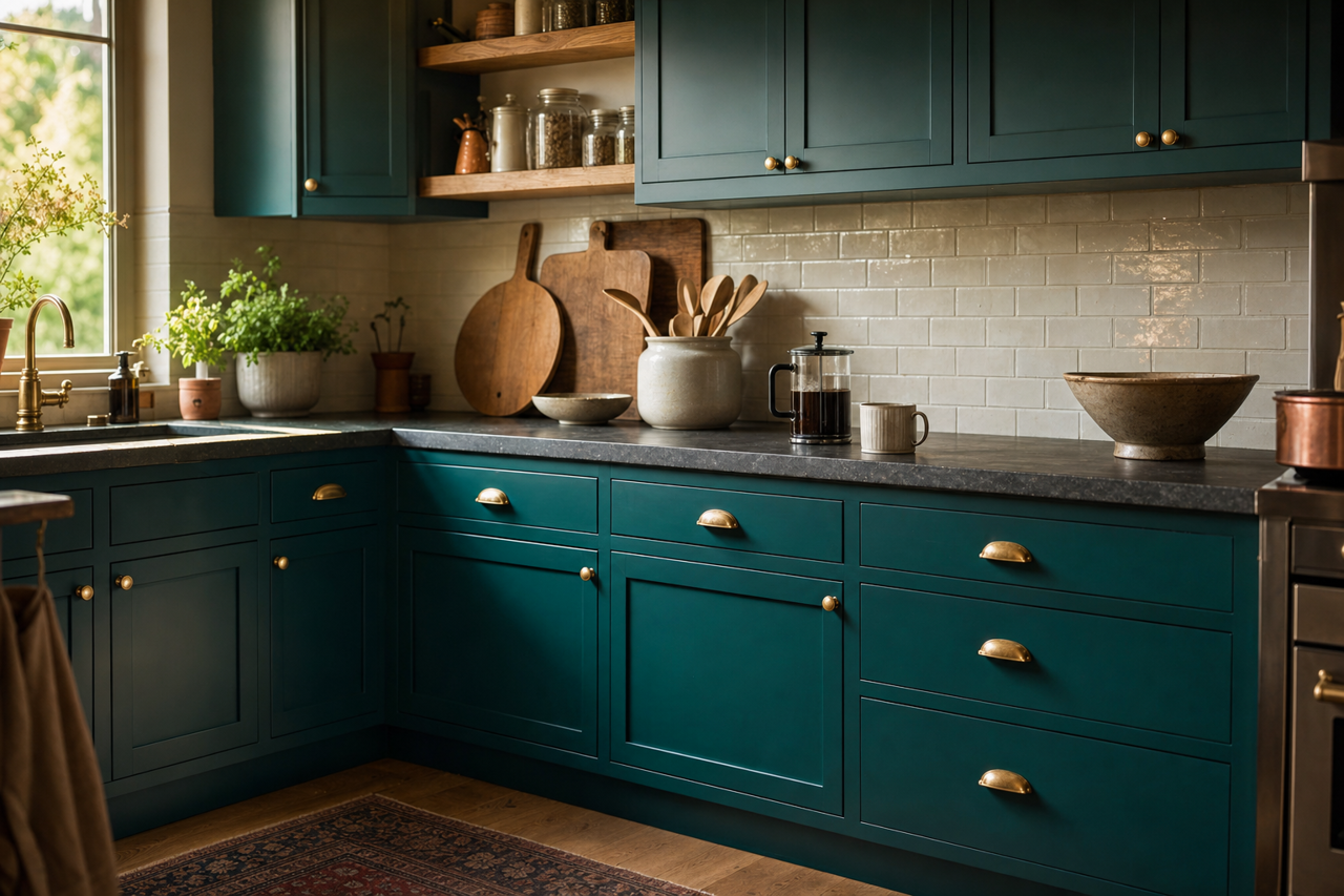
- Gold or Brass: Metallics like brushed gold or antique brass bring out the richness of Blue Peacock and add a touch of glamour.
- Copper: The warm tones of copper create an earthy yet luxe vibe when paired with this color.
Jewel-Toned Complements:
- Raspberry Blush (SW 7586): A vibrant pink-red that adds a playful yet sophisticated touch.
- Oceanside (SW 6496): Another saturated teal that works cohesively within the same color family.
- Tricorn Black (SW 6258): A bold black that grounds the palette and enhances the richness of Blue Peacock.
Best Uses for Sherwin-Williams Blue Peacock
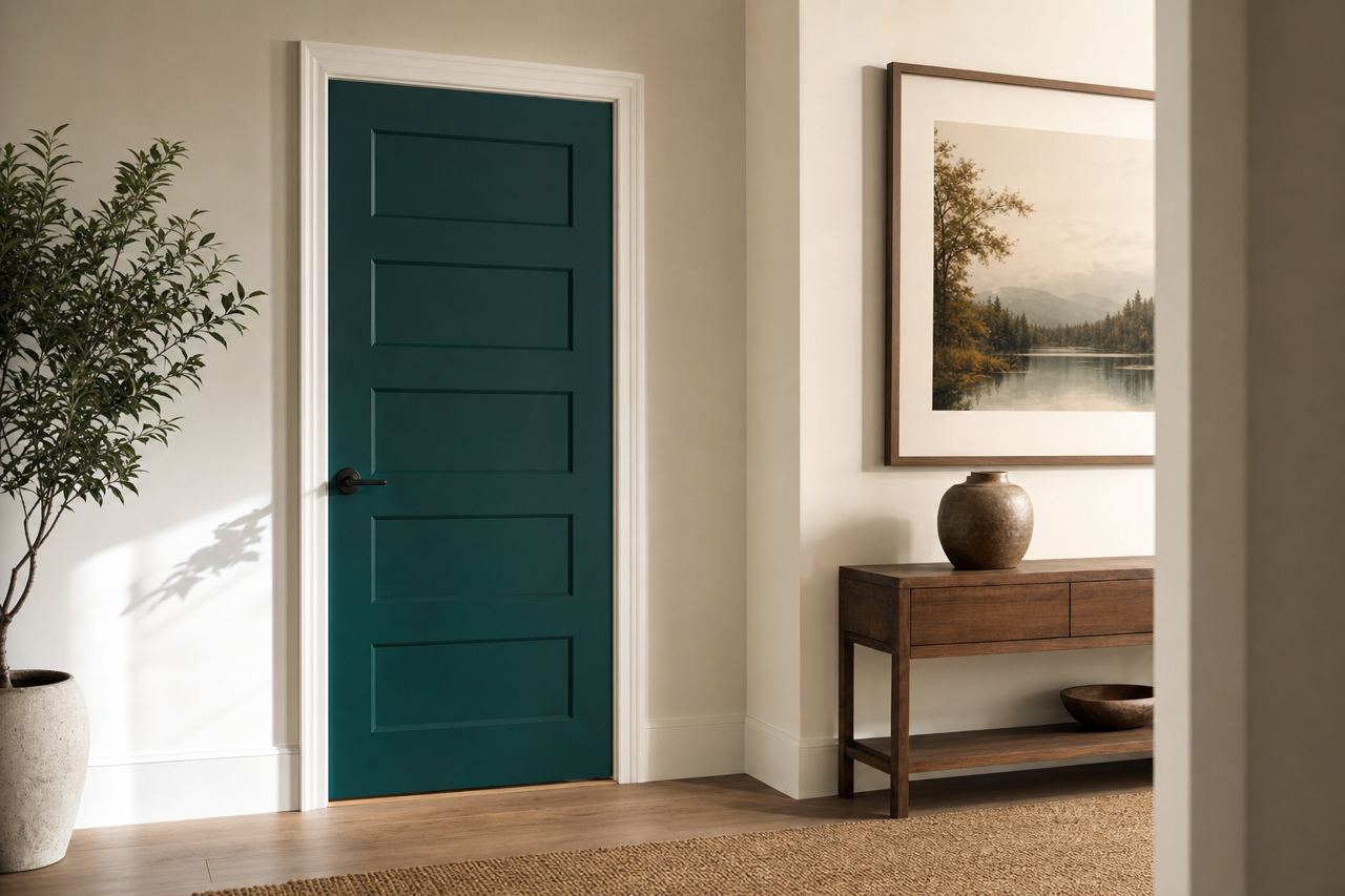
Blue Peacock is a color that demands attention and creates an aura of sophistication wherever it’s used. Its versatility allows it to shine in various applications, from walls to furniture and even cabinetry. Below are some ideas to help you incorporate this stunning shade into your home:
Accent Walls:
Use Blue Peacock on a single wall to create a focal point in living rooms, bedrooms, or entryways. Pair it with lighter neutrals or crisp whites for a striking contrast that enhances the impact of the color.
Dining Rooms and Libraries:
Blue Peacock’s rich tone is perfect for spaces that benefit from a moody, intimate atmosphere. It works exceptionally well in formal dining rooms or cozy libraries, where its depth creates a timeless and inviting ambiance.
Cabinetry and Furniture:
Transform kitchen cabinets or built-in bookshelves with Blue Peacock for a bold yet elegant look. Pair it with marble countertops and brass hardware for a refined finish.
Ceilings:
For a dramatic twist, consider using Blue Peacock on ceilings in smaller spaces like powder rooms or home offices. This unexpected application creates a luxurious cocoon-like feel.
Bathrooms:
In bathrooms, Blue Peacock looks stunning alongside crisp white tiles, gold fixtures, and natural wood elements. Its cool, calming undertones make it an excellent choice for creating a spa-like retreat.
Lighting Considerations
Because Blue Peacock is a bold, saturated hue, lighting plays a key role in how the color is perceived. In rooms with ample natural light, the green undertones may become more pronounced, giving the space a lively vibe. Conversely, in dimly lit spaces or under warm artificial light, the blue tones take center stage, creating a moody and sophisticated ambiance. Always test the color in your space to see how it interacts with your specific lighting conditions.
Sherwin-Williams Blue Peacock (SW 0064) is more than just a paint color; it’s an opportunity to infuse your home with personality, depth, and timeless elegance. Whether used as a statement piece or integrated into a larger palette, this versatile jewel tone is sure to transform your space into something extraordinary.