Sherwin-Williams Doeskin (SW 6044) is a versatile and sophisticated neutral paint color that effortlessly blends warmth and subtlety. Perfect for creating inviting, elegant spaces, this shade sits comfortably between beige and taupe, making it a go-to choice for homeowners and designers seeking a timeless backdrop that complements both modern and classic aesthetics.
Doeskin features soft, warm undertones of pink and brown, giving it a cozy and welcoming personality. These undertones create a gentle richness that keeps the shade from feeling too stark or flat, unlike cooler greys or sharp whites. The subtle infusion of pink makes it particularly suited for spaces where you want a touch of softness without leaning heavily into feminine hues. The brown undertones provide grounding and depth, ensuring that Doeskin remains versatile and balanced in a variety of lighting conditions.
Sherwin-Williams Doeskin pairs beautifully with other colors, offering endless possibilities for cohesive and harmonious designs. Here are some suggestions for coordinating colors:
Neutral Pairings: Complement Doeskin with warm off-whites like Sherwin-Williams Alabaster (SW 7008) or creamy tones like Accessible Beige (SW 7036) for a seamless, layered look. These neutrals enhance Doeskin's warmth while maintaining a clean and airy aesthetic.
Earthy Tones: For a natural, grounded palette, combine Doeskin with earthy greens such as Clary Sage (SW 6178) or muted browns like Toasty (SW 6095). These combinations evoke a sense of calm and connection to nature.
Accent Colors: Add depth and contrast with deep navy blues like Naval (SW 6244) or rich jewel tones like Rookwood Red (SW 2802). These accents create visual interest while letting Doeskin remain the star of the space.
Doeskin’s versatility makes it ideal for a variety of interior applications, from walls to accents. Below are some ideas for incorporating this timeless shade into your home:
Doeskin’s warm undertones make it an excellent choice for living rooms. It creates a welcoming and relaxed atmosphere, whether paired with wooden furniture or modern metallic accents. Use Doeskin as the primary wall color and layer in textured rugs, cushions, and curtains in complementary hues for a cozy yet refined feel.
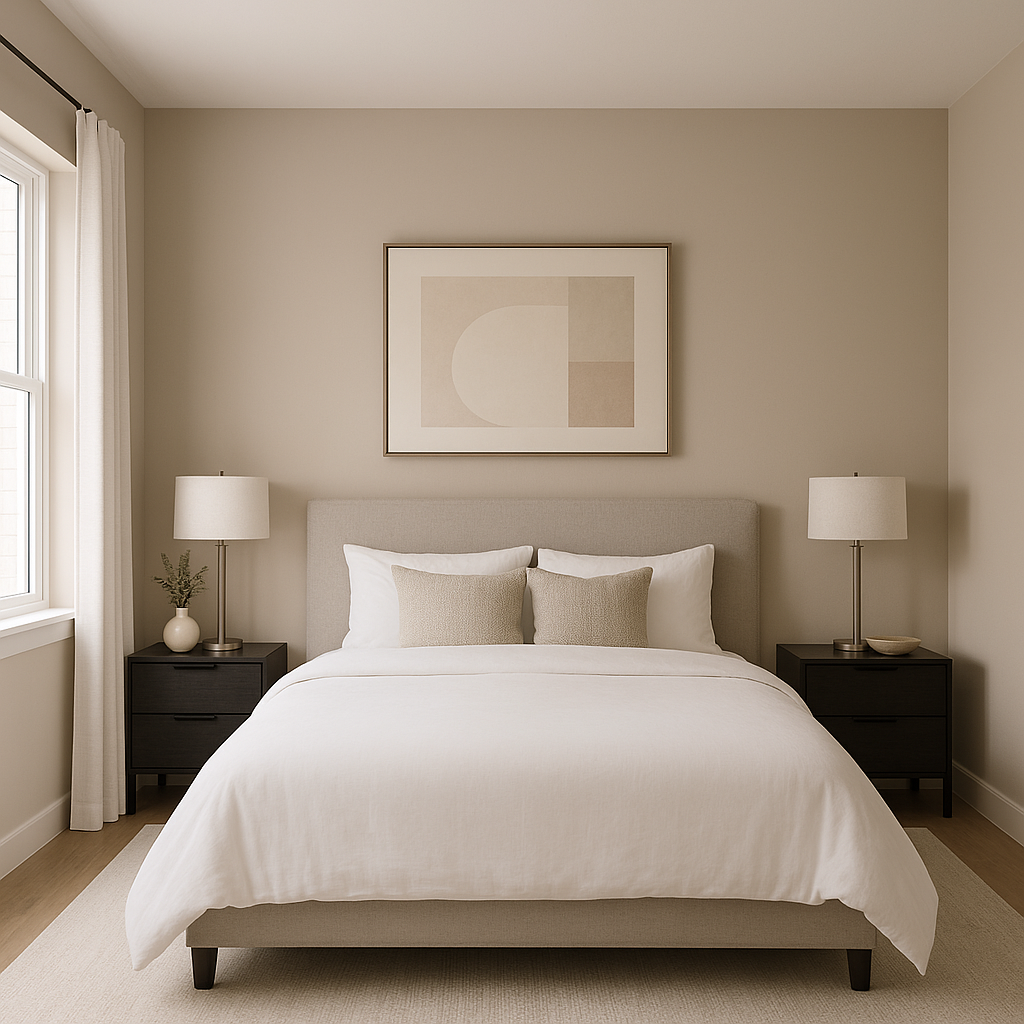
The soft, serene qualities of Doeskin make it perfect for bedrooms. Pair it with white or cream-colored bedding for a crisp, clean look, or add soft pink and mauve accents to enhance its warmth. The shade works equally well for master bedrooms or guest rooms, offering a universal appeal.
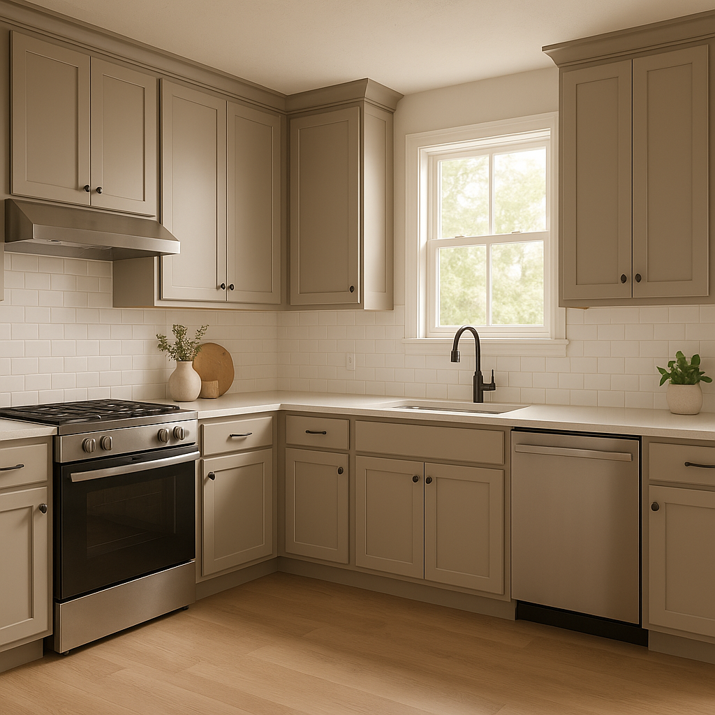
Doeskin’s neutral warmth lends itself beautifully to kitchens and dining spaces, where it can act as a backdrop for natural wood cabinetry or contrasting black hardware. For a fresh, upscale look, pair it with marble countertops and brass or gold fixtures.
In bathrooms, Doeskin creates a spa-like atmosphere. Pair it with white subway tiles, natural wood accents, and greenery to evoke tranquility. Its undertones ensure that it feels warm and inviting, even in spaces with minimal natural light.
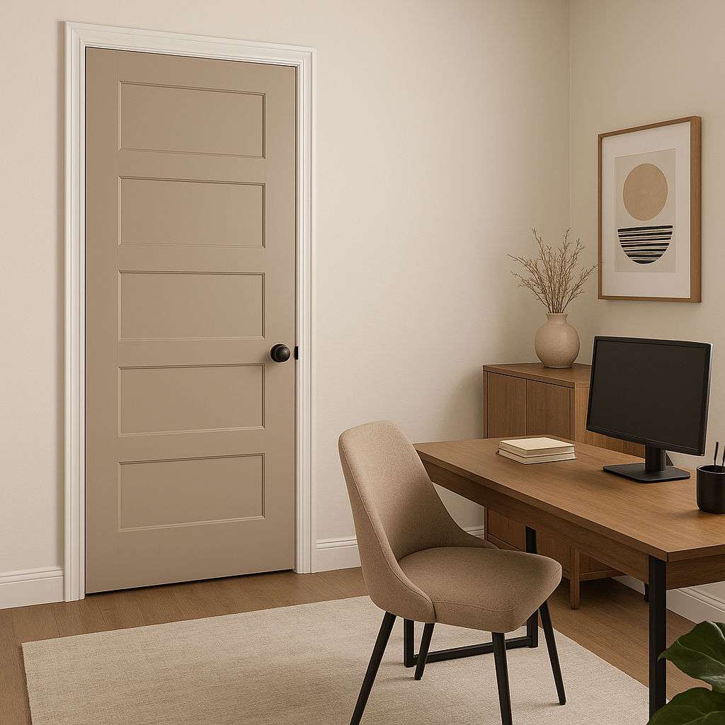
Doeskin’s understated elegance makes it an excellent choice for home offices, where it promotes focus and calm. Pair it with dark wood furniture or sleek black accents for a professional and polished look.
Doeskin’s appearance can shift slightly depending on the lighting in your space. In rooms with ample natural light, its warm undertones will shine, giving the space a sunny and inviting ambiance. In dimly lit or artificial lighting conditions, the shade leans more neutral, maintaining its versatility and charm. Always test a sample on your walls to see how it interacts with your specific lighting setup.
Sherwin-Williams Doeskin (SW 6044) is more than just a neutral paint color—it’s a foundational shade that brings warmth, balance, and timeless elegance to your space. Whether you’re curating a minimalist design, adding layers of texture, or experimenting with bold accent colors, Doeskin offers the flexibility to adapt and elevate your home’s aesthetic. Its ability to pair seamlessly with a variety of hues and materials makes it a favorite among interior designers and homeowners alike.
Note: These images were all generated with AI, there may be inaccurate color results. Please only use a general reference to get a rough idea of what a color may look like, we will continue to generate new images to improve accuracy.
View Colors Only by Brand (No Imagery):
Sherwin-Williams
|
Benjamin-Moore
|
Behr
|
Valspar
Live on the Eastern Slope of Colorado and looking for a local painting professional, check out all our painting services and reach out for a free estimate.
Copyright © 2026 : Wild Fox Painting Inc. : 12435 Mead Way, Littleton, CO 80125


