Sherwin-Williams Quicksilver (SW 6245) is a refined silver-grey paint color that strikes the perfect balance between cool and neutral tones. This shade, with its timeless appeal, exudes elegance and subtlety, making it a versatile choice for both modern and traditional interiors. Its soft demeanor creates a calming backdrop that enhances a wide range of design styles, from minimalist to coastal chic.
Quicksilver is a cool-toned grey with delicate blue undertones. These blue notes add depth without overwhelming the space, giving the color a serene and airy feel. The undertones lean more toward icy, muted blue rather than vibrant or bold, which is why Quicksilver works so well in spaces where tranquility is desired.
The coolness of Quicksilver makes it ideal for north-facing rooms or spaces with ample natural light, as it reflects light beautifully and maintains its crisp appearance throughout the day. However, in dim lighting or south-facing rooms, the blue undertones may become more pronounced, lending a slightly cooler vibe to the space.
To create a harmonious and cohesive palette, pair Sherwin-Williams Quicksilver with colors that complement its cool undertones. Here are some suggestions:
Quicksilver’s versatility allows it to shine in a variety of spaces, whether used as a primary wall color or as part of an accent scheme.
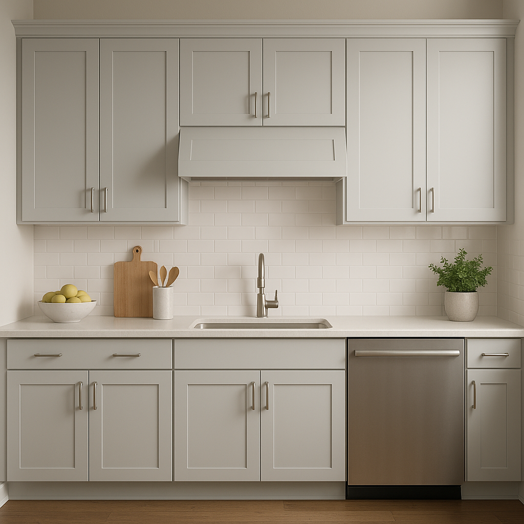
Create a tranquil and inviting living area by using Quicksilver on the walls. Pair it with soft white trim, plush textiles, and metallic accents such as brushed nickel or chrome to enhance its refined character.
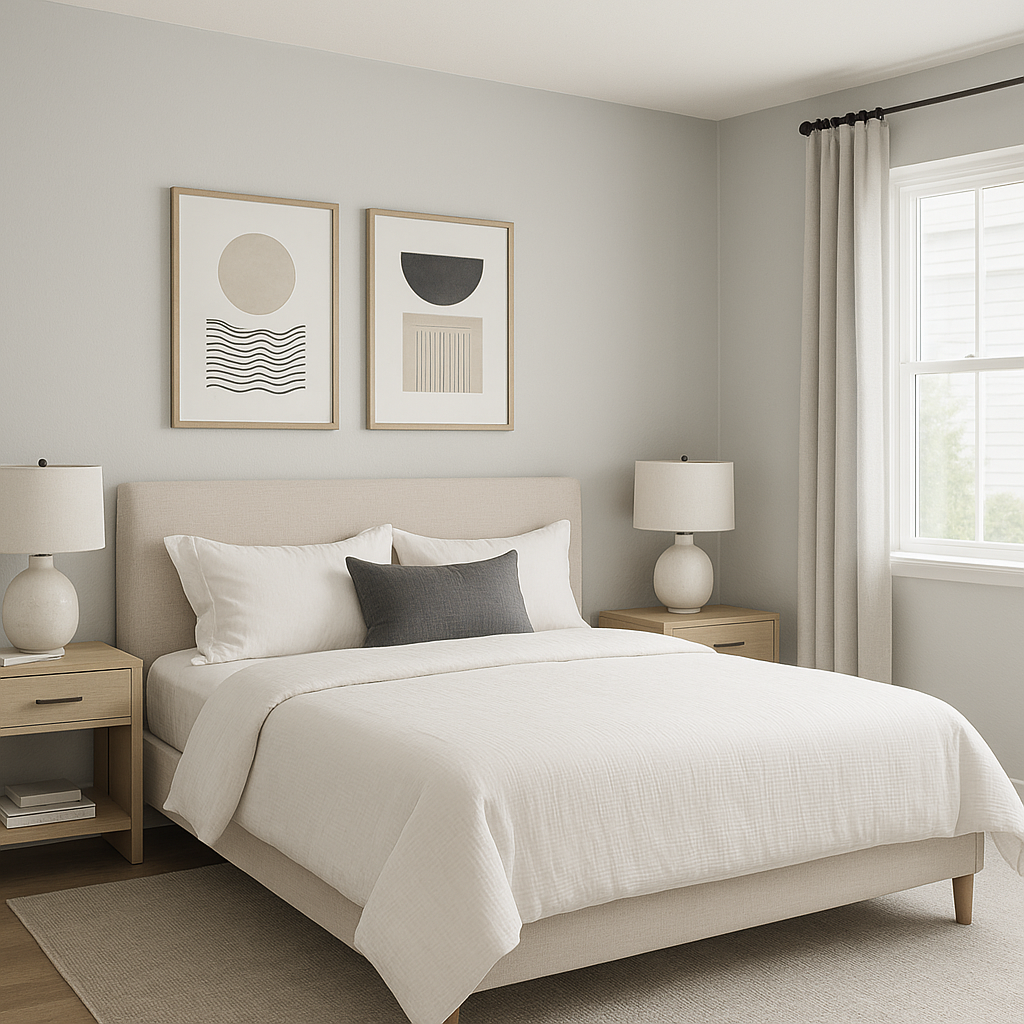
Quicksilver is an exceptional choice for bedrooms due to its calming and serene nature. Layer it with crisp white bedding, navy accents, and textured throws for a sophisticated retreat.
In bathrooms, Quicksilver can evoke a spa-like atmosphere. Pair it with white subway tile, marble countertops, and silver hardware for a clean yet luxurious look.
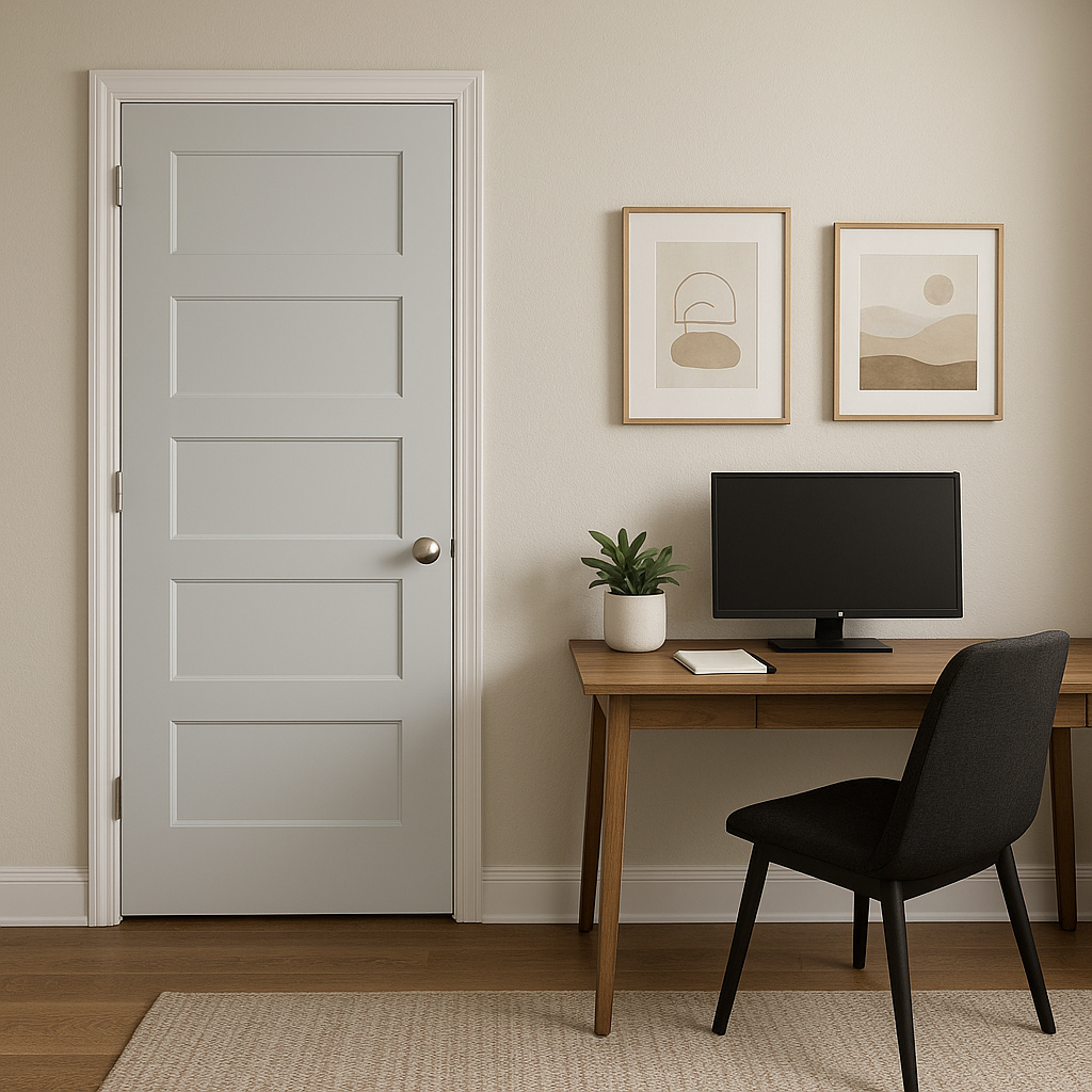
For a productive and peaceful workspace, Quicksilver provides the perfect backdrop. Add pops of color like coral or green in accessories to keep the space energizing yet calm.
Use Quicksilver as an accent wall to add visual interest without overwhelming the room. It pairs beautifully with lighter greys or whites for a subtle contrast, or with bold blues for a more dramatic effect.
Sherwin-Williams Quicksilver (SW 6245) combines elegance, versatility, and subtle cool undertones to create a paint color that works effortlessly in a variety of settings. Whether you're designing a cozy sanctuary or a modern masterpiece, Quicksilver adapts beautifully, making it an ideal choice for homeowners and designers alike. Its ability to coordinate with a range of accent and trim colors ensures it remains a go-to shade for achieving a polished, serene interior.
Transform your space with the understated beauty of Quicksilver—where sophistication meets serenity.
Note: These images were all generated with AI, there may be inaccurate color results. Please only use a general reference to get a rough idea of what a color may look like, we will continue to generate new images to improve accuracy.
View Colors Only by Brand (No Imagery):
Sherwin-Williams
|
Benjamin-Moore
|
Behr
|
Valspar
Live on the Eastern Slope of Colorado and looking for a local painting professional, check out all our painting services and reach out for a free estimate.
Copyright © 2026 : Wild Fox Painting Inc. : 12435 Mead Way, Littleton, CO 80125


