Sherwin-Williams Repose Gray (SW 7015) is a versatile and sophisticated paint color that has become a favorite among interior designers and homeowners alike. This soft gray strikes the perfect balance between warm and cool tones, making it an ideal choice for creating a calm, inviting atmosphere in a variety of spaces. With its subtle elegance, Repose Gray can serve as a neutral foundation or a complementary shade, adapting effortlessly to different design styles.
One of the reasons Repose Gray is so popular is its nuanced undertones. While it is primarily a gray, it carries subtle hints of warmth due to its beige undertones, giving it a greige-like quality. Additionally, it contains faint traces of purple and green undertones, which help it shift slightly depending on the lighting conditions and surrounding colors.
In spaces with ample natural light, Repose Gray may lean cooler, showcasing its gray side. In rooms with artificial or dim lighting, its warmth becomes more apparent, making it feel cozy and inviting. This chameleon-like ability allows Repose Gray to harmonize with a wide range of palettes and environments.
Sherwin-Williams Repose Gray pairs beautifully with a variety of colors, making it an excellent choice for both monochromatic and contrasting designs. Below are some coordinating hues to consider:
Whites and Off-Whites: Repose Gray looks stunning alongside crisp whites like Sherwin-Williams Extra White (SW 7006) or softer shades like Sherwin-Williams Alabaster (SW 7008). These pairings create a clean, timeless aesthetic perfect for modern or traditional spaces.
Blues and Greens: Add depth and vibrancy with blues like Sherwin-Williams Naval (SW 6244) or greens like Sherwin-Williams Sea Salt (SW 6204). These cool tones enhance the subtle undertones of Repose Gray, delivering a harmonious and refreshing palette.
Warm Neutrals: For a cozy and balanced look, pair Repose Gray with warm neutrals such as Sherwin-Williams Accessible Beige (SW 7036) or Sherwin-Williams Urbane Bronze (SW 7048). These combinations highlight the warmer side of Repose Gray and create an inviting atmosphere.
Bold Accents: If you’re looking for a striking contrast, try pairing Repose Gray with rich jewel tones like Sherwin-Williams Tricorn Black (SW 6258) or Sherwin-Williams Real Red (SW 6868). These bold accents can add drama and energy to your space.
Repose Gray’s adaptability makes it a top choice for virtually any room in your home. Below are some inspired ways to incorporate this timeless neutral:
Living Rooms: Use Repose Gray as a main wall color to create a serene and welcoming gathering space. Pair it with plush furniture in muted tones and metallic accents for a polished look.
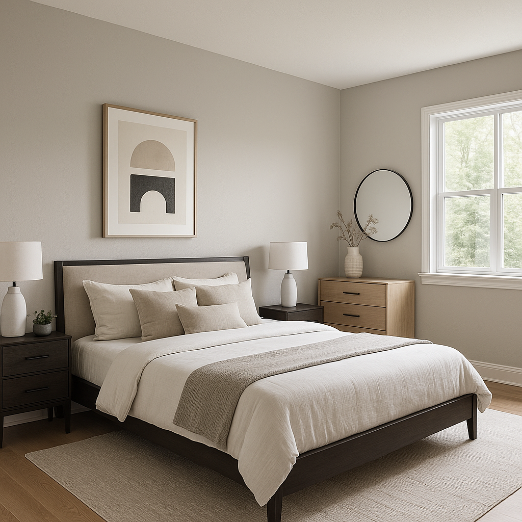
Bedrooms: Its calming undertones make Repose Gray an ideal choice for bedrooms. Pair it with soft linens and layered textures to create a tranquil retreat.
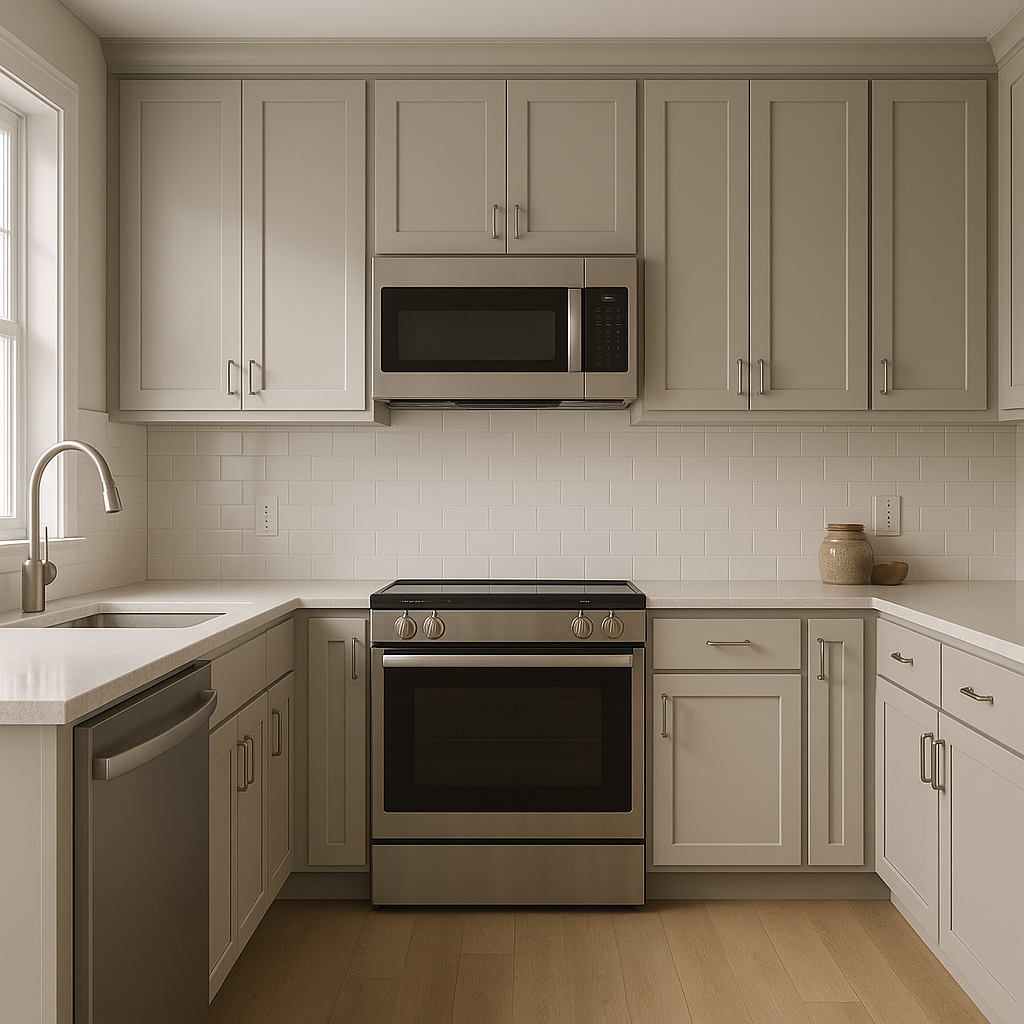
Kitchens and Bathrooms: Repose Gray shines in kitchens and bathrooms, especially when paired with white cabinetry or subway tile backsplashes. Its subtle elegance complements both modern and traditional designs.
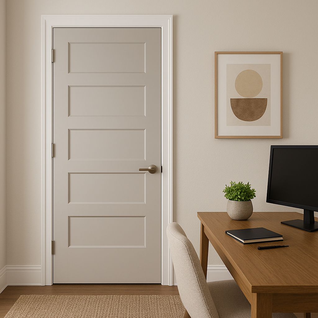
Home Offices: If you’re looking for a productive yet soothing environment, Repose Gray is a fantastic option for a home office. Pair it with warm wood tones and clean-lined furniture for a professional and inviting workspace.
Accent Walls: Make a statement by using Repose Gray on an accent wall. Pair it with coordinating neutrals or contrasting bold colors to anchor the room and add depth.
Sherwin-Williams Repose Gray (SW 7015) delivers unmatched versatility, timeless appeal, and adaptability to a wide range of design styles. Whether you’re updating a single room or creating a cohesive color palette for your entire home, this soft gray provides an elegant foundation that beautifully complements both warm and cool tones. Its ability to transform under different lighting conditions and pair seamlessly with other colors ensures that your space feels balanced, sophisticated, and uniquely yours.
Note: These images were all generated with AI, there may be inaccurate color results. Please only use a general reference to get a rough idea of what a color may look like, we will continue to generate new images to improve accuracy.
View Colors Only by Brand (No Imagery):
Sherwin-Williams
|
Benjamin-Moore
|
Behr
|
Valspar
Live on the Eastern Slope of Colorado and looking for a local painting professional, check out all our painting services and reach out for a free estimate.
Copyright © 2026 : Wild Fox Painting Inc. : 12435 Mead Way, Littleton, CO 80125


